
Graphics in R (Gallery with Examples)
This page shows an overview of (almost all) different types of graphics, plots, charts, diagrams, and figures of the R programming language.
Here is a list of all graph types that are illustrated in this article:
- Barplot
- Boxplot
- Density Plot
- Heatmap
- Histogram
- Line Plot
- Pairs Plot
- Polygon Plot
- QQplot
- Scatterplot
- Venn Diagram
Each type of graphic is illustrated with some basic example code. These codes are based on the following data:
set.seed(123)                        # Set seed for reproducibility
x <- rnorm(30)                       # Create x variable
y <- x + rnorm(30)                   # Create correlated y variable
In each section, you can find additional resources on how to create and modify these graphic types yourself (including reproducible R syntax and many examples).
In addition, this article contains a list of tutorials for general plot modifications in:
So without further ado, let’s dive in!
Barplot
Barplot Definition: A barplot (or barchart; bargraph) illustrates the association between a numeric and a categorical variable. The barplot represents each category as a bar and reflects the corresponding numeric value with the bar’s size.
The following R syntax shows how to draw a basic barplot in R:
barplot(x) # Draw barplot in R
Our example barplot looks a follows:

Advanced Barplots: Find some advanced barplots below. Click on the images to get more information and example R codes for each of the barplots.


Barplot Resources: Find some further resources on the creation of barplots below.
Barplot Video Tutorial: The following video shows a tutorial on creating barplots in R.
Boxplot
Boxplot Definition: A boxplot (or box-and-whisker plot) displays the distribution of a numerical variable based on five summary statistics: minimum non-outlier; first quartile; median; third quartile; and maximum non-outlier. Furthermore, boxplots show the positioning of outliers and whether the data is skewed.
The following R syntax shows how to draw a basic boxplot in R:
boxplot(x) # Draw boxplot in R

Advanced Boxplots: Find some advanced boxplots below. Click on the images to get more information and example R codes for each of the boxplots.


Boxplot Resources: Find some further resources on the creation of boxplots below.
Boxplot Video Tutorial: The following video shows a tutorial on creating boxplots in R.
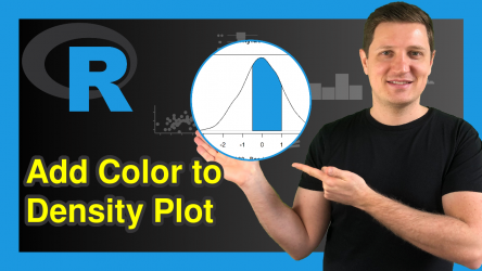
Density Plot
Density Plot Definition: A density plot (or kernel density plot; density trace graph) shows the distribution of a numerical variable over a continuous interval. Peaks of a density plot visualize where the values of numerical variables are concentrated.
The following R syntax shows how to draw a basic density plot in R:
plot(density(x)) # Draw density plot in R

Advanced Density Plots: Find some advanced density plots below. Click on the images to get more information and example R codes for each of the density plots.


Density Plot Resources: Find some further resources on the creation of density plots below.
- Kernel Density Plot in Base R (density Function)
- The plot() Function in R
- Draw Multiple Normally Distributed Density Plots in R
Heatmap
Heatmap Definition: A heatmap (or shading matrix) visualizes individual values of a matrix with colors. More common values are typically indicated by brighter reddish colors and less common values are typically indicated by darker colors.
The following R syntax shows how to draw a basic heatmap in R:
heatmap(cbind(x, y)) # Draw heatmap in R

Advanced Heatmaps: Find some advanced heatmaps below. Click on the images to get more information and example R codes for each of the heatmaps .


Heatmap Resources: Find some further resources on the creation of heatmaps below.
Heatmap Video Tutorial: The following video shows a tutorial on creating heatmaps in R.
Line Plot
Line Plot Definition: A line plot (or line graph; line chart) visualizes values along a sequence (e.g. over time). Line plots consist of an x-axis and a y-axis. The x-axis usually displays the sequence and the y-axis the values corresponding to each point of the sequence.
The following R syntax shows how to draw a basic line plot in R:
plot(1:length(y), y, type = "l") # Draw line plot in R

Advanced Line Plots: Find some advanced line plots below. Click on the images to get more information and example R codes for each of the line plots.


Line Plot Resources: Find some further resources on the creation of line plots below.
- How to Draw a Line Plot in R
- The plot() Function in R
- Smooth Scatterplots with lowess Smoothing Function
- Draw Cumulative Sum in Scatterplot
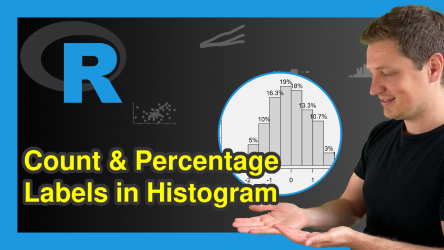
Histogram
Histogram Definition: A histogram groups continuous data into ranges and plots this data as bars. The height of each bar shows the amount of observations within each range.
The following R syntax shows how to draw a basic histogram in R:
hist(x) # Draw histogram in R

Advanced Histograms: Find some advanced histograms below. Click on the images to get more information and example R codes for each of the histograms.


Histogram Resources: Find some further resources on the creation of histograms below.
- How to Create a Histogram in Base R (hist Function)
- How to Create a Histogram with the ggplot2 Package in R (geom_histogram Function)
- Draw Multiple Overlaid Histograms with ggplot2 Package in R
Histogram Video Tutorial: The following video shows a tutorial on creating histograms in R.
Pairs Plot
Pairs Plot Definition: A pairs plot is a plot matrix, consisting of scatterplots for each variable-combination of a data frame.
The following R syntax shows how to draw a basic pairs plot in R:
pairs(data.frame(x, y)) # Draw pairs plot in R

Advanced Pairs Plots: Find some advanced pairs plots below. Click on the images to get more information and example R codes for each of the pairs plots.


Pairs Plot Resources: Find some further resources on the creation of pairs plots below.
Polygon Plot
Polygon Plot Definition: A polygon plot displays a plane geometric figure (i.e. a polygon) within the plot.
The following R syntax shows how to draw a basic polygon plot in R:
plot(1, 1,                           # Draw polygon plot in R
     col = "white",
     xlab = "X", ylab = "Y")
polygon(x = c(0.7, 1.3, 1.3, 0.8),
        y = c(0.6, 1.0, 1.4, 1.3),
        col = "#353436")

Advanced Polygon Plots: Find some advanced polygon plots below. Click on the images to get more information and example R codes for each of the polygon plots.


Polygon Plot Resources: Find some further resources on the creation of polygon plots below.
QQplot
QQplot Definition: A QQplot (or Quantile-Quantile plot; Quantile-Quantile diagram) determines whether two data sources come from a common distribution. QQplots draw the quantiles of the two numerical data sources against each other. If both data sources come from the same distribution, the points fall on a 45 degree angle.
The following R syntax shows how to draw a basic QQplot in R:
qqplot(x, y) # Draw QQplot in R

Advanced QQplots: Find some advanced QQplots below. Click on the images to get more information and example R codes for each of the QQplots.


QQplot Resources: Find some further resources on the creation of QQplots below.
Scatterplot
Scatterplot Definition: A scatterplot (or scatter plot; scatter graph; scatter chart; scattergram; scatter diagram) displays two numerical variables with points, whereby each point represents the value of one variable on the x-axis and the value of the other variable on the y-axis.
The following R syntax shows how to draw a basic scatterplot in R:
plot(x, y) # Draw scatterplot in R

Advanced Scatterplots: Find some advanced scatterplots below. Click on the images to get more information and example R codes for each of the scatterplots.


Scatterplot Resources: Find some further resources on the creation of scatterplots below.
- How to Draw a Scatterplot in R
- The plot() Function in R
- Plot of Empirical Cumulative Distribution Function
Venn Diagram
Venn Diagram Definition: A venn diagram (or primary diagram; set diagram; logic diagram) illustrates all possible logical relations between certain data characteristics. Each characteristic is represented as a circle, whereby overlapping parts of the circles illustrate elements that have both characteristics at the same time.
The following R syntax shows how to draw a basic venn diagram in R:
install.packages("VennDiagram")      # Install VennDiagram package
library("VennDiagram")               # Load VennDiagram package
plot.new()                           # Draw empty plot
draw.single.venn(area = 10)          # Draw venn diagram

Advanced Venn Diagrams: Find some advanced venn diagrams below. Click on the images to get further information and example R codes for each of the venn diagrams.


Venn Diagram Resources: Find some further resources on the creation of venn diagrams below.
Venn Diagram Video Tutorial: The following video shows a tutorial on creating venn diagrams in R.
General Modification of Plots
In the previous part of this article, I have shown you many different types of plots. However, there are plenty of programming tricks for the modification of plots in general. In the following, you will find a list of tutorials that explain such general modifications of plots in R.
Base R Plots


ggplot2
I have created a detailed introduction to the ggplot2 package, which explains the basic concepts of this library in more detail. You can find the introduction here.
Furthermore, you might have a look at the following list of ggplot2 tutorials, in case you are eager to learn more about certain components of the package.

Learn More About Plots in R
This tutorial showed an overview of many different graphics and plots of the R programming language. If you are keen to learn more details about the creation of plots in R, I can recommend the following YouTube video of the DataCamp YouTube channel:
If you would like to learn more about the R programming language in general, you could have a look at the following two links. They show a list of useful R functions…
… and give an overview of all R programming tutorials on this website:
I hope you liked this gallery of R graphics! If you have further questions or any kind of feedback, don’t hesitate to let me know in the comments below.
Also, don’t forget to subscribe to my free statistics newsletter for regular updates on programming and statistics!
19 Comments. Leave new
Thanks for the comprehensive introduction into plots!
Hi Jan,
Thanks for the kind words, glad to hear that you liked the introduction!
Regards,
Joachim
any example on point data on a geographic (country or region ) map. Example temperature or precipitation
Hey Abdoulaye,
I do not have such examples yet, but I’ll put it on my to-do list.
Regards
Joachim
Extremely useful. Thanks. Will you consider making a tutorial for gganimate please
Hey,
Thanks a lot for the very nice feedback! Yes, this is definitely planned for the future. I’ll keep you updated.
Regards
Joachim
Thank a lot Mr Jaochim, very useful and easy to understand ,it will be very helpful if you add tutorial on time series models ,like GARCh,ARIMA ….
Thanks and regards
Hey Mohammad,
Thanks a lot for the kind words!
I have definitely planned to publish more tutorials on time series data in the future. I hope I’ll find the time for it soon 🙂
Regards
Joachim
Looking foreward to it 🙂
I’ll keep you updated! 🙂
Lad X være som givet ovenfor. Implement´er likelihood funktionen λ 7→ L(λ; 3) i R. Plot funktionen i intervallet [0, 6] og indtegn en lodret streg ved λ = λˆML.
please help
Hey,
Please ask your question in English and share the code you have tried yourself 🙂
Regards,
Joachim
I would like to plot both a histogram for observed data and a fitted Weibull function on the same graph. Can u plz help me?
Hello Saima,
I think you can adapt our Overlay Normal Density Curve on Top of ggplot2 Histogram in R tutorial to implement what you want. It is possible that you use the dweibull function instead of dnorm.
Regards,
Cansu
Thanks, Cansu.
I used the following code.
data <- data.frame(x = c(4, 5, 6, 8, 35, 1,23, 4, 3, 27, 3,1, 1, 2, 3,4 ))
head(data) # Print head of example data
ggplot(data, aes(x)) + # Draw histogram with density
geom_histogram(aes(y = ..density..)) +
stat_function(fun = dweibull,
args = list(mean = mean(data$x),
sd = sd(data$x)),
col = "#1b98e0",
size = 5)
But I only get the histogram. I don't get the PDF with it.
Hello Saima,
Apparently, the arguments that you should use are shape and scale when it comes to Weibull. They are something to do with the slope and stretch of the curve, see here. Reminding that you should change the inputs of the arguments, you can adapt the following code:
For further info on plotting continuous distributions via ggplot2, see this.
Regards,
Cansu
I don’t know how to thank you. You are such a wonderful guy. Many thanks.
Hello Saima,
Also, many thanks from my side. Keep it up!
Regards,
Cansu