Add Common Legend to Combined ggplot2 Plots in R (Example)
In this article, I’ll illustrate how to create a shared legend for multiple ggplot2 graphics in the R programming language.
Table of contents:
Let’s get started…
Example Data
In the example of this R tutorial, we’ll use the following example data frames:
# Create example data
set.seed(35753)
data1 <- data.frame(x = round(runif(2000), 2),
                    y = round(runif(2000), 2),
                    group = c(rep("A", 1000), rep("B", 1000)))
data2 <- data.frame(x = round(rnorm(2000), 2),
                    y = round(rnorm(2000), 2),
                    group = c(rep("A", 1000), rep("B", 1000)))
The previous R code creates two data frames. Both of these data frames contain the three columns x, y, and a grouping variable.
Furthermore, we need to install and load the ggplot2 package to draw our data:
# Install and load ggplot2 package
install.packages("ggplot2")
library("ggplot2")
Now, we can move on to the plotting of the data…
Example 1: Add Shared Legend to ggplot2 Plots Using patchwork Package
Example 1 explains how to merge multiple ggplot2 legends using the patchwork package.
First, we have to install and load the package:
# Install and load patchwork package
install.packages("patchwork")
library("patchwork")
Furthermore, we have to create two plot objects containing our ggplot2 plots separately:
ggp1 <- ggplot(data1, aes(x = x, y = y, group = group, col = group)) +
  geom_point()
ggp2 <- ggplot(data2, aes(x = x, y = y, group = group, col = group)) +
  geom_point()
In the next step, we can use the plot_layout function of the patchwork package to create a grid of plots with a common legend:
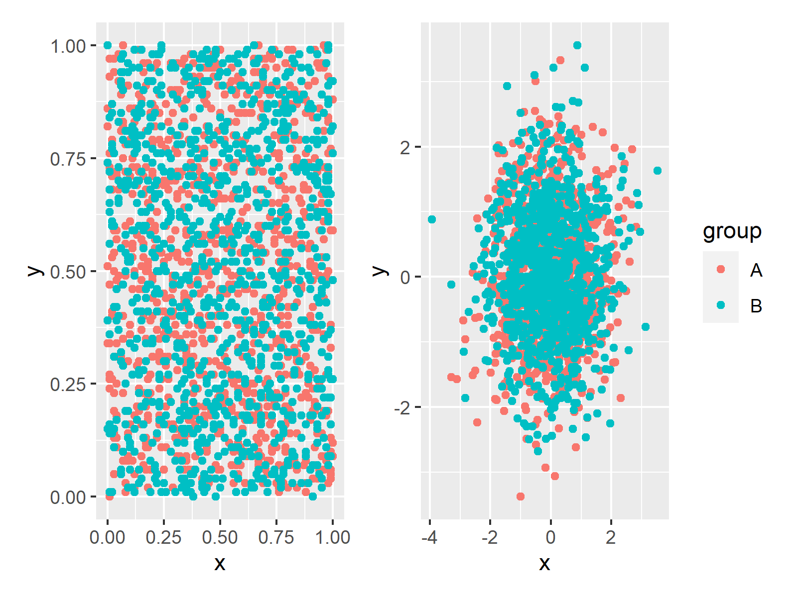
ggp1 + ggp2 + plot_layout(guides = "collect")

Figure 1: Two ggplot2 Plots with a Common Legend Using the patchwork Package.
As you can see, the previous R code has created a shared legend on the right side of the plot.
Example 2: Add Shared Legend to ggplot2 Plots Using gridExtra Package
Alternatively to the patchwork package, we can also use the gridExtra package to draw a grid of ggplot2 plots with a shared legend.
First, let’s install and load the gridExtra package:
# Install and load gridExtra package
install.packages("gridExtra")
library("gridExtra")
Next, we need to create two (or more) plots using the ggplot2 package. The following R syntax stores two ggplot2 graphics in the data objects ggp1 and ggp2. Note that these two plots do not show a legend:
# Create two plots without legends
ggp1 <- ggplot(data1, aes(x = x, y = y, group = group, col = group)) +
  geom_point() +
  theme(legend.position = "none")
ggp2 <- ggplot(data2, aes(x = x, y = y, group = group, col = group)) +
  geom_point() +
  theme(legend.position = "none")
Now, we need to create one of these plots again, but this time with the legend that we want to show later on in the side-by-side graphic. In this case, we are creating a legend at the bottom of the plots. However, you may modify this legend to your specific needs.
# Create plot with legend
ggp1_legend <- ggplot(data1, aes(x = x, y = y, group = group, col = group)) +
  geom_point() +
  theme(legend.position = "bottom")
Next, we define our own function, which enables us to extract the legend of the previously created plot. Note that the code for this function is based on this Stack Overflow thread.
# Create user-defined function, which extracts legends from ggplots
extract_legend <- function(my_ggp) {
  step1 <- ggplot_gtable(ggplot_build(my_ggp))
  step2 <- which(sapply(step1$grobs, function(x) x$name) == "guide-box")
  step3 <- step1$grobs[[step2]]
  return(step3)
}
We can now apply our function to our ggplot2 plot as shown in the following R syntax:
# Apply user-defined function to extract legend
shared_legend <- extract_legend(ggp1_legend)
Our legend is now stored in the data object shared_legend. In order to draw our two plots side-by-side and in order to add a common legend, we can use the grid.arrange and arrangeGrob functions of the gridExtra package:
# Draw plots with shared legend
grid.arrange(arrangeGrob(ggp1, ggp2, ncol = 2),
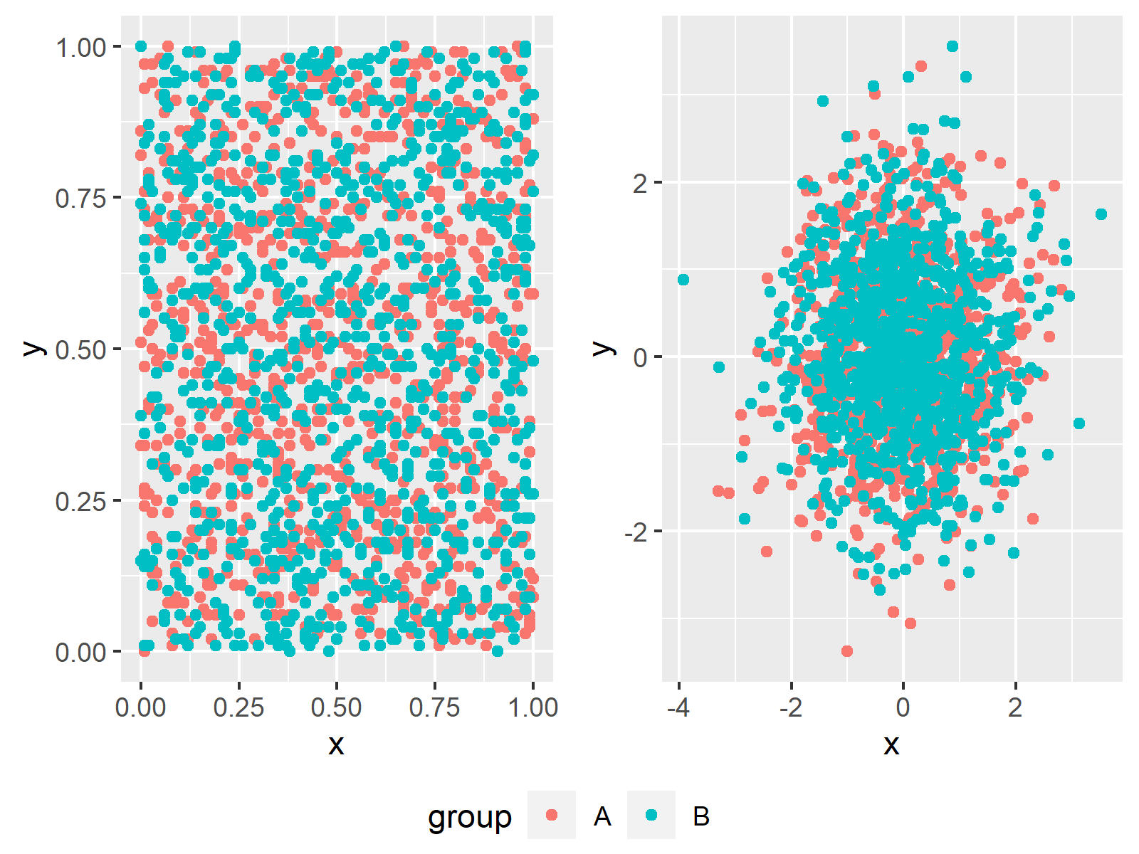
             shared_legend, nrow = 2, heights = c(10, 1))
Figure 1 illustrates the output of the previous R code. As you can see, we created a graph with a shared legend below the two plots.

Figure 1: Two ggplot2 Plots with a Common Legend in R.
In this example, we created a common legend for two scatterplots. However, please note that we could also use other types of ggplot2 plots (e.g. barplots, heatmaps, line graphs, boxplots, and so on…) and we could use any number of plots we want.
Do you want to know more about the creation of shared legends in grid-plots using the gridExtra package? Then you may want to watch the following video of my YouTube channel. In the video, I’m explaining the topics of this article.
Further Resources & Summary
You might want to have a look at some of the other tutorials of www.statisticsglobe.com. Some other tutorials are shown below:
- Graphics in R – Introduction to the ggplot2 Package
- Remove Legend Title from ggplot2 Plot in R
- Create Legend in ggplot2 Plot in R
- Change Legend Title in ggplot2
- Remove Legend in ggplot2
- R Graphics Gallery
- The R Programming Language
In this tutorial you learned how to share a legend for multiple combined ggplot2 plots in R programming. Don’t hesitate to tell me about it in the comments section, in case you have further questions.
Subscribe to the Statistics Globe Newsletter
Get regular updates on the latest tutorials, offers & news at Statistics Globe.
I hate spam & you may opt out anytime: Privacy Policy.
Thank you!
Welcome to the Statistics Globe newsletter. From now on, I’ll send you regular emails about statistics, data science, AI, and programming with R and Python.
I’m Joachim Schork. On this website, I provide statistics tutorials as well as code in Python and R programming.
Statistics Globe Newsletter
Get regular updates on the latest tutorials, offers & news at Statistics Globe. I hate spam & you may opt out anytime: Privacy Policy.
Thank you!
Please check your email inbox and click the confirmation link to complete your subscription. If you don’t see the email within a few minutes, please also check your spam/junk folder.


12 Comments. Leave new
Excellent on the legend extraction. What would be the code to have the legend at the top? I have manipulated the provided code but no luck
Hi Tim,
Thanks for the great question! You would have to modify the grid.arrange() code as follows:
I hope that helps!
Joachim
Thank you so much for code to get the legend at the top of the Grob. However, I am having trouble creating the Grob for exporting to a PNG file. Here is code I am using:
P3<-(arrangeGrob(shared_legend, P1 + theme(legend.position="none"), P2, ncol = 3), heights = c(0.5, 10))
I get the error stating ("Unexpected token ','"). I think the code does not like the "," after shared_legend
I am creating the P3 file so that I can export the PNG file with this code
ggsave(P3,file="c:/destination/P3.png", width=9.5, height=6.5)
Please advise. Unless you have a different method to export the Grob as a PNG file?
Hey Tim,
Thank you for the follow up comment and your emails. I’m happy that you figured it out!
Regards,
Joachim
Dear Joan, Thank you for your tutorial for making singlle ledend for multiple figures. It is good for discrete values. How to modify this code, If I have continous values inform of matrices and I want to make single legends for two different matrices have different scale range.
Hey Muhammad,
Glad to hear that you like my tutorial!
Regarding your question: It’s a bit difficult to tell the best solution without seeing your data. However, one solution might be to create a legend without plot that shows the entire range (see here: https://stackoverflow.com/questions/12041042/how-to-plot-just-the-legends-in-ggplot2). Then, you might add this legend to your two original plots.
I hope this helps!
Joachim
Hi Joachim,
thank you so much for your helpful tutorial video on how extracting the legend. Is it possible to modify your code to put the legend on the right of the graphs?
Hey Farzaneh,
Thanks a lot, glad you like it!
Yes, this is possible. You have to remove this line of code when creating the legend:
i.e.
And then you have to modify the last line of code when creating the final graphic:
I hope that helps!
Joachim
Hola! Tienes algún tutorial sobre regresión lineal o de logaritmo.
Hey Joselyn,
You may use the Statistics Globe search to find tutorials on a topic you are interested in. You can find a list of all regression tutorials here.
Regards,
Joachim
Hi Joachim,
Thank you for the tips shared in your articles. However, I have been trying to find how to add external elements to the legend (such as the meaning of trend lines or linear models). Do you have any tips for this? I haven’t found anything that explains how to do this using ggplot
Thanks
Hey Alex,
Could you please be more specific about what you mean by “trend lines or linear models”? Maybe an example image?
Regards,
Cansu