Barplot in R (8 Examples) | How to Create Barchart & Bargraph in RStudio
In this post you’ll learn how to draw a barplot (or barchart, bargraph) in R programming.
The page consists of eight examples for the creation of barplots. More precisely, the article will consist of this information:
- Example 1: Basic Barplot in R
- Example 2: Barplot with Color
- Example 3: Horizontal Barplot
- Example 4: Barplot with Labels
- Example 5: Stacked Barplot with Legend
- Example 6: Grouped Barplot with Legend
- Example 7: Barplot in ggplot2 Package
- Example 8: Barplot in plotly Package
- Video, Further Resources & Summary
Let’s dig in.
Example 1: Basic Barplot in R
In Example 1, I’ll show you how to create a basic barplot with the base installation of the R programming language. First, we need to create a vector containing the values of our bars:
values <- c(0.4, 0.75, 0.2, 0.6, 0.5) # Create values for barchart
Now, we can use the barplot() function in R as follows:
barplot(values) # Basic barchart in R

Figure 1: Basic Barchart in R Programming Language.
Figure 1 shows the output of the previous R code: A barchart with five bars. However, you can also see that our basic barchart is very plain and simple. In the next examples, I’ll show you how to modify this bargraph according to your specific needs. So keep on reading!
Example 2: Barplot with Color
Example 2 shows how to add some color to the bars of our barplot with the col argument:
barplot(values,                                       # Barchart with colored bars
        col = "#1b98e0")
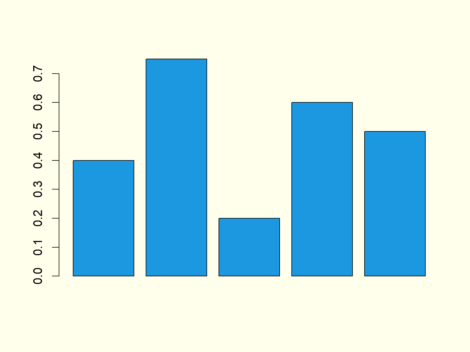
Figure 2: Barchart with Colored Bars.
Note that you could change the color of your bars to whatever color you want. Either you can use HEX-Codes or you could use predefined color names. You can find an overview of colors here.
Example 3: Horizontal Barplot
We can align the bars of our bargrah horizontally by specifying the horiz option to be equal to TRUE:
barplot(values,                                       # Horizontal barchart
        horiz = TRUE)
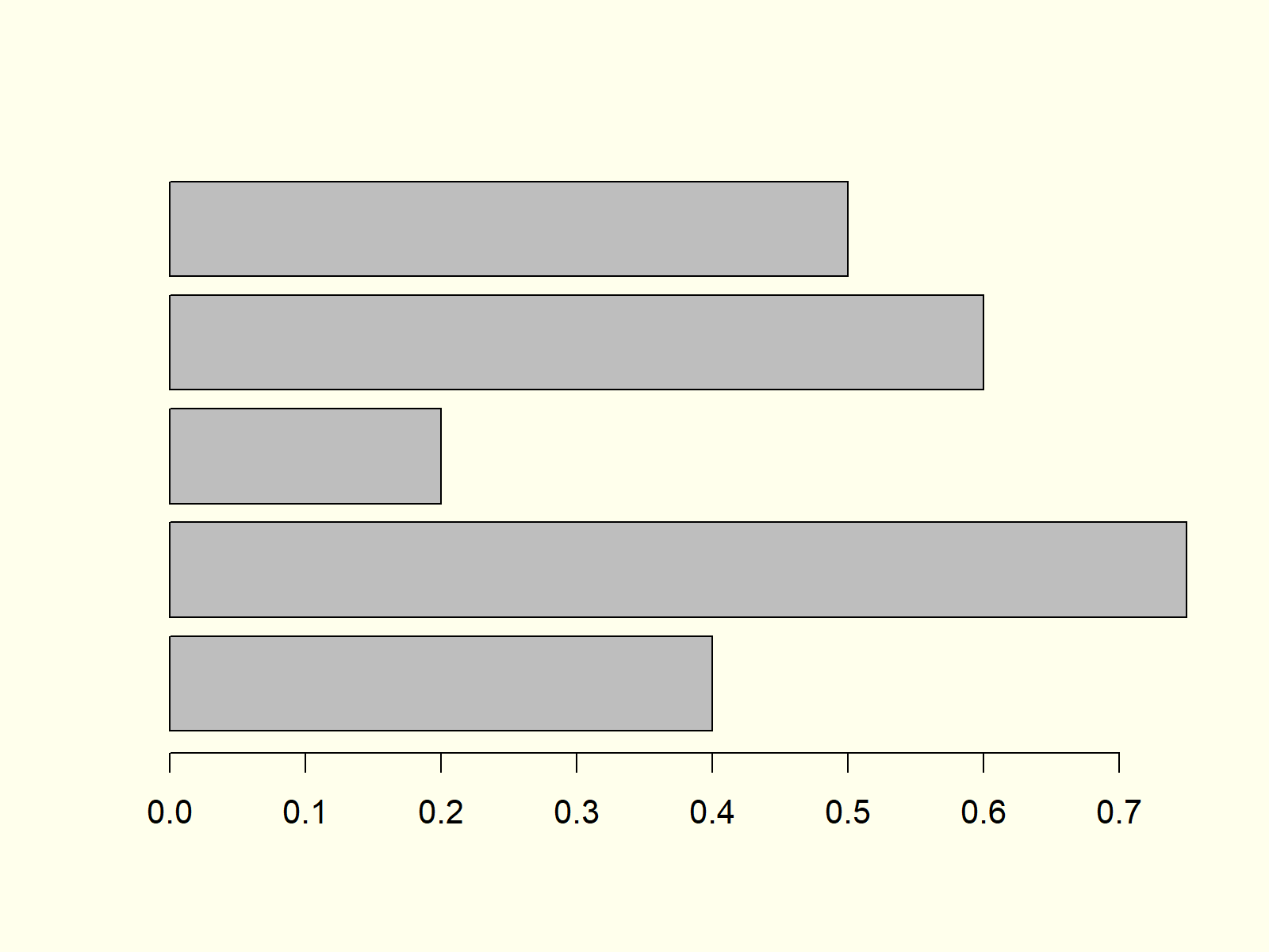
Figure 3: Barchart with Horizontal Alignment.
Figure 3 shows exactly the same bars and values as the previous examples, but this time with horizontal bars instead of vertical bars.
Example 4: Barplot with Labels
It makes a lot of sense to add labels to our barchart in order to show the reader the meaning of each bar. First, we need to specify a vector consisting of the labels of our bars:
group <- LETTERS[1:5] # Create grouping variable
Now, we can add these labels to our barplot with the names.arg option:
barplot(values,                                       # Add labels to barplot
        names.arg = group)
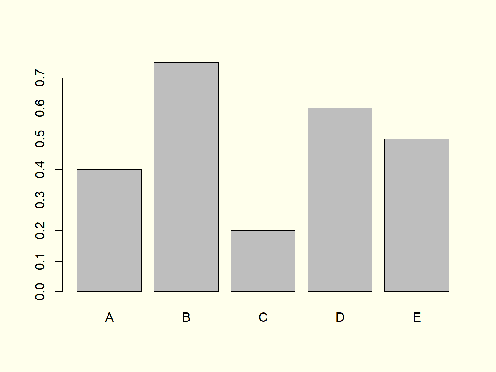
Figure 4: Barchart with Labels of Bars.
Note that the vector containing our labels needs to have the same length and ordering as the vector containing our values.
Example 5: Stacked Barplot with Legend
When we have data with several subgroups (e.g. male and female), it is often useful to plot a stacked barplot in R. For this task, we need to create some new example data:
data <- as.matrix(data.frame(A = c(0.2, 0.4),         # Create matrix for stacked barchart
                             B = c(0.3, 0.1),
                             C = c(0.7, 0.1),
                             D = c(0.1, 0.2),
                             E = c(0.3, 0.3)))
rownames(data) <- c("Group 1", "Group 2")
data                                                  # Print matrix to console
#           A   B   C   D   E
# Group 1 0.2 0.3 0.7 0.1 0.3
# Group 2 0.4 0.1 0.1 0.2 0.3
Based on the previous output of the RStudio console, you can see how our example data should look like: It’s a matrix consisting of a column for each bar and a row for each group.
Now, we can draw a stacked barchart by specifying our previously created matrix as input data for the barplot function:
barplot(data,                                         # Create stacked barchart
        col = c("#1b98e0", "#353436"))
Furthermore, we should add a legend to our stacked bargraph to illustrate the meaning of each color:
legend("topright",                                    # Add legend to barplot
       legend = c("Group 1", "Group 2"),
       fill = c("#1b98e0", "#353436"))
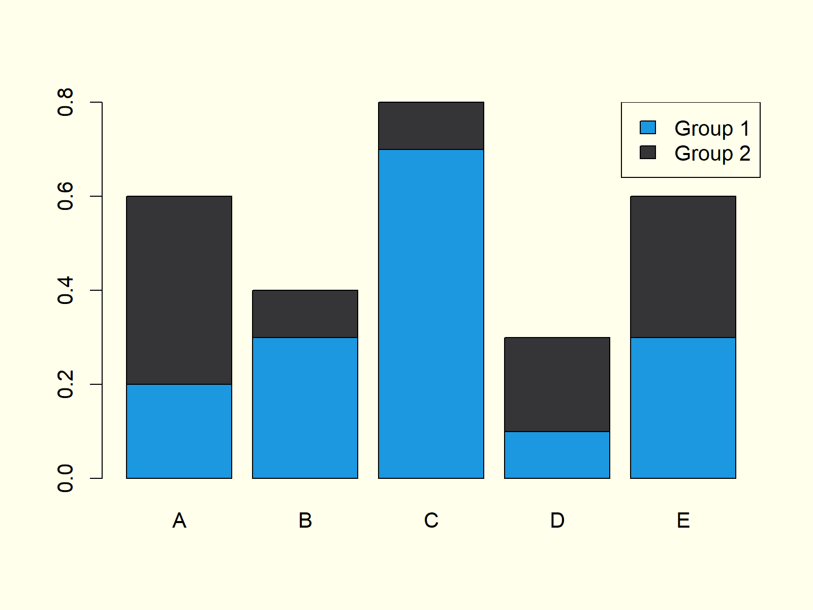
Figure 5: Stacked Barchart with Legend in R.
Figure 5 shows our stacked bargraph. It contains five bars, whereby each of the bars consists of two subgroups. The legend on the topright illustrates the meaning of the two colors of each bar.
Example 6: Grouped Barplot with Legend
Depending on our specific data situation it may be better to print a grouped barplot instead of a stacked barplot (as shown in Example 5). We can do that by specifying beside = TRUE within the barplot command:
barplot(data,                                         # Create grouped barchart
        col = c("#1b98e0", "#353436"),
        beside = TRUE)
As in Example 5, we should also print a legend to our barchart:
legend("topright",                                    # Add legend to barplot
       legend = c("Group 1", "Group 2"),
       fill = c("#1b98e0", "#353436"))
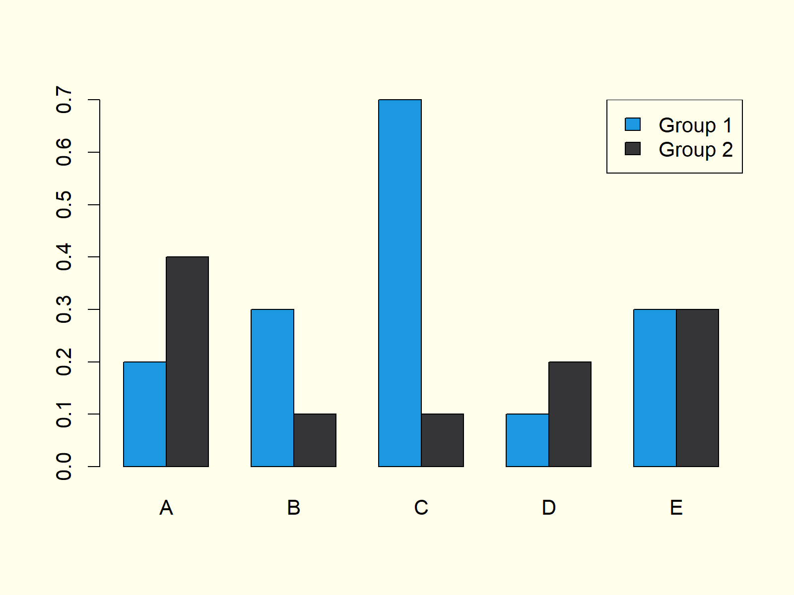
Figure 6: Grouped Barchart with Legend in R.
Compare Figure 5 and Figure 6. Both graphics contain the same values, once in a stacked barchart and once in a grouped barchart.
Example 7: Barplot in ggplot2 Package
So far, we have created all barplots with the base installation of the R programming language. However, there are multiple packages available that also provide functions for the drawing of barcharts.
In this example you’ll learn how to make a basic Barplot with the ggplot2 package. First, we need to install and load the package:
install.packages("ggplot2")                           # Install ggplot2 package
library("ggplot2")                                    # Load ggplot2 package
Then, we also need to store our group and value variables in a data frame – That is required by the functions of the ggplot2 package:
data_ggp <- data.frame(group, values) # Create data frame for ggplot2
Now, we can apply the ggplot and the geom_bar functions of the ggplot2 package to create a barplot:
ggplot(data_ggp, aes(x = group, y = values)) +        # Create barchart with ggplot2
  geom_bar(stat = "identity")
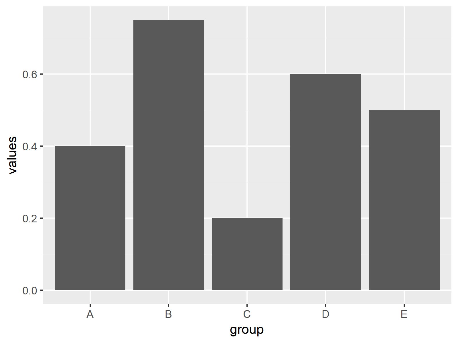
Figure 7: Barchart Created with ggplot2 Package.
Figure 7 shows bars with the same values as in Examples 1-4. However, this time the bargraph is shown in the typical ggplot2 design.
Example 8: Barplot in plotly Package
Another powerful R add-on package for the printing of barcharts is the plotly package. Let’s install and load the package to R:
install.packages("plotly")                            # Install plotly package
library("plotly")                                     # Load plotly package
The plotly package contains the plot_ly function. We can use this function to make a barchart as follows:
plot_ly(x = group,                                    # Create barchart with plotly
        y = values,
        type = "bar")
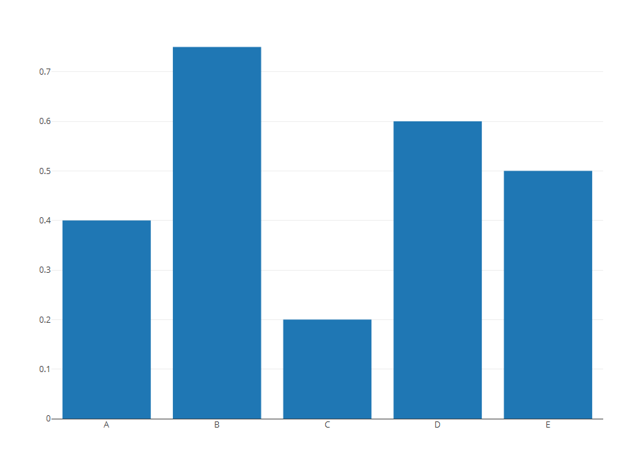
Figure 8: Barchart Created with plotly Package.
Figure 8 also visualizes the same values as Examples 1-5 and 7, but this time in plotly style.
Video, Further Resources & Summary
I have recently released a video on my YouTube channel, which illustrates the R programming syntax of this tutorial. You can find the video below:
In addition, you might read the related articles of my homepage:
- Grouped Barplot in R
- Stacked Barplot in R
- Order Bars of ggplot2 Barchart in R
- R Graphics Gallery
- R Functions List (+ Examples)
- The R Programming Language
In this R tutorial you learned how to create a barplot with multiple bars. Please let me know in the comments, in case you have any further questions.


14 Comments. Leave new
Really useful content. Easy to follow for beginners! Thank You!
This is great to hear Paula! Thank you very much! 🙂
I need help formatting the labels on my stacked bar chart. they currently look like “1000.0000”
I need them to look like this: “1K” rounded to the nearest thousandths.
Also I have 2 labels per section in my stacked bar chart. Meaning there are 4 different parts to the stack and each section has 2 labels of different amounts. I need those labels to be added together to form 1 label per section.
Hey Steven,
Could you explain how your data is structured, and could you also share your R code you have used so far?
Regards,
Joachim
Hi there,
I’ve just started learning R, so I still need to find logic in my head…
I want to create a barplot like figure 6. Is there a possibilty in ggplot to group two variables/columns (with its values)? In these examples there are only values written in a c( …,…,…)
my code:
abbildung2 %
group_by(jahr) %>%
summarize(medianGepr = median(gesamtpr, na.rm = TRUE),medianAupr = median(aufnahmepr, na.rm = TRUE))
ggplot(abbildung2) +
geom_col(aes(x = jahr, y = medianGepr)) +
labs(subtitle = “verlauf der Praevalenzen”)
I need the two median on the y-asis.
Thank you for your help,
Linda
Hey Linda,
Please excuse the delayed response. I was on a long vacation, so unfortunately I wasn’t able to get back to you earlier. Do you still need help with your question?
Regards,
Joachim
Hi Joachim,
thank you for asking. I did find a solution, however it is not quite reproduceable. I added a column with a factor.
temp_Gmedian %
group_by(jahr) %>%
summarize(median1 = median(gesamtpr, na.rm = TRUE))
temp_Gmedian[“A_G”] <- c(0, 0, 0)
temp_Amedian %
group_by(jahr) %>%
summarize(median1 = median(aufnahmepr, na.rm = TRUE))
temp_Amedian[“A_G”] <- c(1, 1, 1)
abbildung2 <- bind_rows(temp_Gmedian, temp_Amedian)
ggplot(abbildung2,aes(x = jahr, y = median1, group = factor(A_G), fill=factor(A_G)))+
geom_col(position=position_dodge(width=1))
With new data coming in next year, I would have to add 0 and 1 to c(0,0,0,0) c(1,1,1,1)
Is there a different, reproduceable solution ?
Best regards,
Linda
Hi Linda,
Glad you already moved forward with your code. It’s difficult to tell without seeing your actual data, but I think you could simply use the following code to replace all “A_G” in your data sets by 0 and 1:
I hope this helps!
Joachim
quick & easy peasy – thank you!
You are very welcome, glad it helped! 🙂
Regards,
Joachim
hey, i created a similar barplot to the one of your example where there is no x-axis. (in my data, the values would be characters, the names of observed sites. on the y-axis there are amounts of found individuals for each site.) i want to put a vertical line between the bars, because i was out on several days and i want to visualize that the first, let’s say, 6 plots belong to a different date. since i cannot refer to any values on the x-axis, i struggle to tell r, where it should put the line. do you have any idea how to solve this? thank you for your content, it’s really hepful!
Hello Maren,
You can check our tutorial about adding vertical and horizontal lines in ggplot2. The x-axis doesn’t have to be numeric; you can specify the intersection by plugging the character value in quotation marks, like “character value”.
Regards,
Cansu
I have used this formula to calculate means,
FIM<-aggregate(x=Data$newfeed, by=list(treatment1=Data$"Ewe group", treatment2=Data$Time), FUN=mean)
treatment 1 has 21 groups treatment two has 4 groups. I would like to plot week one independently of weeks 2,3,4 (treatment 2) with the initial body weight groups (treatment 1); how would i be able to say plot mean of feed intake (worked out to be FIM x against each of the 21 treatments but only for one week.
Hello Amy,
If I got you well, you should subset your data based on the treatment 1 group and then use that data for plotting. See Subset Data Frame Rows Based On Factor Levels in R.
Regards,
Cansu