Draw Multiple Overlaid Histograms with ggplot2 Package in R (Example)
In this tutorial you’ll learn how to create overlaid and transparent histograms with the ggplot2 package in the R programming language.
The article looks as follows:
- Creation of Example Data
- Example: Create Overlaid ggplot2 Histogram in R
- Video, Further Resources & Summary
So now the part you have been waiting for – the examples…
Creation of Example Data
In the example of this R tutorial, we’ll use the following data frame:
set.seed(97531)                                                     # Set seed for random data
data <- data.frame(values = c(rnorm(1000, 5, 3),                    # Create example data
                              rnorm(1000, 7, 2),
                              runif(1000, 8, 11)),
                   group = c(rep("A", 1000),
                             rep("B", 1000),
                             rep("C", 1000)))
Our data contains two columns: The variable values is containing the numeric values for the creation of three different histograms; and the variable group consists of the names of the three histograms (i.e. A, B, and C).
In preparation of the example, we also need to install and load the ggplot2 package to RStudio:
install.packages("ggplot2")                                         # Install and load ggplot2
library("ggplot2")
Now we can draw our overlaid histograms…
Example: Create Overlaid ggplot2 Histogram in R
In order to draw multiple histograms within a ggplot2 plot, we have to specify the fill to be equal to the grouping variable of our data (i.e. fill = group).
Furthermore, we have to specify the alpha argument within the geom_histogram function to be smaller than 1. The alpha argument specifies the transparency of our histograms and therefore allows to display multiple histograms overlaying each other.
Have a look at the following R code:
ggplot(data, aes(x = values, fill = group)) +                       # Draw overlaying histogram
  geom_histogram(position = "identity", alpha = 0.2, bins = 50)

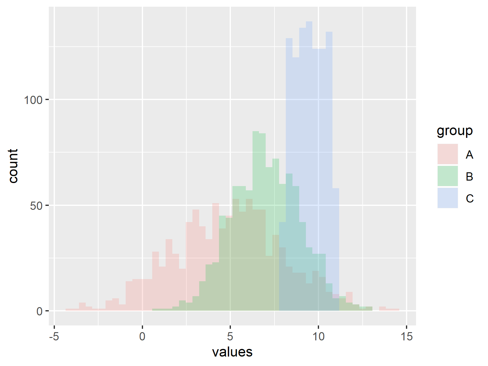
Figure 1: Multiple Overlaid Histograms Created with ggplot2 Package in R.
Figure 1 shows the output of the previous R syntax. As you can see, we created a ggplot2 plot containing of three overlaid histograms. The histograms are transparent, which makes it possible for the viewer to see the shape of all histograms at the same time.
Video, Further Resources & Summary
Do you need more info on the R programming codes of this tutorial? Then I can recommend to have a look at the following video which I have published on my YouTube channel. In the video, I’m explaining the contents of this tutorial in a live session.
Furthermore, you might want to read some of the related articles of this homepage.
- Create ggplot2 Histogram in R
- Create Graphics in R using the ggplot2 Package
- Create Histogram in Base R
- R Graphics Gallery
- The R Programming Language
To summarize: At this point you should have learned how to split your data according to factor levels and plot multiple overlaid histograms with the ggplot2 add-on package in R. If you have additional questions, let me know in the comments below.
Subscribe to the Statistics Globe Newsletter
Get regular updates on the latest tutorials, offers & news at Statistics Globe.
I hate spam & you may opt out anytime: Privacy Policy.
Thank you!
Welcome to the Statistics Globe newsletter. From now on, I’ll send you regular emails about statistics, data science, AI, and programming with R and Python.
I’m Joachim Schork. On this website, I provide statistics tutorials as well as code in Python and R programming.
Statistics Globe Newsletter
Get regular updates on the latest tutorials, offers & news at Statistics Globe. I hate spam & you may opt out anytime: Privacy Policy.
Thank you!
Please check your email inbox and click the confirmation link to complete your subscription. If you don’t see the email within a few minutes, please also check your spam/junk folder.


4 Comments. Leave new
Really interesting
Thanks a lot Muhammad, glad you think so! 🙂
What would be the best way to change the colors of each histogram? When I try fill = , it changes all of the colors to just the one…
Hello Kevin,
If you set fill to a single color (e.g., fill = “blue”), all the bars will be that color. You can adjust the colors either using the scale_filll_manual function or scale_fill_brewer. See the examples below.
Best,
Cansu