Create ggplot2 Histogram in R (7 Examples) | geom_histogram Function
This page shows how to create histograms with the ggplot2 package in R programming.
The tutorial will contain the following:
- Creation of Example Data & Setting Up ggplot2 Package
- Example 1: Basic ggplot2 Histogram in R
- Example 2: Main Title & Axis Labels of ggplot2 Histogram
- Example 3: Colors of ggplot2 Histogram
- Example 4: Bar Width of ggplot2 Histogram
- Example 5: Axis Limits of ggplot2 Histogram
- Example 6: Density & Histogram in Same ggplot2 Plot
- Example 7: Multiple Histograms in Same ggplot Plot
- Video, Further Resources & Summary
Let’s dive into it.
Creation of Example Data & Setting Up ggplot2 Package
In the examples of this R tutorial, we’ll use the following random example data:
set.seed(5753)                                       # Create example data
data <- data.frame(x = rnorm(1000))
Furthermore, we need to install and load the ggplot2 R package:
install.packages("ggplot2")                          # Install and load ggplot2
library("ggplot2")
Example 1: Basic ggplot2 Histogram in R
If we want to create a histogram with the ggplot2 package, we need to use the geom_histogram function. The R code of Example 1 shows how to draw a basic ggplot2 histogram.
ggplot(data, aes(x = x)) +                           # Basic ggplot2 histogram
  geom_histogram()
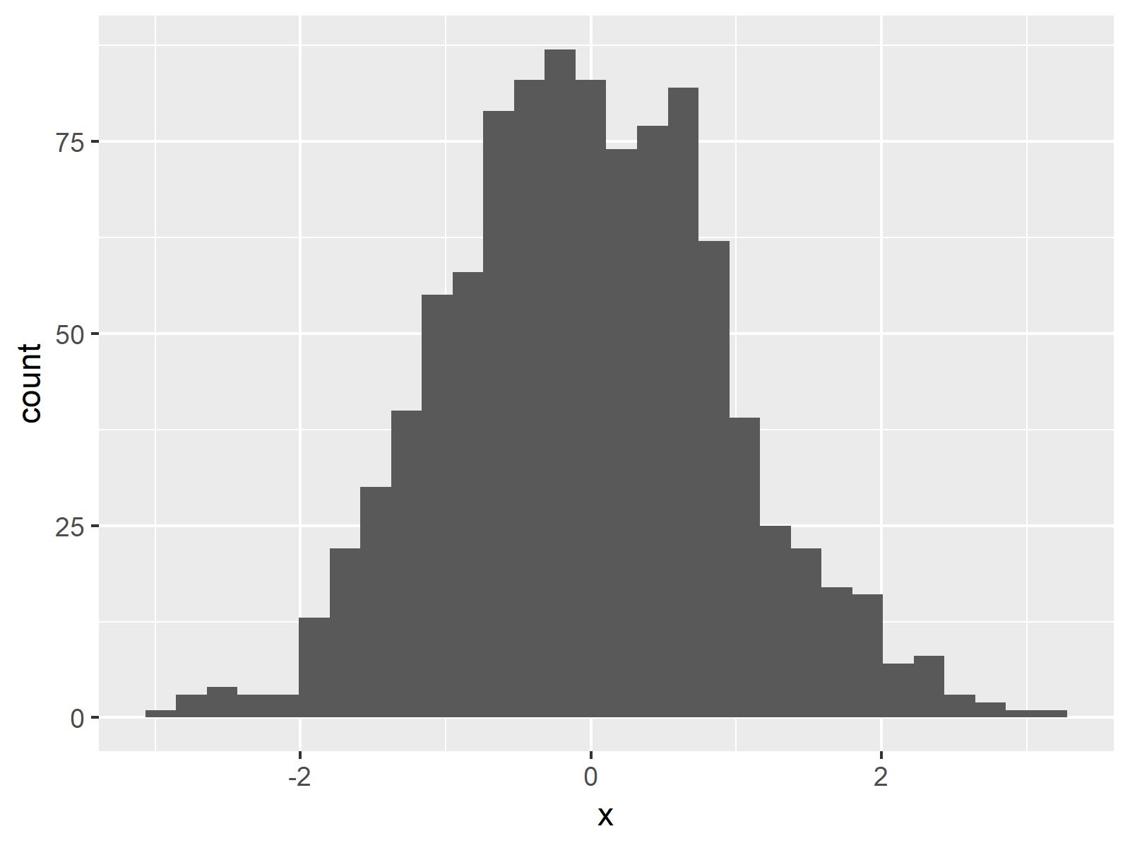
Figure 1: Basic ggplot2 Histogram in R.
Figure 1 visualizes the output of the previous R syntax: A histogram in the typical design of the ggplot2 package.
In the following examples I’ll explain how to modify this basic histogram representation. So keep on reading!
Example 2: Main Title & Axis Labels of ggplot2 Histogram
In ggplot2, we can modify the main title and the axis labels of a graphic as shown below:
ggplot(data, aes(x = x)) +                           # Modify title & axis labels
  geom_histogram() +
  labs(title = "My ggplot2 Histogram",
       x = "Values",
       y = "Count of Values")
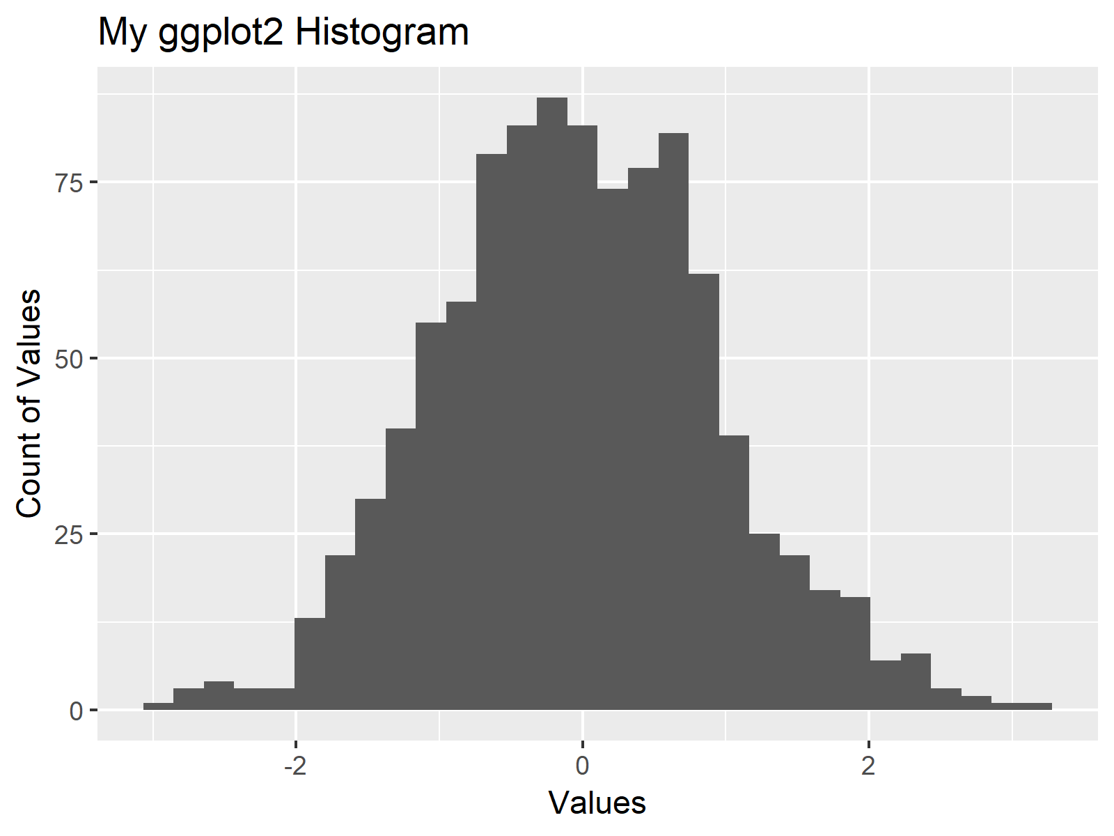
Figure 2: Modified Main Title & Axis Labels.
Figure 2 shows the same histogram as Figure 1, but with a manually specified main title and user-defined axis labels.
Example 3: Colors of ggplot2 Histogram
This example shows how to modify the colors of our ggplot2 histogram in R. If we want to change the color around the bars, we have to specify the col argument within the geom_histogram function:
ggplot(data, aes(x = x)) +                           # Modify color around bars
  geom_histogram(col = "red")
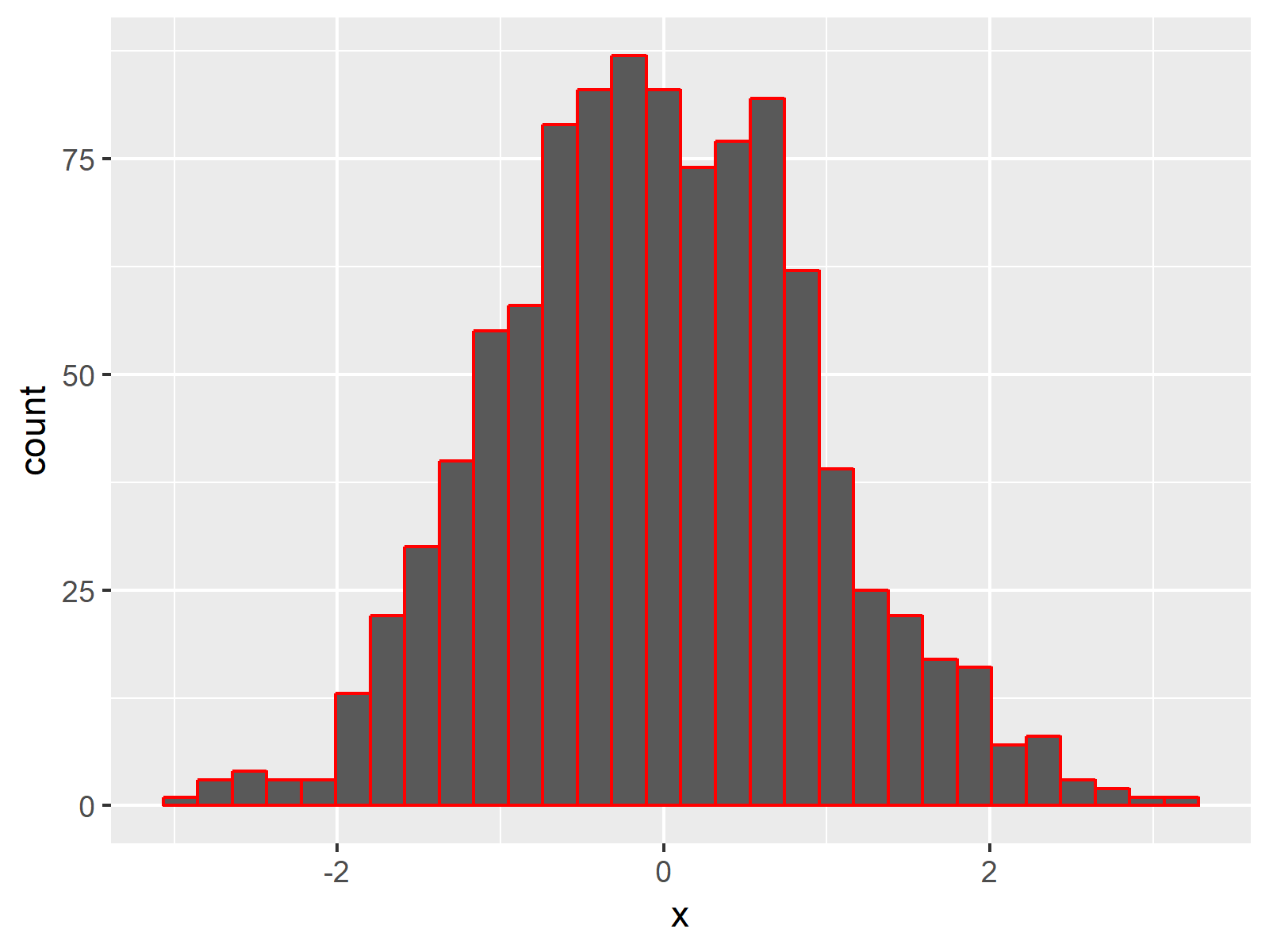
Figure 3: Modified Color of Histogram.
If we want to change the color of the bars, we have to specify the fill argument within the geom_histogram function. We can also specify the col argument to a different color than the fill argument:
ggplot(data, aes(x = x)) +                           # Modify filling of bars
  geom_histogram(col = "black", fill = "red")
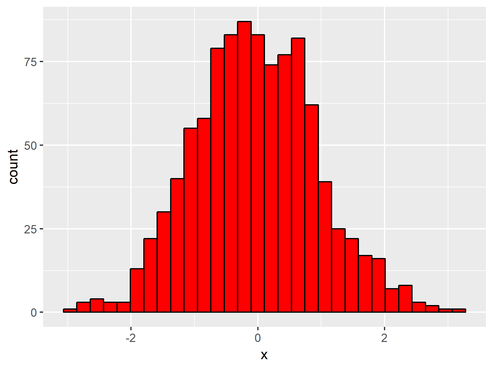
Figure 4: Modified Filling Color of Histogram.
Example 4: Bar Width of ggplot2 Histogram
The geom_histogram command also provides the possibility to adjust the width of our histogram bars. We simply have to specify the binwidth option as shown below:
ggplot(data, aes(x = x)) +                           # Modify width of bars
  geom_histogram(binwidth = 0.1)
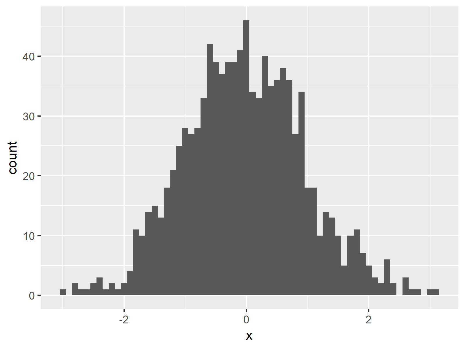
Figure 5: Changing Bar Width in ggplot2 Histogram.
As you can see based on Figure 5, the bars of our new histogram are thinner.
Example 5: Axis Limits of ggplot2 Histogram
If we want to zoom in or zoom out, we can adapt the axis limits with the xlim and ylim functions:
ggplot(data, aes(x = x)) +                           # Modify x- & y-axis limits
  geom_histogram() +
  xlim(- 4, 1) +
  ylim(0, 100)
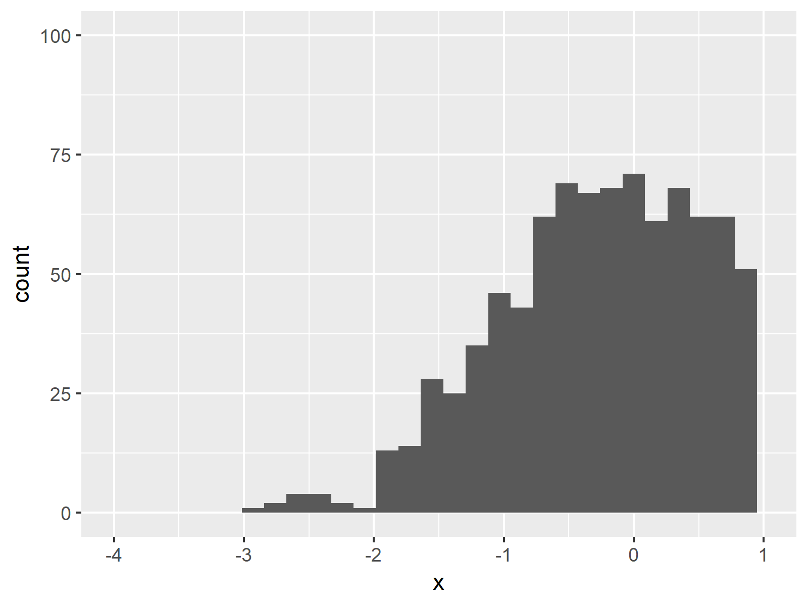
Figure 6: Cutting Off Certain Parts of the Histogram by Setting User-Defined Axis Limits.
Figure 6 shows the output of the previous R code. We increased the height of the y-axis and moved the x-axis to the left. Note that some values on the left side of our histogram were cut off.
Example 6: Density & Histogram in Same ggplot2 Plot
We can also overlay our histogram with a probability density plot. For this task, we need to specify y = ..density.. within the aesthetics of the geom_histogram function and we also need to add another line of code to our ggplot2 syntax, which is drawing the density plot:
ggplot(data, aes(x = x)) +                           # Draw density above histogram
  geom_histogram(aes(y = ..density..)) +
  geom_density(alpha = 0.1, fill = "red")
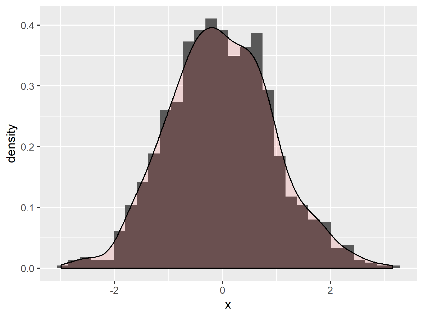
Figure 7: Overlay Histogram with Density in Same Graphic.
Note that we have specified within the geom_density function that the density plot should be transparent and filled with the color red. This helps to distinguish between the histogram in the background and the overlaying density plot.
Example 7: Multiple Histograms in Same ggplot Plot
Similar to Example 6, we can draw multiple histograms in the same ggplot2 graph. Consider the following data frame:
set.seed(19191)                                      # Create example data with group
data2 <- data.frame(x = c(rnorm(500), rnorm(500, 3, 2)),
                    group = as.factor(c(rep(1, 500), rep(2, 500))))
Our new data contains an additional group column. Now we can draw two histograms in the same plot by separating our values by the group variable:
ggplot(data2, aes(x = x, fill = group)) +            # Draw two histograms in same plot
  geom_histogram(alpha = 0.5, position = "identity")
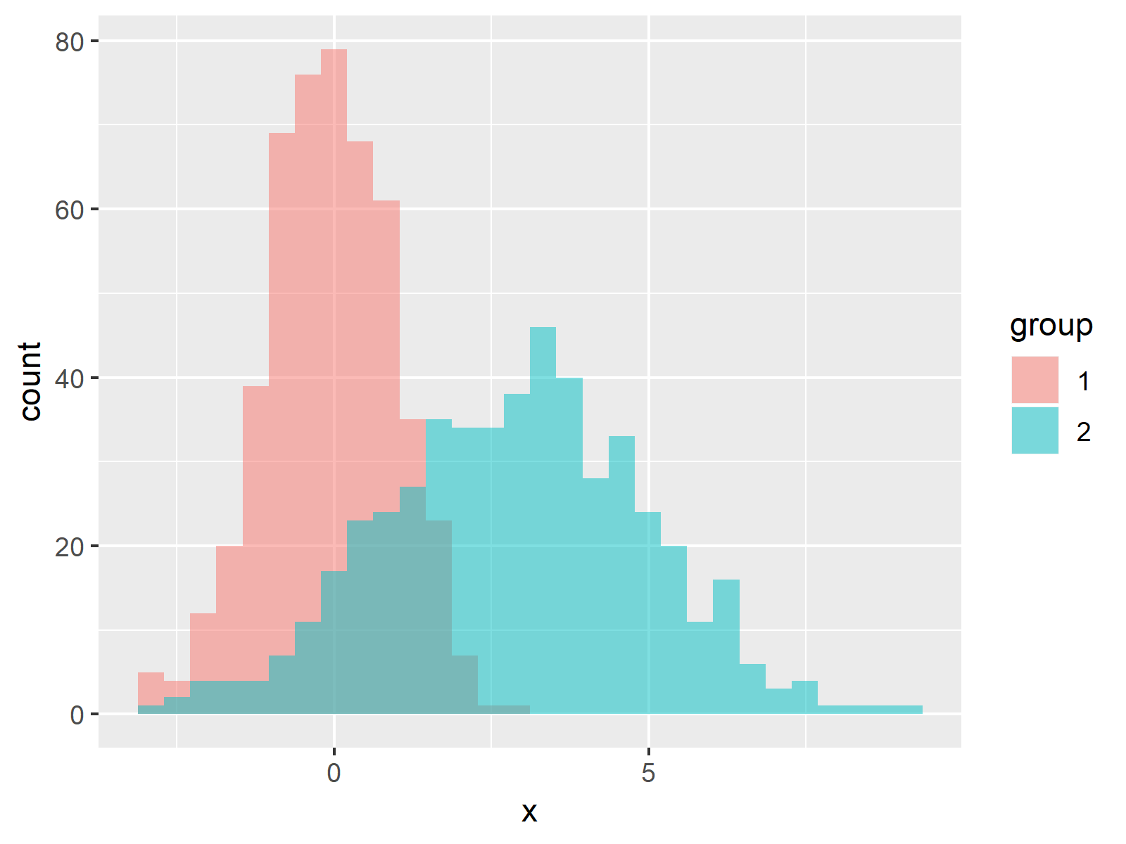
Figure 8: Draw Several Histograms in One Graph.
Video, Further Resources & Summary
Have a look at the following video which I have published on my YouTube channel. In this tutorial I give a detailled introduction to the ggplot2 Package and data visualization in R, structured in different sections with examples for beginners but also advanced users.
In addition to the video, you could have a look at the related articles on this website.
- Create a Histogram in Base R
- Draw Multiple Overlaid Histograms with ggplot2 Package in R
- R Graphics Gallery
- The R Programming Language
In summary: You learned in this article how to make a histogram with the ggplot2 package in the R programming language. Don’t hesitate to let me know in the comments below, in case you have any additional questions.



6 Comments. Leave new
Nice
Thank you 🙂
So interesting. Thanks a million
Thank you very much Fabrice, that’s great to hear!
This was very helpful. Thank you.
Hey Kasang,
Thank you very much for the kind comment, I’m very glad to hear that!
Regards,
Joachim