Boxplot in R (9 Examples) | Create a Box-and-Whisker Plot in RStudio
In this tutorial, I’ll show how to draw boxplots in R.
The tutorial will contain these topics:
- Example 1: Basic Box-and-Whisker Plot in R
- Example 2: Multiple Boxplots in Same Plot
- Example 3: Boxplot with User-Defined Title & Labels
- Example 4: Horizontal Boxplot
- Example 5: Add Notch to Box of Boxplot
- Example 6: Change Color of Boxplot
- Example 7: Specify Different Color for Each Boxplot
- Example 8: Add Space Between Boxplots of Different Groups
- Example 9: Boxplot in ggplot2 Package
- Video & Further Resources
Here’s how to do it…
Example 1: Basic Box-and-Whisker Plot in R
Boxplots are a popular type of graphic that visualize the minimum non-outlier, the first quartile, the median, the third quartile, and the maximum non-outlier of numeric data in a single plot.
Let’s create some numeric example data in R and see how this looks in practice:
set.seed(8642)                                               # Create random data
x <- rnorm(1000)
Our example data is a random numeric vector following the normal distribution. The data is stored in the data object x.
We can now plot these data with the boxplot() function of the base installation of R:
boxplot(x) # Basic boxplot in R
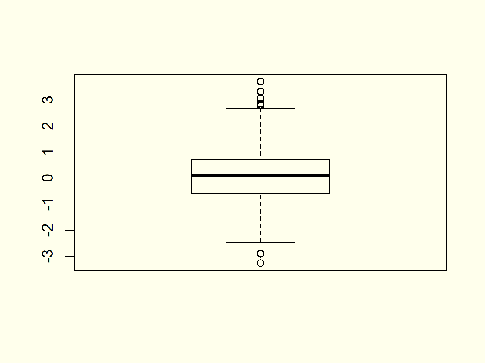
Figure 1: Basic Boxplot in R.
Figure 1 visualizes the output of the boxplot command: A box-and-whisker plot. As you can see, this boxplot is relatively simple. In the following examples I’ll show you how to modify the different parameters of such boxplots in the R programming language.
Example 2: Multiple Boxplots in Same Plot
In Example 2 you’ll learn how to draw a graph containing multiple boxplots side by side in R. First, we need to create some more data that we can plot in our graphic.
The following R code creates a uniformly distributed variable y and a poisson distributed variable z:
y <- runif(1000)                                             # Create more variables
z <- rpois(1000, 3)
Now, we can store our three variables x, y, and z in a data frame:
data <- data.frame(values = c(x, y, z),                      # Combine variables in data frame
                   group = c(rep("x", 1000),
                             rep("y", 1000),
                             rep("z", 1000)))
head(data)                                                   # First six rows of data
#     values group
# -0.8035458     x
#  0.6384819     x
# -0.1417869     x
#  2.1542073     x
# -0.1220888     x
# -0.7332229     x
If we want to create a graphic with multiple boxplots, we have to specify a column containing our numeric values, the grouping column, and the data frame containing our data:
boxplot(values ~ group, data) # Multiple boxplots in same graph

Figure 2: Multiple Boxplots in Same Graphic.
As you can see based on Figure 2, the previous R code created a graph with multiple boxplots.
Example 3: Boxplot with User-Defined Title & Labels
The boxplot function also allows user-defined main titles and axis labels. If we want to add such text to our boxplot, we need to use the main, xlab, and ylab arguments:
boxplot(values ~ group, data,                                # Change main title and axis labels
        main = "My Boxplots",
        xlab = "My Boxplot Groups",
        ylab = "The Values of My Boxplots")
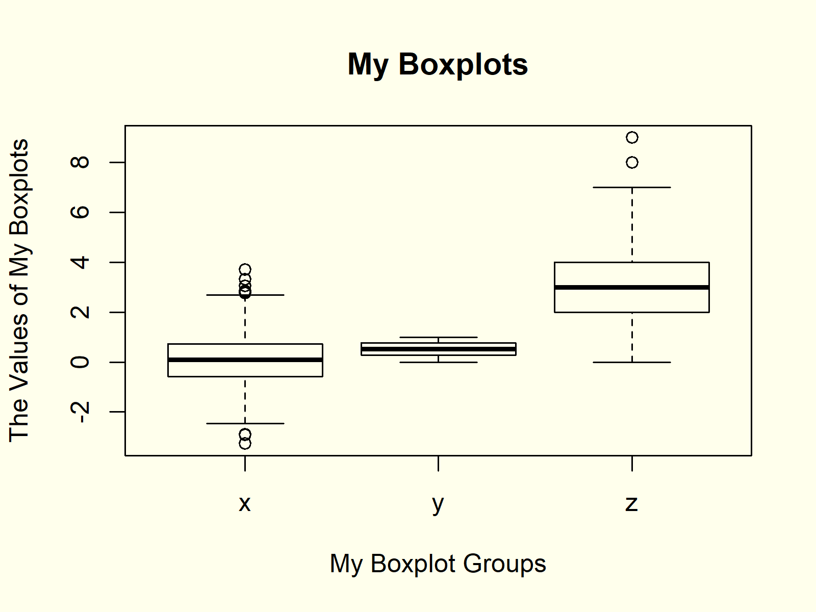
Figure 3: Changed Main Title & Axis Labels.
Example 4: Horizontal Boxplot
We can align our boxplots horizontally with the argument horizontal = TRUE:
boxplot(values ~ group, data,                                # Horizontal boxplots
        horizontal = TRUE)
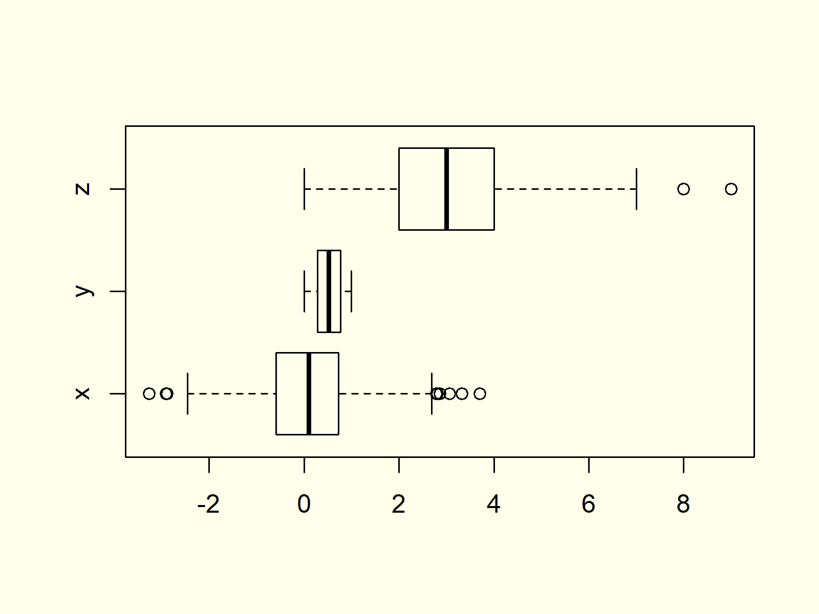
Figure 4: Horizontally Aligned Boxplots.
As you can see based on Figure 4, the previous R syntax changed the X- and Y-Axes of our plot.
Example 5: Add Notch to Box of Boxplot
If we want to make the middle of our boxplots thinner, we can use the notch argument:
boxplot(values ~ group, data,                                # Thin boxplots
        notch = TRUE)
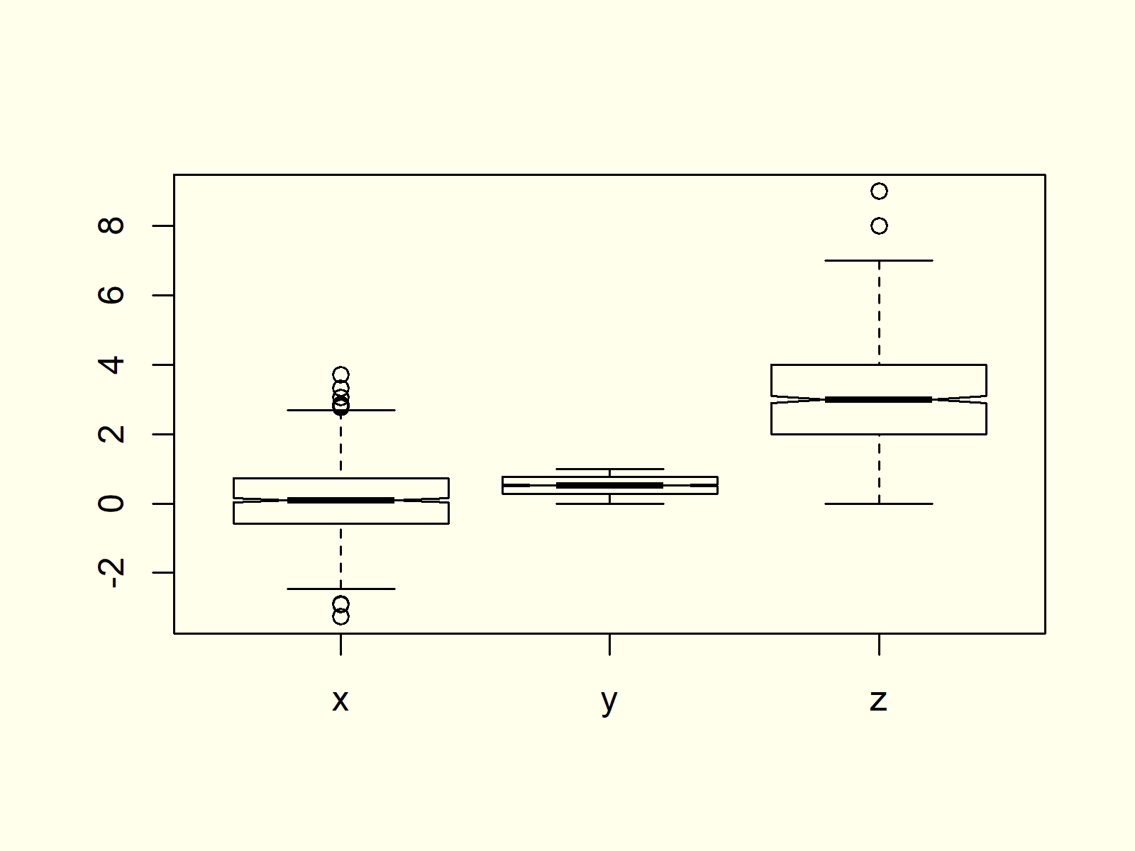
Figure 5: Thinner Boxplots.
Example 6: Change Color of Boxplot
Another popular modification of boxplots is the filling color. If we want to change all our boxplots to the same color, we can specify the col argument to be equal to a single color:
boxplot(values ~ group, data,                                # Color of boxplots
        col = "red")
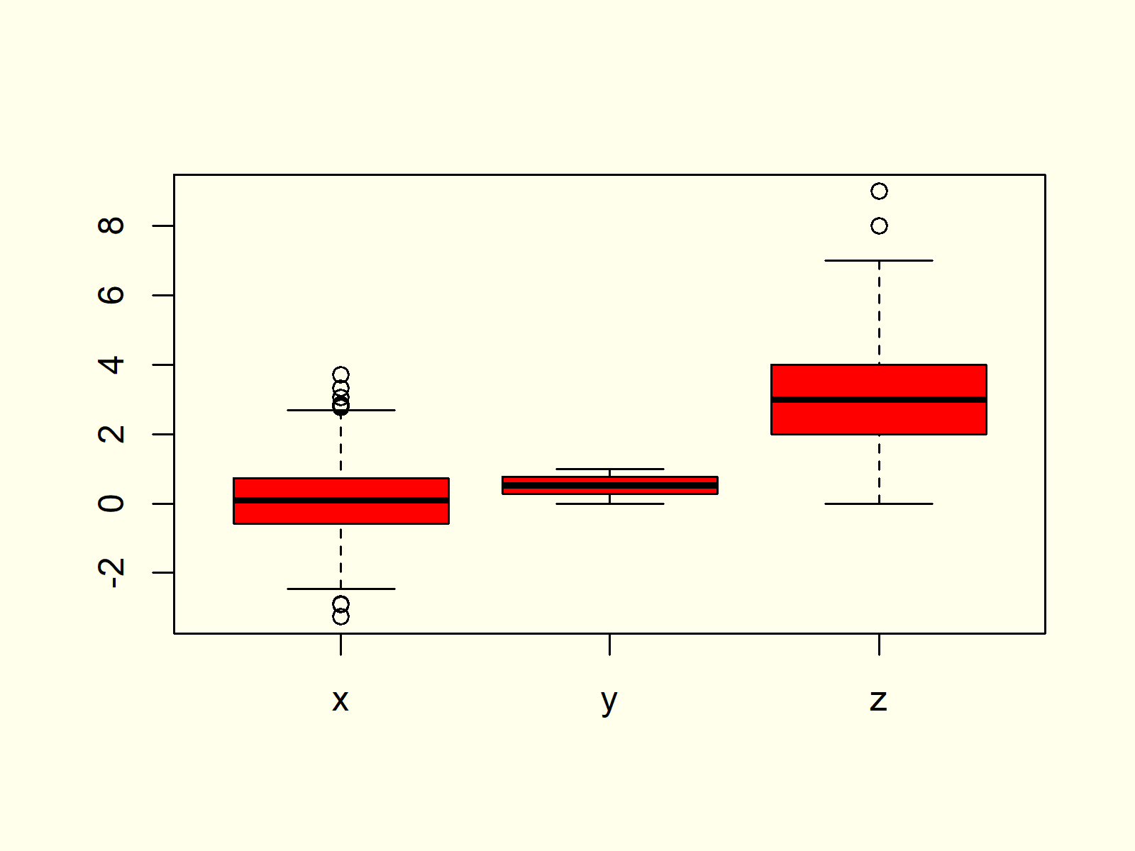
Figure 6: Modify Color of All Boxplots.
Example 7: Specify Different Color for Each Boxplot
If we want to print each of our boxplots in a different color, we have to specify a vector of colors containing a color for each of our boxplots:
boxplot(values ~ group, data,                                # Different color for each boxplot
        col = c("red", "green", "purple"))
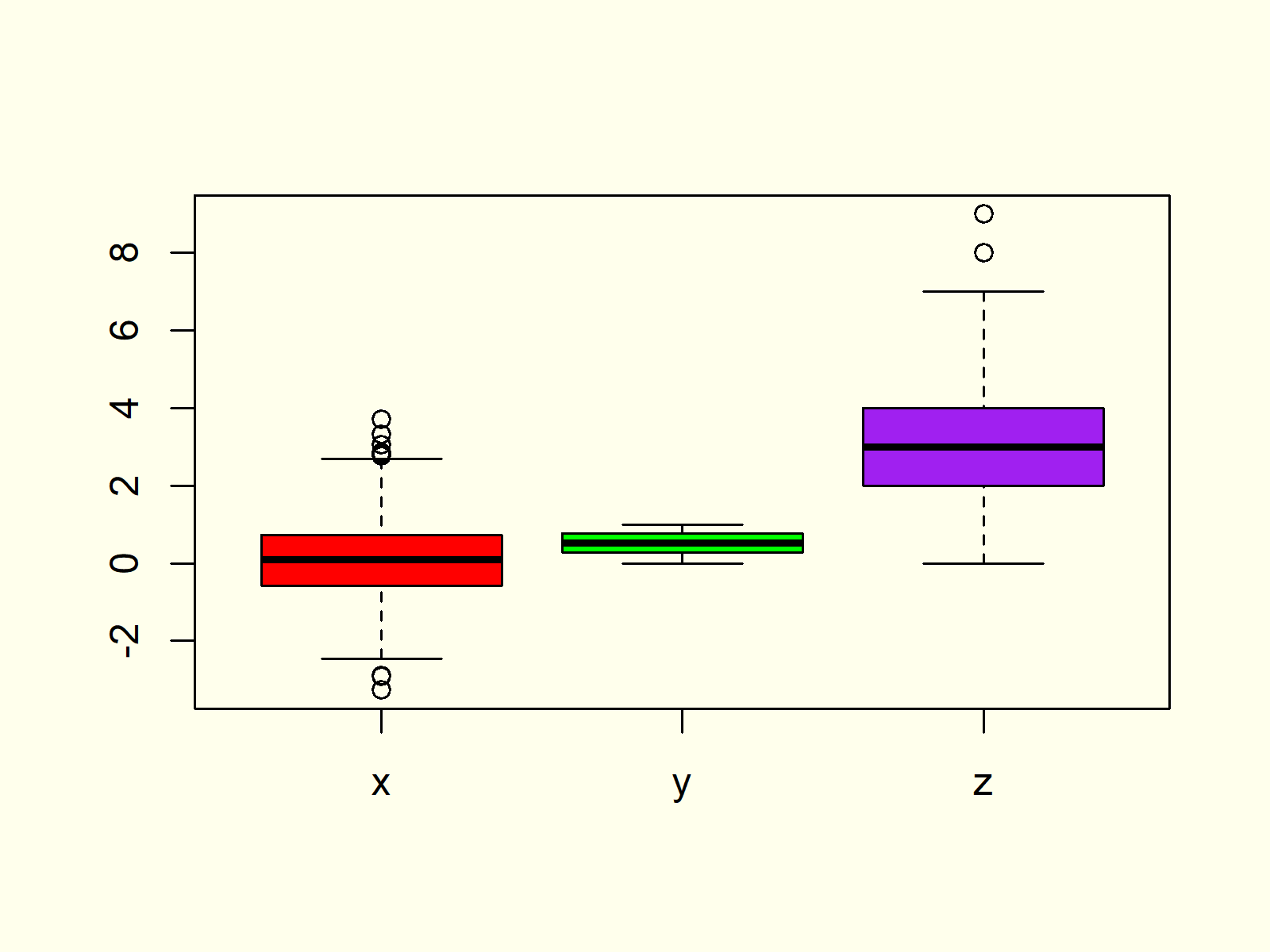
Figure 7: Specify Separate Color for Each Boxplot.
Example 8: Add Space Between Boxplots of Different Groups
Often, we want to cluster our boxplots into different groups (e.g. male and female). In such a case it makes sense to add some additional spacing to our boxplot.
Let’s first modify our data so that each boxplot is divided into subgroups:
data2 <- data                                                # Replicate data
data2$group <- c(rep("x1", 500), rep("x2", 500),             # Modify group variable
                 rep("y1", 500), rep("y2", 500),
                 rep("z1", 500), rep("z2", 500))
Now, we can use the at option of the boxplot function to specify the exact positioning of each boxplot. Note that we are leaving out the positions 3, 4, 7, and 8:
boxplot(values ~ group, data2,                               # Boxplot with manual positions
        col = c("blue", "pink"),
        at = c(1, 2, 5, 6, 9, 10))
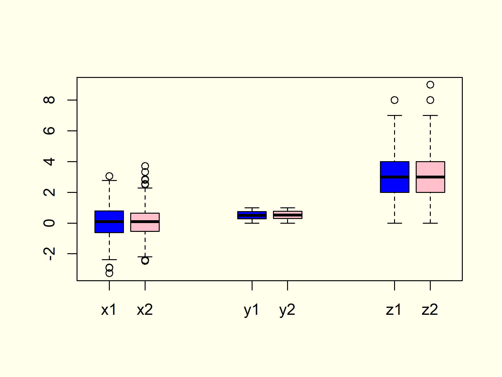
Figure 8: Change Spacing/Positioning of Boxplots.
Example 9: Boxplot in ggplot2 Package
So far, we have created all the graphs and images with the boxplot function of Base R. However, there are also many packages that provide pretty designs and additional modification possibilities for boxplots.
In the example, I’ll show you how to create a boxplot with the ggplot2 package. Let’s install and load the package to RStudio:
install.packages("ggplot2")                                  # Install and load ggplot2
library("ggplot2")
Now, we can use the ggplot and geom_boxplot functions of the ggplot2 package to create a boxplot:
ggplot(data2, aes(x = group, y = values, fill = group)) +    # Create boxplot chart in ggplot2
  geom_boxplot()
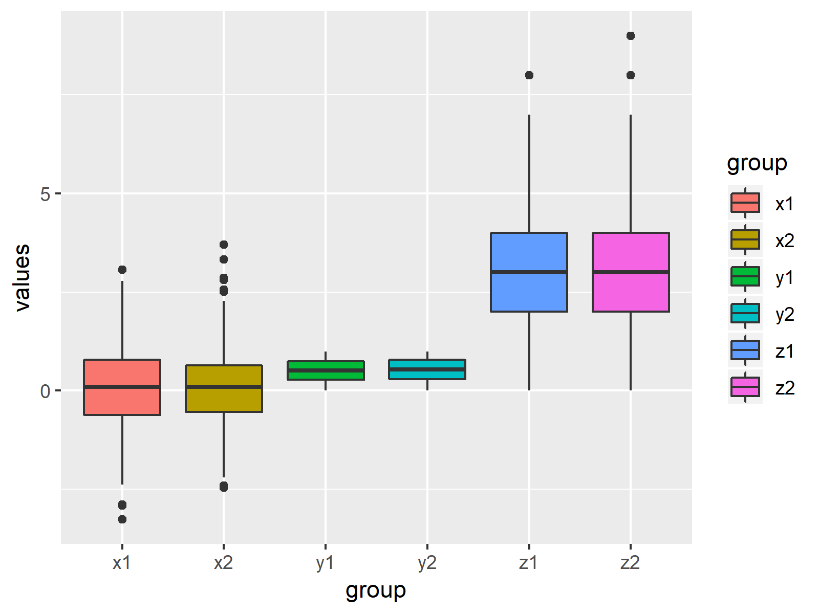
Figure 9: Boxplots Created by ggplot2 Package.
There are many other packages providing different designs and styles. However, the ggplot2 package is the most popular package among them.
Video & Further Resources
Do you need further information on the R programming code of this article? Then you might want to watch the following video of my YouTube channel. In the video, I’m explaining the R syntax of this article:
Furthermore, you might have a look at the other tutorials of this website. I have released numerous tutorials already:
Summary: You learned in this tutorial how to make a boxplot in RStudio. Don’t hesitate to let me know in the comments below, in case you have additional questions.
Subscribe to the Statistics Globe Newsletter
Get regular updates on the latest tutorials, offers & news at Statistics Globe.
I hate spam & you may opt out anytime: Privacy Policy.
Thank you!
Welcome to the Statistics Globe newsletter. From now on, I’ll send you regular emails about statistics, data science, AI, and programming with R and Python.
I’m Joachim Schork. On this website, I provide statistics tutorials as well as code in Python and R programming.
Statistics Globe Newsletter
Get regular updates on the latest tutorials, offers & news at Statistics Globe. I hate spam & you may opt out anytime: Privacy Policy.
Thank you!
Please check your email inbox and click the confirmation link to complete your subscription. If you don’t see the email within a few minutes, please also check your spam/junk folder.



2 Comments. Leave new
In R programming, How can in a polygon dashed lines can be inserted along with color.
For example if we consider a bar graph, how to fill dashed lines in the bar graph along with color?
Please let me know
Hey Sreedhar,
Is the ggpattern package providing what you are looking for? Have a look here.
Regards,
Joachim