Add Different Line to Each Facet of ggplot2 Plot in R (Example)
In this tutorial, I’ll illustrate how to annotate different lines to a ggplot2 facet grid in R programming.
The article contains the following topics:
Let’s take a look at some R codes in action!
Example Data, Add-On Packages & Basic Graphic
We’ll use the following data as basement for this R programming language tutorial:
data <- data.frame(x = 6:1,                           # Create example data frame
                   y = 1:6,
                   group = letters[1:3])
data                                                  # Print example data frame

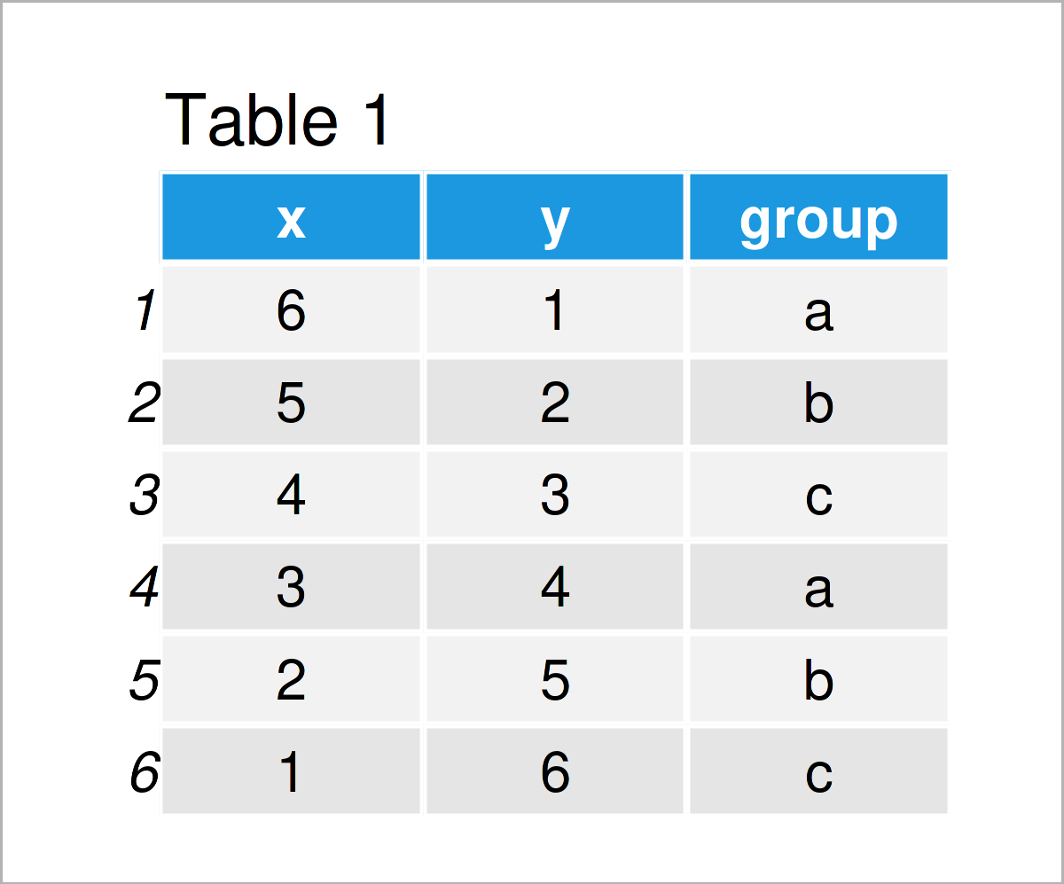
Table 1 shows the structure of the example data: It has six rows and three variables. The variables x and y are integers and the variable group is a character.
If we want to draw the data in a facet grid using the ggplot2 package, we also have to install and load ggplot2 to RStudio:
install.packages("ggplot2")                           # Install & load ggplot2 package
library("ggplot2")
Next, we can draw our data:
ggp <- ggplot(data, aes(x, y)) +                      # Create ggplot2 facet plot
  geom_point() +
  facet_grid(~ group)
ggp                                                   # Draw ggplot2 facet plot

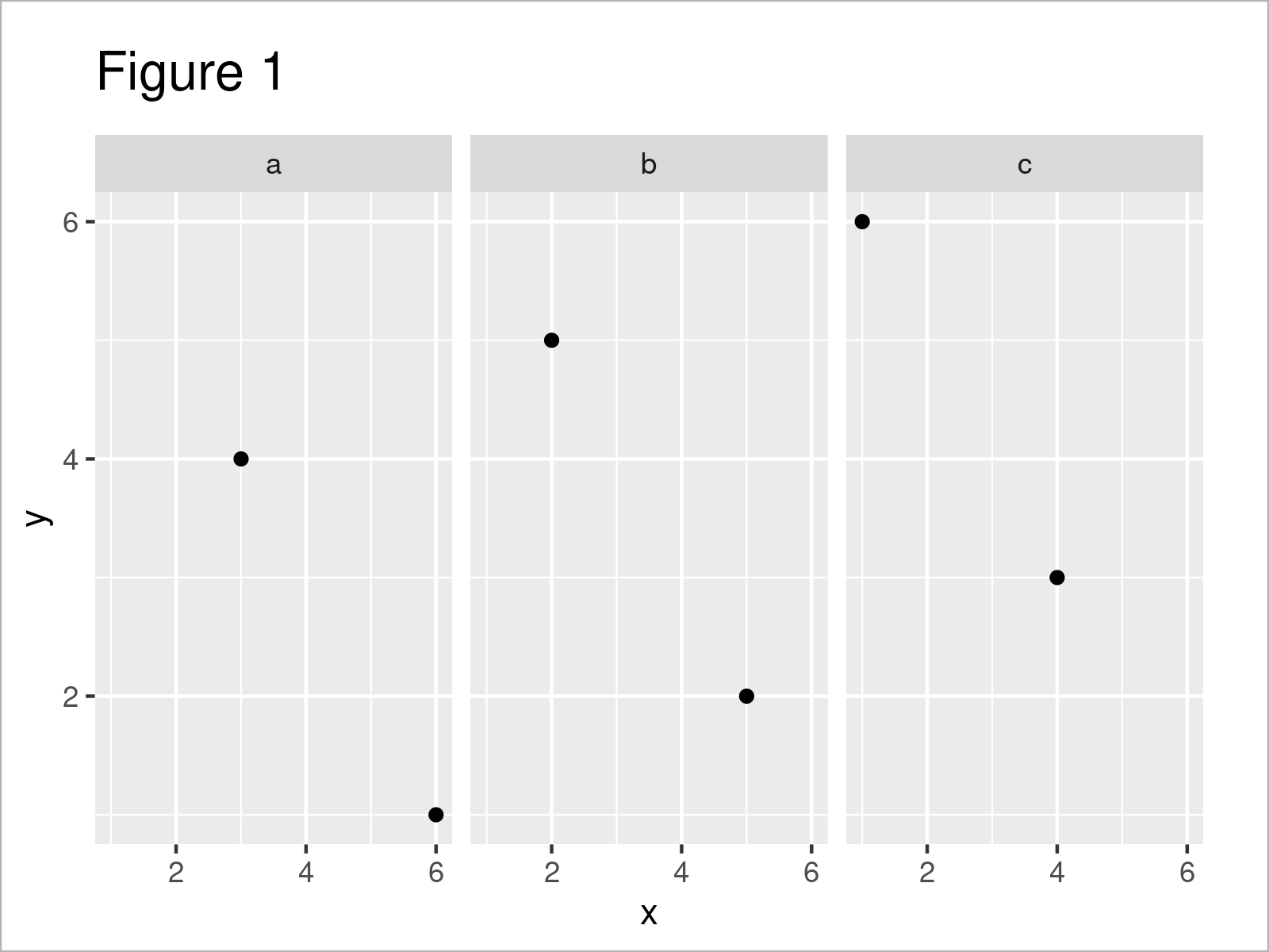
In Figure 1 you can see that we have created a facet grid using the previously shown syntax. Currently, our plot does not contain any vertical or horizontal lines.
Example: Add Different Lines to ggplot2 Facet Grid Using geom_hline() Function
The following syntax demonstrates how to draw different lines to different facets of a ggplot2 facet plot.
For this task, we first have to create a data frame containing the parameters that we want to use for our lines:
data_hline <- data.frame(group = unique(data$group),  # Create data for lines
                         hline = c(3, NA, 5))
data_hline                                            # Print data for lines

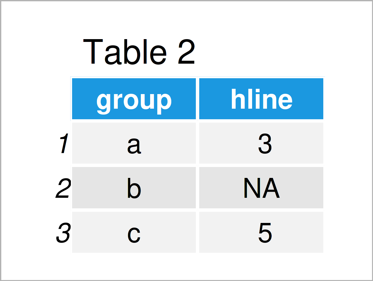
Table 2 shows the output of the previous R programming code: A data set containing the facet groups in our input data as well as the intercepts that we want to use to draw several horizontal lines. Note that we could specify additional parameters such as colors, line types, or the thickness of the lines in this data frame.
Next, we can use the ggpot2 plot object that we have created before as well as the geom_hline function to add our lines:
ggp +                                                 # Add different lines to facet plot
  geom_hline(data = data_hline,
             aes(yintercept = hline))

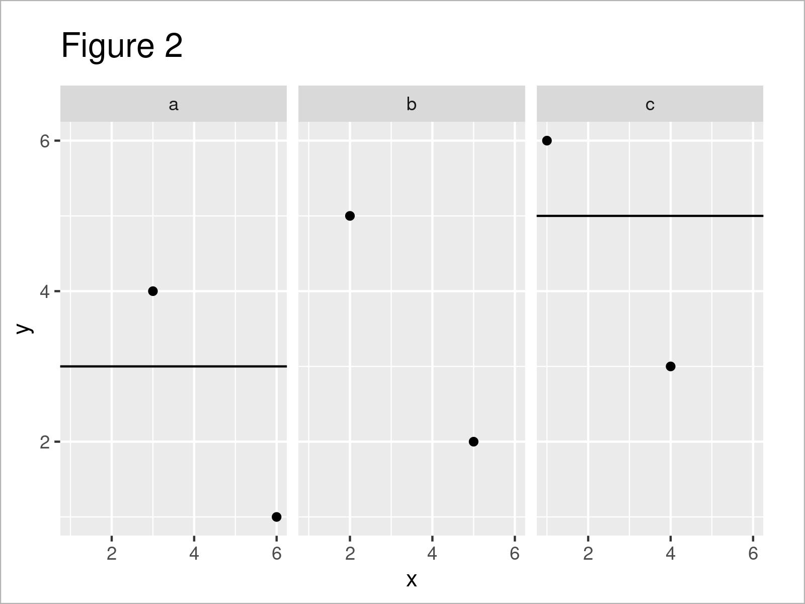
The output of the previous code is visualized in Figure 2: We have added a horizontal line to the first facet as well as to the third facet of our graphic. Note that both lines are shown at different y-axis locations.
Video, Further Resources & Summary
In case you need further explanations on the R programming syntax of this article, you may want to watch the following video on my YouTube channel. In the video, I’m explaining the R codes of this article in RStudio:
Furthermore, you might want to have a look at the other R tutorials on this homepage. I have published numerous posts on similar topics such as plot legends, labels, and lines.
- Add Line Segment & Curve to ggplot2 Plot
- Remove Labels from ggplot2 Facet Plot
- Control Line Color & Type in ggplot2 Plot Legend
- Add Regression Line to ggplot2 Plot
- Draw ggplot2 Plot with Two Y-Axes in R
- R Graphics Gallery
- R Programming Language
To summarize: This tutorial has demonstrated how to add different lines to a ggplot2 facet grid in the R programming language. Note that we have used the facet_grid function in this tutorial. However, we could use the same syntax for a grid created by the facet_wrap function as well. Kindly let me know in the comments, in case you have any further questions.
Subscribe to the Statistics Globe Newsletter
Get regular updates on the latest tutorials, offers & news at Statistics Globe.
I hate spam & you may opt out anytime: Privacy Policy.
Thank you!
Welcome to the Statistics Globe newsletter. From now on, I’ll send you regular emails about statistics, data science, AI, and programming with R and Python.
I’m Joachim Schork. On this website, I provide statistics tutorials as well as code in Python and R programming.
Statistics Globe Newsletter
Get regular updates on the latest tutorials, offers & news at Statistics Globe. I hate spam & you may opt out anytime: Privacy Policy.
Thank you!
Please check your email inbox and click the confirmation link to complete your subscription. If you don’t see the email within a few minutes, please also check your spam/junk folder.


