Add Fitted Line within Certain Range to Plot in R (2 Examples)
In this article, I’ll illustrate how to draw a regression line within certain axis limits in the R programming language.
The page consists of two examples for the drawing of a regression line within certain axis limits to a plot. More precisely, the page is structured as follows:
Let’s dive right into the examples.
Creation of Example Data
Have a look at the following example data:
set.seed(253867)                        # Create example data
x <- rnorm(100)
y <- rnorm(100) + x
data <- data.frame(x, y)
head(data)                              # Print head of example data
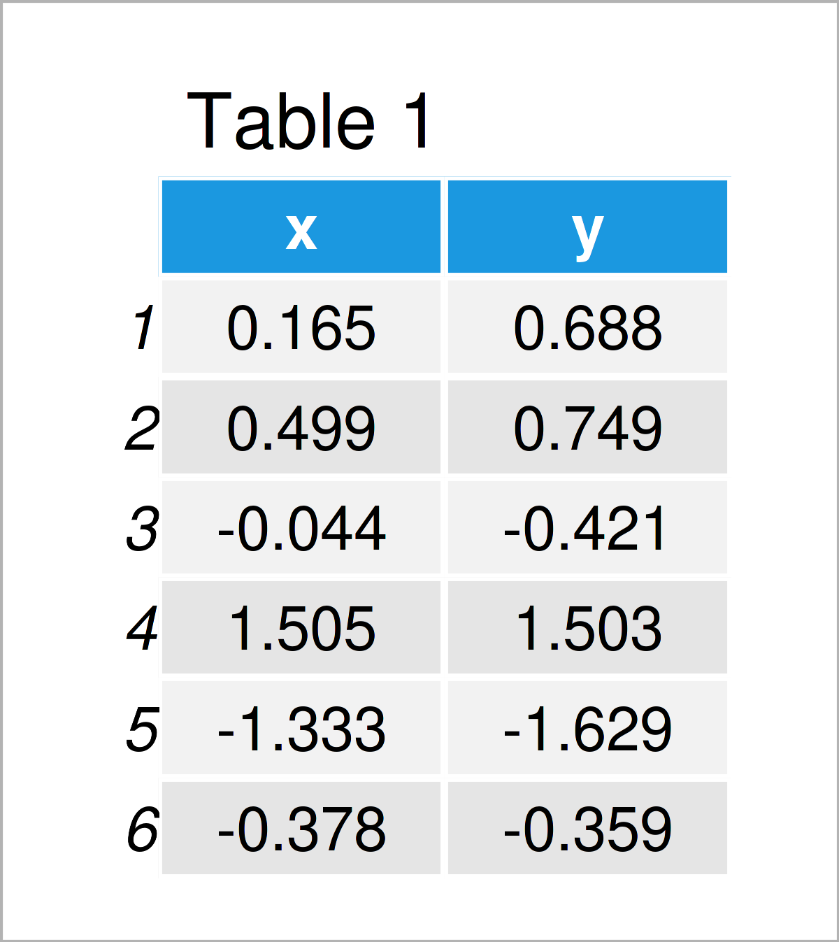
Table 1 shows the first six lines of our example data – as you can see, our data is constructed of the two numerical columns “x” and “y”.
Example 1: Add Regression Line Between Certain Limits in Base R Plot
In this example, I’ll show how to draw a fitted line within a certain range of a Base R graph.
Let’s start by drawing a fitted regression line without any limits:
plot(x = data$x,                        # Draw Base R plot without limits for fitted line
     y = data$y)
abline(lm(y ~ x, data),
       col = "red",
       lwd = 3)
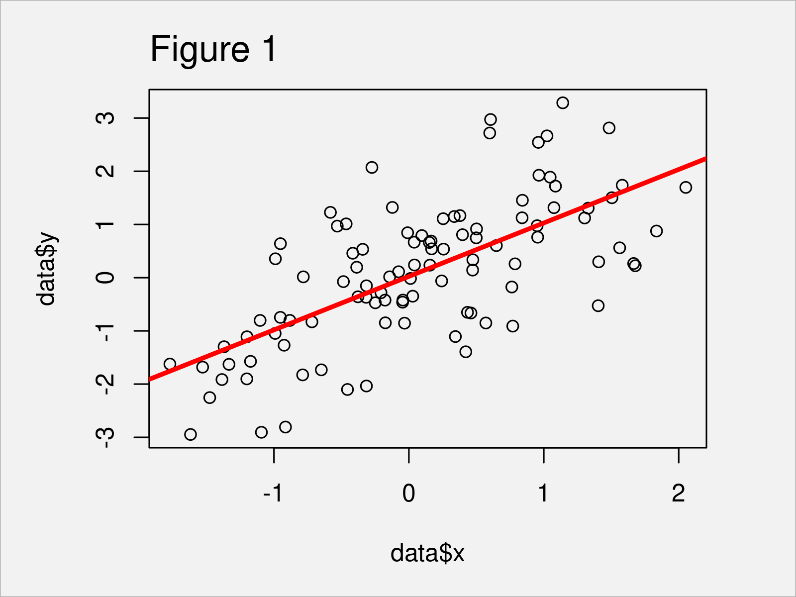
In Figure 1 it is shown that we have created a scatterplot with fitted line by executing the previous syntax. Note that we have used the col and lwd arguments to draw our line in red and a bit thicker. This step is optional.
If we now want to draw this line to a segment of our plot, we can use the clip function between the drawing of the plot and the addition of the abline:
plot(x = data$x,                        # Draw Base R plot with limits for fitted line
     y = data$y)
clip(x1 = 0,
     x2 = 1.7,
     y1 = - 1000,
     y2 = 1000)
abline(lm(y ~ x, data),
       col = "red",
       lwd = 3)
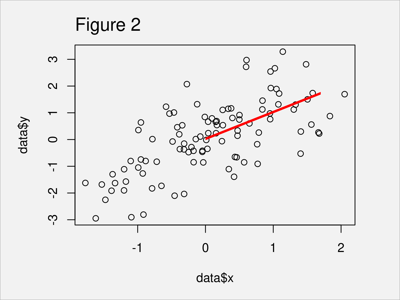
As shown in Figure 2, we have created a regression line for just as specific region of the graphic with the previous R code.
Example 2: Add Regression Line Between Certain Limits in ggplot2 Plot
Example 2 explains how to draw a regression line to a particular area of a plot using the ggplot2 package.
In case we want to use the commands and functions of the ggplot2 package, we first need to install and load ggplot2:
install.packages("ggplot2")             # Install ggplot2 package
library("ggplot2")                      # Load ggplot2
In the next step, we can draw a ggplot2 scatterplot with a fitted line without any limitations:
ggp <- ggplot(data, aes(x, y)) +        # Draw ggplot2 plot without limits for fitted line
  geom_point() +
  stat_smooth(method = "lm",
              se = FALSE,
              col = "red",
              size = 3)
ggp
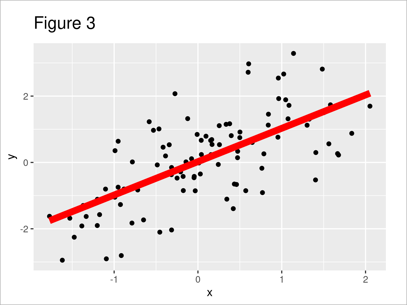
By executing the previous R code we have plotted Figure 3, i.e. a ggplot2 scatterplot with regression line.
Note that we have used the se argument to remove the confidence interval limits around our regression line, as well as the col and size arguments to visualize our regression line in red and with a thicker shape.
Furthermore, please note that the previous syntax has created a ggplot2 plot object called ggp. We can use this plot object and the ggplot_build function to extract some relevant information from our plot:
ggp_info <- ggplot_build(ggp)$data[[2]][ , 1:2]   # Extract coordinates of fitted line
head(ggp_info)
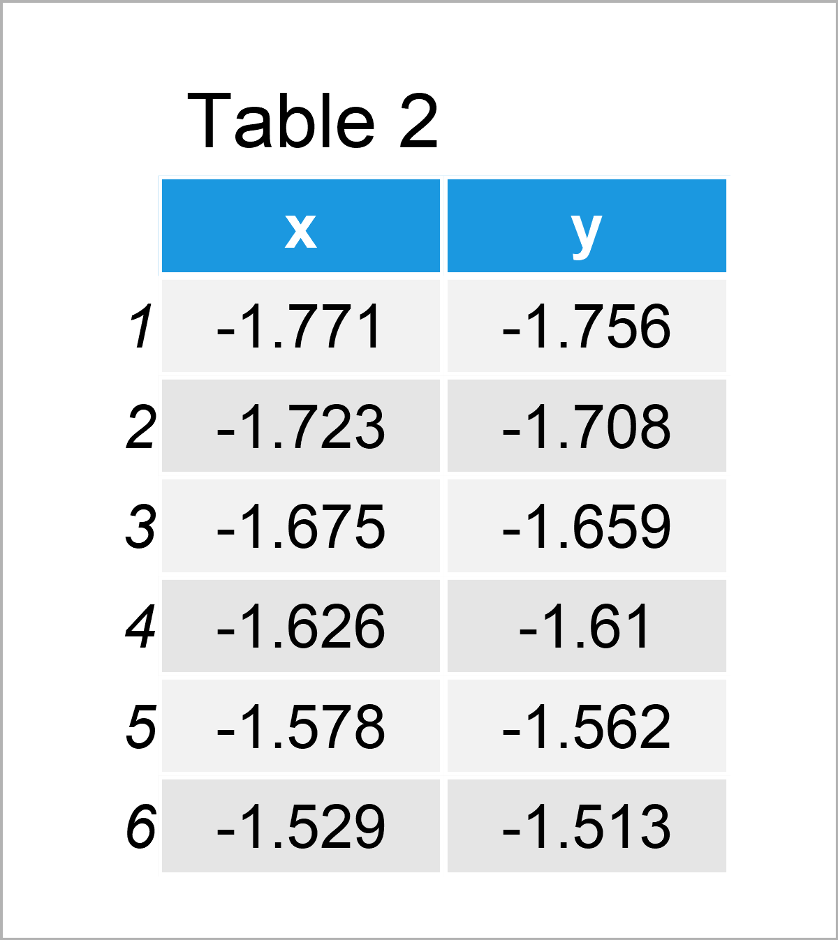
Table 2 shows the head of the data frame that was created by the ggplot_build function. The variable x contains the coordinates of the regression line on the x-axis, and the variable y contains the coordinates of the regression line on the y-axis.
We can now create a data frame subset of these data within a certain range on the x-axis:
ggp_info_range <- ggp_info[ggp_info[ , 1] >= 0 &  # Subset coordinates data of fitted line
                             ggp_info[ , 1] <= 1.7, ]
head(ggp_info_range)
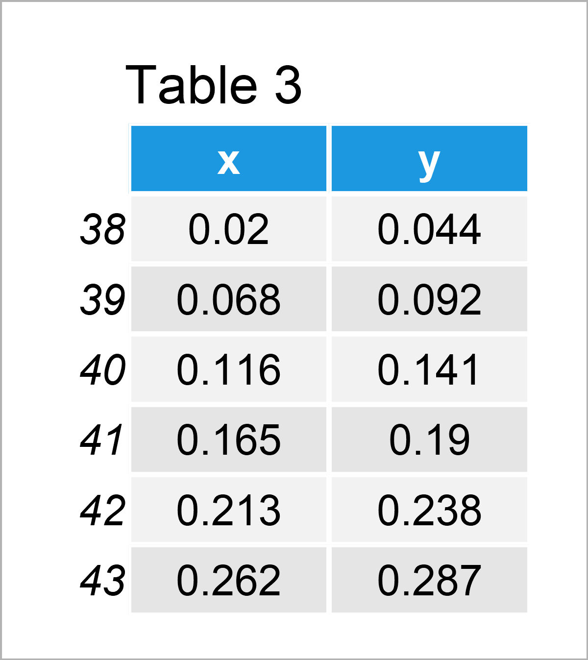
Table 3 shows the subset of the coordinate values.
Next, we can use this data frame subset to add a regression line to a specific range of our plot:
ggplot(data, aes(x, y)) +               # Draw ggplot2 plot with limits for fitted line
  geom_point() +
  geom_line(data = ggp_info_range, aes(x, y),
            col = "red",
            size = 3)
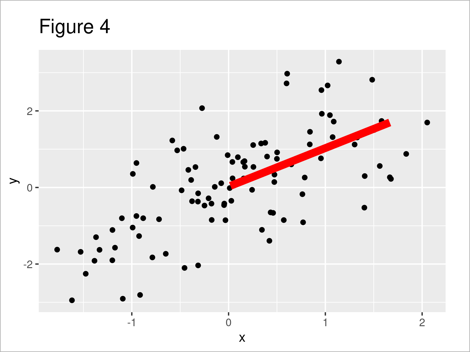
As shown in Figure 4, we have created a ggplot2 scatterplot with a regression line between a certain range.
Video, Further Resources & Summary
Would you like to know more about the drawing of a regression line within certain axis limits to a plot? Then I recommend watching the following video that I have published on my YouTube channel. In the video, I explain the R codes of this tutorial:
In addition, you might want to have a look at some of the other articles on my website:
- Extract stat_smooth Regression Line Fit from ggplot2 Plot
- Add Labels at Ends of Lines in ggplot2 Line Plot
- Add Vertical & Horizontal Line to gglot2 Plot
- Add Regression Line to ggplot2 Plot in R
- Add Label to Straight Line in ggplot2 Plot in R
- Graphics Overview in R
- R Programming Language
In summary: This page has explained how to add a regression line within certain axis limits to a plot in R. If you have any further questions, don’t hesitate to let me know in the comments section below.


4 Comments. Leave new
Hello,
super tutorial.
I have tried to adopt this to determine the regression for different sections within a data set and then display them. These are date values and water levels (dependent variable). I thought I could solve it with the following code, but I can’t get a plot with dates.
Is there another or better solution to be able to plot regressions within different sections of a data set? I would like to see the trend reversal.
`38350022.xlsx`$Zeitpunkt <- as.Date(`38350022.xlsx`$Zeitpunkt, '%d.%m.%Y')
data <- `38350022.xlsx`
data_bis2020 <- subset(data, Zeitpunkt <= "2020-12-31")
data_bis2010 <- subset(data, Zeitpunkt <= "2010-12-31")
data_19912010 = “1991-01-01”)
data_20012020 = “2001-01-01”)
ggp19912010 %
ggplot(aes (x = as.Date(Zeitpunkt), y = (Wasserstand*-1), na.rm = TRUE))+
geom_point()+
stat_smooth(method = “lm”,
se = TRUE,
col = “red”,
size = 1)
ggp20012010 %
ggplot(aes (x = as.Date(Zeitpunkt), y = (Wasserstand*-1), na.rm = TRUE))+
geom_point()+
stat_smooth(method = “lm”,
se = TRUE,
col = “red”,
size = 1)
ggp_info19912010 <- ggplot_build(ggp19912010)$data[[2]][,1:2]
ggp_info20012020 <- ggplot_build(ggp20012010)$data[[2]][,1:2]
ggplot(data, aes(x = as.numeric(Zeitpunkt), y = (Wasserstand*-1), na.rm = TRUE))+
geom_point()+
geom_line(data = ggp_info19912010, aes(x,y), col = "red", size =1)+
geom_line(data = ggp_info20012020, aes(x,y), col = "red", size =1)
Hey Martin,
Thanks a lot for the kind words, glad you like the tutorial!
Could you illustrate the structure of your data in some more detail? What is returned when you execute the following code:
Regards,
Joachim
Hello Joachim,
thank you for the answer.
I think I found my error (see code).
Is there an easier way to determine and display multiple lines for different intervals?
————————
Hallo Joachim,
danke für die Antwort.
Ich glaube ich habe meinen Fehler gefunden (siehe code).
Gibt es einen einfacheren Weg, mehrere Linien für verschiedene Intervalle zu ermitteln und darzustellen?
——————-
ggplot(data, aes(x = as.Date(Zeitpunkt), y = (Wasserstand*-1), na.rm = TRUE))+
geom_point()+
geom_line(data = ggp_info19912010, aes(as.Date(x, origin = “1970-01-01”),y), col = “red”, size =1)+
geom_line(data = ggp_info20012020, aes(as.Date(x, origin = “1970-01-01”),y), col = “red”, size =1)
Freut mich, dass du den Fehler gefunden hast! 🙂
Du könntest alle deine Daten in einem Datensatz zusammenführen und dann eine neue Spalte bilden, die die Daten zu den jeweiligen Linien zuordnet.
In diesem Tutorial findest du hierzu weitere Informationen.
Viele Grüße
Joachim