Create a Histogram in Base R (8 Examples) | hist Function Tutorial
In this R tutorial you’ll learn how to draw histograms with Base R.
The article will consist of eight examples for the creation of histograms in R. To be more precise, the content looks as follows:
- Example Data
- Example 1: Default Histogram in Base R
- Example 2: Histogram with Manual Main Title
- Example 3: Histogram with Colors
- Example 4: Histogram with Manual Number of Breaks
- Example 5: Histogram with Non-Uniform Width
- Example 6: Histogram with Manual Axis Limits
- Example 7: Histogram with Overlaid Density Line
- Example 8: Histogram with Values on Top of Bars
- Video, Further Resources & Summary
Let’s dive right into the examples…
Example Data
In the examples of this R tutorial, we’ll use the rivers data set. The rivers data set contains the length in miles of 141 major rivers in North America.
The data set is already available in Base R and is stored in the numeric vector “rivers”:
rivers                                                      # Inspect example data
# 735  320  325  392  524  450 1459  135  465...
In the following examples, we’ll create different types of histograms of the rivers data. Let’s move on to the examples!
Example 1: Default Histogram in Base R
The Base installation of R provides the hist function. We can make a histogram with default specifications of the hist function as follows:
hist(rivers) # Default histogram
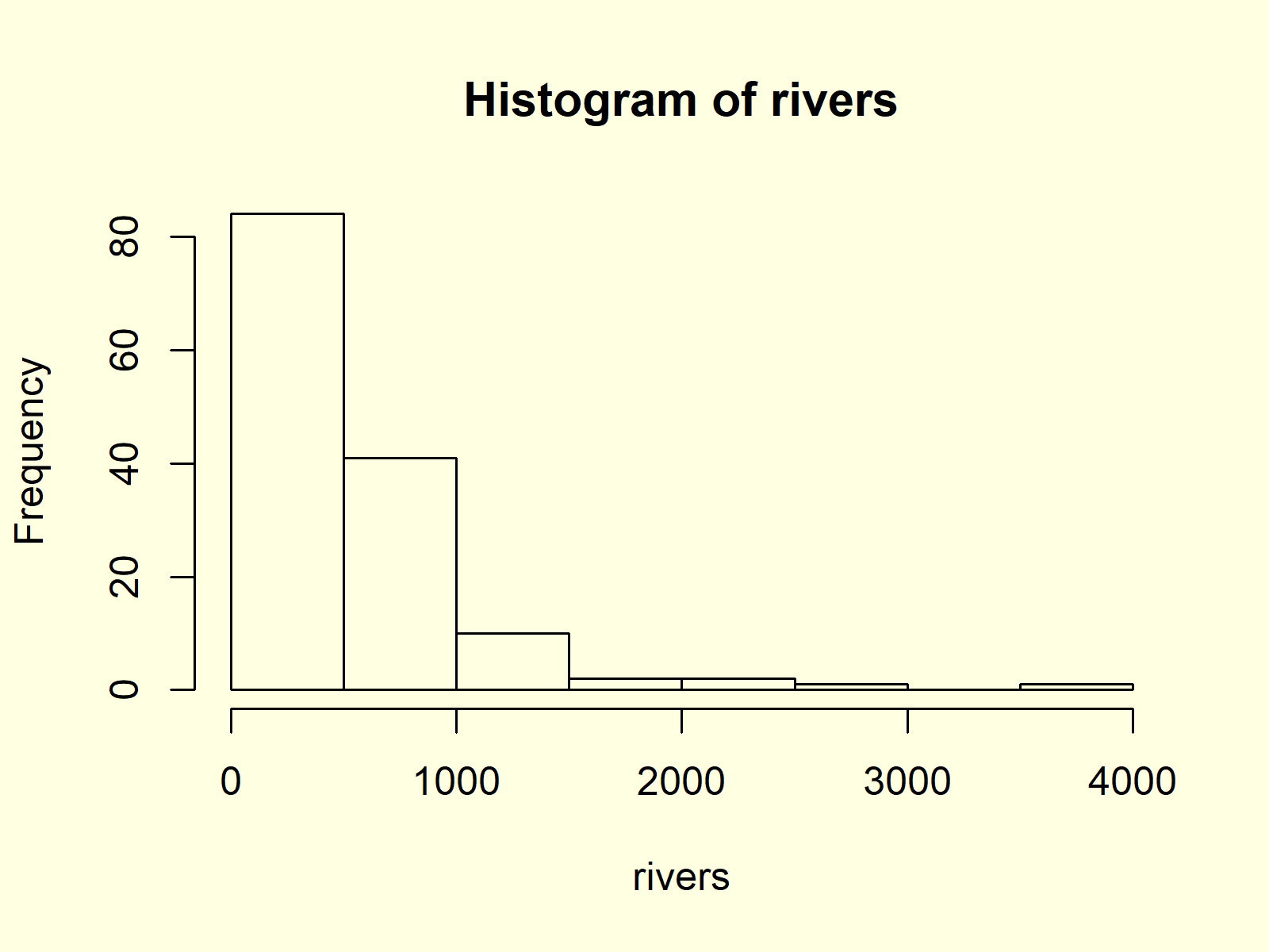
Figure 1: Histogram with Default Specifications.
Figure 1 shows the output of the hist function: A histogram with relatively wide bars, without colors, and with automatic main titles and axis labels.
In the following you’ll learn how to modify the different components of this histogram.
Example 2: Histogram with Manual Main Title
We can change the main title of our histogram by specifying the main argument of the hist function:
hist(rivers,                                                # Change main title of histogram
     main = "Length of Rivers in North America")
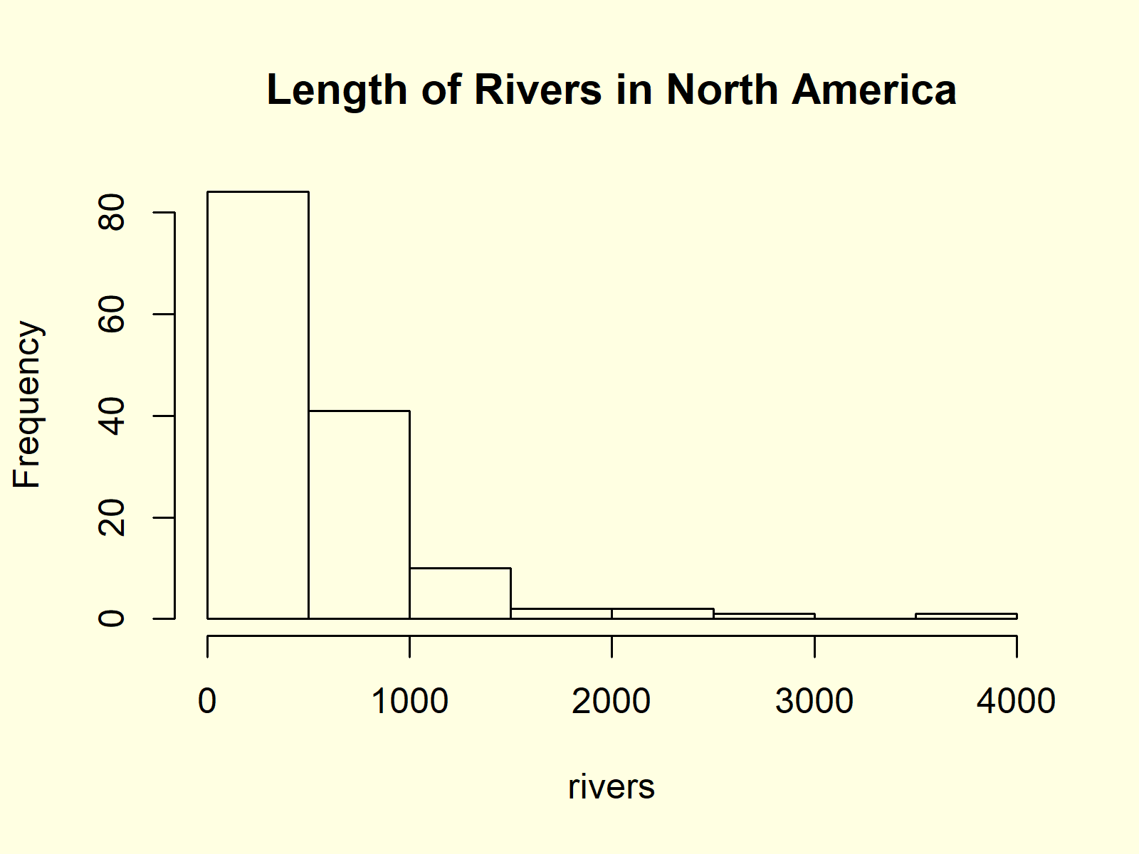
Figure 2: Histogram with User-Defined Main Title.
As you can see in Figure 2, the main title was changed to “Length of Rivers in North America”.
Example 3: Histogram with Colors
If we want to color the bars of our histogram, we can use the col argument:
hist(rivers,                                                # Change color of histogram
     col = "#1b98e0")

Figure 3: Histogram with User-Defined Color.
In this example, we specified the colors of the bars to be blue. However, you can specify any color you want within the quotation marks.
You can either specify a hex color code, as we did in the previous example, or you could assign a predefined color name.
Example 4: Histogram with Manual Number of Breaks
You might have noticed that the bars of our histogram are relatively wide. We can change the width of our histogram bars with the break argument:
hist(rivers,                                                # Change number of histogram breaks
     breaks = 50)
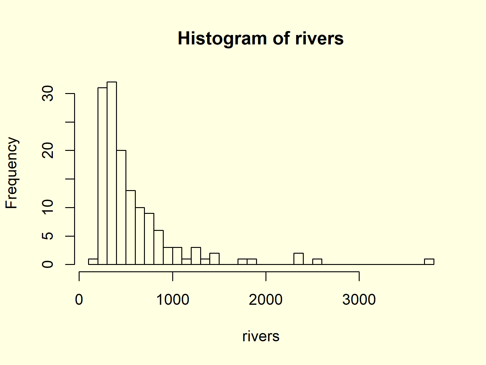
Figure 4: Histogram with More Breaks.
The higher the number of breaks, the smaller are the bars.
Example 5: Histogram with Non-Uniform Width
In Example 4, you learned how to change the number of bars within a histogram by specifying the break argument. However, we can also use the break argument to draw a histogram showing bars with a different width. Consider the following R code:
hist(rivers,                                                # Specify fixed breaks with different width
     breaks = c(0, 250, 300, 400, 500, 750, 1000, 2500, 5000))
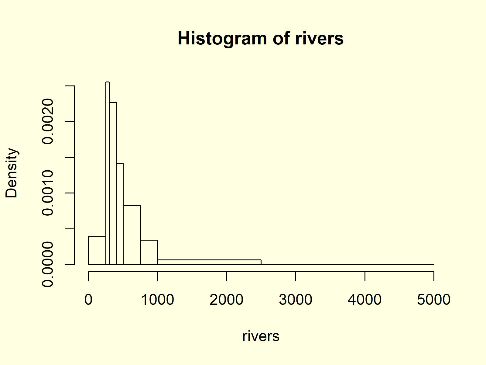
Figure 5: Histogram with Non-Unified Breaks.
As you can see based on Figure 5, each bar of our histogram has a different width.
Example 6: Histogram with Manual Axis Limits
It is also possible to modify the width and height of the Y- and X-axes of our histogram by specifying the xlim and ylim options.
hist(rivers,                                                # Change axis limits of histogram
     xlim = c(0, 5000),
     ylim = c(0, 120))
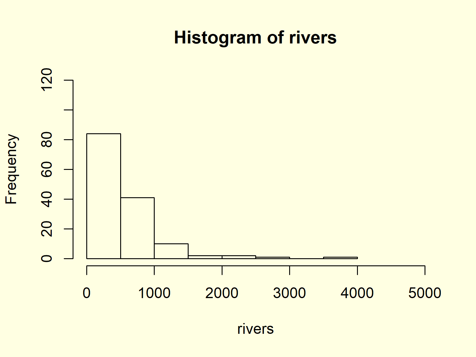
Figure 6: Histogram with User-Defined Axis Limits of Y- & X-Axes.
In the previous R syntax, we specified the x-axis limits to be 0 and 5000 and the y-axis limits to be 0 and 120.
Example 7: Histogram with Overlaid Density Line
Density Plots are a smoother representation of numeric data than histograms. Sometimes it makes sense to plot the density and the histogram of numeric data in the same plot window.
First, we have to create a histogram by specifying the prob argument to be equal to TRUE. Furthermore, it often makes sense to increase the upper y-axis limit, since the density plot may be cut off otherwise.
hist(rivers,                                                # Draw histogram with probability
     ylim = c(0, 0.002),
     prob = TRUE)
After drawing this histogram, we can apply a combination of the lines() and density() functions to overlay our histogram with a density line:
lines(density(rivers), col = "red") # Overlay density on histogram
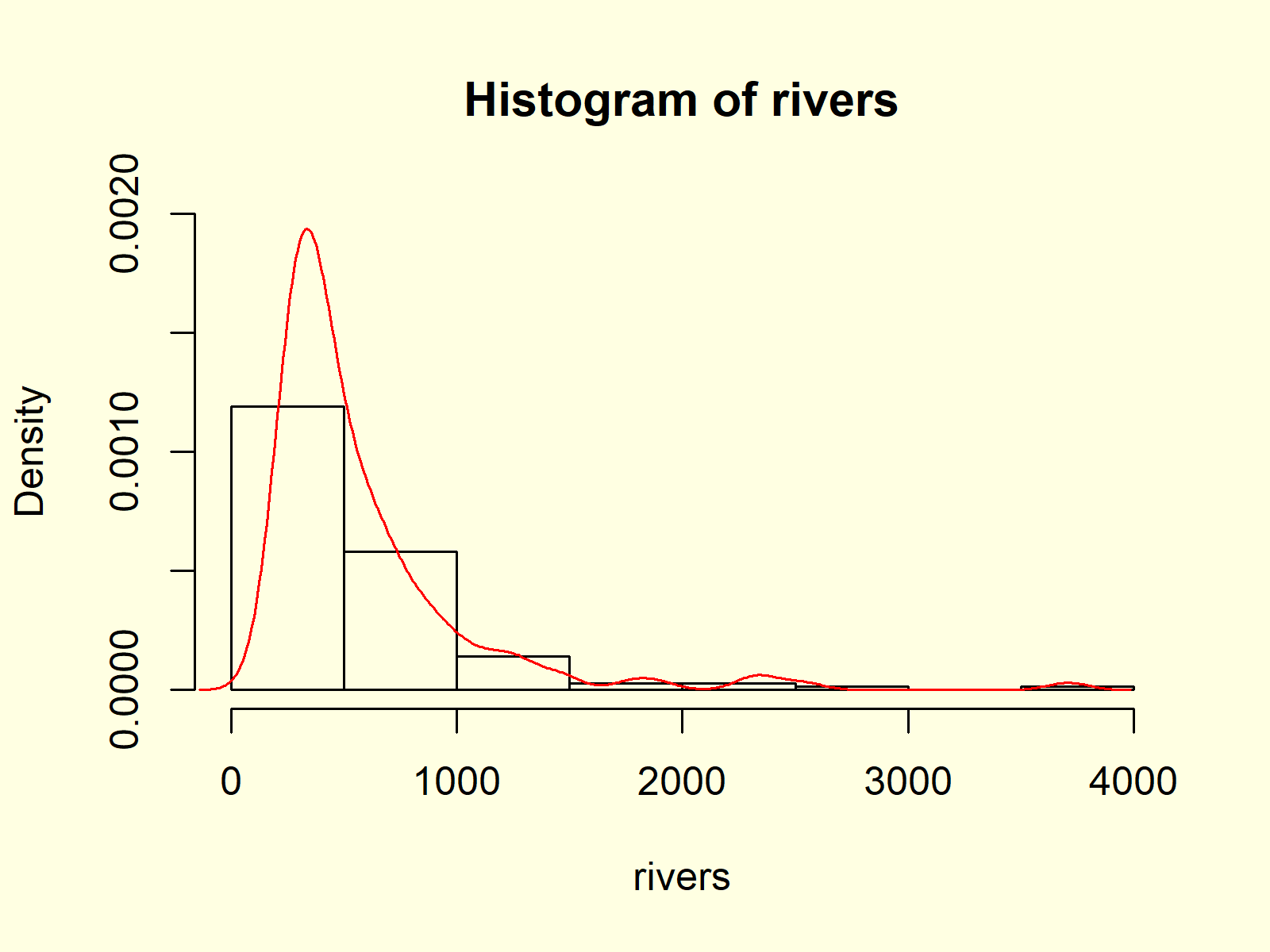
Figure 7: Histogram & Density in One Plot.
Figure 7 shows the output after running the whole R code of Example 7.
Example 8: Histogram with Values on Top of Bars
The hist command can also be used to extract the values of our histogram. Have a look at the following R syntax:
hist_values <- hist(rivers)                                 # Store values of histogram
hist_values                                                 # Print values to RStudio console
# $breaks
# [1]    0  500 1000 1500 2000 2500 3000 3500 4000
#
# $counts
# [1] 84 41 10  2  2  1  0  1
#
# $density
# [1] 1.191489e-03 5.815603e-04 1.418440e-04 2.836879e-05 2.836879e-05 1.418440e-05 0.000000e+00 1.418440e-05
#
# $mids
# [1]  250  750 1250 1750 2250 2750 3250 3750
#
# $xname
# [1] "rivers"
#
# $equidist
# [1] TRUE
#
# attr(,"class")
# [1] "histogram"
As you can see based on the RStudio console output, the hist function returns a lot of information on our histogram, i.e. breaks, counts, density, mids, xname, equidist, and attr. You may have a look at the help documentation of the hist function to learn more about these information.
However, we’ll use only the mids and the counts of our histogram in this example:
text(hist_values$mids,                                      # Add values of histogram on top of bars
     hist_values$counts,
     labels = hist_values$counts,
     adj = c(0.5, - 0.5))
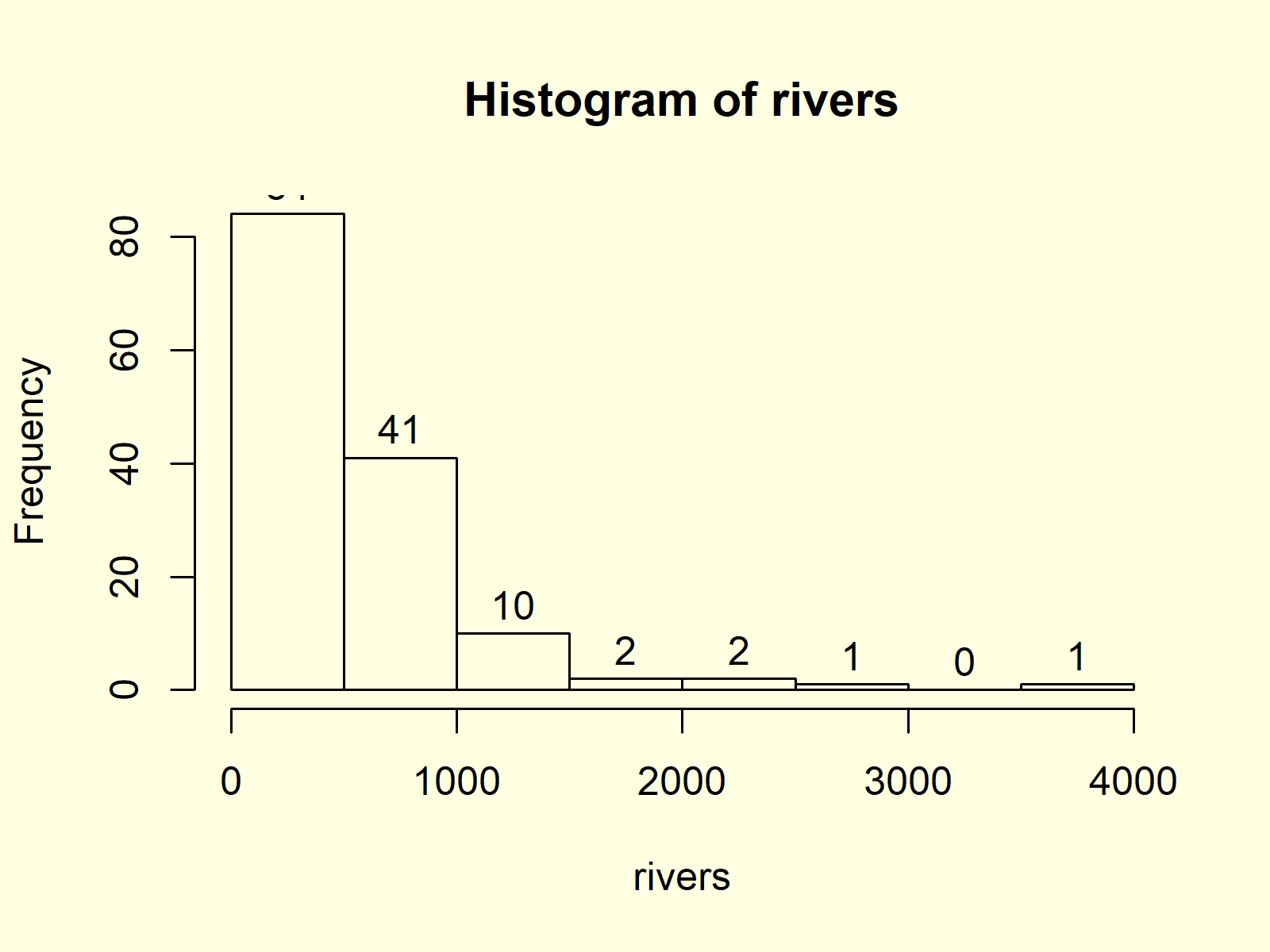
Figure 8: Histogram with Values of Bars on Top.
Figure 8 illustrates the resulting histogram. As you can see, we added the counts at the top of each bar.
Video, Further Resources & Summary
Have a look at the following video that I have published on my YouTube channel. In the video, I show the topics of this article:
Furthermore, you may have a look at the related articles of this website. Some tutorials are shown here.
- Create ggplot2 Histogram in R
- Draw Multiple Graphs & Lines in Same Plot
- R Graphics Gallery
- The R Programming Language
In this article you learned how to create histogram in the R programming language. Let me know in the comments, in case you have further questions and/or comments.
Subscribe to the Statistics Globe Newsletter
Get regular updates on the latest tutorials, offers & news at Statistics Globe.
I hate spam & you may opt out anytime: Privacy Policy.
Thank you!
Welcome to the Statistics Globe newsletter. From now on, I’ll send you regular emails about statistics, data science, AI, and programming with R and Python.
I’m Joachim Schork. On this website, I provide statistics tutorials as well as code in Python and R programming.
Statistics Globe Newsletter
Get regular updates on the latest tutorials, offers & news at Statistics Globe. I hate spam & you may opt out anytime: Privacy Policy.
Thank you!
Please check your email inbox and click the confirmation link to complete your subscription. If you don’t see the email within a few minutes, please also check your spam/junk folder.


2 Comments. Leave new
i am having a hard time finding this answer, your site and channel are very useful and so happy that i found it. i am trying to teach myself R, i am using code that an old co worker left behind. I made a histogram and i have labels = TRUE (which puts the counts above each bar which is what i want. is there a way to increase the font size? it is so much smaller than the fonts I have in the rest of the graph that they are hard to see. i tried to change the different cex but nothing happened with the count label.
hist(Iso6citsti, breaks = citsti6_1bins, ylim = c(0,20), labels=TRUE, col=”slategrey”,
axes = FALSE, xlab=”Size Class (mm)”, ylab=”Number of Individuals”, main=”6.1-m Isobath Catch”,
cex.lab=2.0, cex.axis=2.0, cex.main=2.0)
axis(1, at=c(0, 35, 45, 55, 65, 75, 85, 95, 105, 115, 125, 135, 145, 155),
labels = c(“30”, “40”, “50”, “60”, “70”, “80”, “90”, “100”, “110”, “120”, “130”, “140”, “150”, “160”),
pos=0, cex.axis=2.0)
axis(2, at=c(0, 5, 10, 15, 20), labels = c(“0”, “5”, “10”, “15”, “20”), las=1, cex.axis=2.0)
Hey Jen,
Thank you so much for the kind comment, glad you find my tutorials helpful!
Unfortunately, I don’t know a straightforward solution for this using Base R. Have you considered using ggplot2 for this task? You would have to re-create your barchart, which might require some initial work, but modifications like increasing the text would be much easier using ggplot2.
Take a look at this tutorial on how to create barcharts using ggplot2.
Regards,
Joachim