The jitter R Function | 3 Example Codes (Basic Application & Boxplot Visualization)
Basic R Syntax:
jitter(x)
The jitter R function adds noise to a numeric vector. Typically, this numeric vector is censored or rounded to even values (i.e. integer values). The basic syntax for jitter in R is shown above.
In the tutorial below, I’ll show you three examples for the usage of jitter in the R programming language.
Sound good? Great. Let’s get started…
Example 1: The jitter R Function – Basic Application
Let’s start with a very basic example of the jitter function in R. First, we have to create a numeric data vector, to which we want to apply the jitter function:
set.seed(8642)                            # Set seed for reproducibility
N <- 1000                                 # Sample size
x <- round(runif(N, 1, 5))                # Integer variable
Furthermore, I’m creating another numeric vector that we can use later on in the graphical visualization of the R jitter function:
y <- x + rnorm(N, mean = 0, sd = 2) # Correlated continuous variable
Let’s see how a correlation plot of these two numeric vectors looks like:
plot(x, y, xlim = c(0, 6)) # Correlation plot of X and Y
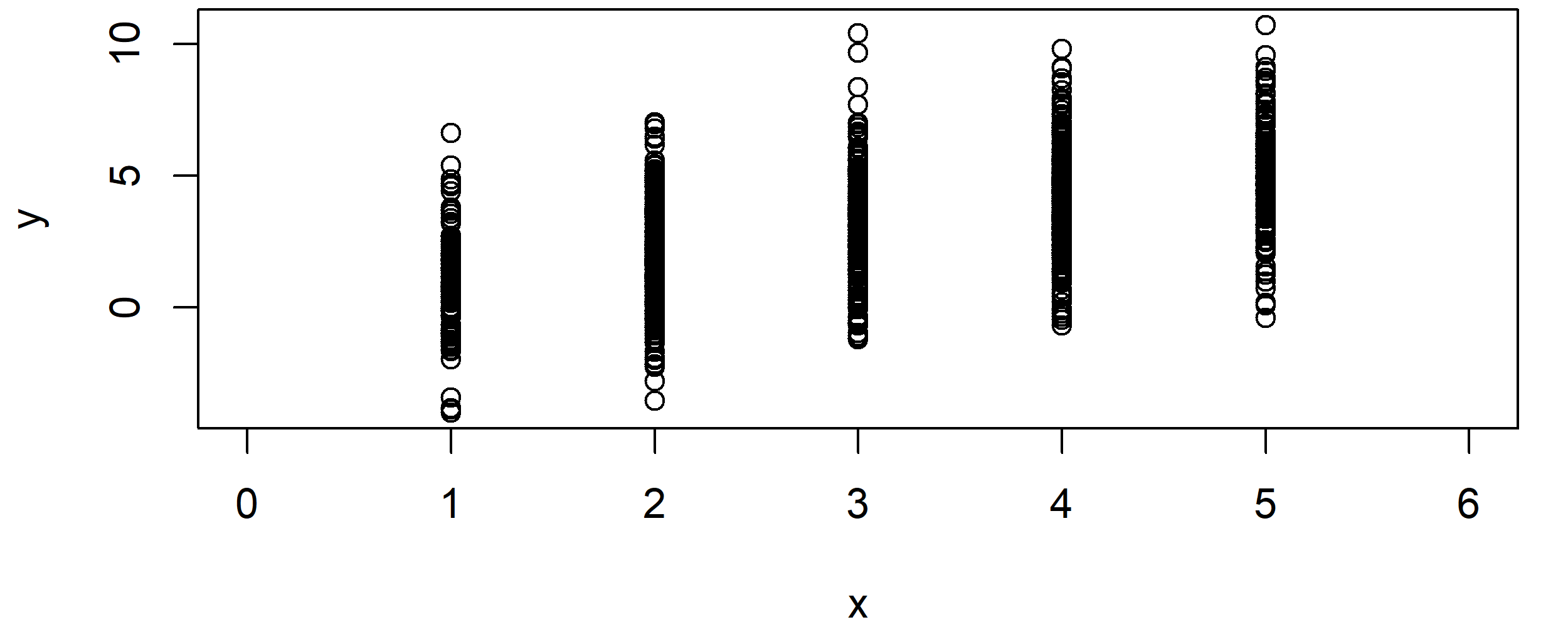
Graphic 1: Correlation Plot of X & Y without the Application of jitter().
As you can see, the correlation plot is restricted to certain values on the x-axis.
Situations like this typically occur in case of censored variables. For instance, you might have collected income groups instead of a continuous income value.
Let’s assume you want to add some random variation to your X variable (e.g. income groups). For this task, you can use the jitter function as follows:
x_jitter <- jitter(x) # Apply jitter R function
Let’s see how our correlation of X and Y looks like after the application of jitter in R:
plot(x_jitter, y, xlim = c(0, 6)) # Correlation plot after using jitter
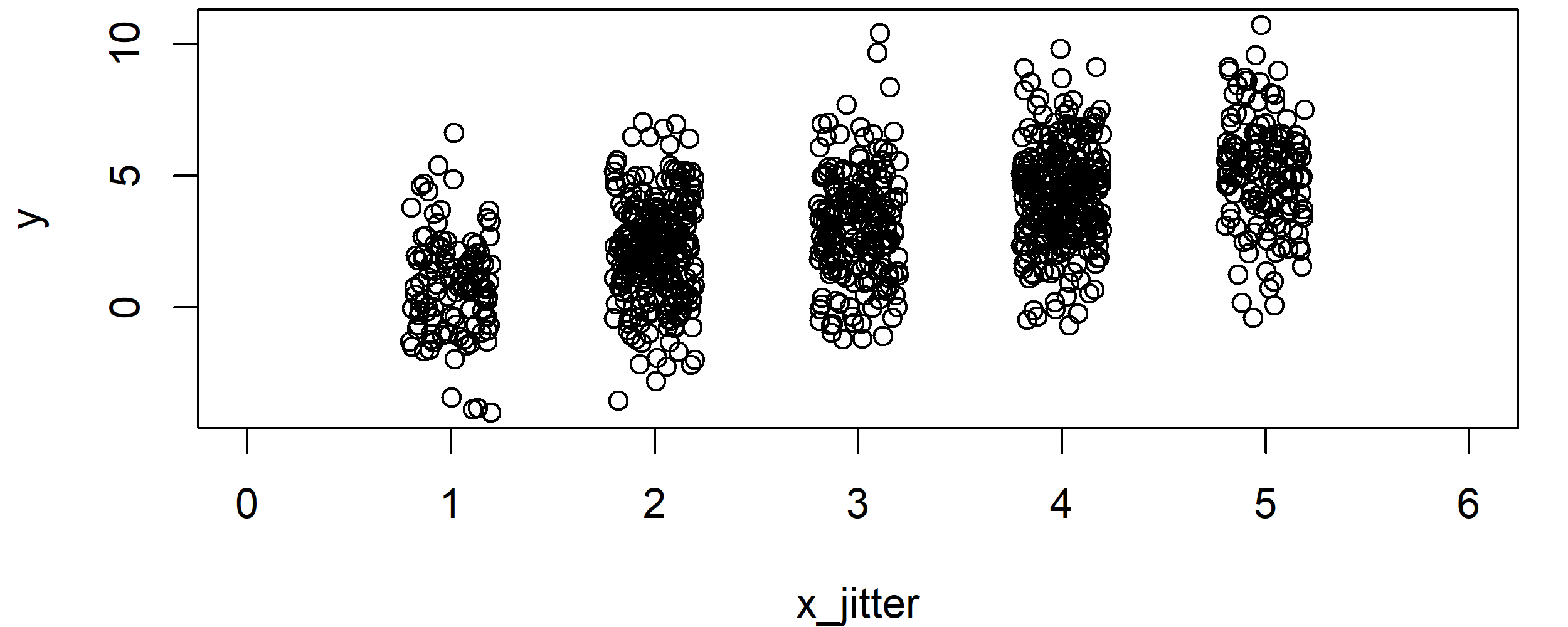
Graphic 2: Correlation Plot after Application of jitter().
Looks better, doesn’t it? But the groups are still relatively far away from each other…
In the following example, I’m therefore going to show you how you could add even more random noise to your variable.
But not so fast! In case you want to learn more on the R code of Example 1, you may also have a look at the following R programming video of my YouTube channel:
Example 2: R jitter Function with Large Factor
You can determine the size of added random noise with the factor specification. Let’s see how this works:
x_jitter_large <- jitter(x, factor = 3)   # Jitter with large factor
plot(x_jitter_large, y, xlim = c(0, 6))   # Correlation plot after using large factor
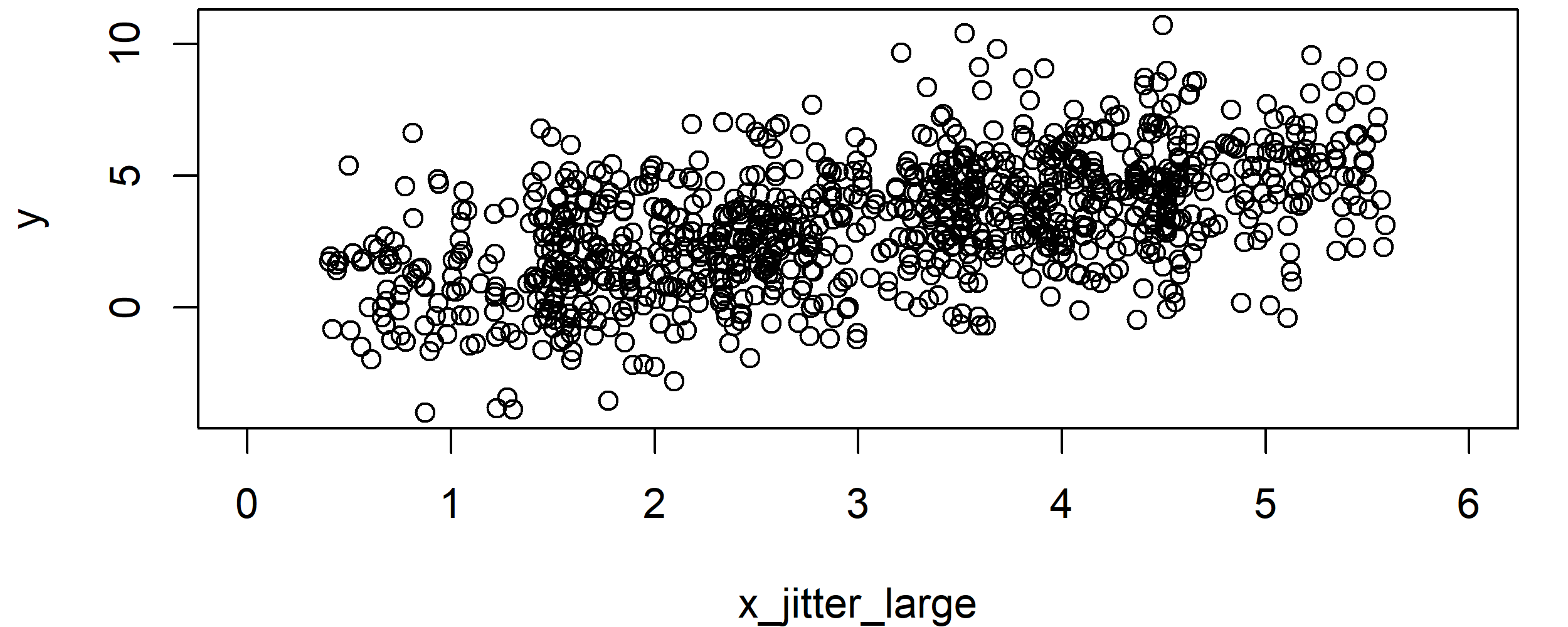
Graphic 3: Correlation Plot after Application of jitter() with Large Factor.
As you can see, at this point you cannot even distinguish the groups from each other anymore. The X variable looks like any other regular continuous variable.
Note: Even though this plot might look more reasonable, don’t forget that we were adding RANDOM noise to our variable. This might reduce the quality of our estimates and, hence, the jitter function has to be used with care. For that reason, it is good practice to report in publications, when the jitter function was used.
However, let’s move on to some nice graphical visualizations…
Example 3: R Boxplot + Jittered Variable
Jittered variables are often visualized in a combination of scatterplots and boxplots. In the following, I’ll show you how to do that:
boxplot(y ~ x,                            # Basic boxplot
        xlim = c(0, 6),
        xlab = "x_jitter", ylab = "y")
points(x_jitter, y)                       # Overlay jittered X variable
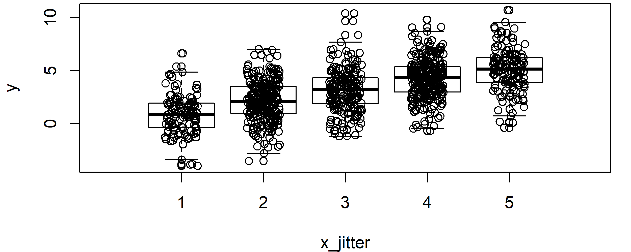
Graphic 4: Boxplot Overlaid by Jittered Variable.
With such a boxplot, you can easily see how a variable is distributed within each group. However, the plot doesn’t look nice yet, so let’s add some color and let’s modify its points…
par(mar = c(0, 0, 0, 0))                  # Remove space around plot
par(bg = "#353436")                       # Set background color

boxplot(y ~ x,                            # Sophisticated boxplot
        col = "yellow",
        border = "yellow",
        pch = 16)

points(x_jitter, y,                       # Sophisticated overlay of jittered X variable
       col = "#1b98e0",
       pch = 16,
       cex = 0.4)
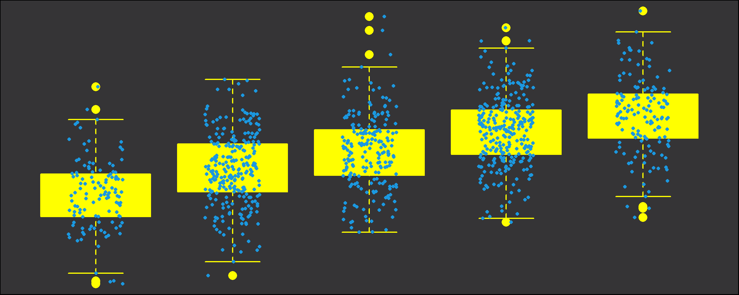
Graphic 5: Boxplot Overlaid by Jittered Variable with Nice Colors and Points.
Looks great, if you ask me 🙂
Jitter in GGPlot2 – Video Instructions
If you want to modify your jitter graphics manually, I can recommend the R package ggplot2. The package provides many different R commands that can be combined with jitter (e.g. geom_jitter or position_jitter). If you want to learn more about ggplot2 and jitter, you could have a look at the following YouTube tutorial of Packt Video. In the video, the speaker is explaining the important ggplot functions in more detail.
Further Reading


4 Comments. Leave new
Please sir I need your help on Geo-additive model using R package to model the nutritional status of children between 0-5 years old. I have the data can I send it to your email if can send your email address to me please.
Hi Vincent,
Unfortunately, I’m not an expert for this topic. I recommend asking your question at Stack Overflow, people there can probably help you better than me.
Regards
Joachim
Thank you sir ,it’s clear and has my problems soved efficiently.
Thanks a lot for the kind words, glad it helped!