R pairs & ggpairs Plot Functions | 5 Example Codes (Color, Labels, Panels & by Group)
Basic R Syntax:
pairs(data)
The pairs R function returns a plot matrix, consisting of scatterplots for each variable-combination of a data frame. The basic R syntax for the pairs command is shown above.
In the following tutorial, I’ll explain in five examples how to use the pairs function in R.
If you want to learn more about the pairs function, keep reading…
Example 1: Basic Application of pairs() in R
I’m going to start with a very basic application of the pairs R function. Let’s first create some random data for this example:
set.seed(525354)                       # Set seed for reproducibility
N <- 1000                              # Sample size of 1000

x1 <- rnorm(N)                         # Create variable
x2 <- x1 + rnorm(N, 0, 3)              # Create correlated variable
x3 <- 2 * x1 - x2 + rnorm(N, 0, 2)     # Create another correlated variable

data <- data.frame(x1, x2, x3)         # Combine all variables to data.frame
Our example data contains three numeric variables and 1,000 rows.
Now, let’s apply the pairs function in R:
pairs(data) # Apply pairs function
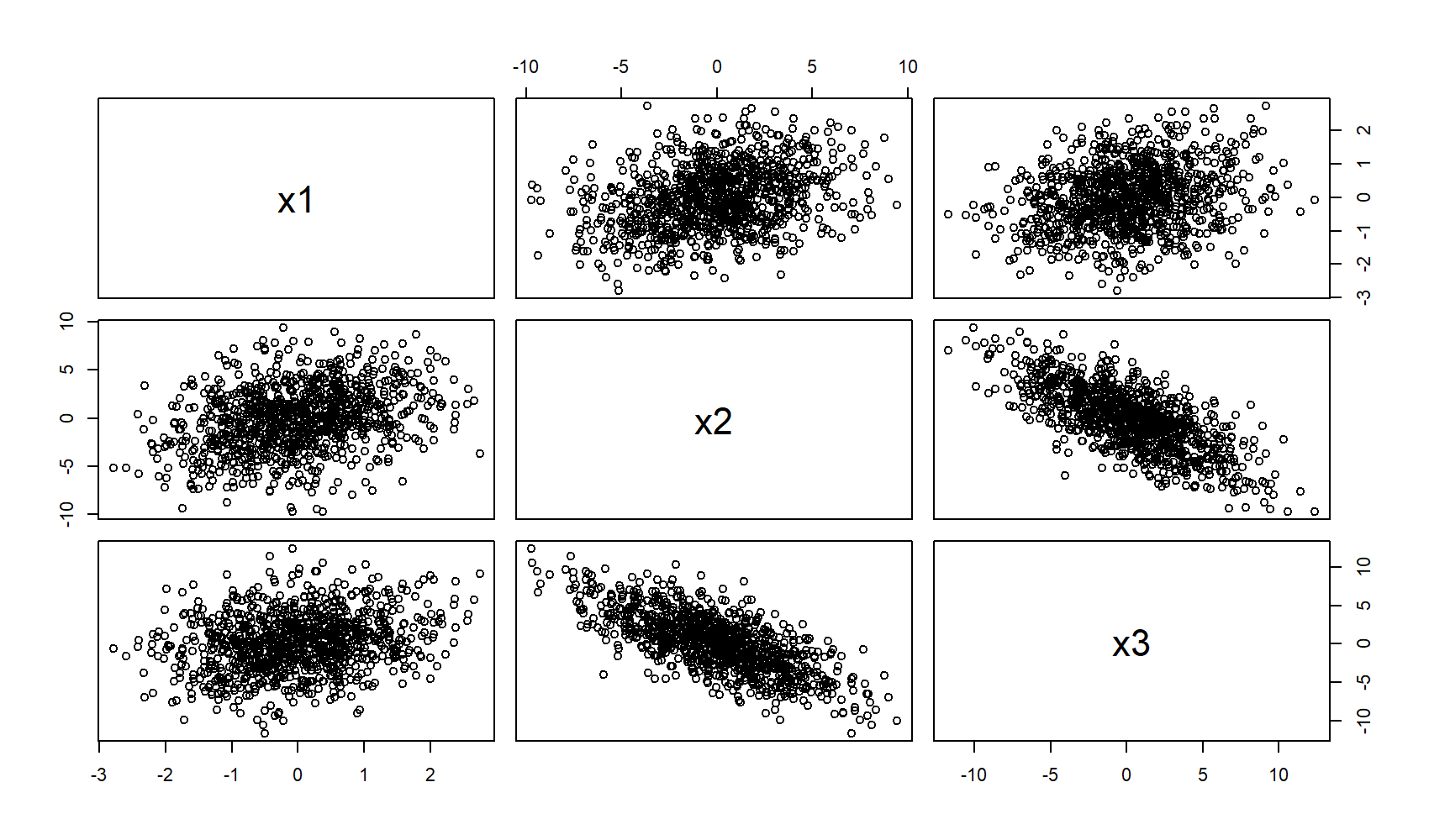
Figure 1: Basic pairs() R Plot.
As you can see, we are able to produce a relatively complex matrix of scatterplots with only one line of code. So, what does this pairs plot actually contain?
- The diagonal shows the names of the three numeric variables of our example data.
- The other cells of the plot matrix show a scatterplot (i.e. correlation plot) of each variable combination of our data frame. The middle graphic in the first row illustrates the correlation between x1 & x2; The right graph in the first row illustrates the correlation between x1 & x3; The left figure in the second row illustrates the correlation between x1 & x2 once more and so on…
In this first example, I have shown you the most basic usage of pairs in R. Let’s modify the options of the function a little bit…
Example 2: Selecting Variables of pairs Plot
Often, you will only be interested in the correlations of a few of your variables. Fortunately, this can be done easily by specifying a formula within the pairs command:
pairs(~ x1 + x2 + x3, data = data) # Produces same plot as in Example 1
With the code above, we can create exactly the same plot as in Example 1. However, we can simply remove the variables from the formula, for which we don’t want to produce a scatterplot:
pairs(~ x1 + x3, data = data) # Leave out one variable
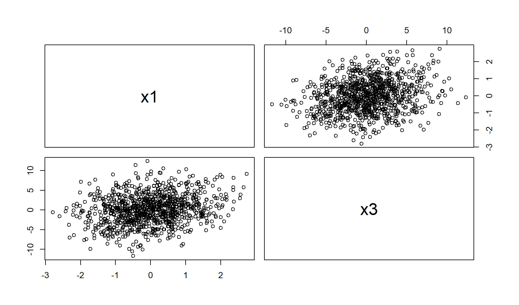
Figure 2: Pairs Plot with Selection of Variables.
In this example, I deleted x2 from the formula, leading to a plot matrix that contains only the scatterplots of x1 and x3.
More modifications? Let’s do it!
Example 3: Modify Color, Shape of Points, Labels & Title
In this example, I’m going to modify many different things:
pairs(data[ , 1:3],
      col = "red",                                         # Change color
      pch = 18,                                            # Change shape of points
      labels = c("var1", "var2", "var3"),                  # Change labels of diagonal
      main = "This is a nice pairs plot in R")             # Add a main title
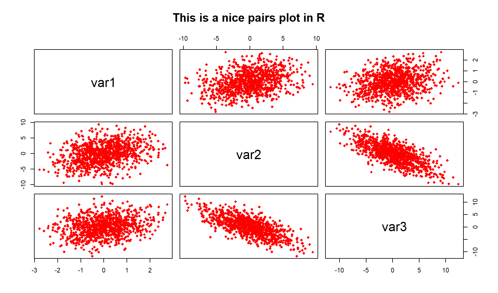
Figure 3: R Pairs Plot with Manual Color, Shape of Points, Labels, and Main Title.
The modified pairs plot has a different color, diamonds instead of points, user-defined labels, and our own main title. For even more options, have a look at the help documentation of pairs by typing ?pairs to the RStudio console.
Example 4: Modify pairs R Plot by Group
Quite often you will have different subsets or subgroups in your data. Let’s add a group indicator (three groups 1, 2 & 3) to our example data to simulate such a situation:
group <- NA
group[data$x1 < - 0.5] <- 1
group[data$x1 >= - 0.5 & data$x1 <= 0.5] <- 2
group[data$x1 > 0.5] <- 3
Now, let’s apply the pairs function again, but this time dependent on the group variable:
pairs(data[ , 1:3],
      col = c("red", "cornflowerblue", "purple")[group],   # Change color by group
      pch = c(8, 18, 1)[group],                            # Change points by group
      labels = c("var1", "var2", "var3"),
      main = "This is an even nicer pairs plot in R")
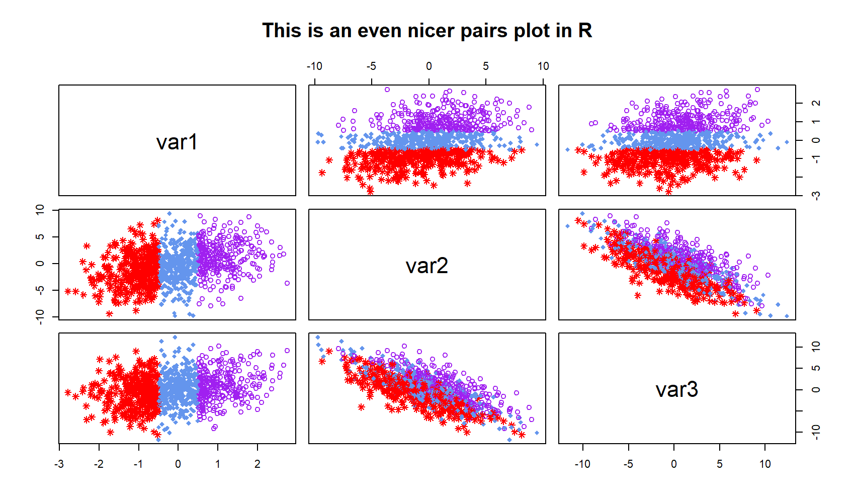
Figure 4: pairs() Plot with Color & Points by Group.
As you can see in Figure 4, we colored the plots and changed the shape of our data points according to our groups.
You need even more options? No problem, let’s move on…
Example 5: ggpairs R Function [ggplot2 & GGally]
So far, we have only used the pairs function that comes together with the base installation of R. However, the ggplot2 and GGally packages provide an even more advanced pairs function, which is called ggpairs(). Let’s install and load the packages:
install.packages("ggplot2")            # Packages need to be installed only once
install.packages("GGally")

library("ggplot2")                     # Load ggplot2 package
library("GGally")                      # Load GGally package
The basic application of ggpairs is similar to the pairs function of base R. You simply have to write the following R code:
ggpairs(data) # Apply ggpairs function
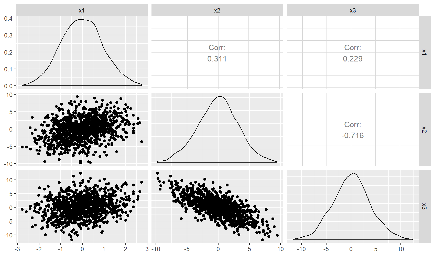
Figure 5: ggpairs R Plot via ggplot2 & GGally packages.
Main difference to the pairs function of base R: The diagonal consists of the densities of the three variables and the upper panels consist of the correlation coefficients between the variables.
Even better than pairs of base R, isn’t it? However, there is even more to explore. In case, you want to know more about the R ggpairs function, I can recommend the following YouTube video of the channel Dragonfly Statistics:
Further Reading
Subscribe to the Statistics Globe Newsletter
Get regular updates on the latest tutorials, offers & news at Statistics Globe.
I hate spam & you may opt out anytime: Privacy Policy.
Thank you!
Welcome to the Statistics Globe newsletter. From now on, I’ll send you regular emails about statistics, data science, AI, and programming with R and Python.
I’m Joachim Schork. On this website, I provide statistics tutorials as well as code in Python and R programming.
Statistics Globe Newsletter
Get regular updates on the latest tutorials, offers & news at Statistics Globe. I hate spam & you may opt out anytime: Privacy Policy.
Thank you!
Please check your email inbox and click the confirmation link to complete your subscription. If you don’t see the email within a few minutes, please also check your spam/junk folder.


54 Comments. Leave new
Hello Joachim, thanks for all your effort, this site is very helpful!
While trying to practice the pairs function along with grouping (specially example 4), I keep getting this error message:
Error in axis(side = side, at = at, labels = labels, …) :
invalid value specified for graphical parameter “pch”
Can you please help explaining the issue?
Thanks so much
Asadi
Hi Asadi,
Thank you for the very nice feedback!
This error message typically occurs when the number of pch values is not the same as the number of groups.
In Example 4 we added this line to the code:
With
, we specified three different pch values for our three different groups.
If I would change the number of pch values (e.g.
), I would get the same error message as you.
Thank you so much for your quick feedback, this is helpful!
Cheers 🙂
I’m glad that it helped 🙂
Hi Joachim,
Great article. I’m running pairs() to correlate HVAC runtimes with power usage. I have set col=month where month is a factor that represents the month the data came from. Is there any way to either control the color for each month or plot a key in the base R version of pairs in this circumstance ?
Hi Kevin,
Thank you very much for your comment. If I understand your problem correctly, Example 4 of this tutorial is what you are looking for. Your month variable would be the “group” variable that I have created in the example. Let me know whether you were able to fix your problem.
Regards,
Joachim
Thanks Joachim,
That worked – I saw your approach earlier, but thought the group had to be numeric. Of course, factors work just as well.
Regards
Kevin
Nice to hear 🙂
Joachim, than you, great site!!
I try ggpairs and got a nice graphics, however I also got a progress output about the grahph creation, fortunatelly, the function has a parameter to echo of: progress = F, here my script, where pariacaca_returns is a object xts.
ggpairs(as.data.frame(pariacaca_returns), progress = F)
Hi Roberto,
Thank you for your nice words and also thank you for sharing your code!
Regards,
Joachim
How do i remove a column from my plot using pairs(data[, 1:7]). I need to remove column 2 from my plot as i do not need it
Hey M Zam,
You may use the following r code:
For more info on how to remove data frame columns, you may also have a look here: https://statisticsglobe.com/r-remove-data-frame-columns-by-name
Regards,
Joachim
Very helpful. Gave me a better understanding of the pairs function.
That’s great to hear Sheila 🙂
Congratulations on the tutorial. It helped a lot. I had some problems with reproduction. I tried to manage the colors for different points or coordinates that meets my requirements but, I am not getting it. All of this using ggpairs.
Hey Nicolas,
Thank you for the comment and the kind words!
In fact, my tutorial only explains how to color Base R pairs plots. However, I found this thread on Stack Overflow that explains how to color ggpairs plots as well.
I hope that helps!
Joachim
It really helped, I could generate fancy multivariate plot !
That’s great Samina, glad it helped! 🙂
Thank you so much! I had been struggling for a week on how to change the names down the diagonal of my matrix scatterplot and turns out it was so simple!
Hi Hollie,
Thank you for the comment! I know this, you keep searching and searching and at the end it is just a little function or line of code that solves a problem… Glad it helped! 🙂
Regards
Joachim
Hi Joachim,
Your article has been very helpful!
I have a lot of variables on my data set and while trying to plot them I keep getting a _figure margins too large_ error. How can I work around this? Is there a way to export pairs’ plot to a jpg or something like that?
Hey José,
Thanks a lot for the kind words!
Please have a look at the following article. It explains how to fix this error message: https://statisticsglobe.com/error-in-plot-new-figure-margins-too-large-in-r
Regards
Joachim
Hi Joachim, thanks for your explanations. Just a quick question is it possible to not get _all_ pairs but just the pairs between a bunch of independent vars and a bunch of dependent variables. I am not interested in the correlations between the independent vars among each other and the dependent variables among each other. So, I would like the correlations between X1 – X3 and X4 and X2 – X3 and X4 but not X1 – X2 and X3 – X4. I would like to have X1 and X2 on the x-axis of the grid and X3 and X4 on the y-axis. Is this possible?
Hi Wienche,
Thanks a lot for the nice comment and the interesting question!
I had a quick look at the help documentation of the pairs function and haven’t found anything useful for this (not sure if I’m missing something here).
However, I would probably create such a plot using face_wrap/facet_grid of the ggplot2 package. You can find more info here: https://statisticsglobe.com/difference-between-facet_grid-and-facet_wrap-ggplot2-r
Let me know in case you have further questions.
Joachim
Hello guys, at first thank you for this very helpful tutorial. I have a question regarding a heatmap i want to create with i think more than 3 variables. At first a short description of the samples. Faeces samples from 134 newborns and their mothers. From them the microbiota was sequenced (which bacteria are in the sample, lets say n=30), 8 tryptophan metabolites were extracted as well from the sample (n=8) and 6 acute phase proteins were extracted as well from this sample (n=6). If possible i want to create an heatmap which shows the coloured intensity of the correlation of each possible pair(bacterium, metabolite,protein)for each sample.
A few additional things are also important to note. The babies are born at different dates. The stool samples was taken from the babies at different time points after the delivery (t=0-72h)–> differentiation meconium and stool. The babies are born via cesarian section or via vaginal delivery (2 more aspects which should be shown in the graph). Mother and/or babies received eventually antibiotics (atb y/n) before/after the delivery (bbirth y/n and abirth y/n). One baby per one mother (1:1)and one mother per one baby (1:1) in this case.
Could someone please give me a hint or a first starting point, how to start/to write this script for the final graph in R?
Thank you very much for your help- to everyone who is willing to help me.
Thank you.
Anne
Just for your information. I posted this same question at stackoverflow.com.
https://stackoverflow.com/q/69822761/17317567
Not everyone is using this website for help and not everyone is using stackoverflow for help.
Thank you very much for your help.
Sure, no problem 🙂
Hey Anne,
Thanks for the comment, glad you found this tutorial helpful!
Could you post a link to a plot that looks similar to the one you want to create? I have difficulties to imagine how such a plot should look like.
Regards,
Joachim
Hi Joachim!
I was searching the internet and cannot find solution to my problem. Maybe you can help.
I want to save the pairs.panel as a graph, but I have 15 columns and each column has around 4000 rows. It takes ages to compile and open the pdf afterwards. Is there a workaround to make these plots “flat”? I don’t need to store any information about all particular dots.
If you have any suggestions, I’d be grateful for it!
Greets
Witek
Hey Witek,
Have you tried to export the graph as PNG instead of PDF? I assume this would be much faster.
Regards,
Joachim
Yeah, sorry, I was not precise enough in my comment. Yes I can do the png, but then I cannot include it in a bigger multi page pdf report and I have it as a separate png in the folder.
Hmm, good question. I have never tried to do this myself, but maybe this approach works? https://stackoverflow.com/questions/8521299/reduce-pdf-file-size-of-plot-in-r
Regards,
Joachim
Great work. Thanks
Thank you very much Samuel, glad you like it!
Hi Joachim, thanks for you post. I have a problem using ggpairs. When the number of column is large and the name of the columns are long, they cannot be displayed properly. Is it possible to downsize the column names?
Hey Kevin,
Thank you for the kind words, glad you like the tutorial!
Regarding your question, you may use the label argument to change the column names:
Or you may use the cex.labels argument to decrease the font size of the labels:
Regards,
Joachim
Is it possible to change font size of the labels in ggpairs? Kevin
Hey Kevin,
In ggpairs, you can use the basic functionally of the ggplot2 package to change font sizes.
To modify the font size of the labels of a ggpairs plot, you can use the following code:
Regards,
Joachim
Hi, Joachim, That’s super. Thanks a lot.
You are very welcome Kevin, glad it helped!
Do Ggally and ggplot2 offer scatter plots of both categorical and numeric variables in one figure
Hey Javed,
Could you explain what you mean with scatterplot of categorical data? Do you maybe have an example how this plot should look like? I think it does not make much sense to draw categorical data in a scatterplot.
Regards,
Joachim
Joachim
I am a catholic from India I am not sure about you, Joachim is name of blessed ever virgin Mother Mary dad’s name.
I use your web site as well as youtube videos, God Jesus has given you wisdom with 3 or 4 lines you explain the concept clearly with simple examples which is very easy for me to understand, I am a novice in R, I always feel jealous about you why I cannot write a code like you, I always try to write code on my own, thinking in a complicated way end up in nothing and then out of frustration see your examples and I blast myself for not thinking in simple way. Thank you !!! for providing free youtube videos and examples in web site. Would appreciate if you could put video how to write code easy way.
Belated Merry Christmas to you and your family and a Happy New Year
Hey RV,
Thank you very much for these very kind words! It’s great to hear that you find my tutorials helpful! 🙂
I hope you have a merry Christmas and a happy new year as well!
Regards,
Joachim
merci beaucoup pour vos efforts
SVP comment puis je résoudre ce problème?(normalement j’ai 13 variables) : Error in plot.new() : figure margins too large. Merci beaucoup
Hey Houssa,
Please have a look at this tutorial. It explains why this error message can occur and how to fix it.
Regards,
Joachim
Hey Joachim! I’ve run a ggpairs plot on my grouped summarized data and it looks like the histogram is based on record counts within the data. My data has a column of “number_of_observations” in each record. I expect the density plots to look quite a bit different because the number_of_observations skews the data significantly. Is there a way to incorporate that into the ggpairs analysis?
Hey Phil,
I’m sorry for the delayed response, I’ve been on vacation for the last couple of days. Do you still need help with your graph?
Regards,
Joachim
Reach this entry via google search.
Simple but very useful for beginner.
Thanks so much
Hi Hau,
thanks for the positive feedback. We are glad to hear that.
Regards,
Matthias
Hi team! Thank you very much for the usefull website, I have been consulting it a lot for my bachelor thesis. I used the pairs.panels form psych for my correlation matrix. I played around with the asterisks, ellipses, CI etc., however my supervisor would like me to add the R2 too.. I have not found anything on the web (after long search) which could really help me further here :(.. do you know if this is possible?
Hello Mikki,
I think it is a very complex thing to implement. Alternatively, you can plot each pair separately via scatter plot with a Rsquare text or manually add the R-square statistics to your matrix plot. Here is how to do the former for a pair of variable.
Best,
Cansu
Hi Cansu!
Thank you very much for the reply, will try this out asap!!
Very Welcome!