Quantile-Quantile Plot in R (4 Examples) | qqplot, qqnorm & qqline Functions | ggplot2 Package
This tutorial explains how to draw QQplots in R programming.
Table of contents:
- Example 1: Basic QQplot & Interpretation
- Example 2: QQplot of Logistically Distributed Values
- Example 3: Compare Two Data Sets with QQplot
- Example 4: Create QQplot with ggplot2 Package
- Video, Further Resources & Summary
Let’s dive right into the R code:
Example 1: Basic QQplot & Interpretation
In this example I’ll show you the basic application of QQplots (or Quantile-Quantile plots) in R. In the example, we’ll use the following normally distributed numeric vector:
set.seed(5432)                   # Set seed for reproducibility
x <- rnorm(10000)                # Create random normally distributed values
Our vector contains 10000 random values, which follows a normal distribution.
Now, we can use the qqnorm function to create a QQplot of this vector…
qqnorm(x) # QQplot of normally distributed values
…and the qqline function to add a theoretical line according to the normal distribution:
qqline(x, col = "red") # Add qqline to plot

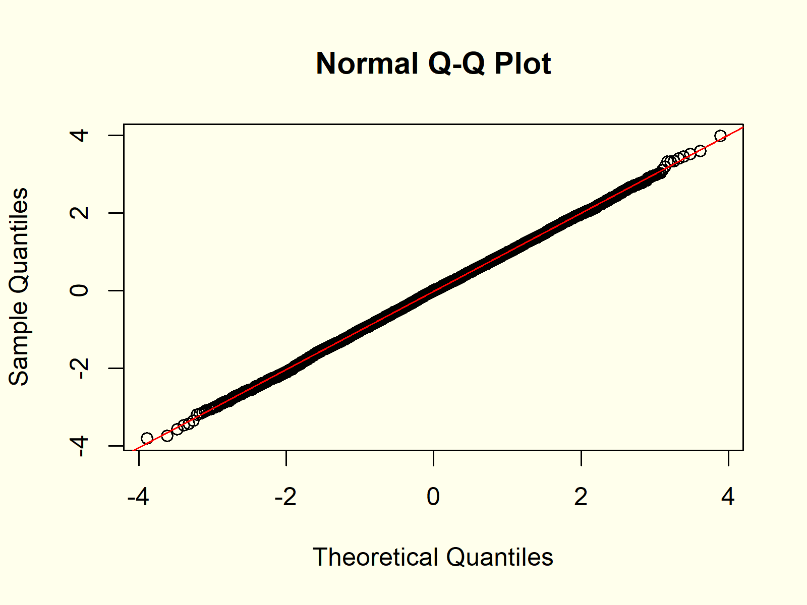
Figure 1: QQplot of Normally Distributed Random Numbers.
Figure 1 shows the output of the previous R code: A QQplot of our normally distributed random data compared to the theoretical normal distribution and a QQline.
We can interpret the graphic as follows:
The quantiles of our sampled random data and the theoretical quantiles follow the QQline almost perfectly. For that reason, the QQplot indicates that our random values are normally distributed.
Example 2: QQplot of Logistically Distributed Values
Let’s apply the same R code as in Example 1 to a different probability distribution in R:
y <- rlogis(10000) # Random values according to logistic distribution
Our new random data follows a logistic distribution. Now, let’s draw a QQplot and a QQline to see the difference compared to Examples 1:
qqnorm(y)                        # QQplot of logistic distribution
qqline(y, col = "red")

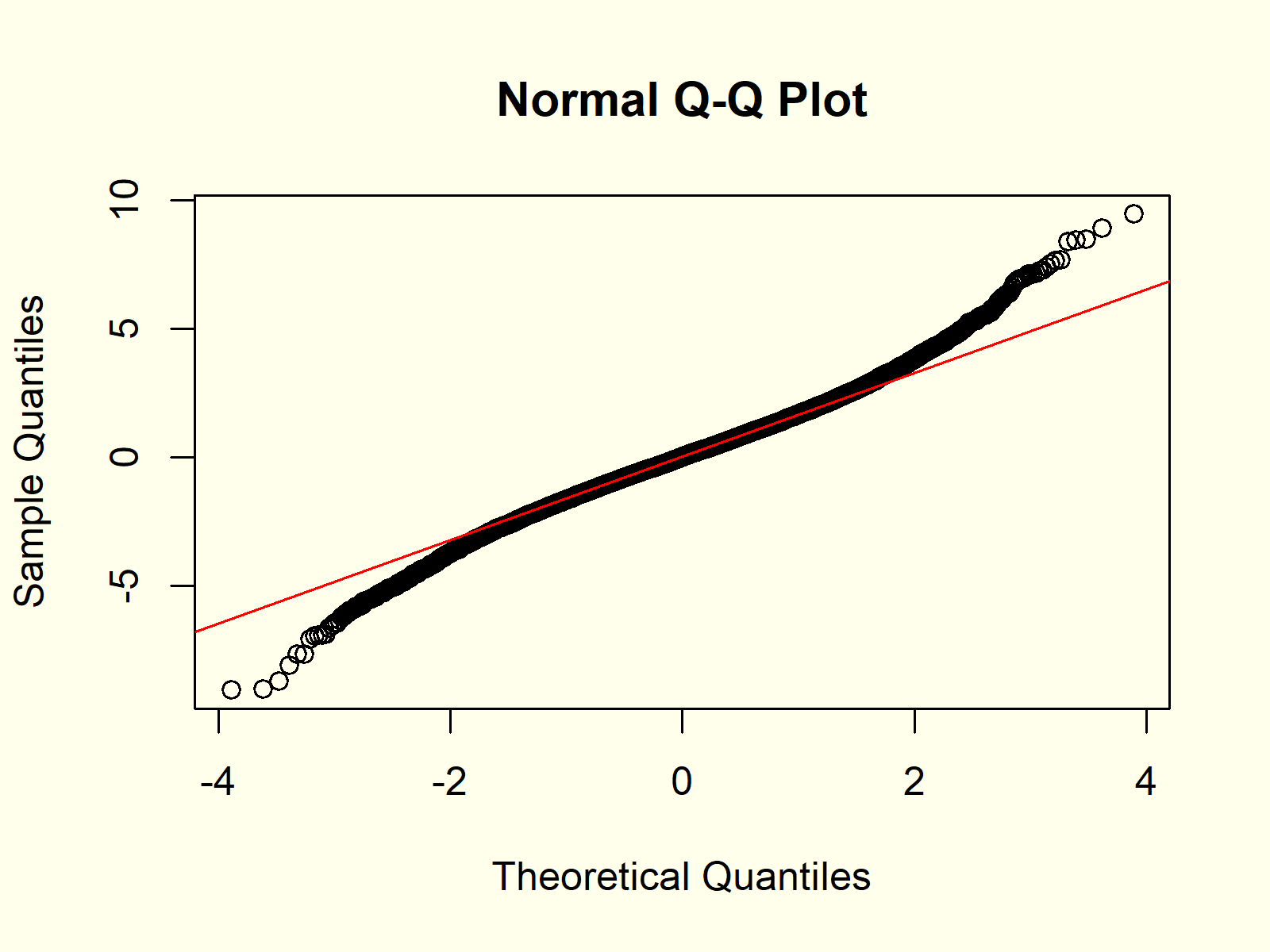
Figure 2: QQplot of Logisitc Distribution vs. Normal Distribution.
Figure 2 shows the result. In contrast to Figure 1, the QQplot is not following the straight QQline, indicating that our random values do not follow a normal distribution.
Example 3: Compare Two Data Sets with QQplot
So far, we have only compared one input data set vs. a theoretical normal distribution. However, it is also possible to compare two input data sets with each other.
Consider the following random values with a student t distribution:
z <- rt(10000, 3) # Random values according to student t distribution
We can use the qqplot function to compare this distribution with the logistically distributed vector that we have created in Example 2:
qqplot(y, z) # QQplot of logistic & student t distribution

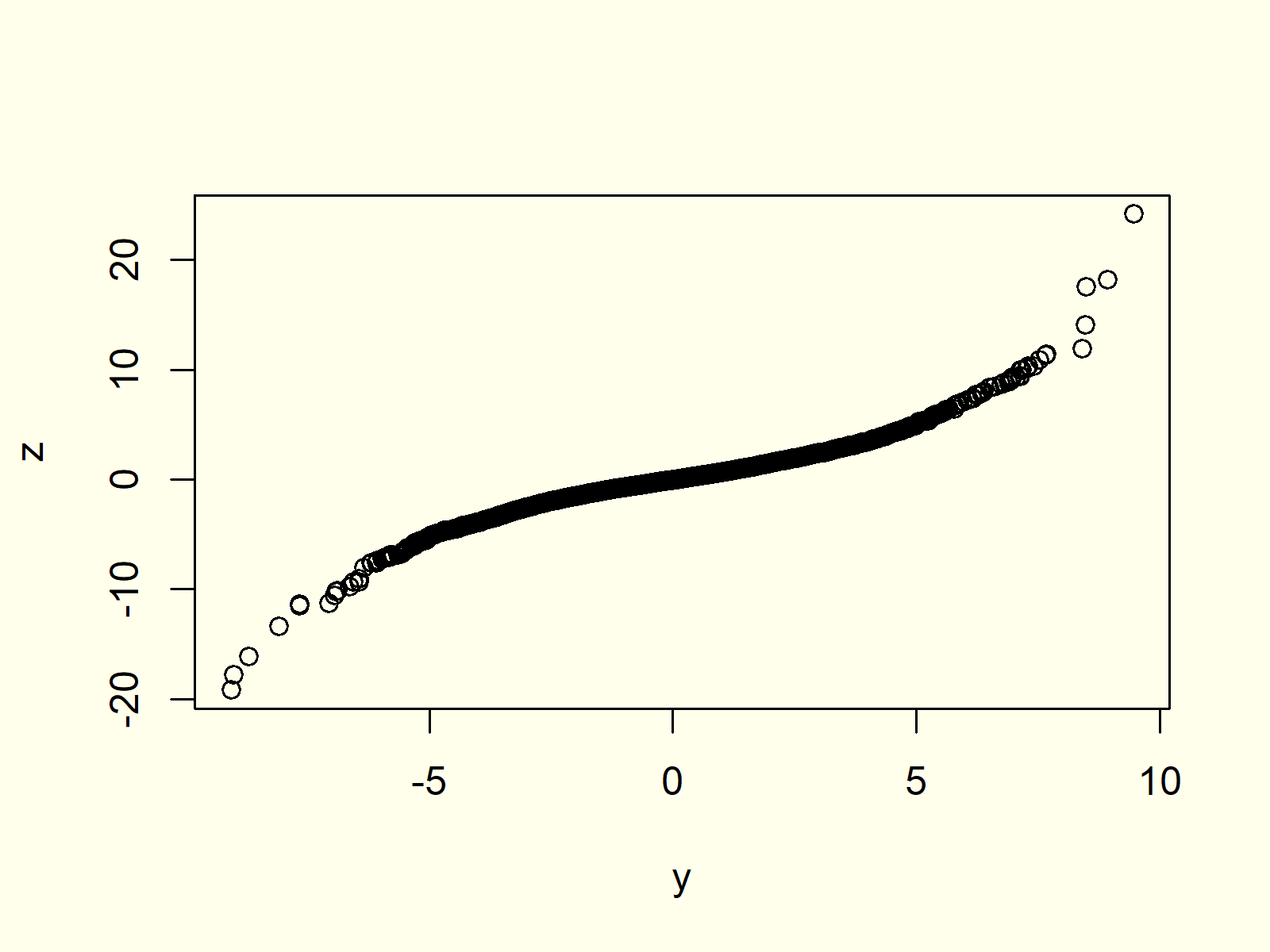
Figure 3: QQplot with Two Input Data Sets.
As you can see based on Figure 3, our two input data sets do now follow the same distribution, since the QQplot is not following a straight line.
Example 4: Create QQplot with ggplot2 Package
Until now, we have used the base installation of R to produce our QQplots. However, there are many packages, which provide prettier representations of QQplots.
Probably the most common package for graphics in R is the ggplot2 package.
Let’s install and load the package:
install.packages("ggplot2")      # Install & load ggplot2
library("ggplot2")
The ggplot2 package takes data frames as input, so let’s convert our numeric vector of Example 1 to a data frame:
data <- data.frame(x) # Create data frame containing x
Now, we can use the stat_qq and stat_qq_line functions of the ggplot2 package to create a QQplot:
ggplot(data, aes(sample = x)) +  # Create QQplot with ggplot2 package
  stat_qq() +
  stat_qq_line(col = "red")

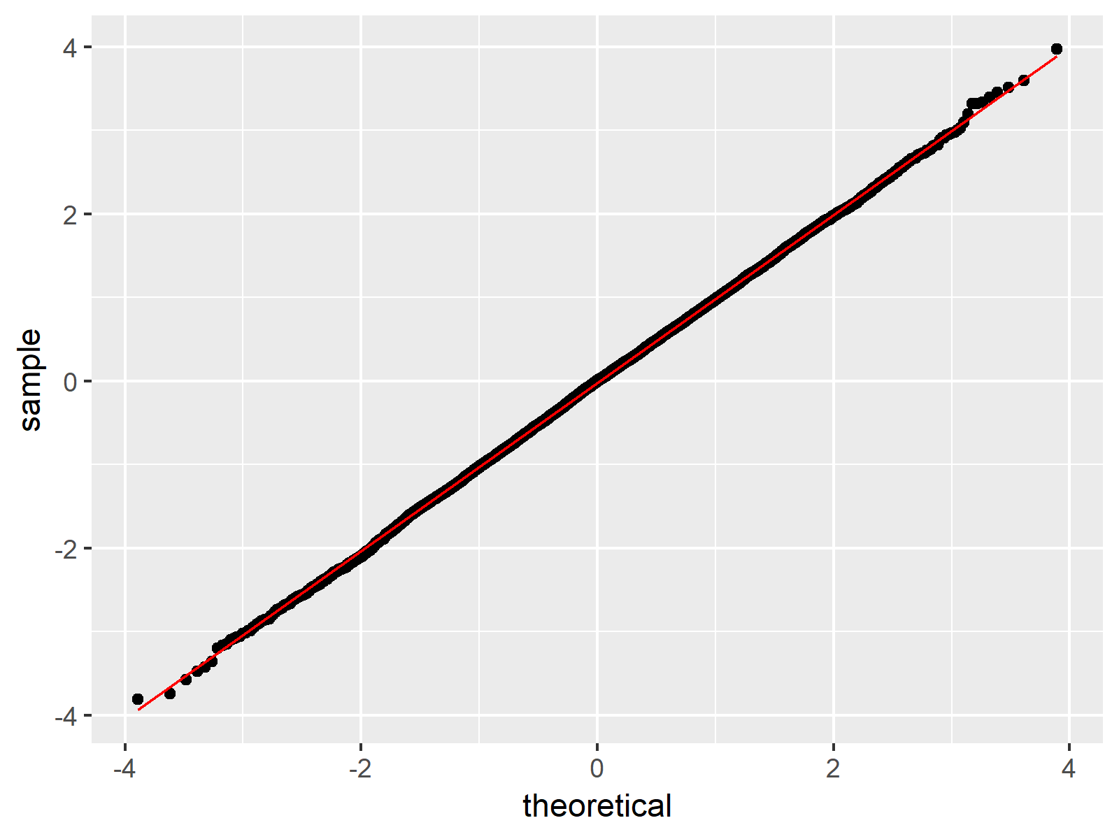
Figure 4: QQplot Created by ggplot2 Package.
Figure 4 shows the same QQplot as Figure 1, but this time in the typical ggplot2 design.
Video, Further Resources & Summary
Do you need more information on the R programming syntax of the present tutorial? Then you may want to have a look at the following video of my YouTube channel. In the video, I explain the R syntax of this article.
The YouTube video will be added soon.
Besides the video, you might read the other tutorials of this homepage. Some articles can be found below:
This article illustrated how to make a Quantile-Quantile plot in the R programming language. Please let me know in the comments section, in case you have additional questions.
Subscribe to the Statistics Globe Newsletter
Get regular updates on the latest tutorials, offers & news at Statistics Globe.
I hate spam & you may opt out anytime: Privacy Policy.
Thank you!
Welcome to the Statistics Globe newsletter. From now on, I’ll send you regular emails about statistics, data science, AI, and programming with R and Python.
I’m Joachim Schork. On this website, I provide statistics tutorials as well as code in Python and R programming.
Statistics Globe Newsletter
Get regular updates on the latest tutorials, offers & news at Statistics Globe. I hate spam & you may opt out anytime: Privacy Policy.
Thank you!
Please check your email inbox and click the confirmation link to complete your subscription. If you don’t see the email within a few minutes, please also check your spam/junk folder.


4 Comments. Leave new
Podría ser interesante presentar la distribución logística para mostrar cómo se pueden ver las colas cortas y largas en ggplot.
See my response on your English comment 🙂
It could be insightful presenting the logistic distribution in order to show how you cansee the short and long tails in qqplot.
Hey Alfredo,
Thank you for the comment!
Example 2 shows the logistic distribution, or did you mean something else?
Regards,
Joachim