Introduction to ggplot2 Package in R (Tutorial & Examples)
This tutorial demonstrates how to draw graphics using the ggplot2 package in R programming.
The table of contents is shown below:
So without further ado, let’s dig in…
The Grammar of Graphics & ggplot2 Layers
ggplot2 is a popular open-source data visualization package in R. It was created by Hadley Wickham and is part of the tidyverse collection of R packages. ggplot2 is built on the principles of the “Grammar of Graphics“, a framework for describing and building a wide range of visualizations using a consistent and coherent syntax.
The package allows users to create complex and customizable plots using a layered approach, where each layer can represent a different aspect of the data or plot. The main components of ggplot2 are:
- Data: The data set you want to visualize, usually provided as a data frame or a tibble.
- Aesthetics (aes): Aesthetic mappings define how variables in the data are mapped to visual properties, like color, size, shape, or position on the x and y axes.
- Geometries (geom): Geoms represent the geometric objects that make up the plot, such as points, lines, bars, or areas. Each geom function adds a layer to the plot.
- Scales: Scales control how aesthetic values are transformed and displayed, such as changing the colors or axis limits.
- Coordinate systems (coord): Coordinate systems define the space in which the plot is drawn, such as Cartesian or polar coordinates.
- Facets: Facets are used to create grids of graphs that show multiple plots side-by-side, dividing the data into subsets based on one or more variables.
- Themes: Themes control the non-data components of the plot, such as background color, grid lines, axis labels, and legends.
To create a plot using ggplot2, you typically start with the ggplot() function, which initializes the plot, and then add layers using the + operator.
Next, we’ll have a look at some simple ggplot2 plots that demonstrate the basics of the ggplot2 package!
Install & Load the ggplot2 Package
To be able to use the functions of the ggplot2 add-on package, we first have to install ggplot2.
This step needs to be done only once. In case you have installed the ggplot2 package already, please move on to the next step.
install.packages("ggplot2") # Install ggplot2 package
Once you have installed ggplot2, you have to load the package. This needs to be done at the beginning of each R (or RStudio) session.
library("ggplot2") # Load ggplot2
We are set up, let’s have a look at the data that we will visualize!
Simple Example Data
Before we can use the ggplot2 package, we’ll have to create some data that we can use in the following examples:
data <- data.frame(x = 1:9,                # Create simple example data
                   y = c(3, 1, 4,
                         3, 5, 2,
                         1, 2, 3),
                   group = rep(LETTERS[1:3], each = 3))
data                                       # Print example data
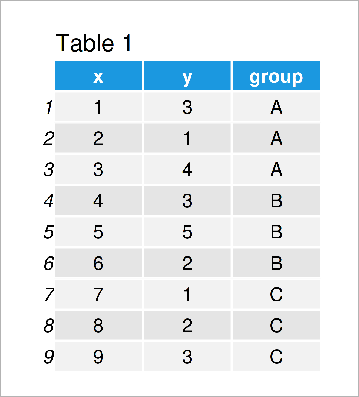
Table 1 visualizes our example data. As you can see, it contains nine rows and three columns. The two variables x and y contain numeric values, and the variable group separates our data into different groups.
So far so good, let’s visualize our data using ggplot!
Basic Application of the ggplot2 Package
The following code applies the theoretical explanations of the first section (i.e. the Grammar of Graphics) in practice. Make sure to scroll back and re-read Section 1 in case you need additional explanations on the syntax below.
However, the following syntax contains four different components:
- The ggplot function, which initializes our plot.
- Our data frame, which is called data.
- The aesthetics, which are in this case the numeric variables x and y.
- The geom, in this case geom_point, which is used to draw a scatterplot.
Let’s do this!
ggplot(data,                               # Draw basic ggplot2 scatterplot
       aes(x = x,
           y = y)) +
  geom_point()
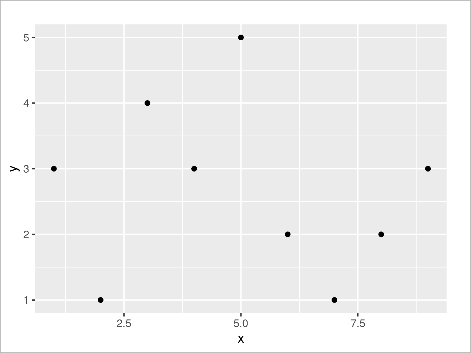
As shown in Figure 1, we have plotted a scatterplot (also called xy-plot) of our entire data frame. The values of the variable x are represented on the x-axis, and the values of the variable y are represented by the y-axis.
This is probably one of the most basic ggplot2 graphs that we can create. However, with some easy modifications, we can improve our graphic drastically.
We may specify additional parameters for our points within the geom_point function. For example, the size of our points can be increased (or decreased) using the size argument. The larger the value is, the larger our points will be displayed.
ggplot(data,                               # Increase point size
       aes(x = x,
           y = y)) +
  geom_point(size = 3)
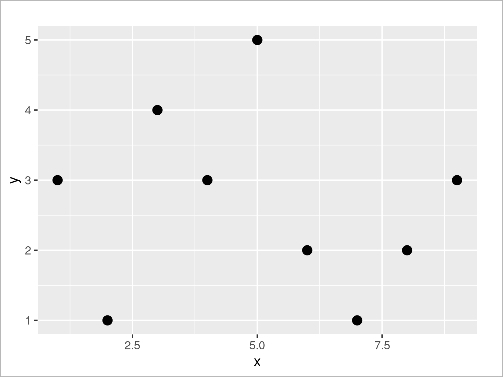
As shown in Figure 2, the previous R code has managed to increase our point size.
Next, let’s add some colors to our plot. We can specify the col (i.e. colors) argument within the aesthetics of our graphic to be equal to our group column. This sets the colors by group, and it also creates a legend on the right side of our ggplot2 plot.
ggplot(data,                               # Set colors by groups
       aes(x = x,
           y = y,
           col = group)) +
  geom_point(size = 3)
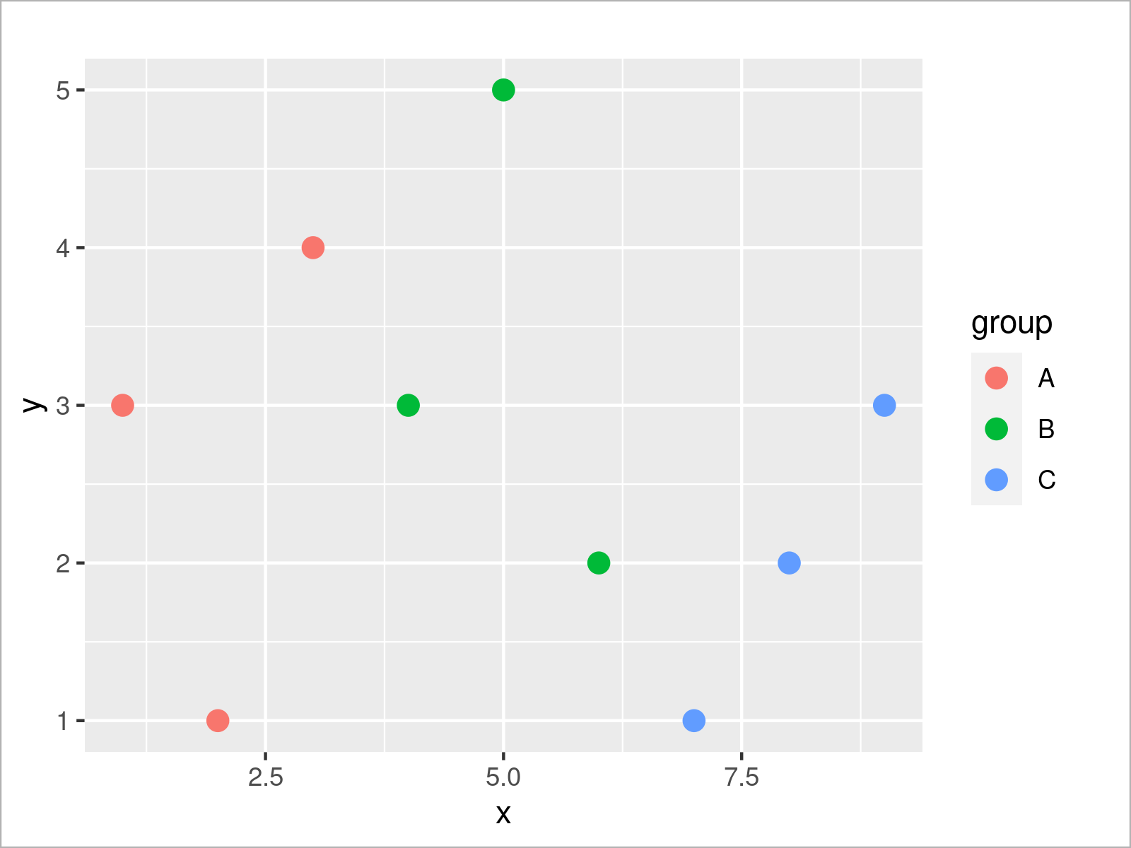
Looks good! We will use this plot as a basis for our next modifications. For this, we can store our plot in a data object as shown below:
ggp_simple <- ggplot(data,                 # Store ggplot2 plot in data object
                     aes(x = x,
                         y = y,
                         col = group)) +
  geom_point(size = 3)
Recall the explanations in Section 1. We have defined our data, aesthetics, and geometries in the data object ggp_simple.
We might now add additional layers to this plot object. For example, we can manipulate the axis limit of the x-axis using the scale_x_continuous function:
ggp_simple +                               # Change x-axis limits
  scale_x_continuous(limits = c(- 3, 15))
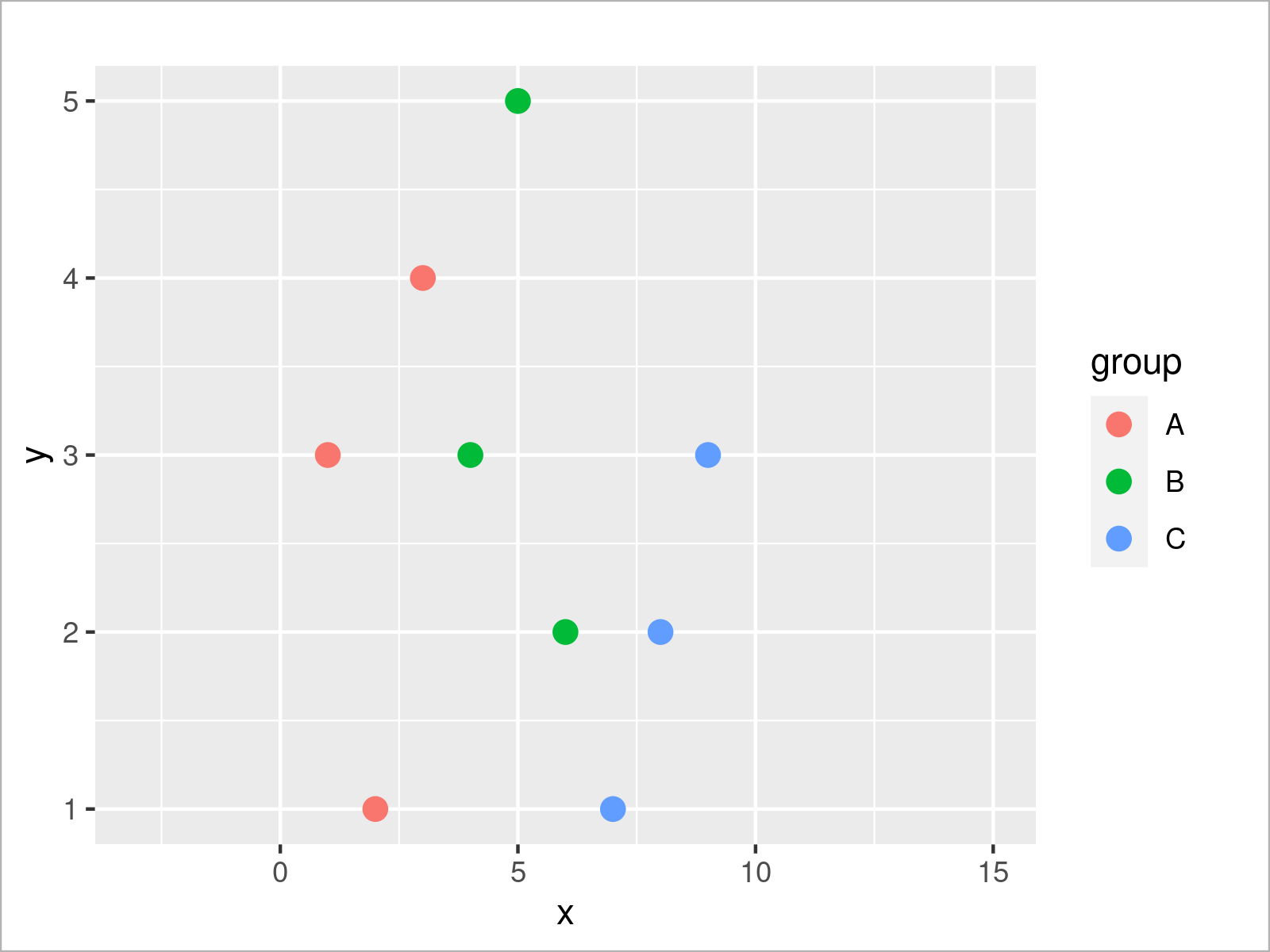
We could also add other scale layers, for instance, to change the colors of our groups:
ggp_simple +                               # Change colors by groups
  scale_color_manual(breaks = c("A", "B", "C"),
                     values = c("#1b98e0", "#353436", "#e32f08"))
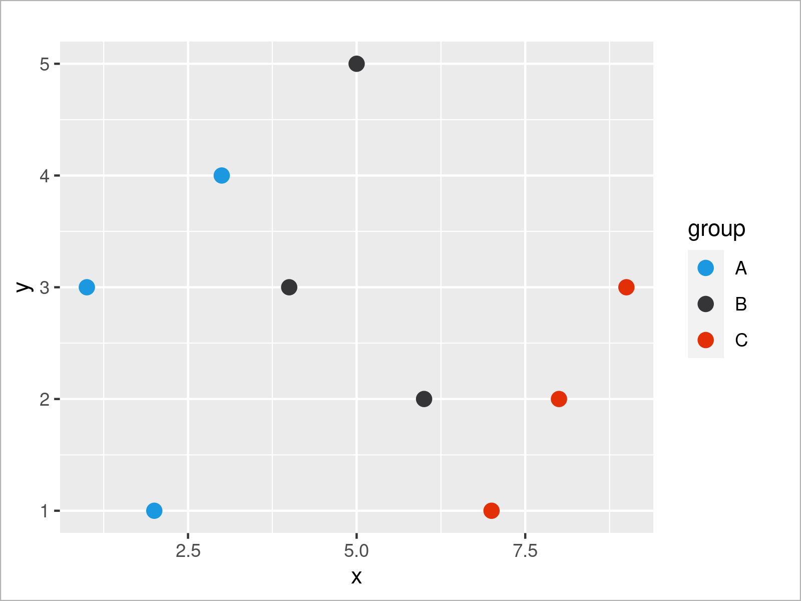
It is also possible to define multiple scale layers for the same ggplot2 graphic. In the following plot, we change the x-axis range as well as the group color palette simultaneously. Note that we use the + operator to add each new layer.
ggp_simple +                               # Add multiple scale layers
  scale_x_continuous(limits = c(- 3, 15)) +
  scale_color_manual(breaks = c("A", "B", "C"),
                     values = c("#1b98e0", "#353436", "#e32f08"))
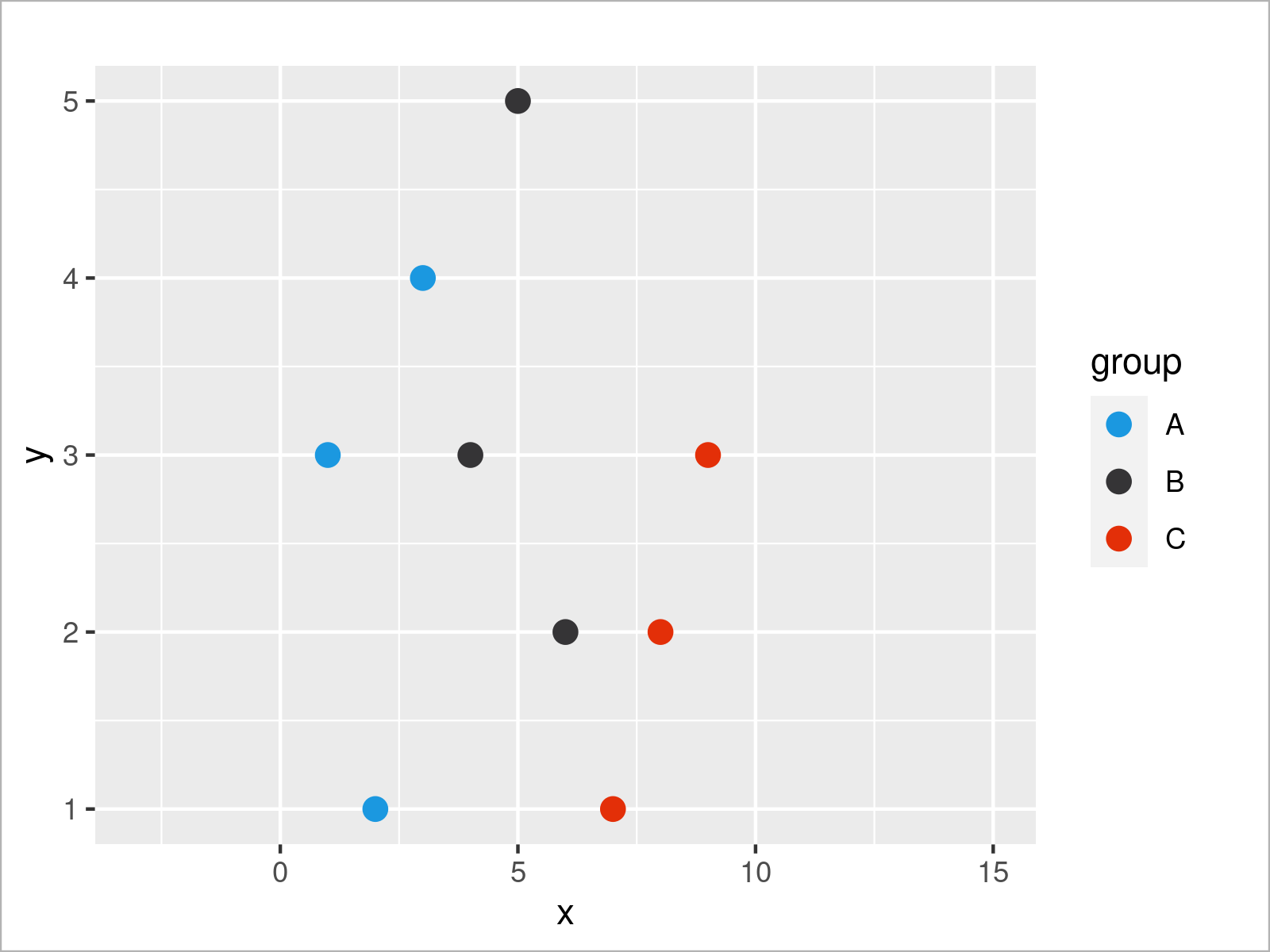
So much about scale layers. As explained in Section 1, we may also split our data into subplots using facets. We can add the facet_wrap function to our plot to split our data based on the group variable:
ggp_simple +                               # Create subplots using facet_wrap()
  scale_x_continuous(limits = c(- 3, 15)) +
  scale_color_manual(breaks = c("A", "B", "C"),
                     values = c("#1b98e0", "#353436", "#e32f08")) +
  facet_wrap(group ~ .)
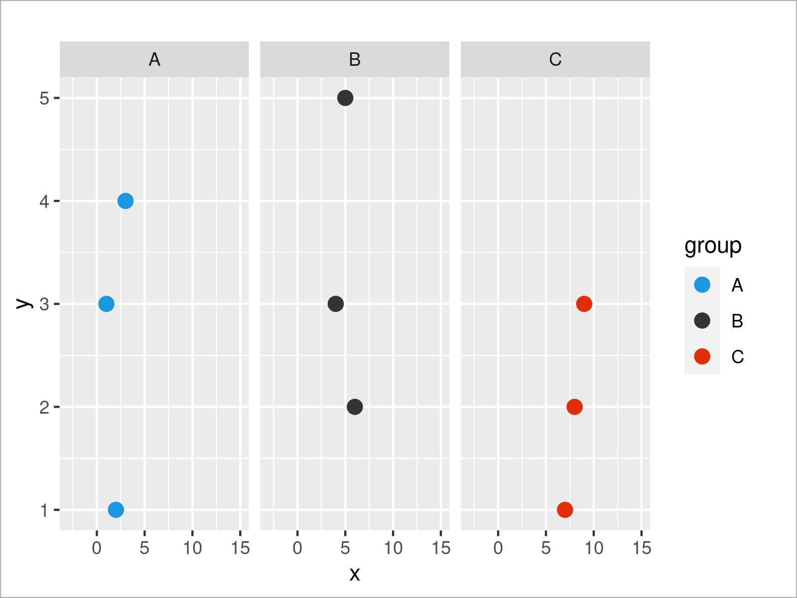
Last but not least, we can also use a theme layer, to change the general design of our graphic. A popular pre-defined theme of the ggplot2 package is called theme_bw. It creates a simplified graph that relies mainly on black and white background colors.
ggp_simple +                               # Change ggplot2 theme
  scale_x_continuous(limits = c(- 3, 15)) +
  scale_color_manual(breaks = c("A", "B", "C"),
                     values = c("#1b98e0", "#353436", "#e32f08")) +
  facet_wrap(group ~ .) +
  theme_bw()
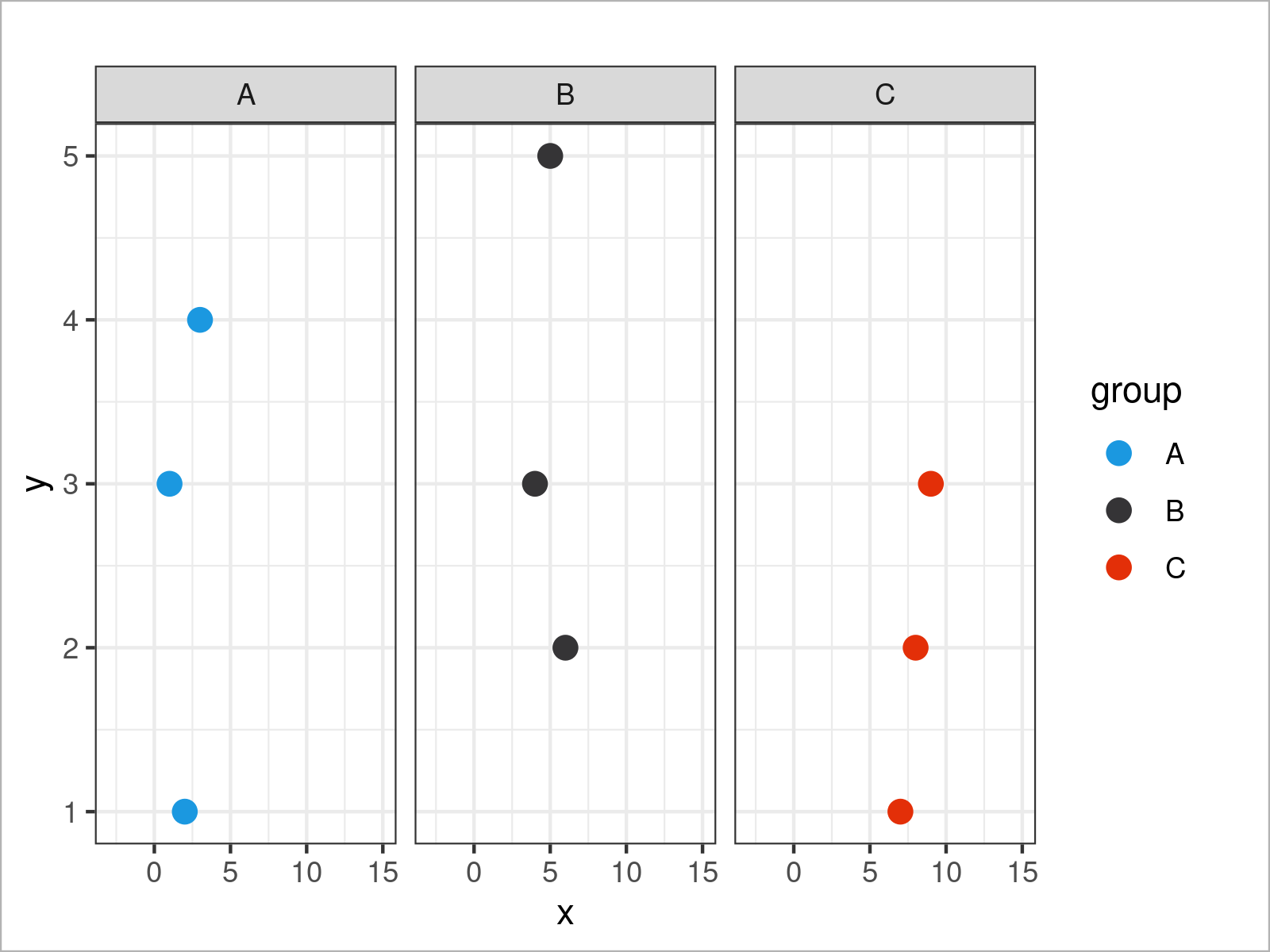
Until now, we have added more and more layers to our ggplot2 graph. However, we can also remove certain elements from our plot.
Often, such removals are specified within the theme function. For example, we can use the theme function and the legend.position argument to avoid the legend in our plot:
ggp_simple +                               # Remove legend from plot
  scale_x_continuous(limits = c(- 3, 15)) +
  scale_color_manual(breaks = c("A", "B", "C"),
                     values = c("#1b98e0", "#353436", "#e32f08")) +
  facet_wrap(group ~ .) +
  theme_bw() +
  theme(legend.position = "none")
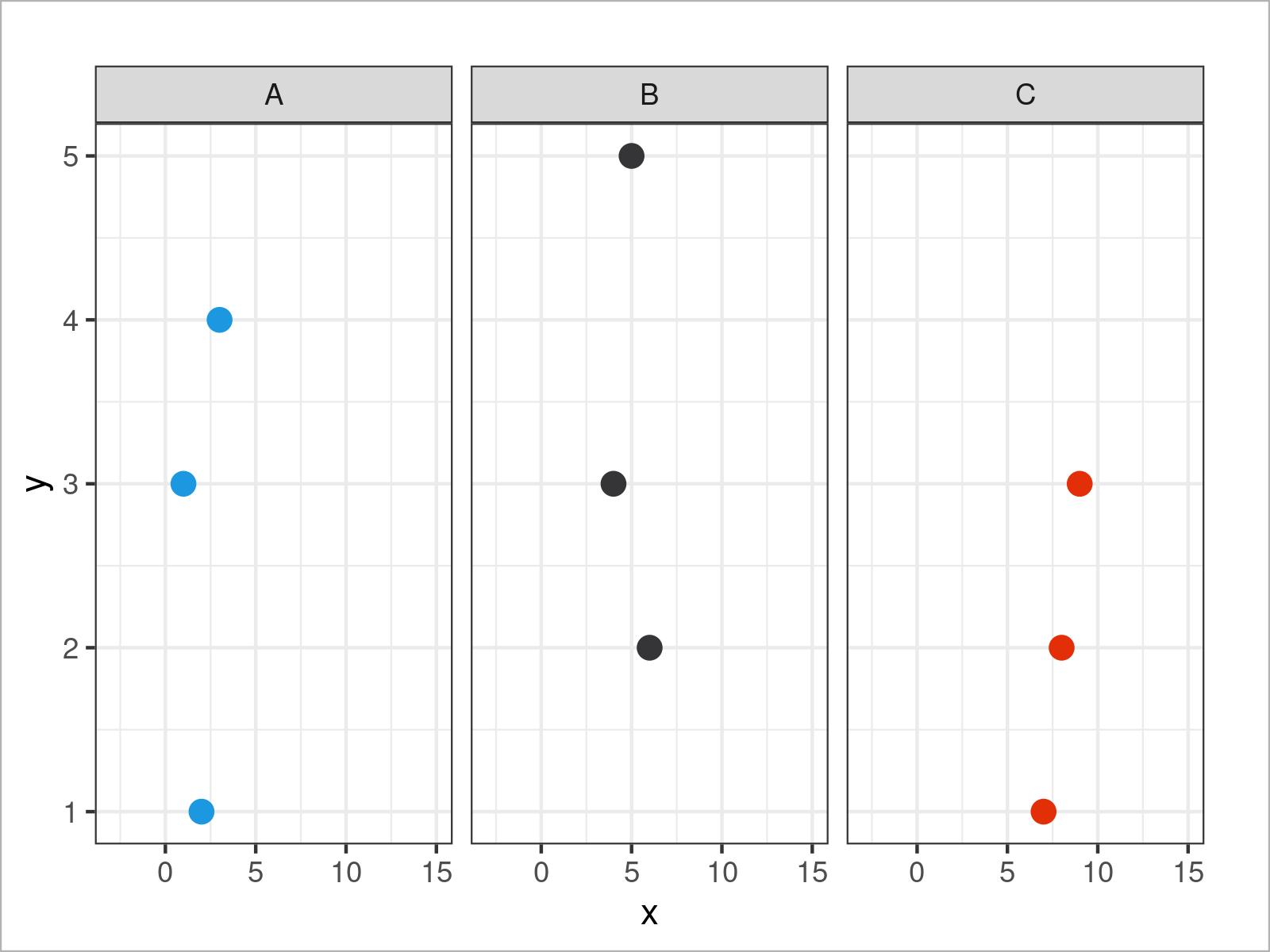
The theme function provides endless arguments for the modification of our plot. The following syntax removes the titles, text labels, and ticks from our x- and y-axes.
ggp_simple +                               # Remove axis information
  scale_x_continuous(limits = c(- 3, 15)) +
  scale_color_manual(breaks = c("A", "B", "C"),
                     values = c("#1b98e0", "#353436", "#e32f08")) +
  facet_wrap(group ~ .) +
  theme_bw() +
  theme(legend.position = "none",
        axis.title.x = element_blank(),
        axis.text.x = element_blank(),
        axis.ticks.x = element_blank(),
        axis.title.y = element_blank(),
        axis.text.y = element_blank(),
        axis.ticks.y = element_blank())
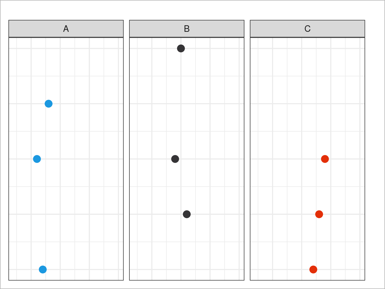
Have a look at the options of the theme function to get a list of all available parameters.
In the previous section, I have demonstrated how to apply the basics of the gglot2 library. However, we have used a very simplified data set, and for that reason, I would like to continue with some more sophisticated data to be able to show you a few more advanced ggplot2 plots.
Let’s have a closer look.
Complex Data for More Sophisticated Graphs
For the following examples of this tutorial, we’ll use the diamonds data set. This data set contains the prices and other attributes of almost 54,000 diamonds.
We can load and print the first six rows of the data set using the data and head functions:
data(diamonds)                             # Load diamonds data set
head(diamonds)                             # Print first six rows of data
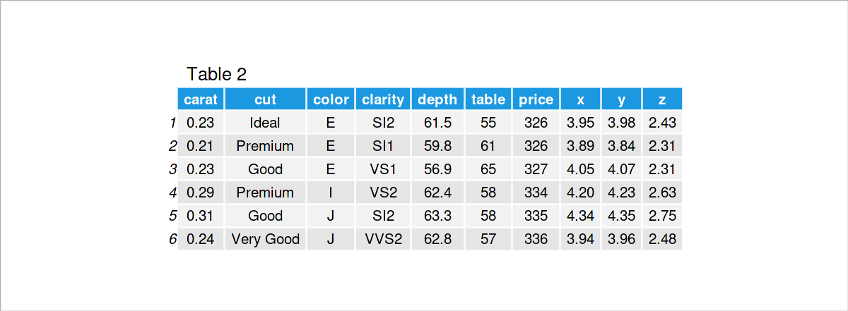
Table 2 illustrates the structure of the diamonds data set. In the following examples, we will use the following variables:
- price: price in US dollars
- carat: weight of a diamond
- clarity: how clear a diamond is
- depth: total depth percentage
- cut: quality of the cut
- color: diamond color from D (best) to J (worst)
Let’s visualize our diamonds!
ggplot2 Scatterplot
As a first step, I would like to demonstrate that the ggplot2 package makes it quite simple to draw even more sophisticated data in a graph.
Compare the following syntax with the syntax for our very basic plot at the beginning of this tutorial. We only have to change the names of the data set and the variables.
ggplot(diamonds,                           # Draw ggplot2 scatterplot
       aes(x = price,
           y = carat)) +
  geom_point()
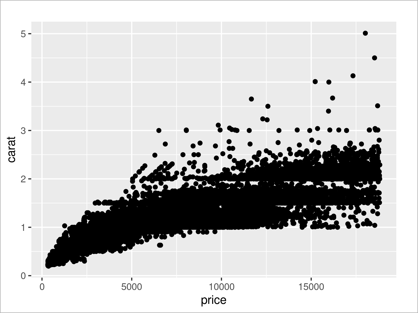
As you can see, we managed to draw a scatterplot of our entire diamonds data set.
We can already see a positive correlation between the carat and price variables. Makes sense: the higher the carat, the more expensive is a diamond.
However, the previous graph looks kind of overplotted!
Let’s add some group colors:
ggplot(diamonds,                           # Change color by groups
       aes(x = price,
           y = carat,
           col = clarity)) +
  geom_point()
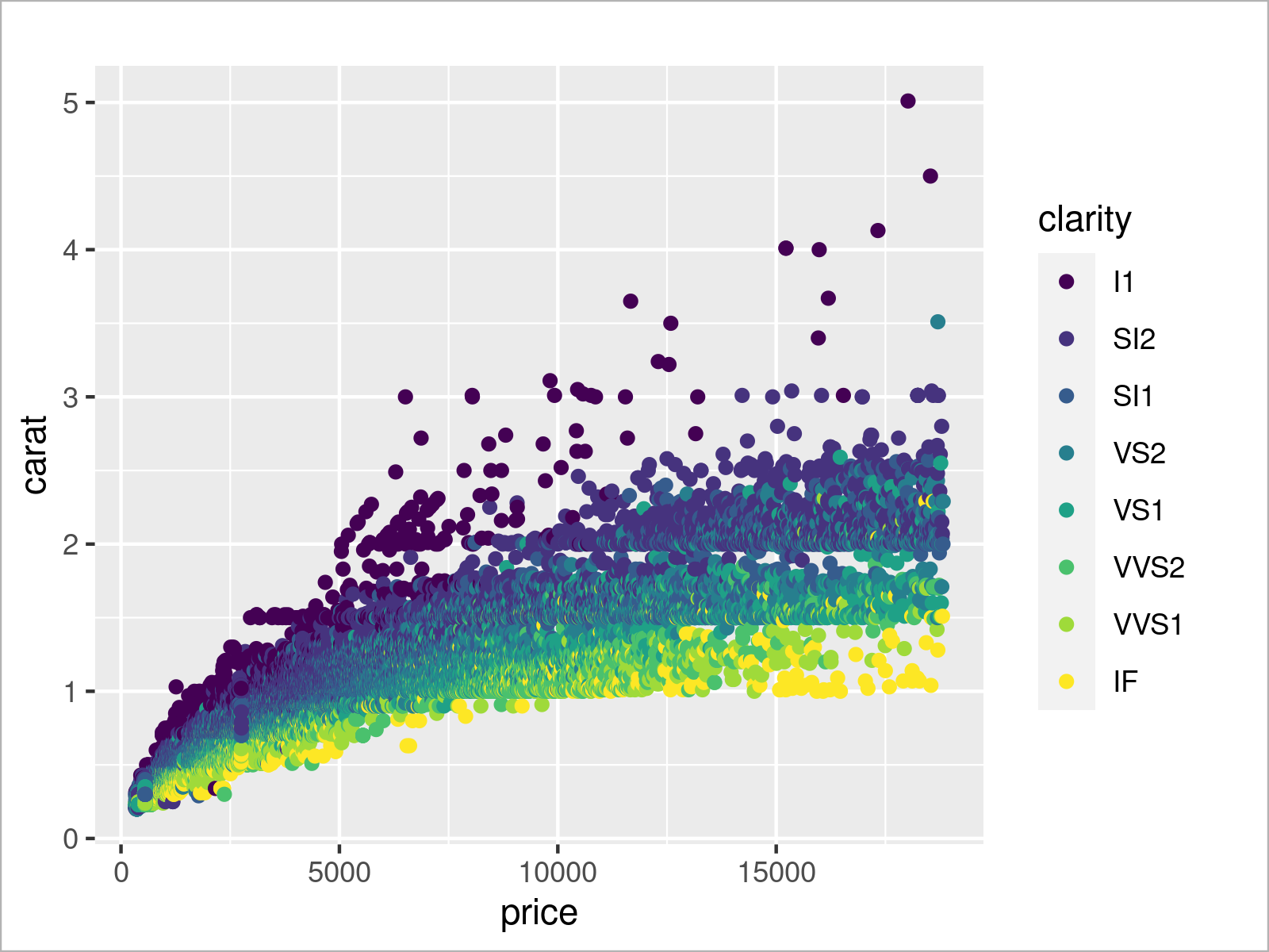
After executing the previous syntax, the previous scatterplot with group colors has been created.
This adds some additional information to our plot. As it seems, some clarity groups have a lower average carat than others.
We could distinguish our groups even better by adding a facet layer to our ggplot2 plot:
ggplot(diamonds,                           # Show data in subplots by groups
       aes(x = price,
           y = carat)) +
  geom_point() +
  facet_wrap(clarity ~ .)
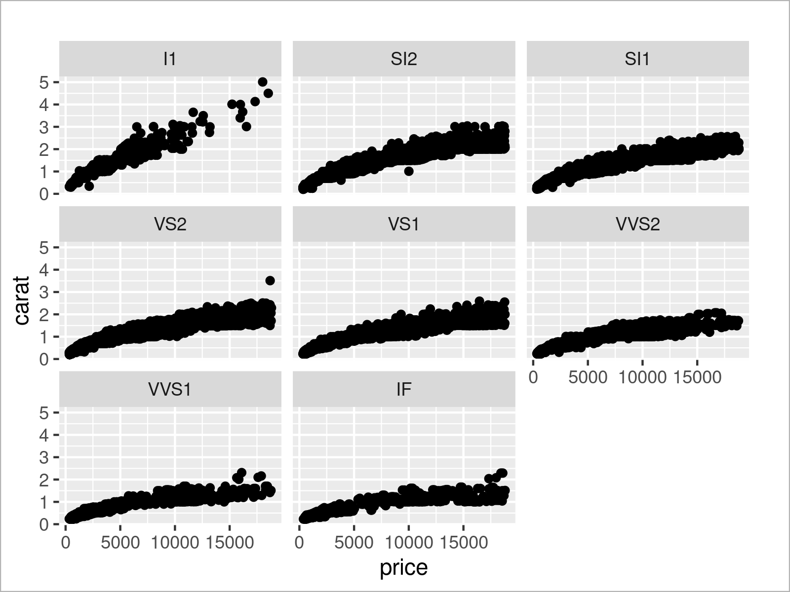
As you can see, the previous syntax has created a separate subplot for each of the clarity groups in our data.
This already shows some group differences in terms of the correlation between price and carat. It seems like some correlations are more positive than others.
We may now add another geom layer to our plot to add a linear regression line to each of our subplots:
ggplot(diamonds,                           # Add regression line to each subplot
       aes(x = price,
           y = carat)) +
  geom_point() +
  facet_wrap(clarity ~ .) +
  geom_smooth(method = "lm",
              formula = y ~ x)
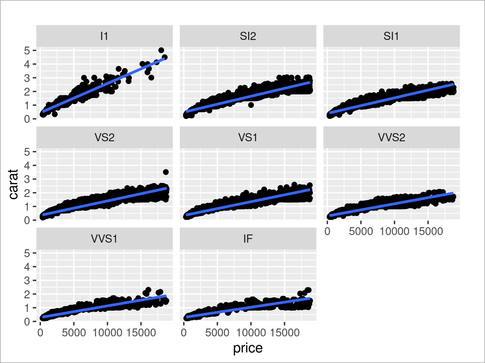
Figure 15 shows the output of the previous R programming code: The clarity group I1 seems to have a higher correlation between the variables carat and price than the other groups.
Until now, we have only used scatterplots to analyze our data. However, the ggplot2 package makes it extremely easy to draw many different types of plots. In the following sections, I’ll demonstrate how to draw some other types of graphs to visualize our data in even more detail.
Let’s do this!
ggplot2 Density Plot
Another very common plot type are kernel density plots.
To draw such a plot, only one continuous variable is needed. In the following example, we use the depth variable of the diamonds data set to draw such a density plot.
As shown below, we only need to specify the x argument within the aesthetics of our ggplot2 plot, and we have to use the geom_density function instead of geom_point.
ggplot(diamonds,                           # Draw ggplot2 density plot
       aes(x = depth)) +
  geom_density()
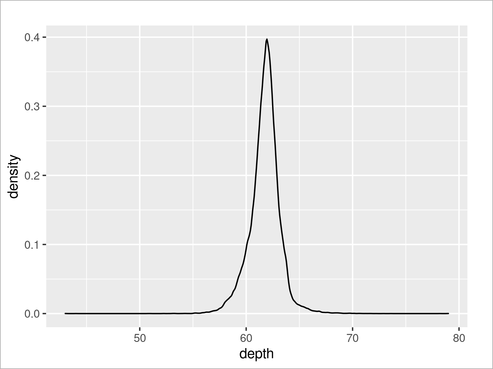
As shown in the previous Figure, the previous R programming code has created a ggplot2 density plot that reflects all our data points.
As in the case of a scatterplot, we may split our data into multiple overlaid densities.
For this, we could use the col argument as in the previous examples, or we could use the fill argument to add color below the density lines.
Consider the R code and the resulting plot below:
ggplot(diamonds,                           # Draw density plots by group
       aes(x = depth,
           fill = cut)) +
  geom_density()
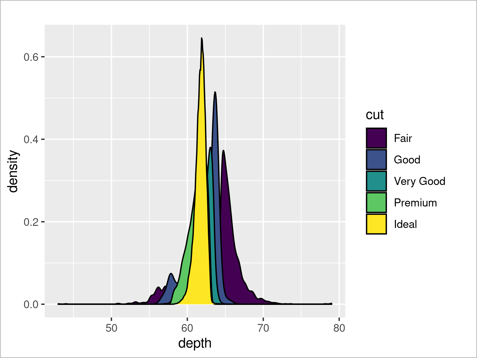
After running the previous R programming syntax, our ggplot2 plot shows multiple overlaid densities.
One problem of these plots is that the underlying densities cannot be seen anymore. For that reason, we might use the alpha argument within the geom_density function to add a certain level of opacity to our densities.
ggplot(diamonds,                           # Make densities transparent
       aes(x = depth,
           fill = cut)) +
  geom_density(alpha = 0.3)
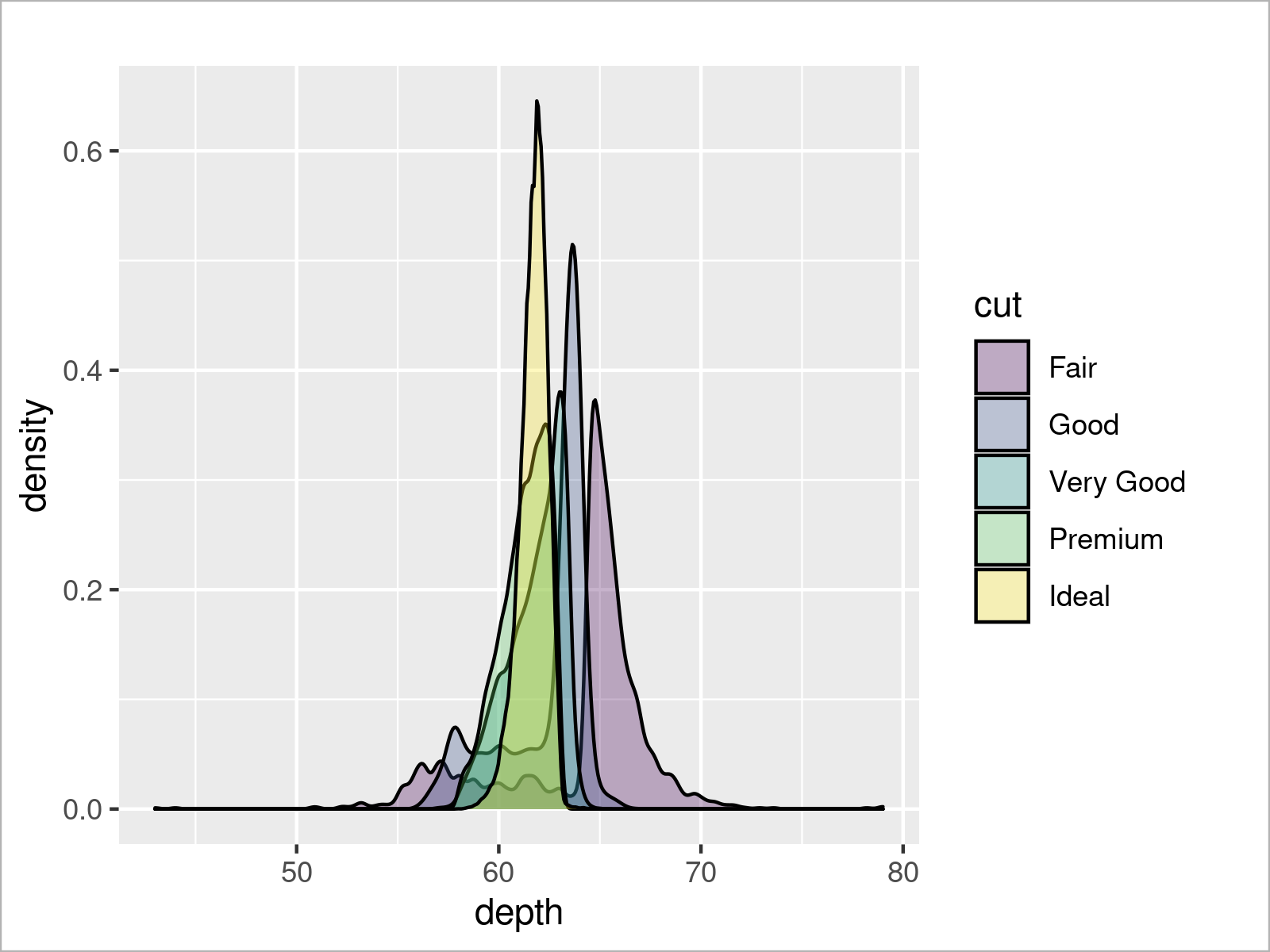
As illustrated in the previous Figure, we have drawn multiple transparent kernel densities. This allows us to interpret all the densities separately. For example, we can see that the density for the Ideal cut group is more on the left side of the depth scale than the density of the Fair cut group.
Of course, there is much more to explore about ggplot2 density plots. However, in this tutorial, I would like to move on to another very popular type of plot: ggplot2 barcharts!
ggplot2 Barplot
In this section, I will demonstrate how to draw barplots using the ggplot2 package in R.
For this, it makes sense to first calculate certain metrics that we would like to visualize. In this example, we’ll use the aggregate function to calculate the mean price for each clarity group.
Have a look at the code below:
diamonds_m_cl <- aggregate(diamonds,       # Calculate mean by groups
                           price ~ clarity,
                           mean)
diamonds_m_cl
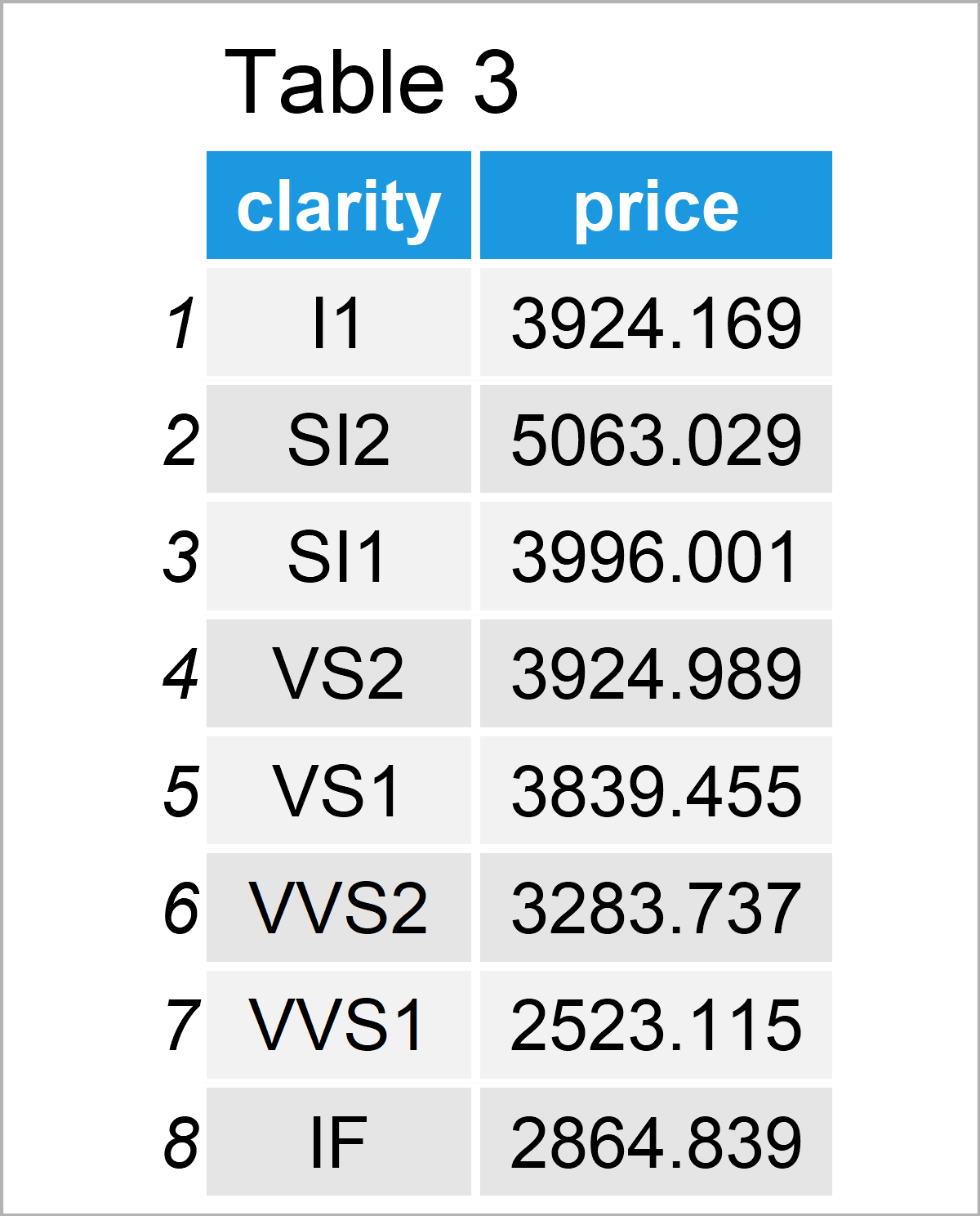
The previous Table shows our new data. It contains the mean price value for each of the clarity levels.
Now, we can use this data set and the geom_bar function to draw a ggplot2 barplot:
ggplot(diamonds_m_cl,                      # Draw barplot with mean by groups
       aes(x = clarity,
           y = price)) +
  geom_bar(stat = "identity")
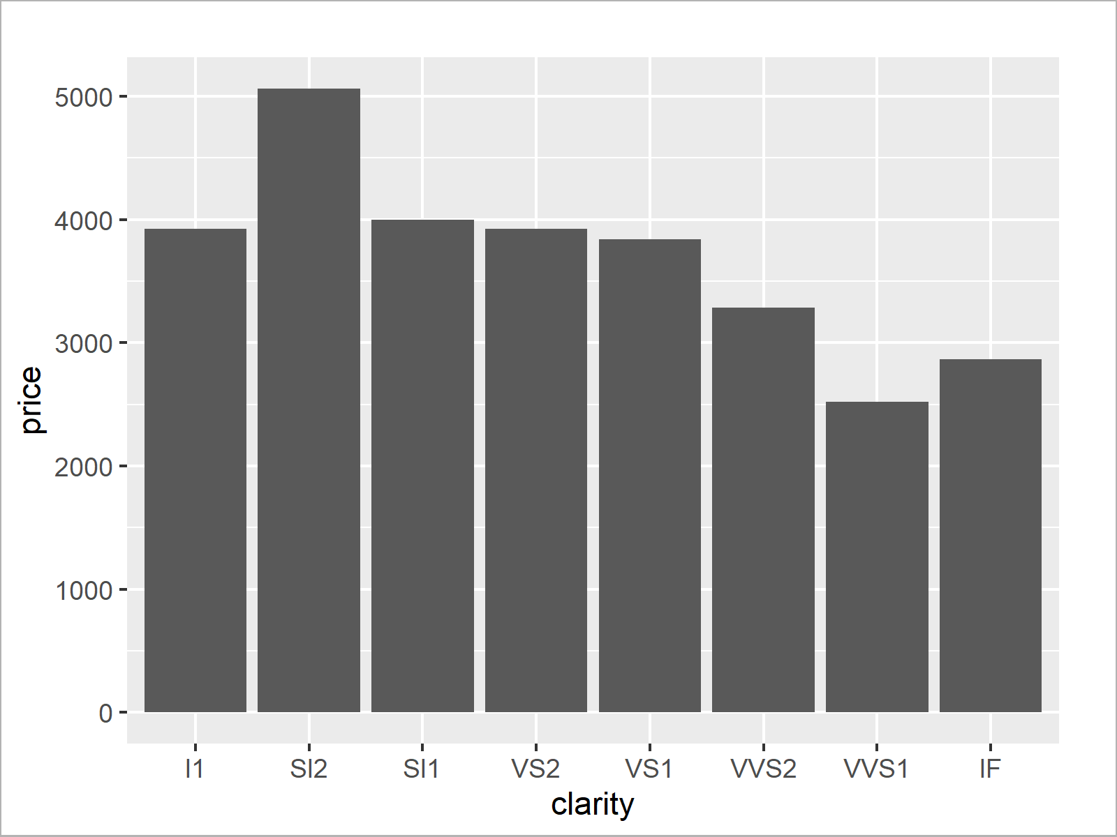
Our barchart illustrates that the clarity group SI2 has the highest average price and the clarity group VVS1 has the lowest average price.
Interesting! However, we can add even more information to our chart by creating a grouped ggplot2 barplot.
For this, we need to create another data set that contains metrics for each subgroup. In this example, we’ll calculate the mean price value for each clarity and color combination:
diamonds_m_cl_co <- aggregate(diamonds,    # Calculate mean by subgroups
                              price ~ clarity + color,
                              mean)
head(diamonds_m_cl_co)
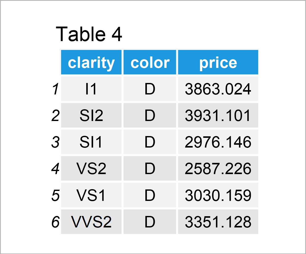
The previous table shows the first six rows of our new data set. As you can see, we have calculated the mean values by subgroups.
We can now use these data to draw a grouped bargraph. Note that we specify the color column to be equal to the fill within the aesthetics of our ggplot2 plot. Furthermore, we have to specify the position argument within the geom_bar function to be equal to “dodge” to draw a grouped instead of a stacked barchart.
ggplot(diamonds_m_cl_co,                   # Draw grouped barplot
       aes(x = clarity,
           y = price,
           fill = color)) +
  geom_bar(stat = "identity",
           position = "dodge")
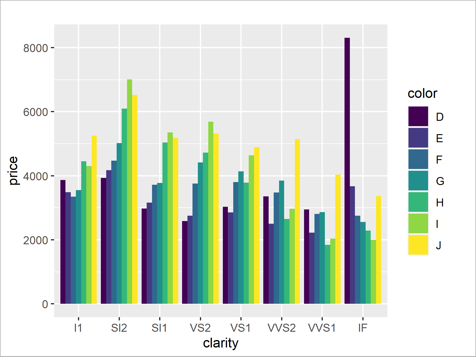
There you have it! We have created a grouped barplot that illustrates the average prices for each diamond color, separated by clarity levels.
This grouped barplot shows some interesting findings. In most of the clarity groups, the colors I and J are the most expensive. However, especially in the clarity group IF the color D is the most expensive.
That’s kind of weird, since the colors I and J are supposed to be more expensive than the color D. So let’s continue to analyze this phenomenon in another type of graph…
ggplot2 Boxplot
The following R syntax explains how to draw a boxplot using the ggplot2 library.
Since we want to continue investigating on average prices grouped by clarity and color, we use these variables to create a grouped boxplot.
As you can see below, the syntax is again very similar to the previous examples. However, this time, we use the geom_boxplot function.
ggplot(diamonds,                           # Draw grouped boxplot
       aes(x = clarity,
           y = price,
           fill = color)) +
  geom_boxplot()
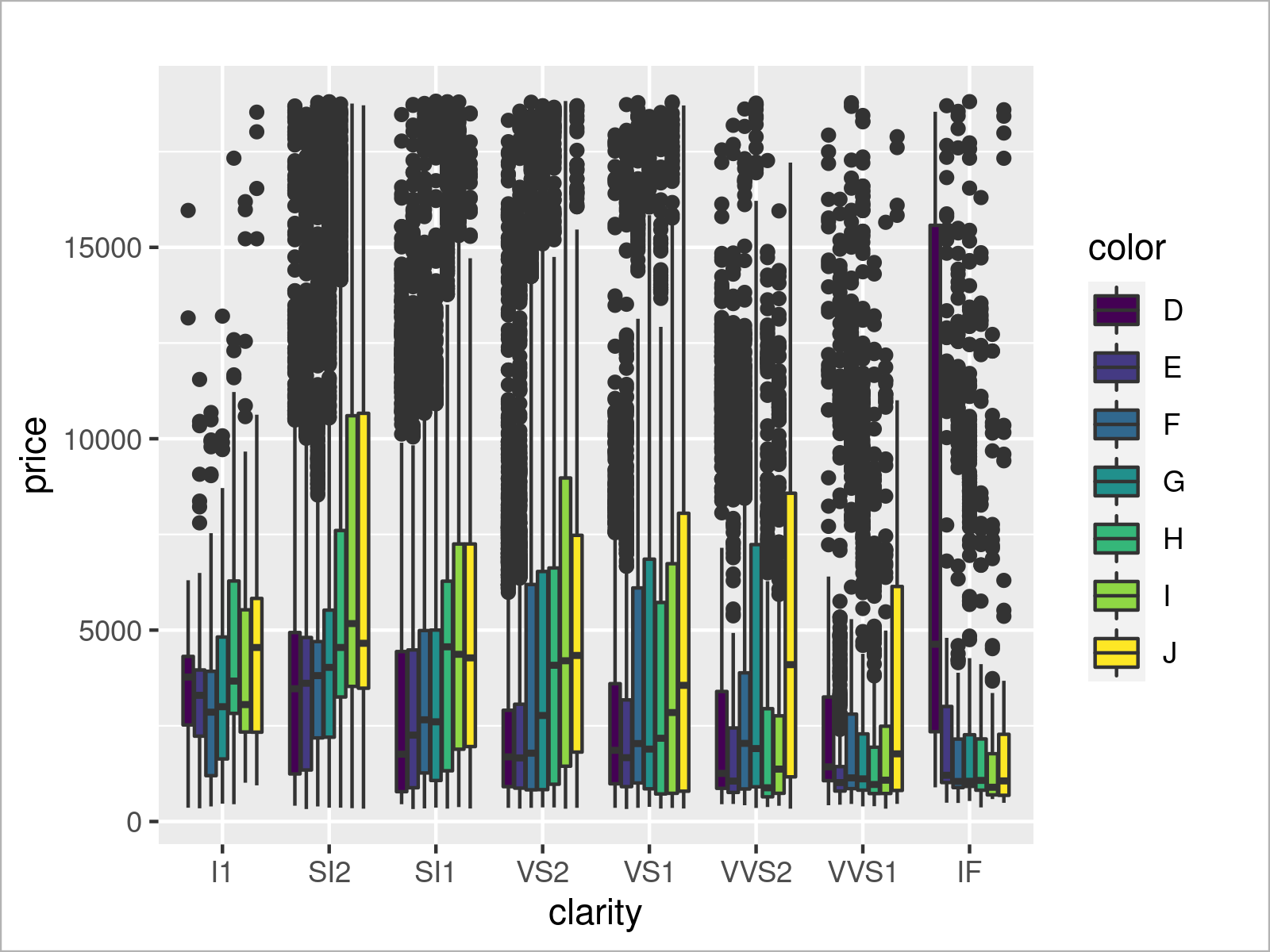
We have created a grouped boxplot that shows our subgroups side-by-side. By having a closer look at color D of the clarity group IF you can see that this specific box is very wide. This indicates a large variance in this subgroup compared to the other subgroups.
We can now use this additional information to investigate further on this subgroup…
ggplot2 Plot of Subsample
We already found out that there is something going on with the color D in the clarity group IF. For further investigations, it might make sense to create a new data set containing only this subgroup:
diamonds_D <- diamonds[diamonds$clarity == "IF" & # Extract subsample
                         diamonds$color == "D", ]
head(diamonds_D)
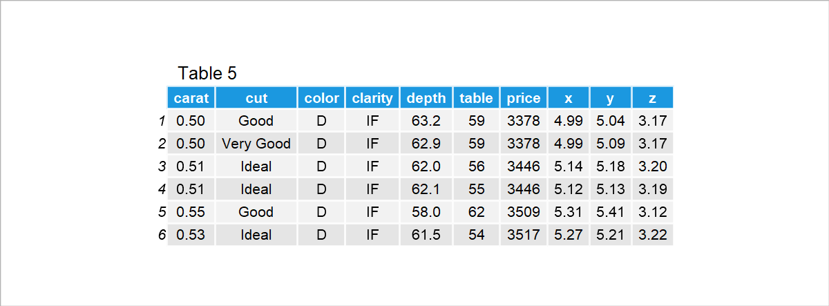
The previous Table shows the first six rows of our subsample. As you can see, it contains only the clarity group IF and the color D.
Let’s draw these data in a density plot:
ggplot(diamonds_D,                         # Draw density plot of subsample
       aes(x = price)) +
  geom_density()
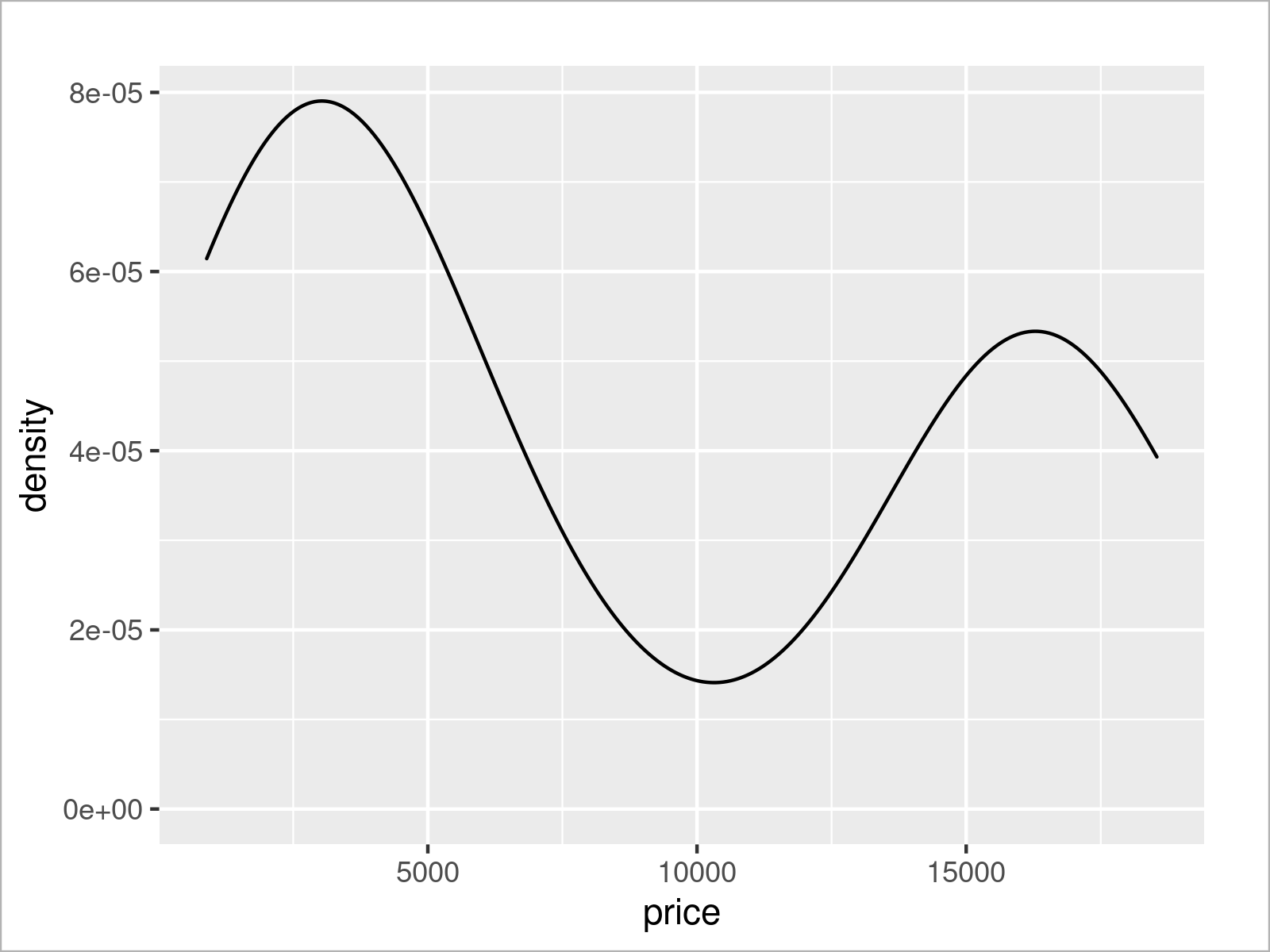
The previous graph shows that our density has two peaks – almost like if there were two mixed distributions.
Let’s have a look at our entire data set to see if we can spot anything special.
The following code prints our entire data to the RStudio console (I don’t show the console output here, since it would be too long for this page).
print(diamonds_D, n = nrow(diamonds_D)) # Print entire tibble
It seems like the carat has an enormous impact on the prices in this diamond group. Carat values greater than 1 are seemingly much more expensive.
Let’s split our data into two separate densities based on the carat values. The following syntax uses the logical operator > to create a ggplot2 density for carat values smaller than / equal to 1 as well as another density for carat values greater than 1.
ggplot(diamonds_D,                         # Draw subsample by groups
       aes(x = price,
           fill = carat > 1)) +
  geom_density(alpha = 0.5)
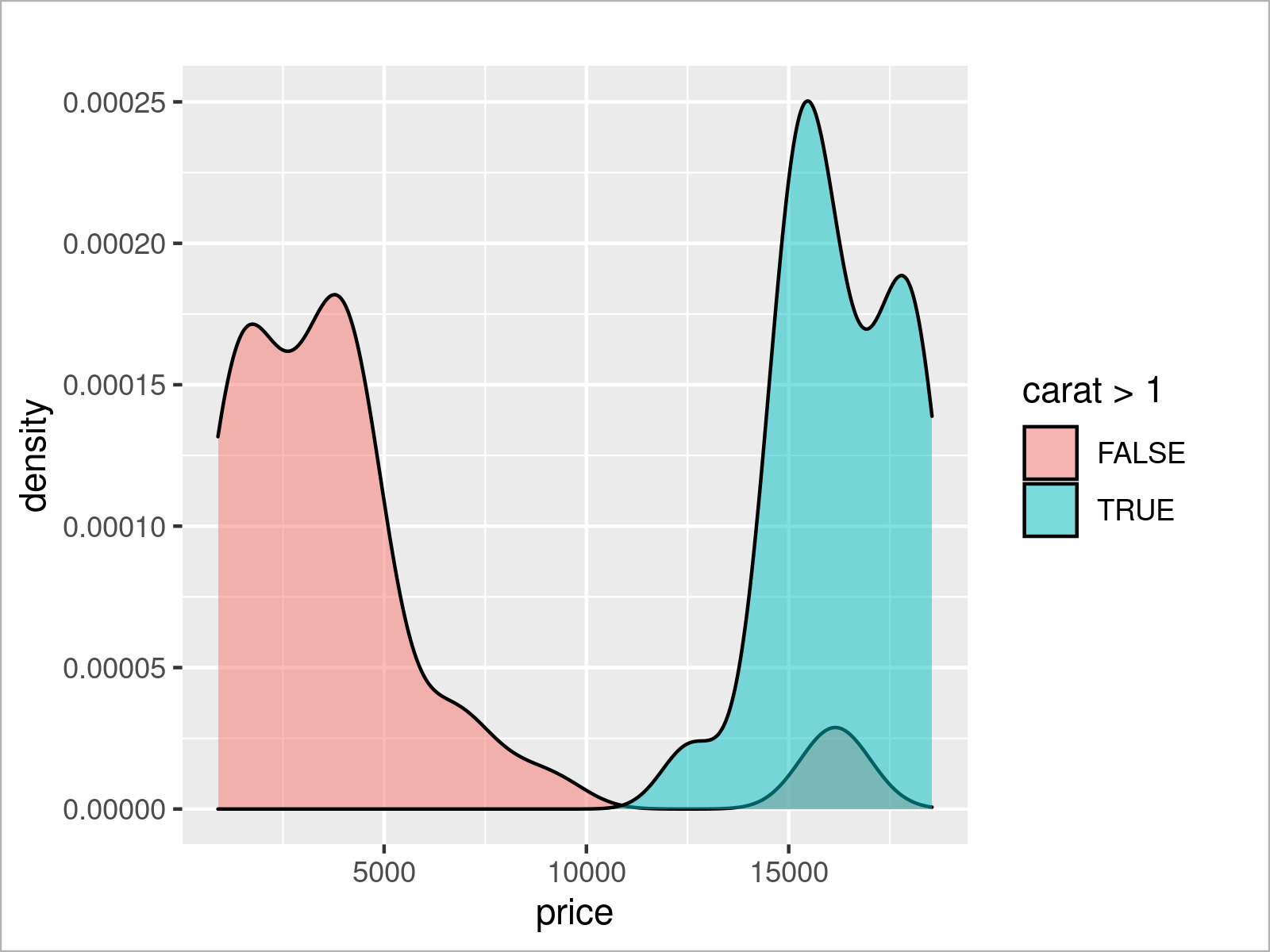
It seems like we found one of the reasons why this subgroup appeared differently in our graphics compared to other subgroups: The carat value has a massive impact on this group.
However, as you can see, there is even another strange peak in the red density. Some diamonds with low carat values are still quite expensive.
We might now use our knowledge about the ggplot2 package to investigate even further. However, I think for the sake of this demonstration, I will stop the investigations at this point.
Video & Further Resources
Do you need more explanations on the ggplot2 package in R? Then I recommend having a look at the following video on the Statistics Globe YouTube channel. I illustrate the R syntax of this tutorial in the video.
Furthermore, you might want to have a look at the related articles that I have published on this homepage. I have created a huge number of very detailed ggplot2 guidelines, which go way beyond the present ggplot2 introduction. Please have a look at the list of tutorials below:
In this R tutorial, you have learned how to create graphs using the ggplot2 library. This introduction was mainly created for beginners and intermediate programmers. Kindly note that this introduction couldn’t explain every single ggplot2 topic in detail.
Do you want to know more about other types of graphs such as histograms, heatmaps, pie, and line charts? Would you like to add text labels to your plot, or are you keen to learn more on manual font size specifications? Do you want to add marginal plots to the sides of your existing ggplot2 graph? Are you interested in the visualization of time series data? Or would you like to learn how to format and reshape your data for a certain graph?
Please tell me about it in the comments, in case you have additional questions on these topics or any other ggplot2 related task. Me and the rest of the Statistics Globe team will do our best to help you with your ggplot2 data visualizations.
Happy plotting! 🙂


