Add Count & Percentage Labels on Top of Histogram Bars in R (2 Examples)
This article shows how to draw frequencies and percentage points above each bar of a histogram in R.
Table of contents:
Sound good? Let’s get started.
Creation of Example Data
Let’s first construct some example data:
set.seed(92365)                     # Create example data
x <- rnorm(100)
head(x)                             # Print first values of data
# [1] -1.94404137 -0.28602202  1.90124067  0.05188518  0.25174766  0.23888625
The previous output of the RStudio console reveals that the example data is a numeric vector containing randomly distributed values.
Now, we can create a graphic of our data as shown below:
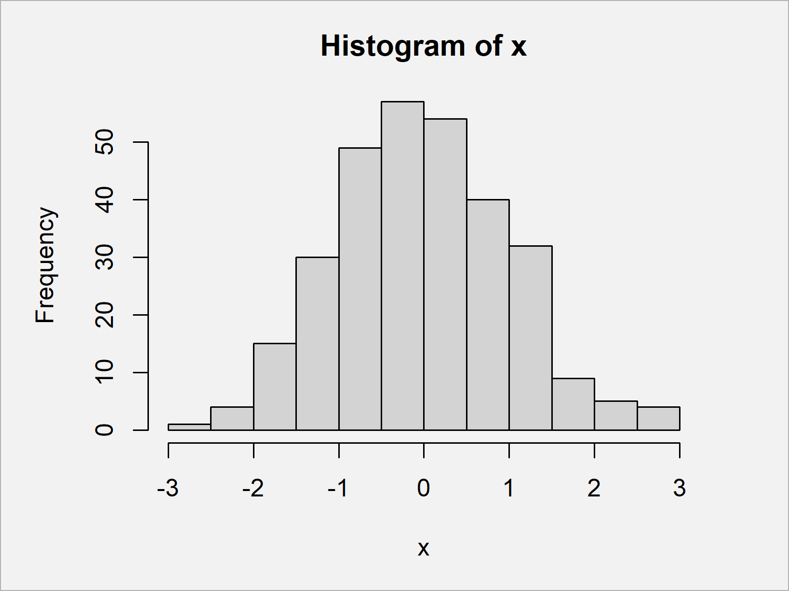
hist(x) # Draw default histogram

As visualized in Figure 1, we have created a histogram using Base R by executing the previous R programming syntax. This histogram does not show any labels on top of the bars yet.
Example 1: Add Count Labels on Top of Histogram Bars
In this example, I’ll show how to draw frequency counts on top of the bars of our histogram.
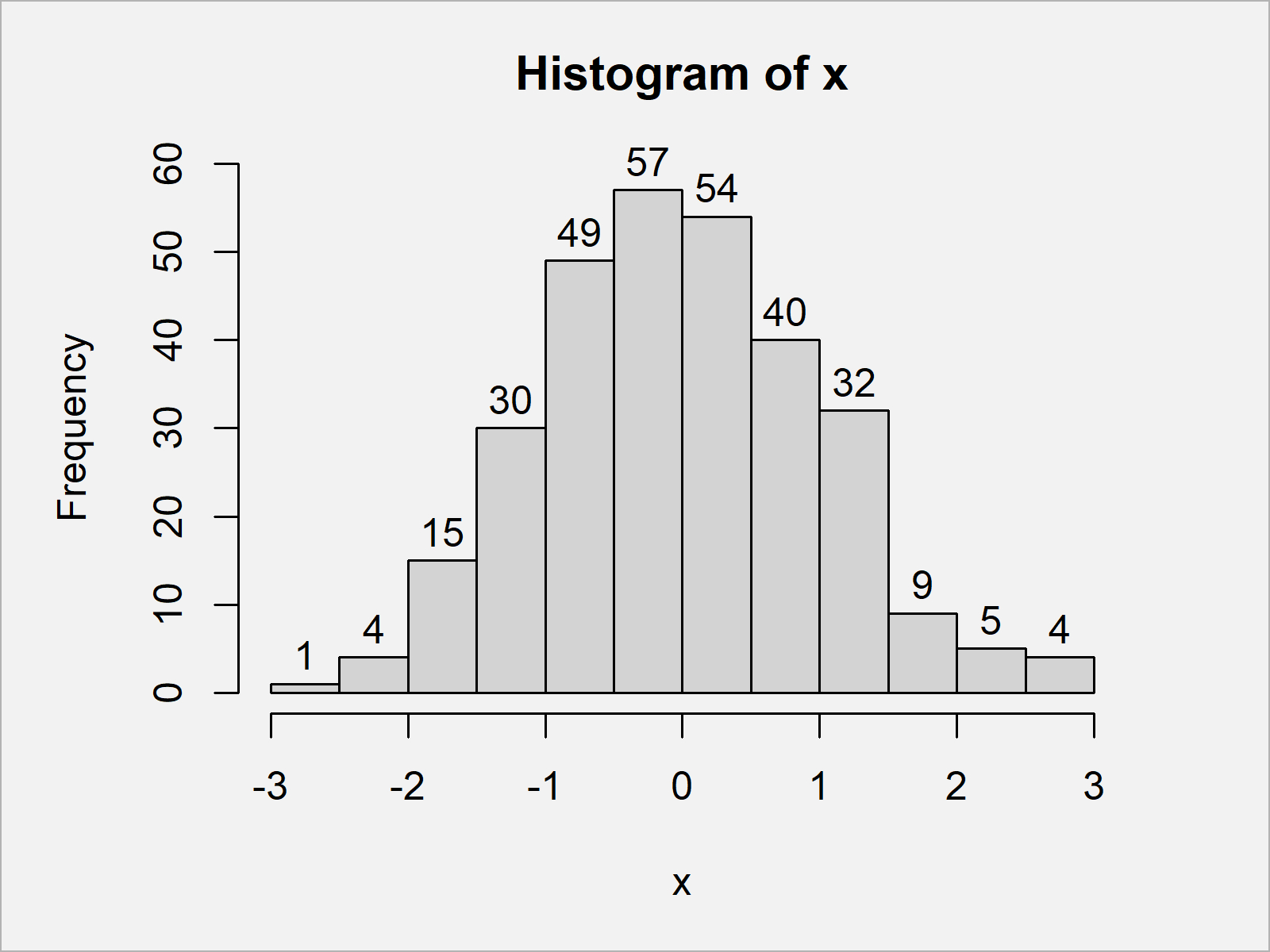
For this, we simply have to specify the labels argument within the hist function to be equal to TRUE:
hist(x,                             # Add count labels
     labels = TRUE)

In Figure 2 it is shown that we have plotted a Base R histogram with frequency count labels on top of the bars.
Example 2: Add Percentage Labels on Top of Histogram Bars
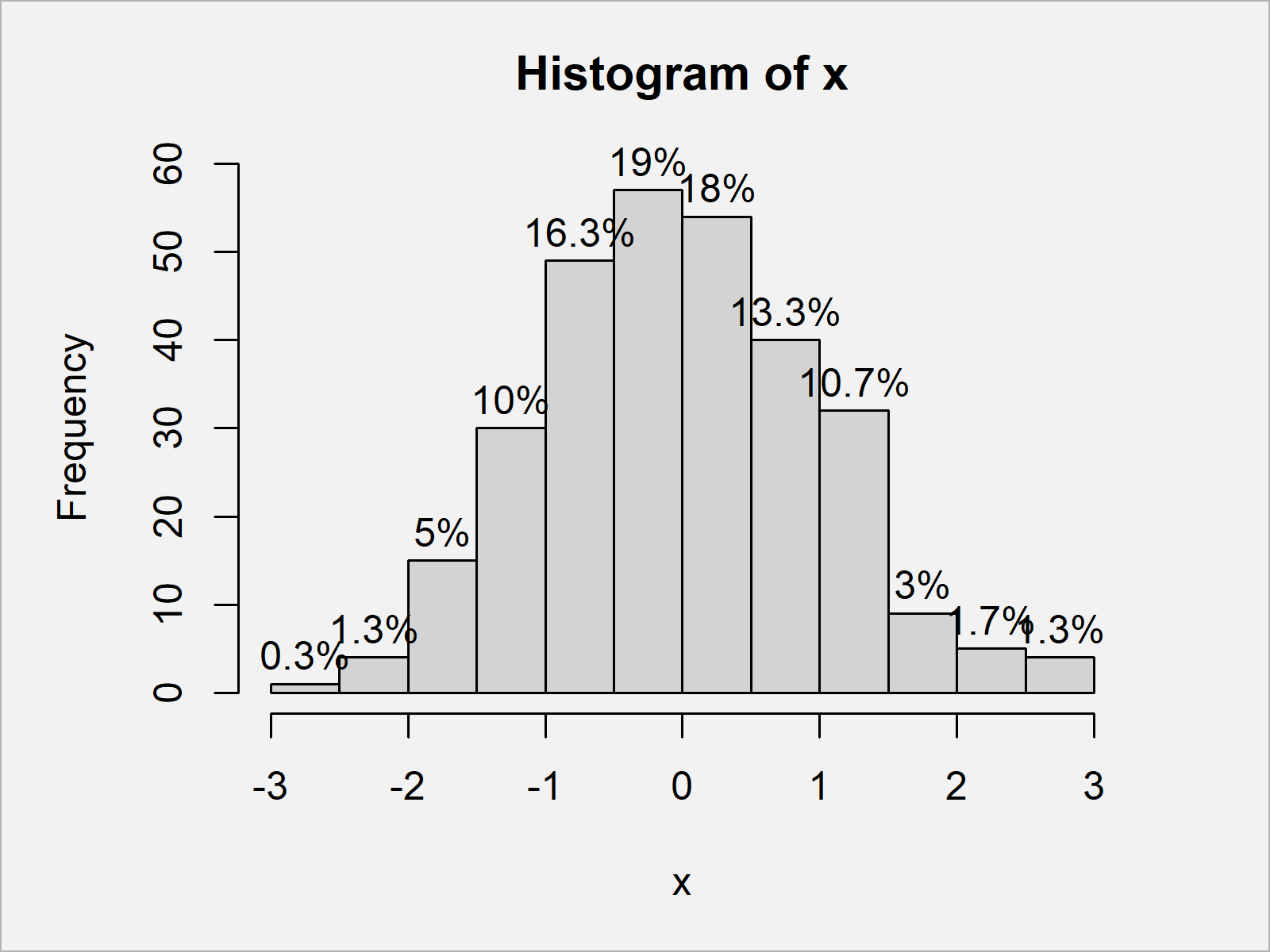
In this example, I’ll illustrate how to display the labels on top of a histogram in percentage points.
Have a look at the following R code:
hist(x,                             # Add percentage labels
     labels = paste0(round(hist(x, plot = FALSE)$counts / length(x) * 100, 1), "%"))

In Figure 3 it is shown that we have created a histogram with percentage points over the bars.
The R syntax of this example might look a bit complicated. However, you can just copy and paste the R code shown here and use it for your own application.
Video, Further Resources & Summary
Have a look at the following video of my YouTube channel. In the video, I’m showing the R syntax of this article in RStudio:
Furthermore, you might read the other tutorials of this website:
- Draw Histogram with Percentages Instead of Frequency Counts
- Add Count Labels on Top of ggplot2 Barchart
- Drawing Plots in R
- Introduction to R
In this R tutorial you have learned how to show counts and percentages in histograms. Let me know in the comments, in case you have additional questions.
Subscribe to the Statistics Globe Newsletter
Get regular updates on the latest tutorials, offers & news at Statistics Globe.
I hate spam & you may opt out anytime: Privacy Policy.
Thank you!
Welcome to the Statistics Globe newsletter. From now on, I’ll send you regular emails about statistics, data science, AI, and programming with R and Python.
I’m Joachim Schork. On this website, I provide statistics tutorials as well as code in Python and R programming.
Statistics Globe Newsletter
Get regular updates on the latest tutorials, offers & news at Statistics Globe. I hate spam & you may opt out anytime: Privacy Policy.
Thank you!
Please check your email inbox and click the confirmation link to complete your subscription. If you don’t see the email within a few minutes, please also check your spam/junk folder.


2 Comments. Leave new
muito bommmm, mas gostaria de ver mas sobre gráfico de barra….principalmente como adicionar os nomes de forma inclinado em baixo das barras….
desde já agradeço!!!
Hey Manoel,
I don’t speak Portuguese, so I’m uncertain if I got your question correctly. However, I assume you are looking for this? https://statisticsglobe.com/change-axis-labels-of-boxplot-in-r
Regards,
Joachim