Draw Multiple Graphs & Lines in Same Plot in R (Example)
This article shows how to draw several graphs in the same plot window in the R programming language.
The R tutorial is structured as follows:
- Step 1: Draw Plot in R
- Step 2: Overlay Second Plot
- Step 3: Draw Overlaying Line to Plot
- Video & Further Resources
Let’s move on to the example code!
Step 1: Draw Plot in R
First, we are going to draw a basic scatterplot in R. Let’s create some random data:
set.seed(2525)                             # Set seed for reproducibility
x1 <- rnorm(1000)                          # Normally distributed x1
y1 <- x1 + rnorm(1000)                     # Correlated y1
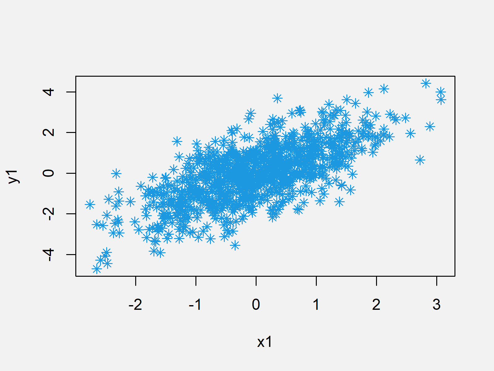
With the following programming code, we can draw a scatterplot in R:
plot(x1, y1, col = "#1b98e0", pch = 8) # Plot scatterplot of x1 & y1

Figure 1: Scatterplot in R.
In the next step, we will plot a second graph to the same plot window. So keep on reading…
Step 2: Overlay Second Plot
Consider the following example data:
x2 <- runif(200, -1, 2)                    # Uniformly distributed x2
y2 <- - x2 + runif(200)                    # Correlated y2
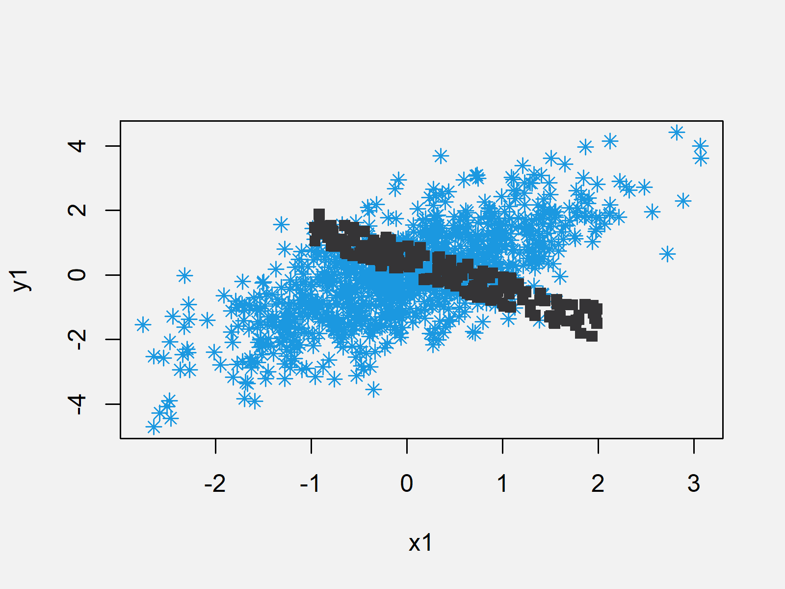
We can combine our new example data with our plot that we created in Step 1 as follows:
points(x2, y2, col = "#353436", pch = 15) # Overlaying scatterplot of x2 & y2

Figure 2: Add Second Graph to Plot.
Note: The R syntax in Step 2 is the same as in Step 1, besides the R function that we used: In Step 1 we used the function plot(); and in Step 2 we used the function points().
Step 3: Draw Overlaying Line to Plot
We can also mix our original graphic with a line (or multiple lines). Let’s create some more data:
x3 <- c(0, 2.5, -1, 0)                     # Some points on x-axis
y3 <- c(0, 4, 2, -3)                       # Some points on y-axis
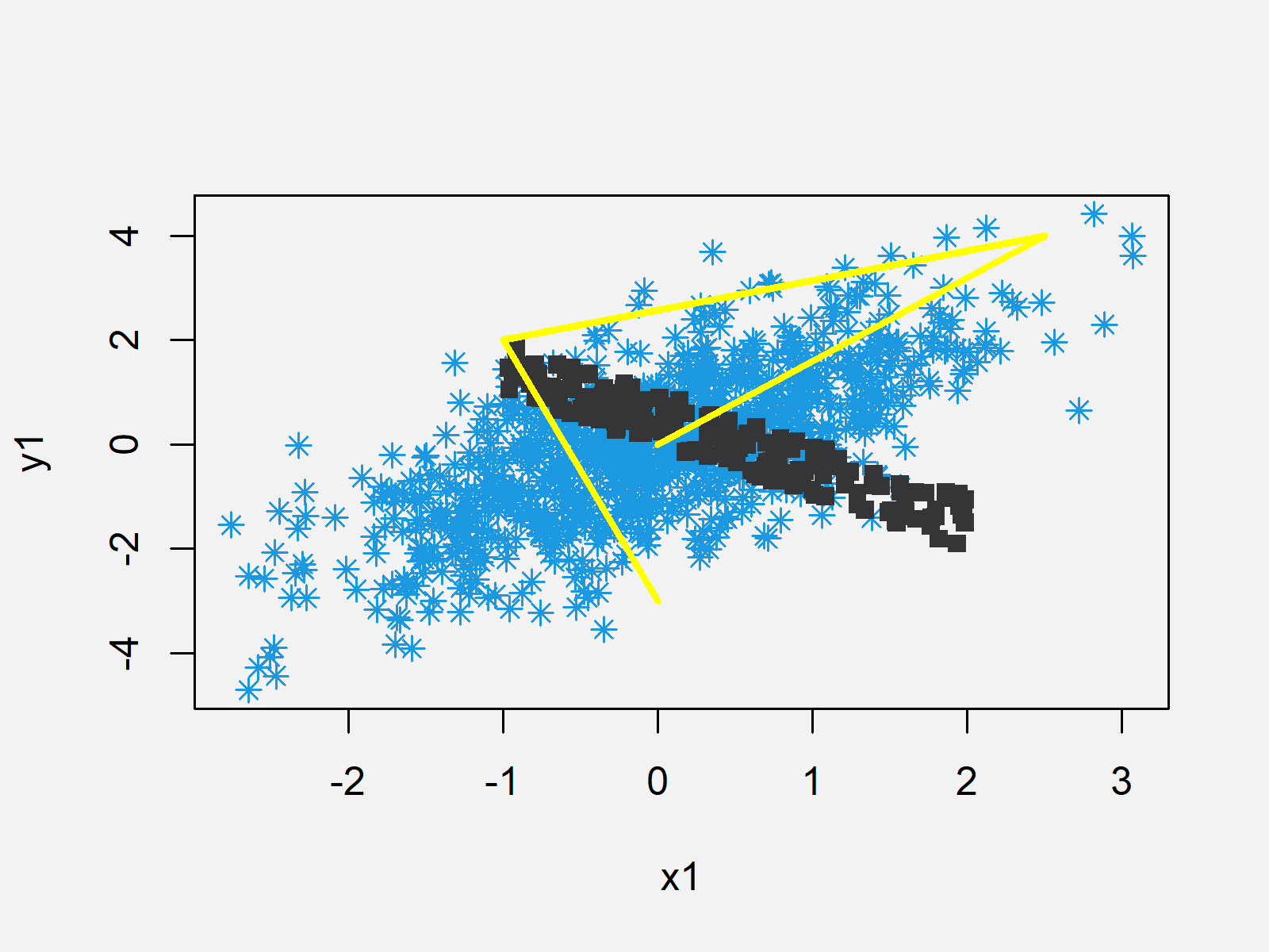
Now, we can use the lines() function to add a line to our previously created plot:
lines(x3, y3, col = "yellow", lwd = 3) # Overlaying line

Figure 3: Add Line to Plot in R.
Note: In this example, we used scatterplots and solid lines. However, we could apply the same principles to other plots and graphics (e.g. barplot, boxplot, density plot, histogram, QQplot, and so on…).
Video & Further Resources
I have recorded a video that describes the example of this tutorial in some more detail. Click below to have a look at the video:
Do you want to learn even more about plots in R? Then I can recommend to have a look at the following ultimate graphics cheat sheet that I have created on my website:
Furthermore, you could have a look at some related tutorials that I have published on my website:
In summary: In this tutorial, you have learned to plot two graphs and a line in the same plot. Keep in mind the points and the lines functions, since they are the basement for the drawing of several graphics to one plot panel. If you have further questions, please let me know in the comments section below.
Subscribe to the Statistics Globe Newsletter
Get regular updates on the latest tutorials, offers & news at Statistics Globe.
I hate spam & you may opt out anytime: Privacy Policy.
Thank you!
Welcome to the Statistics Globe newsletter. From now on, I’ll send you regular emails about statistics, data science, AI, and programming with R and Python.
I’m Joachim Schork. On this website, I provide statistics tutorials as well as code in Python and R programming.
Statistics Globe Newsletter
Get regular updates on the latest tutorials, offers & news at Statistics Globe. I hate spam & you may opt out anytime: Privacy Policy.
Thank you!
Please check your email inbox and click the confirmation link to complete your subscription. If you don’t see the email within a few minutes, please also check your spam/junk folder.


