Plot Data in R (8 Examples) | plot() Function
This tutorial explains how to use the plot() function in the R programming language.
The page consists of these topics:
- Creating Example Data
- Example 1: Basic Application of plot() Function in R
- Example 2: Add Regression Line to Scatterplot
- Example 3: Draw a Density Plot in R
- Example 4: Plot Multiple Densities in Same Plot
- Example 5: Modify Main Title & Axis Labels
- Example 6: Plot with Colors & PCH According to Group
- Example 7: Add Legend to Plot
- Example 8: Plot a Function in R
- Video, Further Resources & Summary
Here’s how to do it.
Creating Example Data
First, we need to create some example data that we can use in the examples later on:
set.seed(1919)                                 # Create example data
x1 <- rnorm(1000)
y1 <- x1 + rnorm(1000)
Our example data contains of two numeric vectors x and y. Now, let’s plot these data!
Example 1: Basic Application of plot() Function in R
In the first example, we’ll create a graphic with default specifications of the plot function. We simply need to specify our x- and y-values separated by a comma:
plot(x1, y1) # Apply plot function
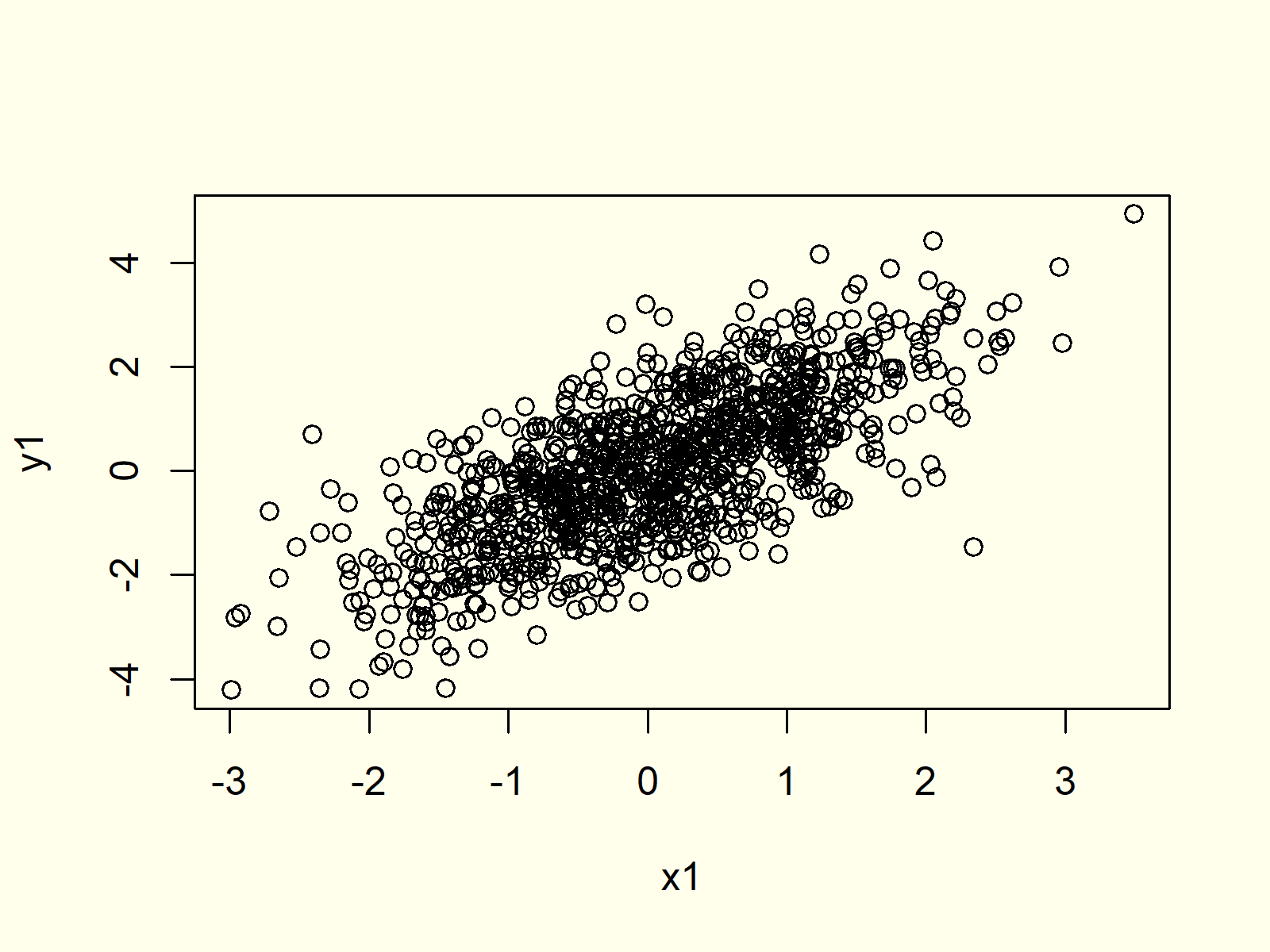
Figure 1: Basic Application of plot Function in R.
Figure 1 shows the output of the plot function: A scatterplot of our two vectors.
Example 2: Add Regression Line to Scatterplot
We can also draw a regression line to our scatterplot by using the abline and lm R functions:
plot(x1, y1)                                   # Apply plot function
abline(lm(y1 ~ x1), col = "red")               # Draw regression line
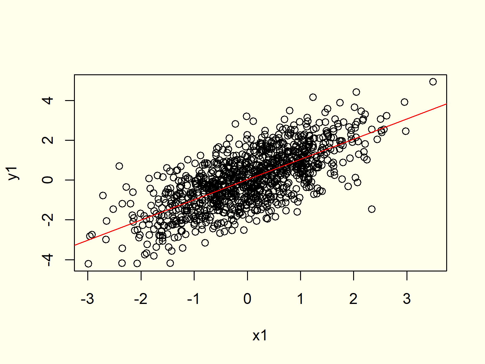
Figure 2: Draw Regression Line in R Plot.
Figure 2 shows the same scatterplot as Figure 1, but this time a regression line was added.
Example 3: Draw a Density Plot in R
In combination with the density() function, the plot function can be used to create a probability density plot in R:
plot(density(x1)) # Plot density
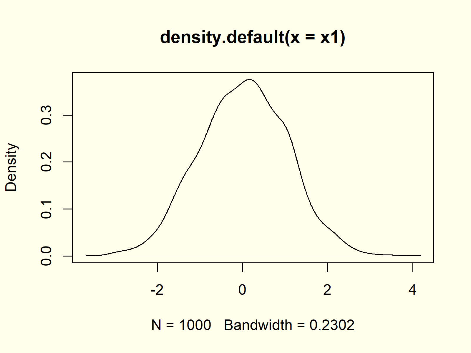
Figure 3: Density Plot in R.
Figure 3 shows that our variable x is following a normal distribution. The small peaks in the density are due to randomness during the data creation process.
Example 4: Plot Multiple Densities in Same Plot
If we replace the plot() function with the lines() function, we can add a second density to our previously created kernel density plot. Have a look at the following R code:
plot(density(x1))                              # Plot multiple densities
lines(density(y1), col = "red")
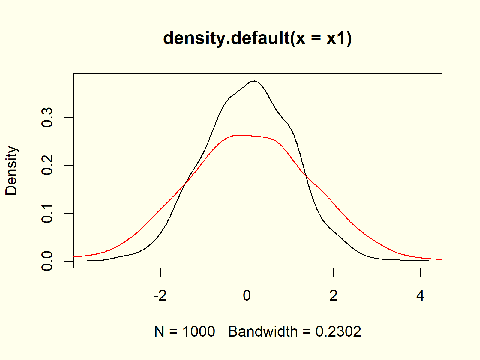
Figure 4: Multiple Densities in Same Plot.
Figure 4 contains multiple normally distributed densities, i.e. the densities of our x and y variables.
Example 5: Modify Main Title & Axis Labels
The plot function provides many arguments for the modification of its parameters. For instance, we can change the main title and the axis labels of our plot as follows:
plot(x1, y1,                                   # Modify title and axis labels
     main = "This is my Plot",
     xlab = "X-Values",
     ylab = "Y-Values")
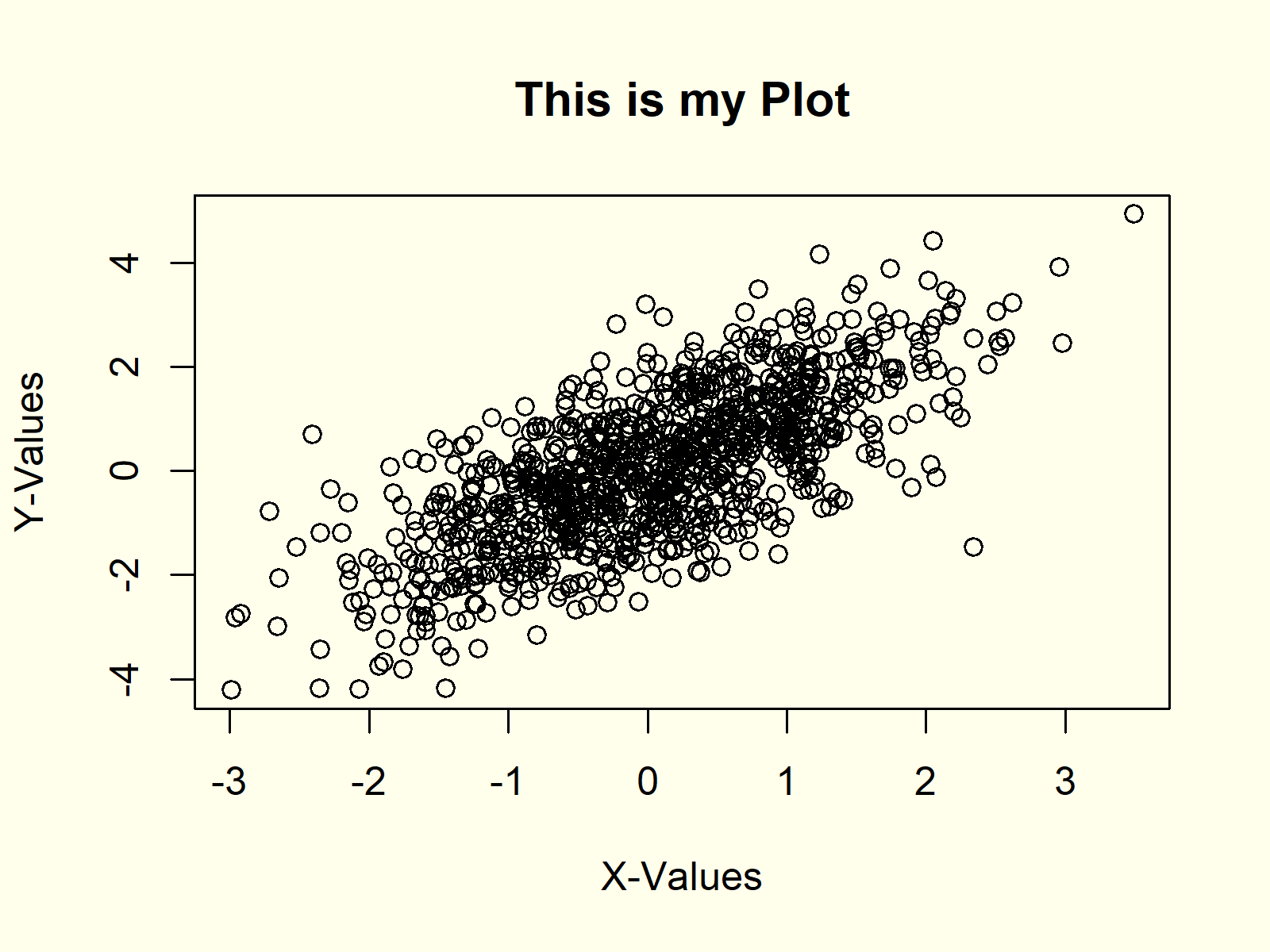
Figure 5: Modification of Main Title & Axis Labels.
Have a look at the help documentation of the plot function to find all the provided arguments and options.
Example 6: Plot with Colors & PCH According to Group
We can also represent different groups in our graph. First, we need to create a group indicator:
group <- rbinom(1000, 1, 0.3) + 1 # Create group variable
Now, we can use this grouping variable to assign colors and different symbols to each group:
plot(x1, y1,                                   # Create plot with groups
     main = "This is my Plot",
     xlab = "X-Values",
     ylab = "Y-Values",
     col = group,
     pch = group)
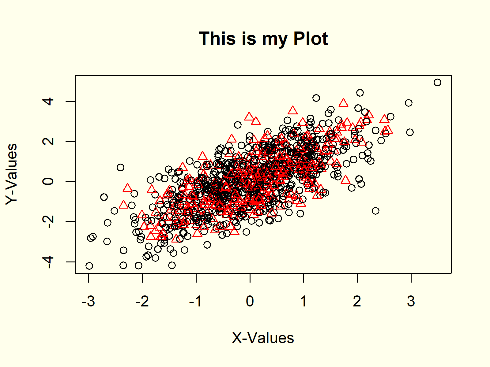
Figure 6: Add Grouping Variable.
As you can see in Figure 6, the first group is colored in black and its symbols are round dots. The second group, in contrast, is represented by red triangles.
Example 7: Add Legend to Plot
Whenever we show groups in a graphic, diagram or chart in R, we should add a legend to our plot. First, we need to create our plot as shown before:
plot(x1, y1,                                   # Create plot with groups
     main = "This is my Plot",
     xlab = "X-Values",
     ylab = "Y-Values",
     col = group,
     pch = group)
And then we can use the legend command to draw a legend representing our groups to the plot:
legend("topleft",                              # Add legend to plot
       legend = c("Group 1", "Group 2"),
       col = 1:2,
       pch = 1:2)
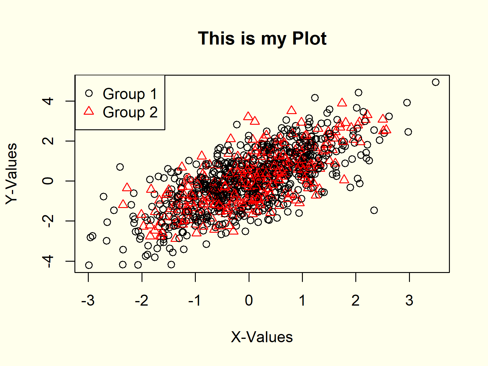
Figure 7: How to Draw a Legend to a Plot.
Example 8: Plot a Function in R
The plot() function also allows to draw a function in R. Let’s assume that we want to draw the cos function in R. Then we first need to create a sequence of x-values…
x2 <- seq(- 5, 5, 0.01) # Create sequence
…then we need to apply the cos function to this sequence…
y2 <- cos(x2) # Cosinus of sequence
…and finally we can plot the function as follows:
plot(x2, y2) # Plot a function in R
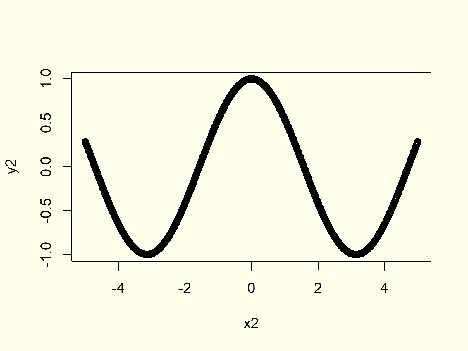
Figure 8: Plot a Function in R.
Of cause, we could modify this plot with different line types, colors, axis labels etc. as partly shown in the examples before.
Video, Further Resources & Summary
If you need further explanations on the R programming syntax of this article, you might want to watch the following video of my YouTube channel. I explain the R code of this article in the video.
In addition, you might have a look at the related posts on this website. Some other articles are shown below:
- Increase Font Size in Base R Plot
- Remove Axis Values of Plot in Base R
- Rotate Axis Labels of Base R Plot
- abline Function in R
- Draw Legend Outside of Plot Area in Base R Graphic
- Probability Distributions in R
- R Graphics Gallery
- R Functions List (+ Examples)
- The R Programming Language
To summarize: This tutorial illustrated how to make xy-plots and line graphs in R. Don’t hesitate to let me know in the comments, if you have additional comments and/or questions.


8 Comments. Leave new
Nice intro!
Thanks Philip!
Great and so nice work dear
Thanks a lot for the kind words Kalim! 🙂
what a incridible web, thank a lot for made this
Hey Sayed,
Thank you very much for the very kind words! Glad you like my tutorials!
Regards,
Joachim
If it’s a possible please add some beautiful charts like boxplot with jitter
Hello Shokhrukh,
You can check the third example of our tutorial The jitter R Function, if you are interested in plotting boxplots with jitter.
Regards,
Cansu