Normal Distribution in R (5 Examples) | dnorm, pnorm, qnorm & rnorm Functions
In this tutorial I’ll introduce you to the normal distribution functions in the R programming language.
Table of contents:
- Example 1: Normally Distributed Density (dnorm Function)
- Example 2: Distribution Function (pnorm Function)
- Example 3: Quantile Function (qnorm Function)
- Example 4: Random Number Generation (rnorm Function)
- Example 5: Modify Mean & Standard Deviation
- Video, Further Resources & Summary
Let’s dive right in:
Example 1: Normally Distributed Density (dnorm Function)
The dnorm function returns the probability distribution for a given mean and standard deviation.
In order to apply the dnorm function, we first need to specify all values for which we want to return the probability:
x_dnorm <- seq(- 5, 5, by = 0.05) # Specify x-values for dnorm function
Then, we can apply the dnorm function as follows:
y_dnorm <- dnorm(x_dnorm) # Apply dnorm function
The probabilities are stored in the data object y_dnorm. We can plot these probabilities with the plot function:
plot(y_dnorm) # Plot dnorm values
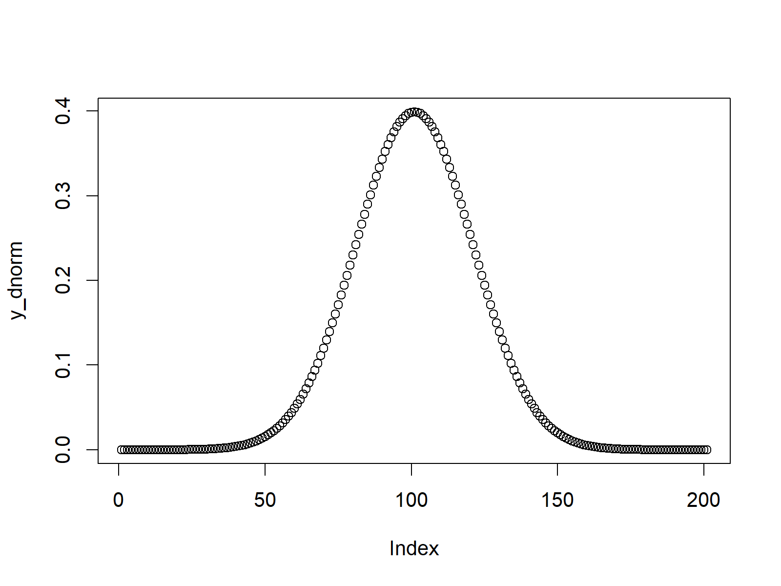
Figure 1: Normally Distributed Density Plot.
Figure 1 shows a plot of the values returned by dnorm. As you can see the values are distributed according to a normal distribution.
Example 2: Distribution Function (pnorm Function)
Similar to Example 1, we can use the pnorm R function to return the distribution function (also called Cumulative Distribution Function or CDF).
As in Example 1, we first need to create a sequence of x-values for which we want to return the corresponding values of the distribution function:
x_pnorm <- seq(- 5, 5, by = 0.05) # Specify x-values for pnorm function
We then can apply the pnorm function as follows:
y_pnorm <- pnorm(x_pnorm) # Apply pnorm function
Based on the plot function, we can illustrate the output of the pnorm function:
plot(y_pnorm) # Plot pnorm values
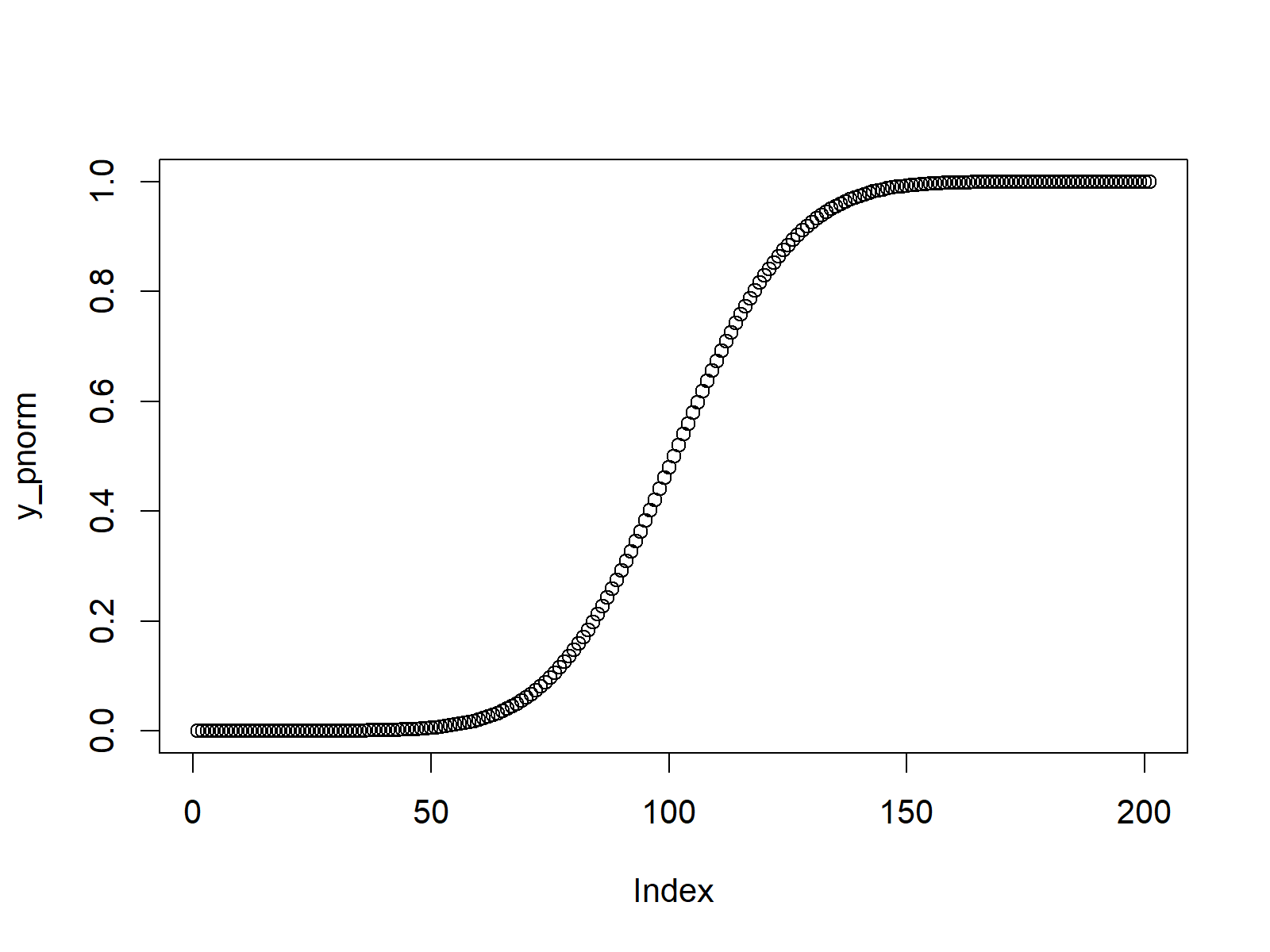
Figure 2: Probability of Normally Distributed Random Number.
Example 3: Quantile Function (qnorm Function)
R provides the qnorm command to get the quantile function (i.e. the inverse of the CDF that was shown in Example 2).
Again, we need to specify some input values first. This time the values need to be in the range between 0 and 1:
x_qnorm <- seq(0, 1, by = 0.005) # Specify x-values for qnorm function
The qnorm function is the applied in R as follows:
y_qnorm <- qnorm(x_qnorm) # Apply qnorm function
The returned values can be drawn with the plot function as follows:
plot(y_qnorm) # Plot qnorm values
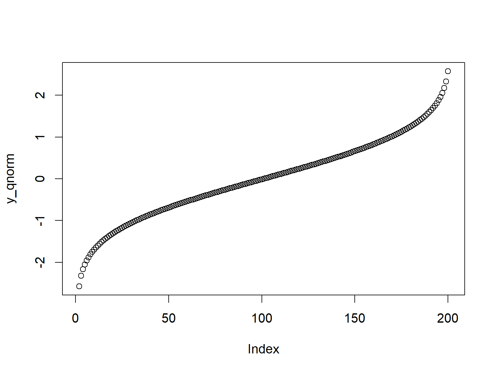
Figure 3: The Quantile Function.
Example 4: Random Number Generation (rnorm Function)
In case we want to generate random numbers according to the normal distribution, we can use the rnorm function in R.
First, we need to set a seed to ensure that our example is reproducible…
set.seed(13579) # Set seed for reproducibility
…and then we need to specify the amount of random numbers that we want to draw:
N <- 10000 # Specify sample size
Now, we can apply the rnorm function in order to draw N (i.e. 10000) random numbers:
y_rnorm <- rnorm(N)                                  # Draw N normally distributed values
y_rnorm                                              # Print values to RStudio console
# -1.234715493 -1.252833873 -0.254778031 -1.526646627  1.097114685  2.488744223  0.779480260  0.188375005 -1.026445945...
We can also create a scatterplot of these randomly generated numbers:
plot(y_rnorm) # Plot pnorm values
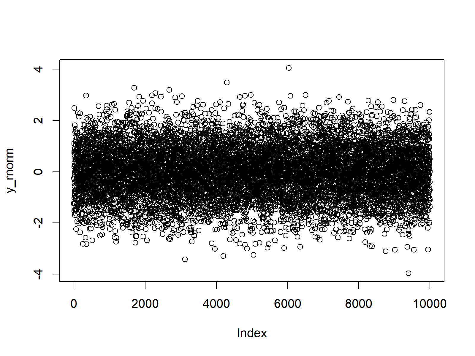
Figure 4: Random Numbers Drawn from the Normal Distribution.
Figure 4 shows that our random numbers are centred around a mean of 0 and have a range from approximately -4 to +4.
An even better way to visualize our random data is provides by a combination of the plot and density R functions:
plot(density(y_rnorm)) # Plot density of pnorm values
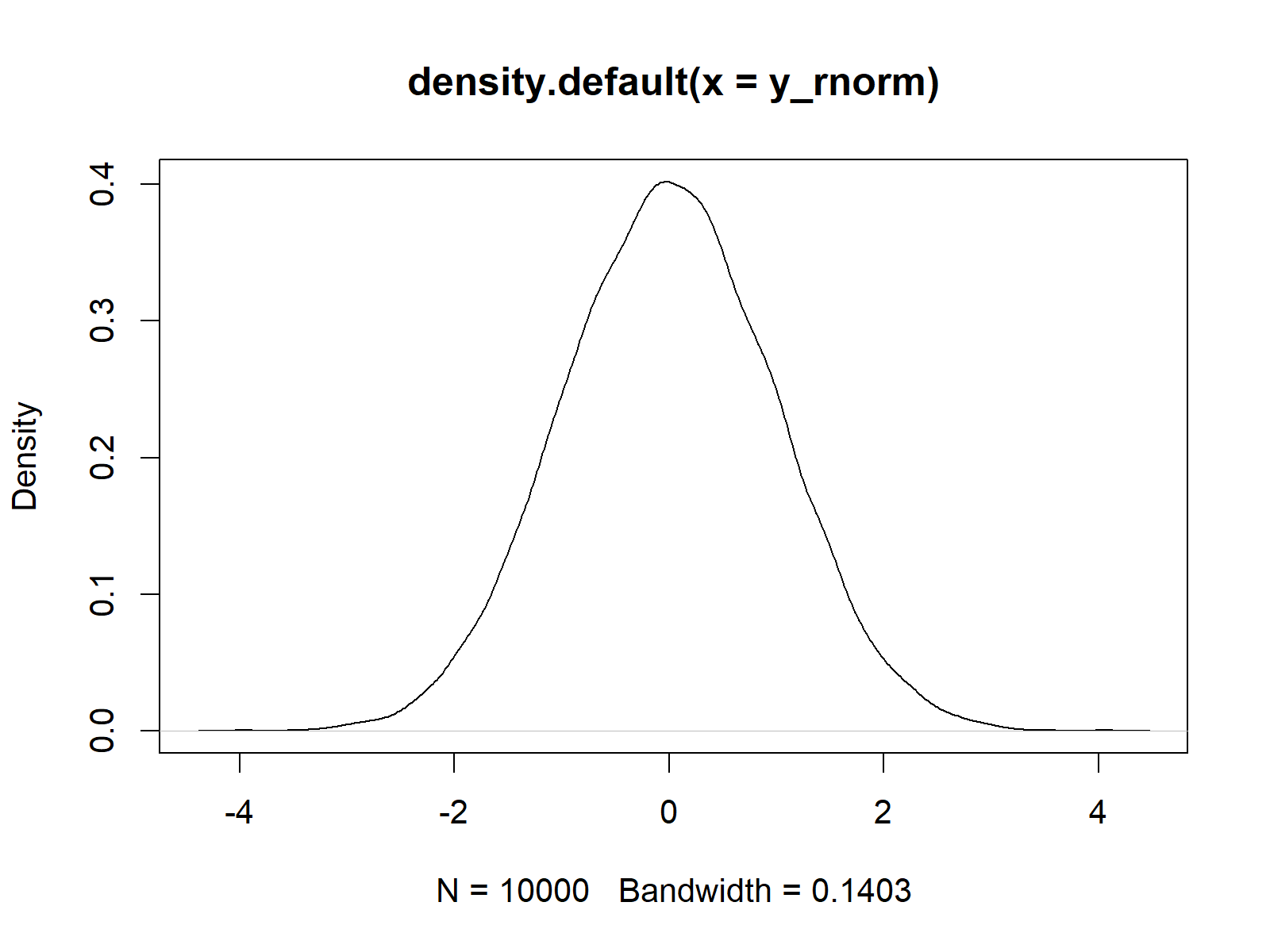
Figure 5: Density Plot of Normally Distributed Random Numbers.
In Figure 5 you can see that our random numbers are almost perfectly distributed according to the standard normal distribution. The slight peaks of the density are due to randomness.
Change the seed that we set in the beginning. You will see that the output varies a little bit.
Example 5: Modify Mean & Standard Deviation
So far, we have only used the default specifications of the mean and standard deviation of the norm functions. However, it is also possible to modify the mean and the standard deviation within all of the norm functions.
Let’s illustrate that based on the rnorm function. First, we can modify the mean to be equal to 2 (instead of the default of 0)…
y_rnorm2 <- rnorm(N, mean = 2) # Modify mean
…and then we can draw another set of random values where we specify the mean to be equal to 2 and the standard deviation to be equal to 3 (instead of the default value of 1):
y_rnorm3 <- rnorm(N, mean = 2, sd = 3) # Modify standard deviation
Now, we can draw our three vectors of random values to a graph with multiple plots:
plot(density(y_rnorm),                               # Plot default density
     xlim = c(- 10, 10),
     main = "Normal Distribution in R")
lines(density(y_rnorm2), col = "coral2")             # Plot density with higher mean
lines(density(y_rnorm3), col = "green3")             # Plot density with higher sd
legend("topleft",                                    # Add legend to density
       legend = c("Mean = 0; SD = 1",
                  "Mean = 2; SD = 1",
                  "Mean = 2; SD = 3"),
       col = c("black", "coral2", "green3"),
       lty = 1)
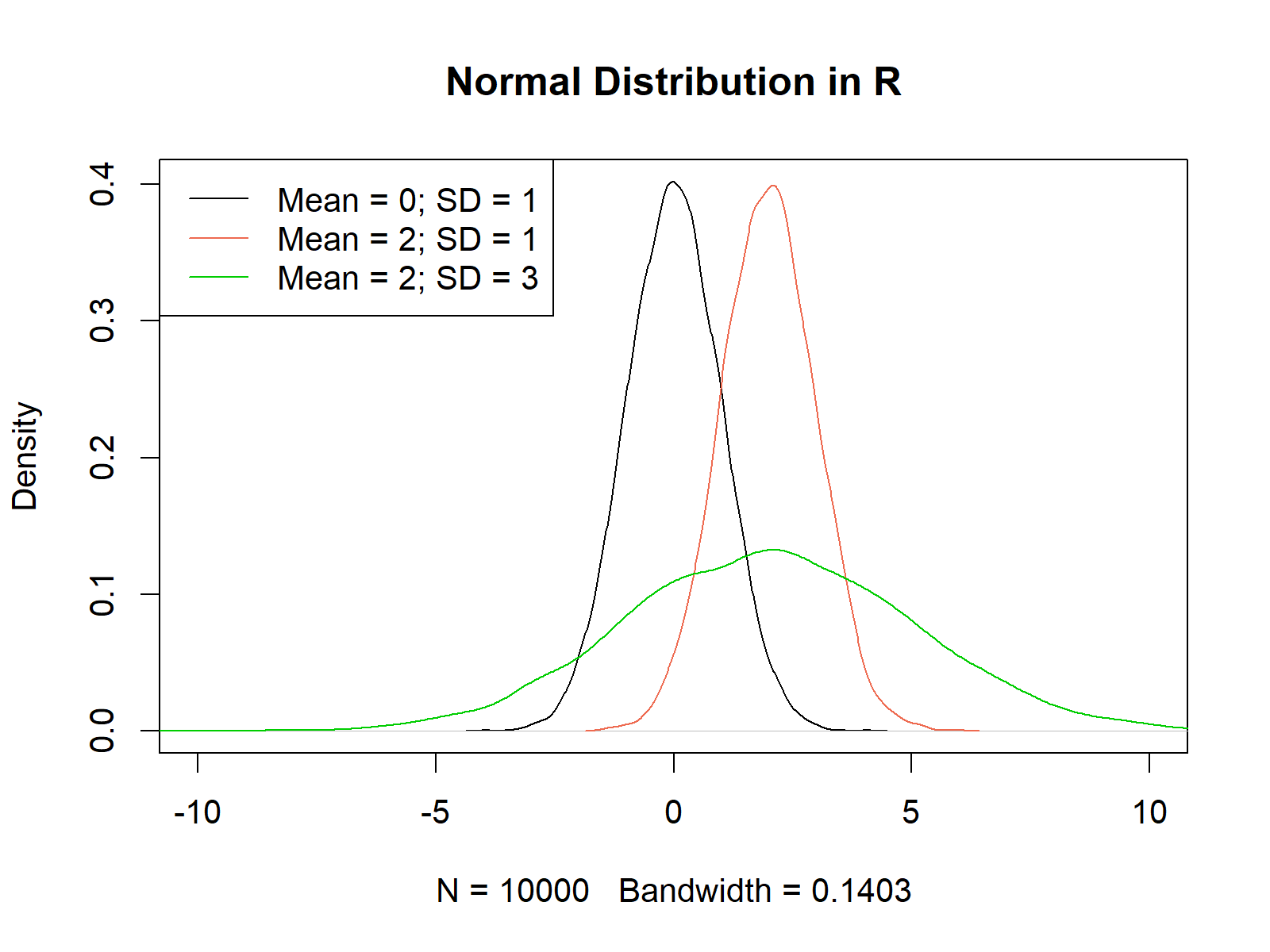
Figure 6: Multiple Density Plots with Different Mean & Standard Deviation.
Figure 6 shows our three random value vectors. The black density was drawn according to the standard normal distribution (i.e. mean = 0 and sd = 1). The red density has a mean of 2 and a standard deviation of 1 and the green density has a mean of 2 and a standard deviation of 3.
Video, Further Resources & Summary
I have recently published a video on my YouTube channel, which shows the R codes of this article. You can find the video below:
The YouTube video will be added soon.
You could also have a look at the other tutorials on distributions and the simulation of random numbers in R:
- Bernoulli Distribution in R
- Beta Distribution in R
- Binomial Distribution in R
- Bivariate & Multivariate Distributions in R
- Cauchy Distribution in R
- Chi-Squred Distribution in R
- Exponential Distribution in R
- F Distribution in R
- Gamma Distribution in R
- Geometric Distribution in R
- Hypergeometric Distribution in R
- Log Normal Distribution in R
- Logistic Distribution in R
- Negative Binomial Distribution in R
- Normal Distribution in R
- Poisson Distribution in R
- Student t Distribution in R
- Studentized Range Distribution in R
- Uniform Distribution in R
- Weibull Distribution in R
- Wilcoxon Signedank Statistic Distribution in R
- Wilcoxonank Sum Statistic Distribution in R
Furthermore, you may have a look at the other articles of https://www.statisticsglobe.com/. Some tutorials about different types of statistical distributions are listed here.
- mean Function in R
- Standard Deviation in R
- R Graphics Gallery
- R Functions List (+ Examples)
- The R Programming Language
At this point you should have learned how to create probability plots and how to draw random numbers according to the normal distribution in the R programming language. If you have additional questions, let me know in the comments below.


