Create Kernel Density Plot in R (7 Examples) | density() Function
In this R tutorial you’ll learn how to draw a kernel density plot.
Table of contents:
- Creation of Example Data
- Example 1: Basic Kernel Density Plot in Base R
- Example 2: Modify Main Title & Axis Labels of Density Plot
- Example 3: Create Polygon Below Density Plot
- Example 4: Add Vertical Line for Mean to Density Plot
- Example 5: Histogram & Density in Same Plot
- Example 6: Multiple Densities in Same Plot
- Example 7: Add Legend to Density Plot
- Video, Further Resources & Summary
Let’s get started…
Creation of Example Data
In the examples of this R tutorial, we’ll use the following normally distributed numeric data vector in R:
set.seed(13531)                                     # Create random numeric data
x <- rnorm(1000)
Our example data contains of 1000 numeric values stored in the data object x.
Example 1: Basic Kernel Density Plot in Base R
If we want to create a kernel density plot (or probability density plot) of our data in Base R, we have to use a combination of the plot() function and the density() function:
plot(density(x)) # Create basic density plot
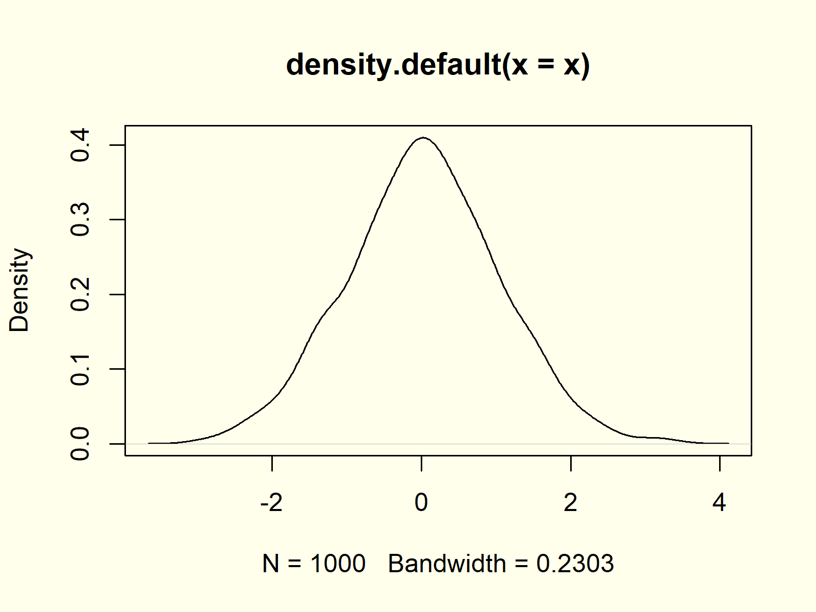
Figure 1: Basic Kernel Density Plot in R.
Figure 1 visualizes the output of the previous R code: A basic kernel density plot in R.
Example 2: Modify Main Title & Axis Labels of Density Plot
The plot and density functions provide many options for the modification of density plots. With the main, xlab, and ylab arguments we can change the main title and axis labels of a density chart:
plot(density(x),                                    # Modify main title & labels
     main = "My Kernel Density Plot",
     xlab = "X-Values",
     ylab = "Density of my X-Values")
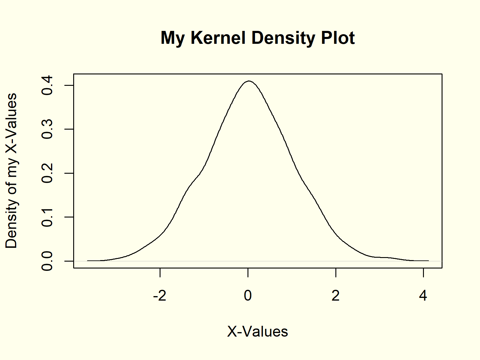
Figure 2: Density Plot with Manual Text.
Figure 2 shows the same density as Figure 1, but with different text.
Example 3: Create Polygon Below Density Plot
We can also fill the area below the density with some color by using the polygon function in combination with the density function:
plot(density(x))                                    # Create polygon density
polygon(density(x), col = "#1b98e0")
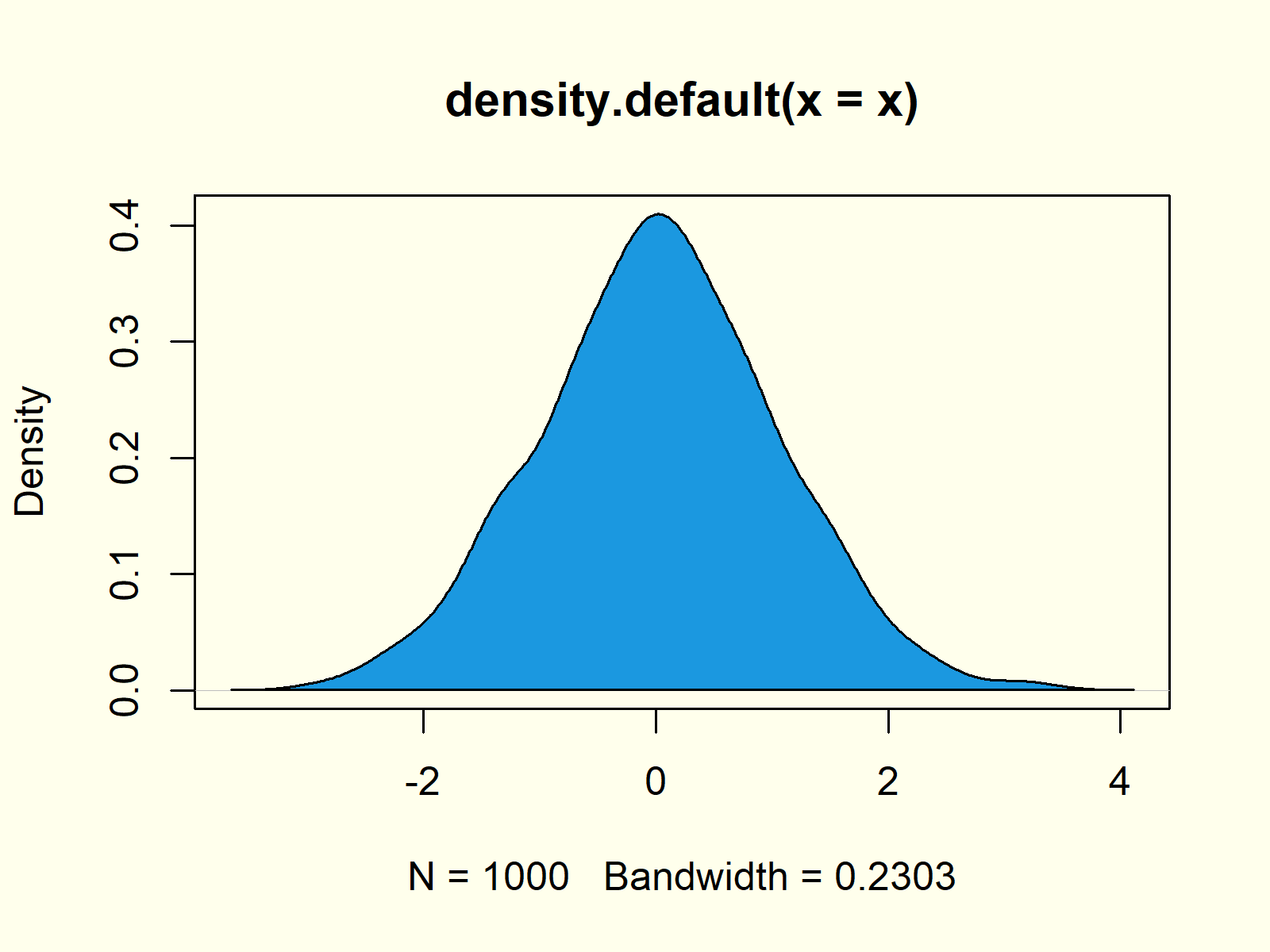
Figure 3: Blue Polygon Below Density.
As you can see based on Figure 3, we just filled the area below our density with blue color.
Example 4: Add Vertical Line for Mean to Density Plot
We may draw additional lines or segments to our density plot with the abline function. In this example, I’m showing you how to add a red vertical line at the position of the mean of our data.
plot(density(x))                                    # Add mean line to density
abline(v = mean(x), col = "red")
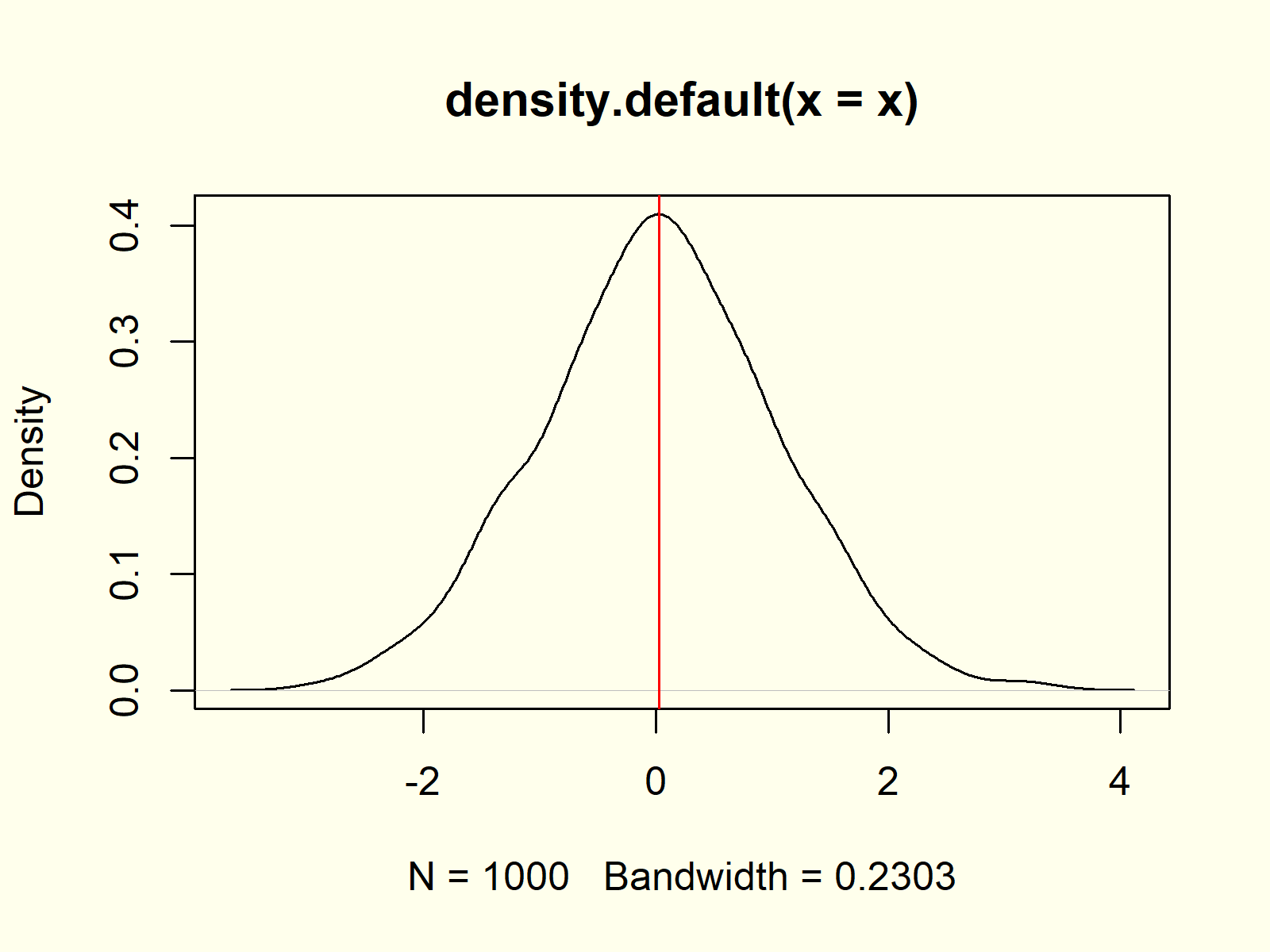
Figure 4: Red Vertical Mean Line.
Example 5: Histogram & Density in Same Plot
It is possible to overlay existing graphics or diagrams with a density plot in R. This example shows how to draw a histogram and a density in the same plot:
hist(x, prob = TRUE)                                # Histogram and density
lines(density(x), col = "red")
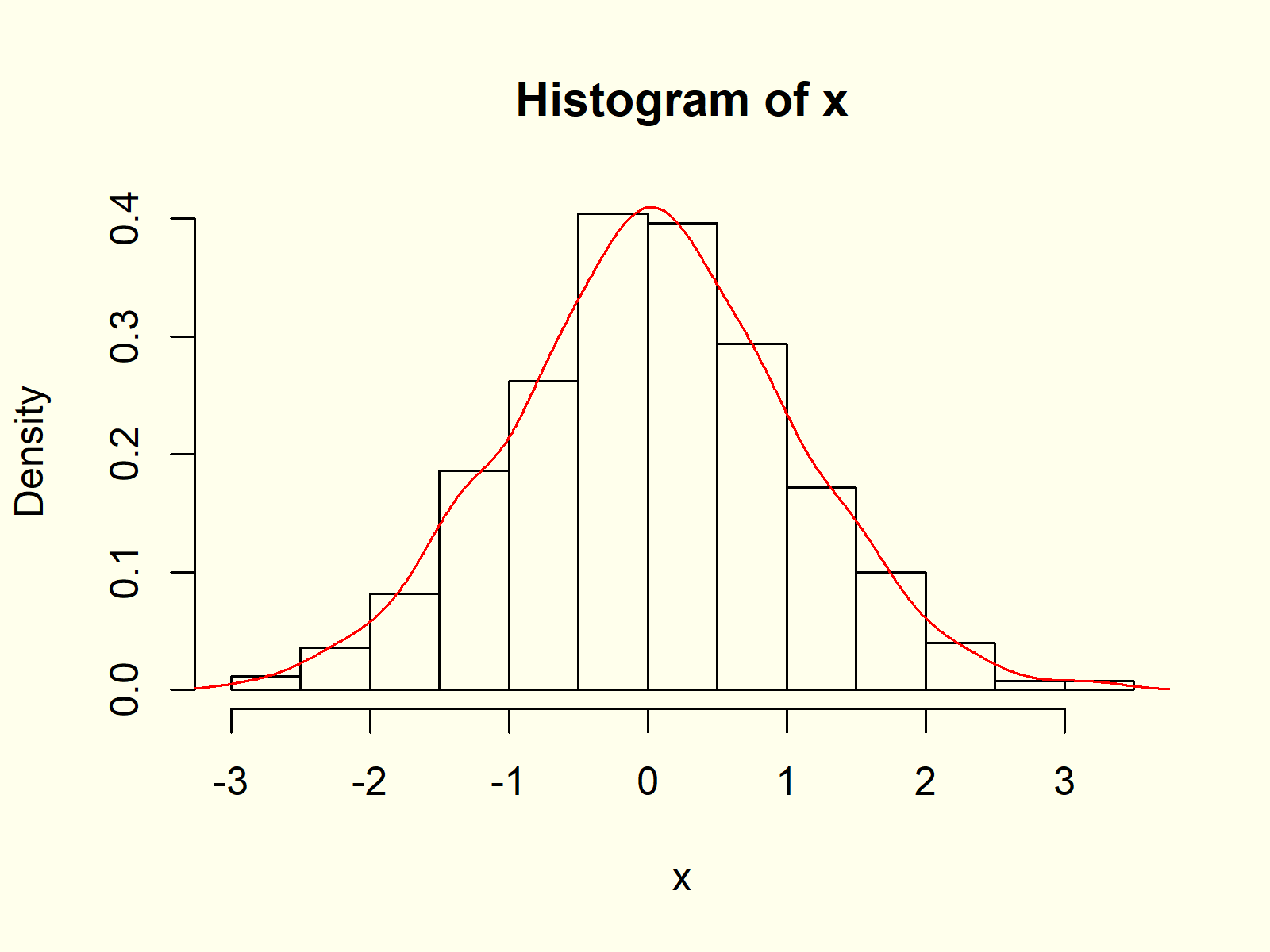
Figure 5: Histogram and Density in One Graph.
Note that we have to use the lines) function instead of the plot function, in case we want to overlay an already existing graph with a density plot.
Example 6: Multiple Densities in Same Plot
Similar to Example 5, we can create a graphic with multiple density plots in the same image. First, we need to create more random variables for the additional densities:
y <- rnorm(100, 1, 2)                               # Create two more variables
z <- rpois(1000, 3)
Now, we can overlay our original density with these new densities:
plot(density(x), xlim = c(- 4, 8))                  # Plot density of x
lines(density(y), col = "red")                      # Overlay density of y
lines(density(z), col = "green")                    # Overlay density of z
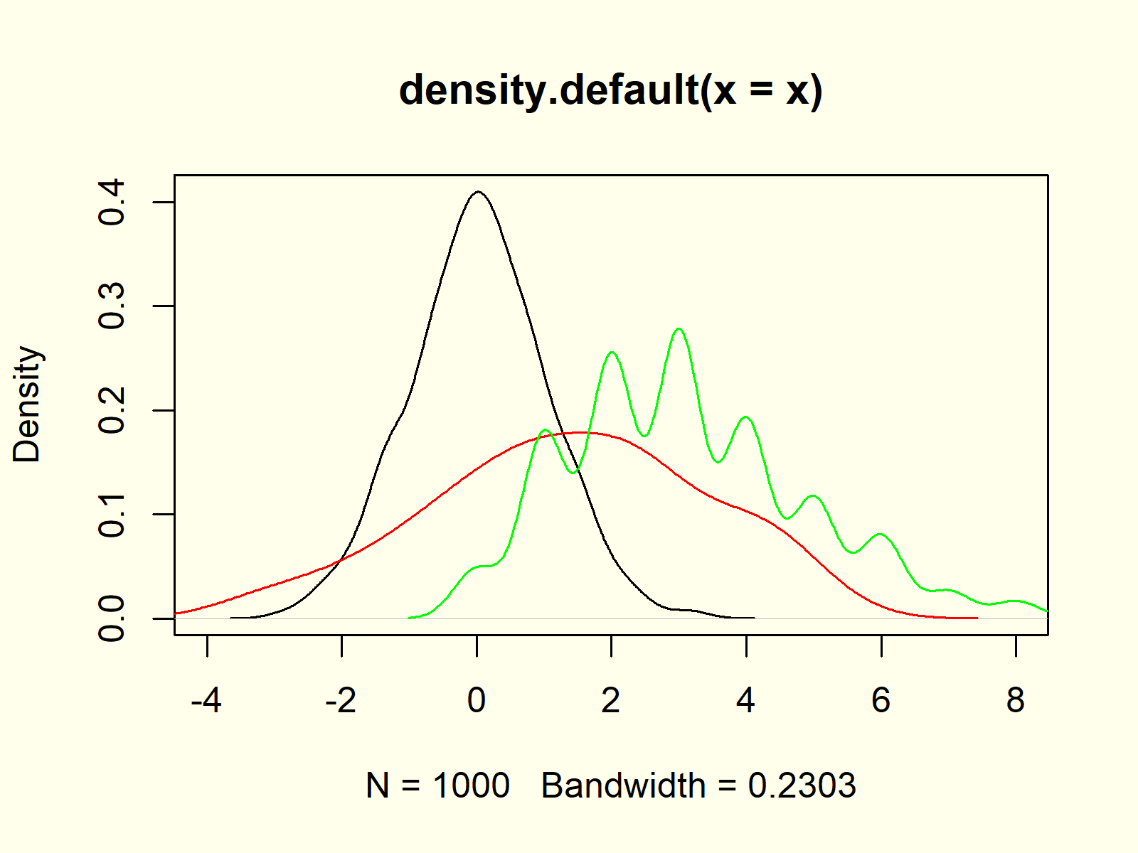
Figure 6: Several Densities in Same Graphic.
Note that we had to replace the plot function with the lines function to keep all probability densities in the same graphic (as already explained in Example 5).
Example 7: Add Legend to Density Plot
Whenever we visualize several variables or columns in the same picture, it makes sense to create a legend. First, let’s plot our data as already shown in Example 6:
plot(density(x), xlim = c(- 4, 8))                  # Plot density of x
lines(density(y), col = "red")                      # Overlay density of y
lines(density(z), col = "green")                    # Overlay density of z
Now, we can use the legend function to add a legend to our plot:
legend("topright",                                  # Add legend to density
       legend = c("Density x", "Density y", "Density z"),
       col = c("black", "red", "green"),
       lty = 1)

Figure 7: Add Legend to Density Plot.
Figure 7 shows the final output of the previous R syntax: Multiple kernel densities and a legend in the same plot window.
Video, Further Resources & Summary
Do you want to learn more about the plotting of densities in R? Then you might want to have a look at the following video of my YouTube channel. In the video, I explain the contents of this tutorial in RStudio:
The YouTube video will be added soon.
In addition, I can recommend to read some of the other articles on this website.
- The plot() Function in R
- Create a Histogram in Base R
- Normal Distribution in R
- Generate Random Numbers in R
- The polygon Function
- abline Function in R
- R Graphics Gallery
- R Functions List (+ Examples)
- The R Programming Language
You learned in this article how to make and interpret a density chart in R. In case you have additional questions or comments, don’t hesitate to let me know in the comments below.
Subscribe to the Statistics Globe Newsletter
Get regular updates on the latest tutorials, offers & news at Statistics Globe.
I hate spam & you may opt out anytime: Privacy Policy.
Thank you!
Welcome to the Statistics Globe newsletter. From now on, I’ll send you regular emails about statistics, data science, AI, and programming with R and Python.
I’m Joachim Schork. On this website, I provide statistics tutorials as well as code in Python and R programming.
Statistics Globe Newsletter
Get regular updates on the latest tutorials, offers & news at Statistics Globe. I hate spam & you may opt out anytime: Privacy Policy.
Thank you!
Please check your email inbox and click the confirmation link to complete your subscription. If you don’t see the email within a few minutes, please also check your spam/junk folder.


