3D Plot of PCA in R (2 Examples)
In this tutorial, I’ll demonstrate how to draw a 3D Plot of a Principal Component Analysis (PCA) in the R programming language.
This is the table of content:
Here’s how to do it!
Prepare Data and Load Add-On Library
First of all, we need to load the library rgl that will allow us to plot our PCA in 3D. If you haven’t installed it, please install it now using the code below.
install.packages("rgl")
Next, load the library:
library(rgl)
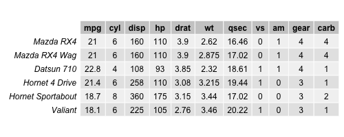
Now, it’s time to prepare our data in order to perform the PCA. For this example, we will use the mtcars database, which contains 32 car models with 11 features. Let’s take a look at the first rows of the dataset!
data(mtcars)

head(mtcars)

Even if all variables look numerical, by description, the features vs and am are categorical by defining if the engine is v-shaped or straight, or if the transmission is manual or automatic. Therefore, those variables are removed from the dataset since PCA essentially works with numeric data. For PCAs deal with categorical data, see our tutorial: Can PCA be Used for Categorical Variables?
data_cars <- mtcars[,-(8:9),
                    drop=FALSE]

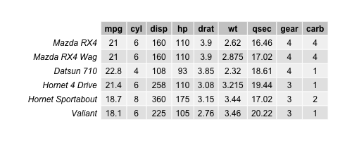
head(data_cars)

Now, we have a data set with 32 observations and 9 variables. Let’s perform a PCA and see how the data is spread in a 3D plot with respect to the first three principal components!
Perform PCA
The next step is to perform our PCA in R as follows.
pca_cars <- prcomp(data_cars,
                   scale=TRUE)

summary(pca_cars)

# Importance of components:
#                           PC1    PC2     PC3     PC4     PC5     PC6     PC7
# Standard deviation     2.3782 1.4429 0.71008 0.51481 0.42797 0.35184 0.32413
# Proportion of Variance 0.6284 0.2313 0.05602 0.02945 0.02035 0.01375 0.01167
# Cumulative Proportion  0.6284 0.8598 0.91581 0.94525 0.96560 0.97936 0.99103
#                           PC8     PC9
# Standard deviation     0.2419 0.14896
# Proportion of Variance 0.0065 0.00247
# Cumulative Proportion  0.9975 1.00000
The output shows that the first three principal components explain 92% of the variance. Now, we need to retrieve the component scores too in order to represent the data in a 3D plot on the three principal component axes. The scores are stored under $x in our PCA output. See how we restored them in a data frame named scores.
scores = as.data.frame(pca_cars$x)

head(scores[1:4])

Let’s plot the scores in 3D!
Example 1: Plot PCA in 3D
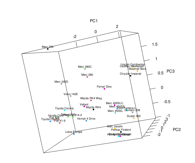
In order to plot the component scores in 3D, we will use the plot3d() function to plot the observations with respect to the principal component coordinates and the text3d() function to label the car models. Be aware that only the first three columns of the scores data set are used, which correspond to the first three components’ scores.
plot3d(scores[,1:3],
       size=5,
       col = seq(nrow(scores)))

text3d(scores[,1:3],
       texts=c(rownames(scores)),
       cex= 0.7, pos=3)

Example 2: Add Biplot to 3D Plot
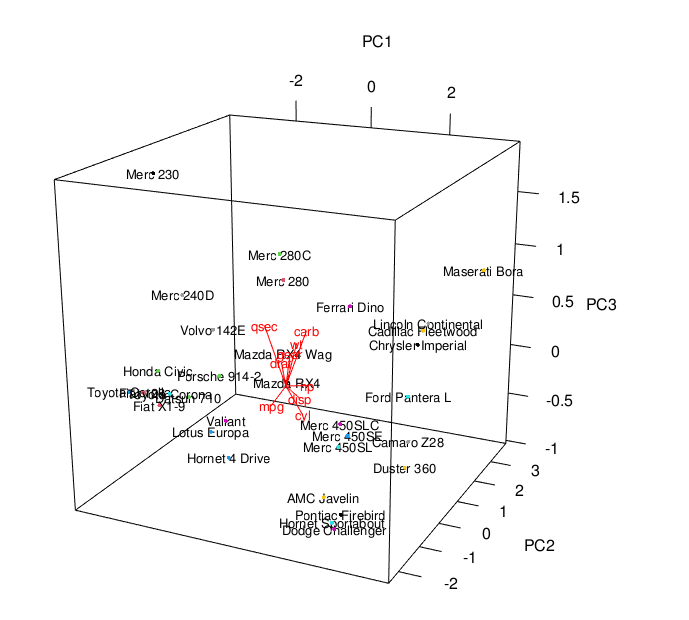
We can also add the loading vectors into the previously created 3D scatterplot to obtain a 3D biplot. For this, we will set a for loop that allows us to include the loading vectors showing the relationship between the variables and the three principal components. Please be aware that the loadings are stored in pca_cars$rotation.
plot3d(scores[,1:3])

text3d(scores[,1:3],
       texts=rownames(data_cars),
       cex=0.8)

text3d(pca_cars$rotation[,1:3],
       texts=rownames(pca_cars$rotation),
       col="red",
       cex=0.8)

coords <- NULL
for (i in 1:nrow(pca_cars$rotation)) {
  coords <- rbind(coords,
                  rbind(c(0,0,0),
                                pca_cars$rotation[i,1:3]))
}

lines3d(coords,
        col="red",
        lwd=1)

You see the 3D biplot above. If you are also interested in plotting biplots in 2D in R, feel free to visit our tutorial: Biplot of PCA in R.
Video, Further Resources & Summary
Do you need more explanations and examples for PCA in R? Then you should have a look at the following YouTube video of the Statistics Globe YouTube channel.
Furthermore, you could have a look at some of the other tutorials on Statistics Globe:
- What is a Principal Component Analysis?
- Can PCA be Used for Categorical Variables?
- Principal Component Analysis in R
- 3D Plot of PCA in R
- Biplot for PCA Explained
- Biplot of PCA in R
This post has shown how to plot your PCA results in 3D. In case you have further questions, you may leave a comment below.
This page was created in collaboration with Paula Villasante Soriano. Please have a look at Paula’s author page to get more information about her academic background and the other articles she has written for Statistics Globe.
Subscribe to the Statistics Globe Newsletter
Get regular updates on the latest tutorials, offers & news at Statistics Globe.
I hate spam & you may opt out anytime: Privacy Policy.
Thank you!
Welcome to the Statistics Globe newsletter. From now on, I’ll send you regular emails about statistics, data science, AI, and programming with R and Python.
I’m Joachim Schork. On this website, I provide statistics tutorials as well as code in Python and R programming.
Statistics Globe Newsletter
Get regular updates on the latest tutorials, offers & news at Statistics Globe. I hate spam & you may opt out anytime: Privacy Policy.
Thank you!
Please check your email inbox and click the confirmation link to complete your subscription. If you don’t see the email within a few minutes, please also check your spam/junk folder.


12 Comments. Leave new
remarkable lecture
Q. please share me if you have a video related to NMDS for three or more factors (four sites with varied species)
Hello Meseret,
I am glad that you liked the tutorial. Unfortunately, we don’t have any tutorials on that topic. Let us know if you have any questions regarding PCA.
Best,
Cansu
it’s really fascinating and helpful and keep the faith Dr
It is great to hear such nice words. Thank you, Meseret.
Have a good one!
Cansu
Hello.
I was looking for a tool to visualize a 3D pca plot.
I am not able to plot anything though. the plot3d() function runs but no plot appears anywhere.
What might be the cause?
Thanks.
Hey Thomas,
Thank you for your comment. Could you please share your code and the structure of your data?
Regards,
Joachim
Hi Joachim,
sure I can do that. thanks for helping me out.
Basically, I work with biological count data (bulkRNAseq) and have samples ordered in columns and the genes represented in the rows:
str(keep_counts)
‘data.frame’: 19335 obs. of 42 variables:
$ normoxia_rep1 : num 291 34972 62 104 9 …
$ normoxia_rep2 : num 209 28263 33 74 4 …
and here is my code:
> pca_keep_counts summary(pca_keep_counts)
Importance of components:
PC1 PC2 PC3 PC4 PC5 PC6 PC7 PC8 PC9 PC10 PC11 PC12
Standard deviation 63.1609 57.9978 34.8189 29.0994 27.39365 26.99547 23.48912 22.81189 20.75868 19.57219 18.39841 17.99778
Proportion of Variance 0.2063 0.1740 0.0627 0.0438 0.03881 0.03769 0.02854 0.02691 0.02229 0.01981 0.01751 0.01675
Cumulative Proportion 0.2063 0.3803 0.4430 0.4868 0.52561 0.56330 0.59183 0.61875 0.64103 0.66085 0.67835 0.69511
PC13 PC14 PC15 PC16 PC17 PC18 PC19 PC20 PC21 PC22 PC23
Standard deviation 17.60858 16.96837 16.61149 16.28696 16.02784 15.96866 15.68688 15.50941 15.4198 15.13976 15.02446
Proportion of Variance 0.01604 0.01489 0.01427 0.01372 0.01329 0.01319 0.01273 0.01244 0.0123 0.01185 0.01167
Cumulative Proportion 0.71114 0.72603 0.74031 0.75403 0.76731 0.78050 0.79323 0.80567 0.8180 0.82982 0.84149
PC24 PC25 PC26 PC27 PC28 PC29 PC30 PC31 PC32 PC33 PC34
Standard deviation 14.93415 14.63922 14.38961 14.12366 14.03858 13.94079 13.65871 13.51077 13.39875 13.06880 12.7439
Proportion of Variance 0.01153 0.01108 0.01071 0.01032 0.01019 0.01005 0.00965 0.00944 0.00929 0.00883 0.0084
Cumulative Proportion 0.85303 0.86411 0.87482 0.88514 0.89533 0.90538 0.91503 0.92447 0.93376 0.94259 0.9510
PC35 PC36 PC37 PC38 PC39 PC40 PC41 PC42
Standard deviation 12.34849 12.08163 11.7134 11.54230 11.35260 11.28948 11.06148 2.323e-13
Proportion of Variance 0.00789 0.00755 0.0071 0.00689 0.00667 0.00659 0.00633 0.000e+00
Cumulative Proportion 0.95888 0.96643 0.9735 0.98041 0.98708 0.99367 1.00000 1.000e+00
>
> scores
> plot3d(scores[,1:3],
+ size=5,
+ col = seq(nrow(scores)))
>
> text3d(scores[,1:3],
+ texts=c(rownames(scores)),
+ cex= 0.7, pos=3)
no error or warning but also nothing plotted.
where did i go wrong?
Hey Thomas,
Thanks for sharing your code. I cannot see the part of your code where you define the scores object, though. Could you please share this code as well?
Regards,
Joachim
Hi again.
I don’t understand why my code is changed when posting the comment because it seems right when pasting the code.
i have a dataframe with samples as columns and genes as rows. i have countdata. i want to see how my 42 samples cluster in 3d.
so here again in a different way:
pca_keep_counts <- prcomp(t(log2(cpm(keep_counts)+1)), scale=TRUE)
scores <- as.data.frame(pca_keep_counts$x)
plot3d(scores[,1:3],
size=5,
col = seq(nrow(scores)))
text3d(scores[,1:3],
texts=c(rownames(scores)),
cex= 0.7, pos=3)
thank you.
Sorry, I just saw your second comment. Could you please share the output of this code? head(scores[ , 1:3])
Thanks,
Joachim
sorry Joachim. It seems i have troubles sending messages here as my last message should have been posted shortly after you replied. here again:
head(scores[ , 1:3])
PC1 PC2 PC3
07-06h-zh_rep1 -111.6817 36.06649 -23.918677
07-06h-zh_rep2 -135.7428 68.26297 -4.482828
07-06h-zh_rep3 -116.6018 76.06111 36.914256
07-06h-zh_rep4 -152.4950 84.04475 -16.020224
07-06h-zh_rep5 -124.3474 72.13282 22.341345
07-06h-zh_rep6 -141.4696 67.81903 10.632800
Hey,
No problem at all, it seems like something was wrong with the comments on the website.
I checked your code, and it seems fine to me. Have you noticed that the plot is opened in a new plot window? You might have to open this to see the plot.
Regards,
Joachim