Add Color Between Two Points of Kernel Density Plot in R (Example)
In this tutorial, I’ll show how to add color to a certain area below a density plot in the R programming language.
The content of the post looks as follows:
- Introducing Example Data
- Example: Coloring Particular Area Below Density Plot
- Video & Further Resources
You’re here for the answer, so let’s get straight to the examples!
Introducing Example Data
First, we need to generate some random data that we can draw as kernel density plot later on:
set.seed(75757)                                            # Create example data
x <- rnorm(1000)
Our example data consists of 1000 numeric values and is normally distributed.
Now, we can convert our numeric vector to a density object with the density function:
dens_x <- density(x) # Compute density of data
We can draw a graph with default specifications by using the plot function:
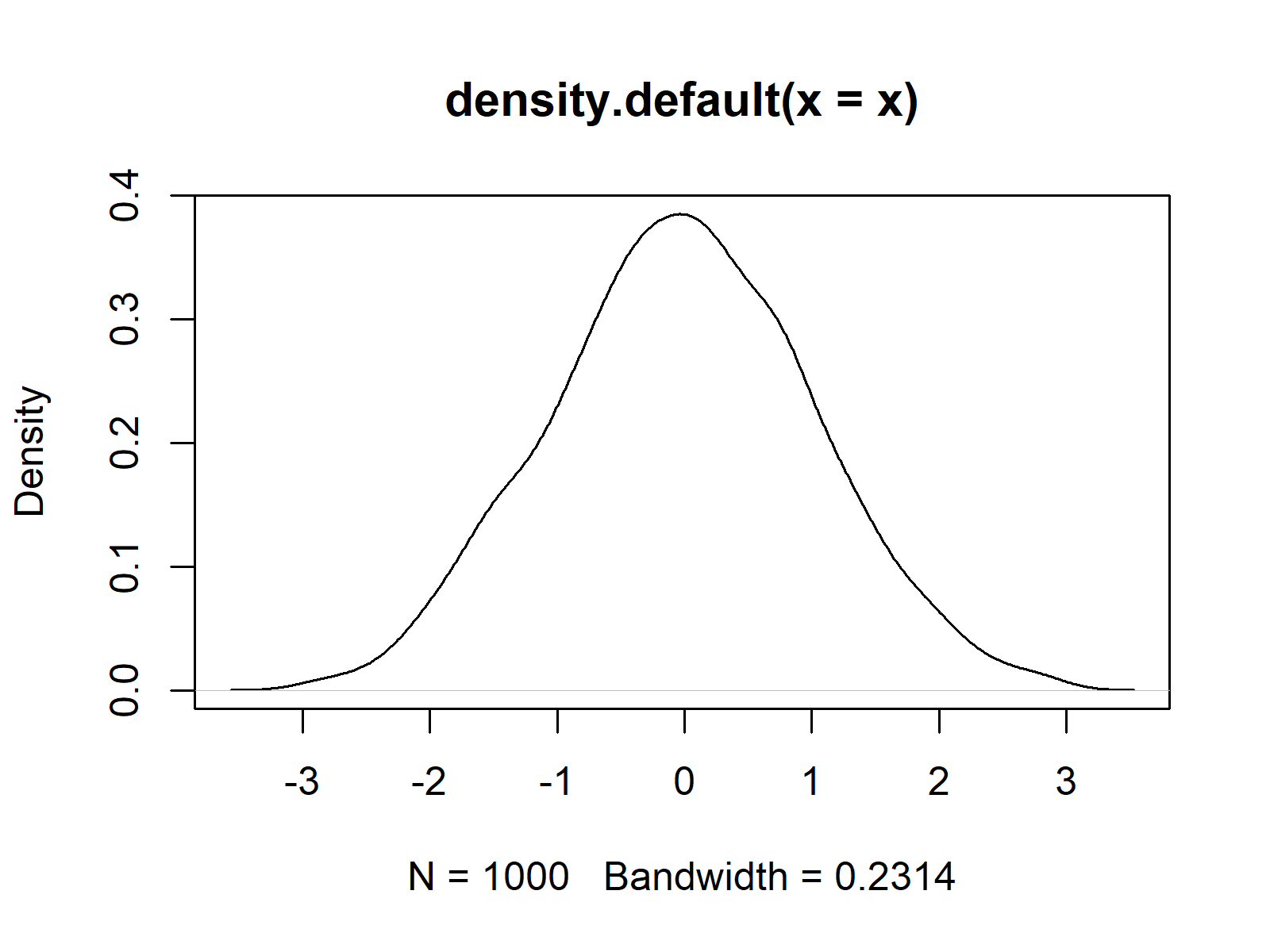
plot(dens_x) # Default plot of density

Figure 1: Basic Density Plot in R.
Figure 1 shows how our example plot looks like. It’s a normally distributed kernel density graph with a mean of 0 and a standard deviation of 1.
Let’s add some color…
Example: Coloring Particular Area Below Density Plot
If we want to add some color or a shade below our kernel density plot, we first need to specify between which points on the x-axis we want to add this color. In this example, we are using the lower limit – 0.5 and the upper limit 1:
x_low <- min(which(dens_x$x >= - 0.5))                     # Define lower limit of colored area
x_high <- max(which(dens_x$x < 1))                         # Define upper limit of colored area
Now, we can use the with and the polygon functions to add some color between our two limits:
with(dens_x,                                               # Add color between two limits
     polygon(x = c(x[c(x_low, x_low:x_high, x_high)]),
             y = c(0, y[x_low:x_high], 0),
             col = "#1b98e0"))

Figure 2: Density with Colored Area Between Two Points.
Figure 2 illustrates the output of the previous R programming code. As you can see, we added some blue color below the previously specified area of our graphic.
Video & Further Resources
Do you want to learn more about graphics in R? Then you might want to watch the following video which I have published on my YouTube channel. In the video, I show the R programming code of this page.
Furthermore, you may have a look at this forum thread at Stack Overflow. The R code shown in this tread was used as basement for this tutorial and in the thread you can also find R programming codes for the coloring of certain areas below a density based on the ggplot2 package.
In addition, you may want to have a look at some of the related articles on my website. You can find a selection of articles below:
Summary: You learned in this tutorial how to shade a particular part of a kernel density graphic in the R programming language. Let me know in the comments, if you have any additional questions.
Subscribe to the Statistics Globe Newsletter
Get regular updates on the latest tutorials, offers & news at Statistics Globe.
I hate spam & you may opt out anytime: Privacy Policy.
Thank you!
Welcome to the Statistics Globe newsletter. From now on, I’ll send you regular emails about statistics, data science, AI, and programming with R and Python.
I’m Joachim Schork. On this website, I provide statistics tutorials as well as code in Python and R programming.
Statistics Globe Newsletter
Get regular updates on the latest tutorials, offers & news at Statistics Globe. I hate spam & you may opt out anytime: Privacy Policy.
Thank you!
Please check your email inbox and click the confirmation link to complete your subscription. If you don’t see the email within a few minutes, please also check your spam/junk folder.


