R polygon Function | 6 Example Codes (Frequency & Density Plot)
Basic R Syntax:
polygon(x_coordinates, y_coordinates)
The R polygon function draws a polygon to a plot. The basic R syntax for the polygon command is illustrated above.
In the following tutorial, I will show you six examples for the application of polygon in the R language.
Sound good? Great. Let’s get started.
Example 1: Draw a Square Polygon in an R Plot
Let’s begin with an easy example. In this example, we are going to draw a simple square polygon to an empty R plot. Let’s first create an empty plot:
plot(1, 1, col = "white", xlab = "X", ylab = "Y") # Draw empty plot
To this plot, we can draw a polygon with the following R code:
polygon(x = c(0.7, 1.3, 1.2, 0.8),                           # X-Coordinates of polygon
        y = c(0.6, 0.8, 1.4, 1),                             # Y-Coordinates of polygon
        col = "#1b98e0")                                     # Color of polygon
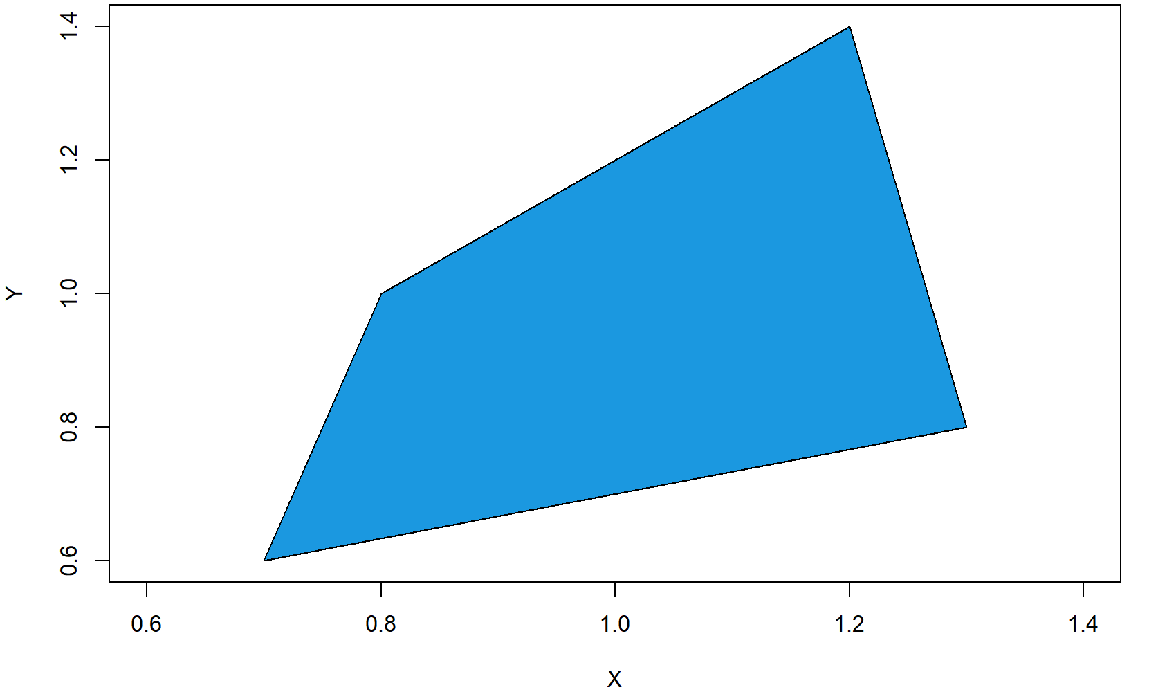
Figure 1: Square Polygon in Empty Plot.
As you can see, the previous polygon() R code consists of three different components:
- x: Here we specify the x-coordinates of each corner of the square polygon.
- y: Here we specify the y-coordinates of each corner of the square polygon.
- color: Here we specify the color of the polygon.
OK, that was easy, but let’s make the graphic a bit prettier…
Example 2: Colored Border of Polygon
For the second example, I’m using exactly the same code as in Example 1, but this time I’m modifying the border color of the polygon. Let’s begin again with an empty graph…
plot(1, 1, col = "white", xlab = "X", ylab = "Y") # Draw empty plot
…and then let’s draw a thick red border around the polygon:
polygon(x = c(0.7, 1.3, 1.2, 0.8),                           # X-Coordinates of polygon
        y = c(0.6, 0.8, 1.4, 1),                             # Y-Coordinates of polygon
        col = "#1b98e0",                                     # Color of polygon
        border = "red",                                      # Color of polygon border
        lwd = 5)                                             # Thickness of border

Figure 2: Square Polygon with Thick & Colored Border.
We used two further options within the R polygon function:
- border: Here we specify the border color.
- lwd: Here we specify the thickness of the border.
That’s it with the square polygon examples. But as you will see in the next examples, the polygon R function has much more to offer.
Example 3: Frequency Polygon in R
In the following example, I will show you how to create a frequency polygon in R. Let’s create some data for the example:
x1 <- 1:10                                                   # X values for frequency polygon
y1 <- c(2, 4, 7, 4, 5, 8, 6, 6, 1, 2)                        # Y values for frequency polygon
We can draw a frequency polygon plot with the following R code. First, we draw the line of the frequency polygon with the plot function:
plot(x1, y1,                                                 # Plot frequency polygon
     type = "l",                                             # Set line type to line
     lwd = 3)                                                # Thickness of line
Then, we can add some color below the line with the polygon function:
polygon(c(1, x1, 10), c(0, y1, 0),                           # X-Y-Coordinates of polygon
        col = "#1b98e0")                                     # Color of polygon
To make the polygon frequency plot a bit prettier, we can also add some squares at the cut-points of our frequency polygon:
points(x1, y1,                                               # Add squares to frequency polygon
       cex = 2,                                              # Size of squares
       pch = 15)                                             # Set point type to squares
And finally, we can add some line segments to the figure:
segments(x1, 0, x1, y1) # Add line segments to plot
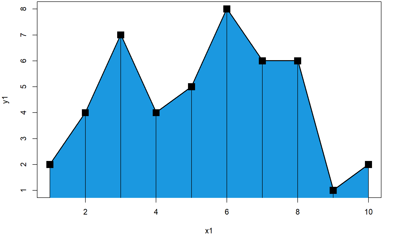
Figure 3: Frequency Polygon in R.
Looks good. So let’s move on to the next – very popular – application of the polygon R function…
Example 4: Draw Polygon Below Density
The following application of the polygon function is quite often used to make the plot of a probability density function (PDF) more visible. With the following R code, you can fill the area below a density curve with color (i.e. we are drawing a polygon according to the shape of the density).
Again, let’s begin with some data. For this example, I’m going to use a poisson distribution:
set.seed(15051)                                              # Set seed for reproducibility
N <- 1000                                                    # Sample size
x2 <- rpois(N, 2)                                            # Draw random poisson distribution
First, we have to draw the density curve to a plot…
plot(density(x2),                                            # Draw density plot
     main = "",                                              # No main title
     xlab = "x2")                                            # Set name of x-axis to x2
…and then we can add the polygon below this density:
polygon(c(min(density(x2)$x), density(x2)$x),                # X-Coordinates of polygon
        c(0, density(x2)$y),                                 # Y-Coordinates of polygon
        col = "#1b98e0")                                     # Color of polygon
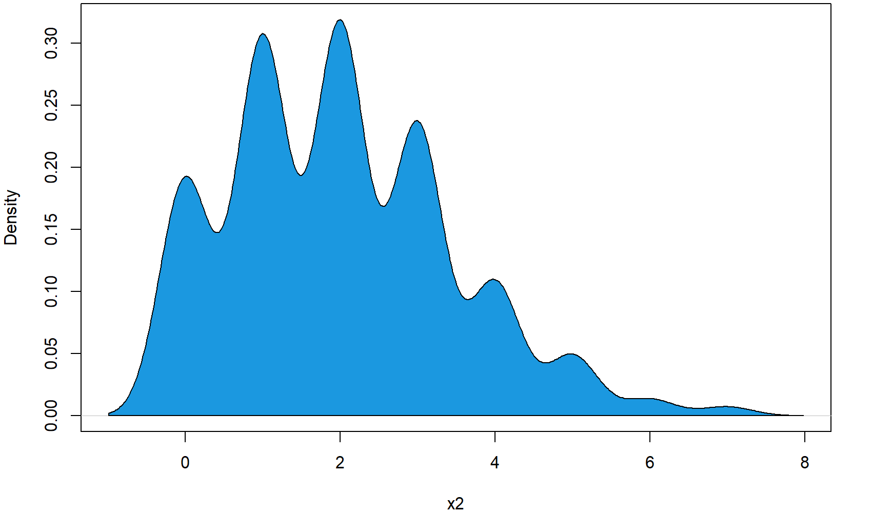
Figure 4: Polygon Below Poisson Distribution.
So, that’s the basic code for a density polygon. But we can modify the polygon in several ways…
Example 5: Density Polygon for Specific Range
In this example, I’m going to show you how to restrict your density polygon to a certain range of x-values. At this point, I’m just continuing the code of Example 4.
First, we have to define the range, to which we want to restrict our polygon:
poly_range <- density(x2)$x > 1 & density(x2)$x < 2.5 # Set polygon x-range
Then, we can use this range to subset our polygon coordinates:
polygon(c(1, density(x2)$x[poly_range], 2.5),                # X-Coordinates of polygon range
        c(0, density(x2)$y[poly_range], 0),                  # Y-Coordinates of polygon range
        col = "#353436")                                     # Color of polygon range
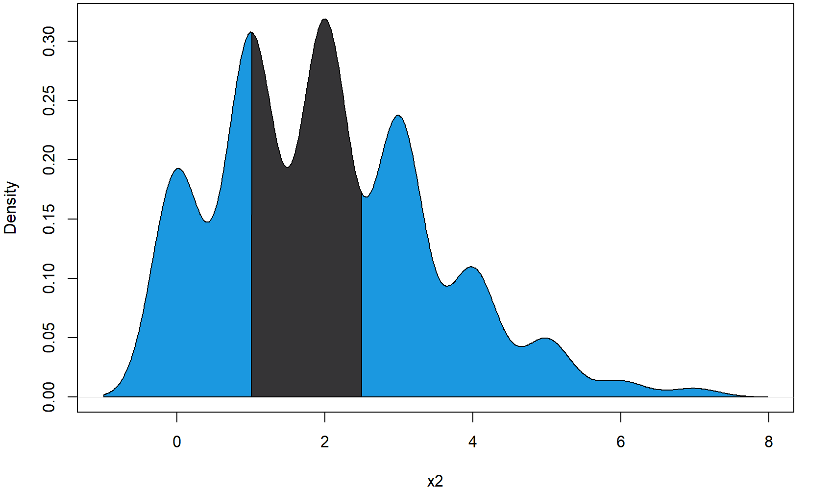
Figure 5: Density Polygon for Restricted X-Range.
As you can see, we are just overlaying the blue polygon of Example 4 with our restricted polygon. However, we could of cause just skip the polygon of Example 4 and draw only the restricted polygon.
At this point, you know how to restrict polygons to certain X-values. However, we could also restrict a polygon to certain values on the Y-axis…
Example 6: Draw Polygon Between Two Densities
We can either restrict our density polygon to a fixed Y-range – or even prettier, we can restrict our polygon to the shapes of two densities. For the first density, I’m using again the x2 data that we created in Example 2. Let’s plot the x2 density:
plot(density(x2),                                            # Draw density plot again
     main = "",                                              # No main title
     xlab = "x2 & x3",                                       # Set name of x-axis to x2 & x3
     xlim = c(- 6, 10))                                      # Wider xlim
For the second density, I’m using the following data:
x3 <- rnorm(N, 2, 2.5) # Draw random normal distribution
We can now use the values of our first and second density to draw a polygon between the two densities:
polygon(c(density(x3)$x, rev(density(x2)$x)),                # X-Coordinates of polygon
        c(density(x3)$y, rev(density(x2)$y)),                # Y-Coordinates of polygon
        col = "#1b98e0")                                     # Color of polygon
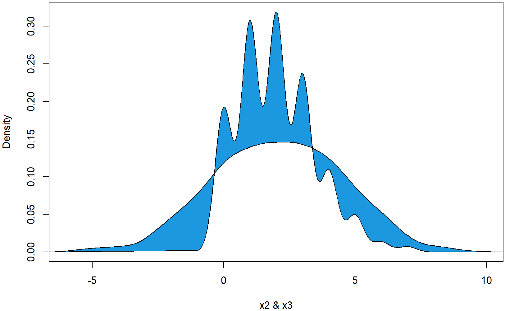
Figure 6: Polygon Between Two Densities.
As you can see in the plot, the second densities follows a normal distribution that is partly lower and partly higher than our first density. Interestingly, the polygon is reflecting this by drawing the polygon sometimes below the first density line and sometimes above the first density line.
Video Explanation from this Article & More Examples of polygon in R
Have a look at the following video which I have published on my YouTube channel. I show the examples of this tutorial in the video.
You need even more examples? No problem! Just have a look at the following video of the YouTube channel intromediateecon. In the video, the speaker explains some cool tricks for the application of polygon in R – especially for drawing polygon shades below a bell curve.
Further Reading



4 Comments. Leave new
Dear Joachim,
Great tutorial: R polygon Function | 6 Example Codes. Very clearly laid out and it explains everything very well.
With thanks,
Arthur Chapman
Hey Arthur,
Thanks a lot, glad to hear that you liked the tutorial! 🙂
Regards,
Joachim
thank
You are very welcome Ded.
Regards,
Joachim