Order Bars of ggplot2 Barchart in R (4 Examples)
In this R tutorial you’ll learn how to order the bars of a ggplot2 barchart.
The content is structured as follows:
- Introduction to the ggplot2 Package
- Creation of Example Data
- Example 1: Ordering Bars Manually
- Example 2: Barchart with Increasing Order
- Example 3: Barchart with Decreasing Order
- Video, Further Resources & Summary
Here’s how to do it!
Creation of Example Data
First, we need to create some example data to illustrate the following examples:
data <- data.frame(x = c("A", "B", "C", "D", "E"),            # Create example data
                   y = c(0.5, 2, 1.2, -0.2, 0.7))
Furthermore, we need to install and load the ggplot2 package to R:
install.packages("ggplot2")                                   # Install ggplot2 package
library("ggplot2")                                            # Load ggplot2 package
Now, we can draw a basic barplot with the following R code:
ggplot(data, aes(x, y)) +                                     # Create basic barchart
  geom_bar(stat = "identity")

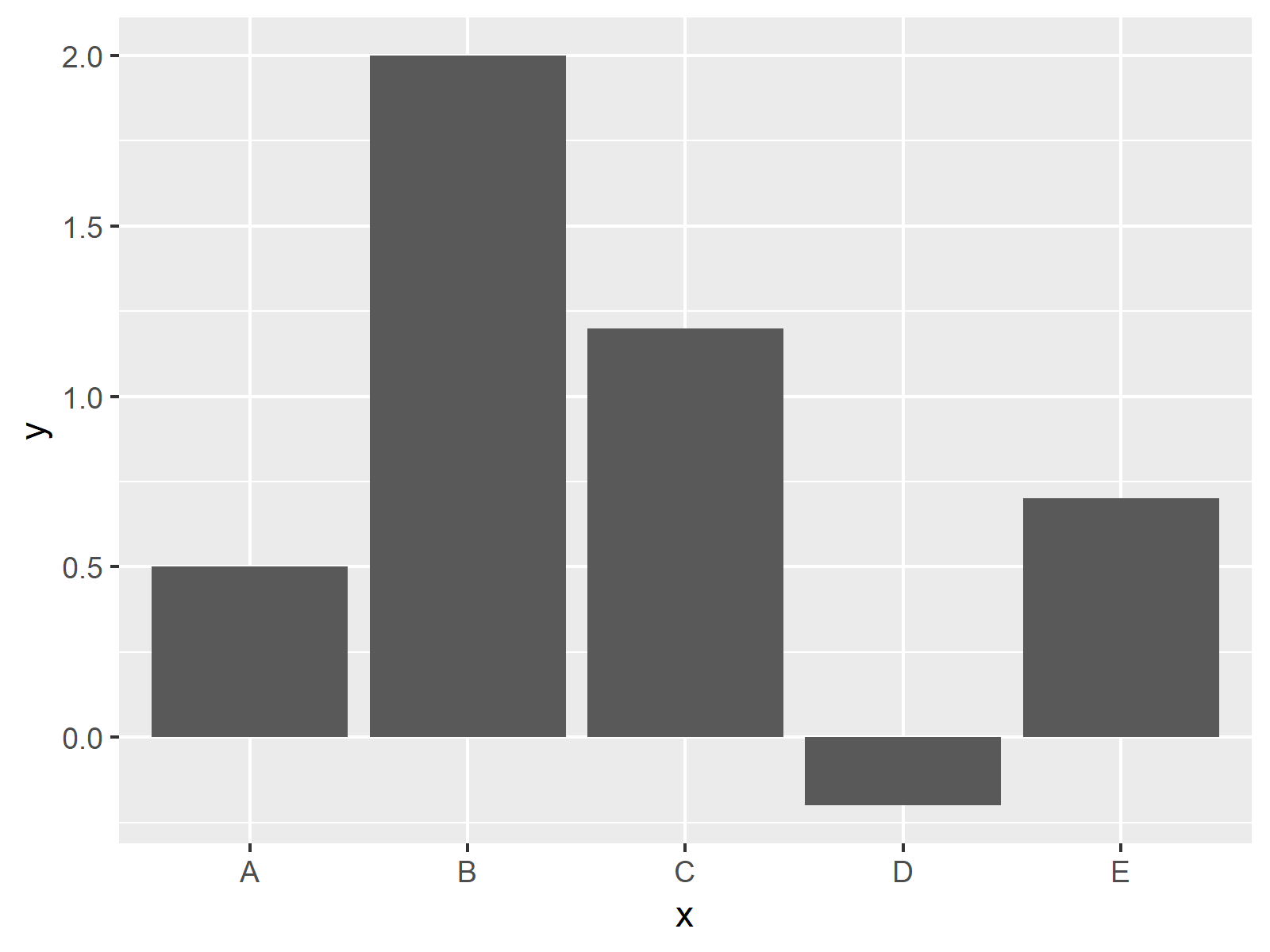
Figure 1: Basic Barchart in ggplot2 R Package.
Figure 1 shows the output of the previous R code – An unordered ggplot2 Barplot in R.
Example 1: Ordering Bars Manually
If we want to change the order of the bars manually, we need to modify the factor levels of our ordering column. We can do that with the following R syntax:
data1 <- data                                                 # Replicate original data
data1$x <- factor(data1$x,                                    # Change ordering manually
                  levels = c("B", "D", "E", "C", "A"))
If we now use exactly the same ggplot2 syntax as before, we get the following plot:
ggplot(data1, aes(x, y)) +                                    # Manually ordered barchart
  geom_bar(stat = "identity")

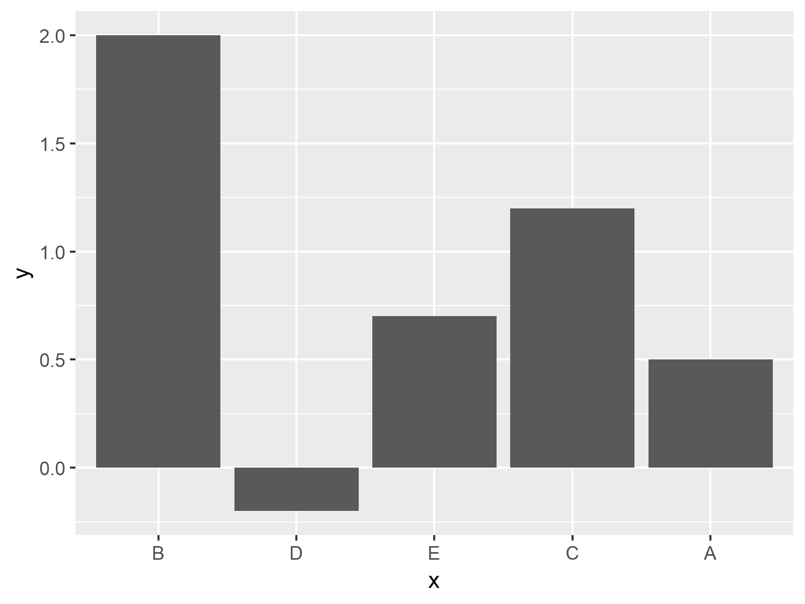
Figure 2: Manual Order of Bars.
Figure 2 illustrates the new ordering of our barchart.
Example 2: Barchart with Increasing Order
Let’s assume that we want to sort our barplot by the size of the bars. Then we can easily use the sort function to order the factor levels according to the values of our bars:
data2 <- data                                                 # Replicate original data
data2$x <- factor(data2$x,                                    # Factor levels in increasing order
levels = data2$x[order(data2$y)])
ggplot(data2, aes(x, y)) +                                    # Increasingly ordered barchart
  geom_bar(stat = "identity")

Figure 3: Increasing Order of Bars.
As you can see in Figure 3, our bars were sorted in decreasing order.
Example 3: Barchart with Decreasing Order
Of course, you could also do the sorting the other way around in reversed order. The following R code sorts our bars in decreasing order:
data3 <- data                                                 # Replicate original data
data3$x <- factor(data3$x,                                    # Factor levels in decreasing order
                  levels = data3$x[order(data3$y, decreasing = TRUE)])
ggplot(data3, aes(x, y)) +                                    # Decreasingly ordered barchart
  geom_bar(stat = "identity")

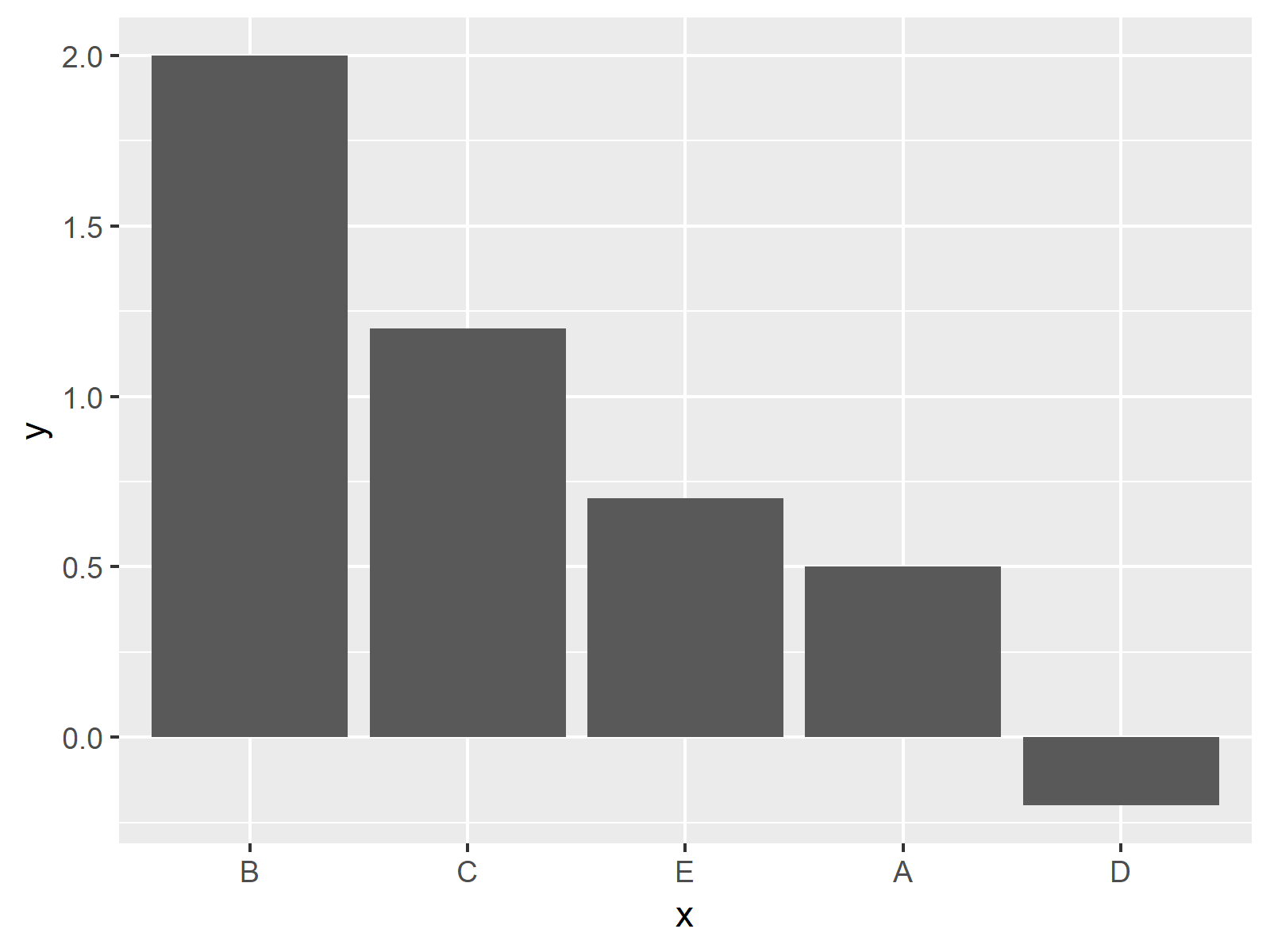
Figure 4: Decreasing Order of Bars.
That’s it!
Video, Further Resources & Summary
Would you like to learn more about the ordering of bargraphs using ggplot2? Then you might have a look at the following video of my YouTube channel. In the video, I illustrate the content of this post.
Furthermore, I can recommend having a look at some of the related articles of this website. A selection of articles about the ordering of factors is listed here.
- sort, order & rank R Functions
- How to Drop Factor Levels of Vector & Data Frame
- R Graphics Gallery
- The R Programming Language
You learned in this article how to reorder factors to plot the bars of a ggplot in a specified axis order in R programming.
Note that it would be possible to use similar R codes to reorder or reverse the axis orders of other types of graphs showing discrete or categorical variables such as boxplots or heatmaps.
Please let me know in the comments, if you have any additional questions. Furthermore, don’t forget to subscribe to my email newsletter for updates on the newest tutorials.


12 Comments. Leave new
Hi Joachim,
I am trying to make a legend for my data that would reflect bar colours. When I add “col = status” it adds the legend but with dark grey colour inside. Any help would be appreciated?
The code I am using is:
p1 <- ggplot(d1, aes(x= reorder(gene, -fold_change), y= fold_change, fill = status, color = status)) +
geom_bar(position = position_dodge(0.9), stat = "identity", width = 0.8) +
geom_errorbar( aes(ymin=fold_change-se, ymax=fold_change+se), width=0.2, position = position_dodge(0.8), colour="black", alpha=0.9, size=0.5) +
ggtitle("Gene expression") +
xlab(NULL) +
ylab("Fold change") +
theme_classic() +
theme(axis.text=element_text(size=12), axis.title=element_text(size=14,face="bold"))+
theme(axis.text = element_text(colour = "black", size = rel(1.15))) +
theme(panel.background = element_rect(fill = "white"), plot.margin = margin(0.5, 0.5, 0.5, 0.5, "cm"), plot.background = element_rect(fill = "grey90",colour = "black",size = 1)) +
theme(legend.title = element_text(color = "black",size = 15))+
theme(plot.title = element_text(size = 20, face = "bold")) +
guides(fill = FALSE)
p1
Thank you
Manjinder
Hey Manjinder,
Thank you for the comment. I think the reason for this is the last line of your code (i.e. ‘+ guides(fill = FALSE)’). If you remove this line it should work.
I hope you’ll have a happy new year!
Joachim
Hi Joachim,
Thank you for your quick reply. It worked and actually I added “Null” instead of “FALSE”.
Now my graph looks pretty except for one issue I am trying to fix. I have two bars orange and green, right next to each other for “Bleed” and “No bleed” samples. By default, bleed bars come first, and I want to change it to make the “No-bleed” bar appear first. Is there any way to do that?
Thank you again and Happy New Year!
Manjinder
Hey Manjinder,
Glad to hear that it helped!
Have you tried to order the bars manually as described in Example 1?
Regards, Joachim
Hi Joachim,
This is very much useful and very clear to understand. But in my data set I have three columns ie Category, Value and Aging . So I need to order category of bar graph according to the value in decreasing order. But I have duplicate categories . eg Category column :: “North” “North” West” “East” “East” etc. Therefore unable to change factor levels. R is throwing error : Error in `levels<-`(`*tmp*`, value = as.character(levels)) :
factor level [2] is duplicated
Requesting your help.
Many Thanks
Hi Shweta,
Thank you for the kind words and for your interesting question!
Could you provide the code that you have used?
Thanks
Joachim
Hi Joachim,
How do you keep the order of a variable in a data frame to be used in an argument in facet_wrap?
ie.
xav 0, xav 2, xav 10, not (xav 0, xav 10, xav 2) ?
or
sss, sss, sss, bbb, bbb, bbb, mmmm, mmmm, mmmm, not (bbb, bbb, bbb, mmmm, mmmm, mmmm, sss, sss, sss) ?
Thank you for your help!
Todd
Hey Todd,
I’m not certain if I get your question correctly. Do you want to reorder the facets in a plot? In this case, please have a look here: https://statisticsglobe.com/reorder-facets-in-ggplot2-plot-in-r
Regards,
Joachim
I am following you on youtube. Your tutorials are so easy to understand. I was trying to reorder bars in ggplot and I checked so many resources, tried so many methods but only your method worked. Simplicity of your codes is something I really appreciate. Thank you for sharing your knowledge with us.
Hey Ankita,
Thank you so much for the wonderful feedback! It’s great to hear that you like my tutorials! 🙂
Regards,
Joachim
Hey Joachim,
this isn’t the first time that I’m looking at your tutorials, so first of all: thank you very much for your work!
However, I have kind of a special case where I cannot figure out how to reorder all of my bars in descending order.
Here is the data I use (long format):
structure(list(Landform = c(“Periglacial”, “Glacial”, “Mixed”,
“Periglacial”, “Glacial”, “Mixed”, “Periglacial”, “Glacial”,
“Mixed”), group = structure(c(1L, 1L, 1L, 2L, 2L, 2L, 3L, 3L,
3L), levels = c(“Dry Andes”, “Desert Andes”, “Central Andes”), class = “factor”),
value = c(21, 74.8, 4.2, 5.9, 93.5, 0.6, 25.5, 69.3, 5.2)), row.names = c(NA,
-9L), class = “data.frame”)
Since I assume I have to change something in the dataframe here is the same dataframe in wide format:
structure(list(`Dry Andes` = c(21, 74.8, 4.2), `Desert Andes` = c(5.9,
93.5, 0.6), `Central Andes` = c(25.5, 69.3, 5.2), Landform = c(“Periglacial”,
“Glacial”, “Mixed”)), row.names = c(NA, -3L), class = “data.frame”)
To make the desired plot I used:
plot <- ggplot() +
geom_col(data = df_landformcount_melt, mapping = aes(x = reorder(group, +value), y = value, fill = Landform), position = "dodge") +
labs(x = "", y = "%") +
scale_y_continuous(expand = c(0,0), limits = c(0, 100)) +
scale_fill_manual(values = c(color_glacial, color_mixed, color_periglacial)) +
theme_bw() +
theme(legend.position = "none",
axis.text.x = element_text(size = 11),
axis.title.y = element_text(size = 11))
What I want is a descending bar order for each category. How do I proceed in this case if I have multiple categories on the x-axis and the dataframe that I have? I think that this question is similar to the one of Shweta, yet I see that she did not provide any code examples.
Best wishes,
Philipp
Hi Philipp,
Thank you so much for the kind words, glad you find my tutorials helpful!
I’m sorry for the delayed reply. I was on a long vacation, so unfortunately I wasn’t able to get back to you earlier. Do you still need help with your syntax?
Regards,
Joachim