Overlay Normal Density Curve on Top of ggplot2 Histogram in R (Example)
In this R tutorial you’ll learn how to draw a ggplot2 histogram and a normal density line in the same graph.
The tutorial will consist of one example for the plotting of histograms and normal curves. To be more precise, the tutorial contains this content:
Let’s start right away:
Example Data, Packages & Default Plot
To start with, we need to construct some data that we can use in the following examples:
set.seed(119864293)           # Create example data
data <- data.frame(x = rnorm(300))
head(data)                    # Print head of example data

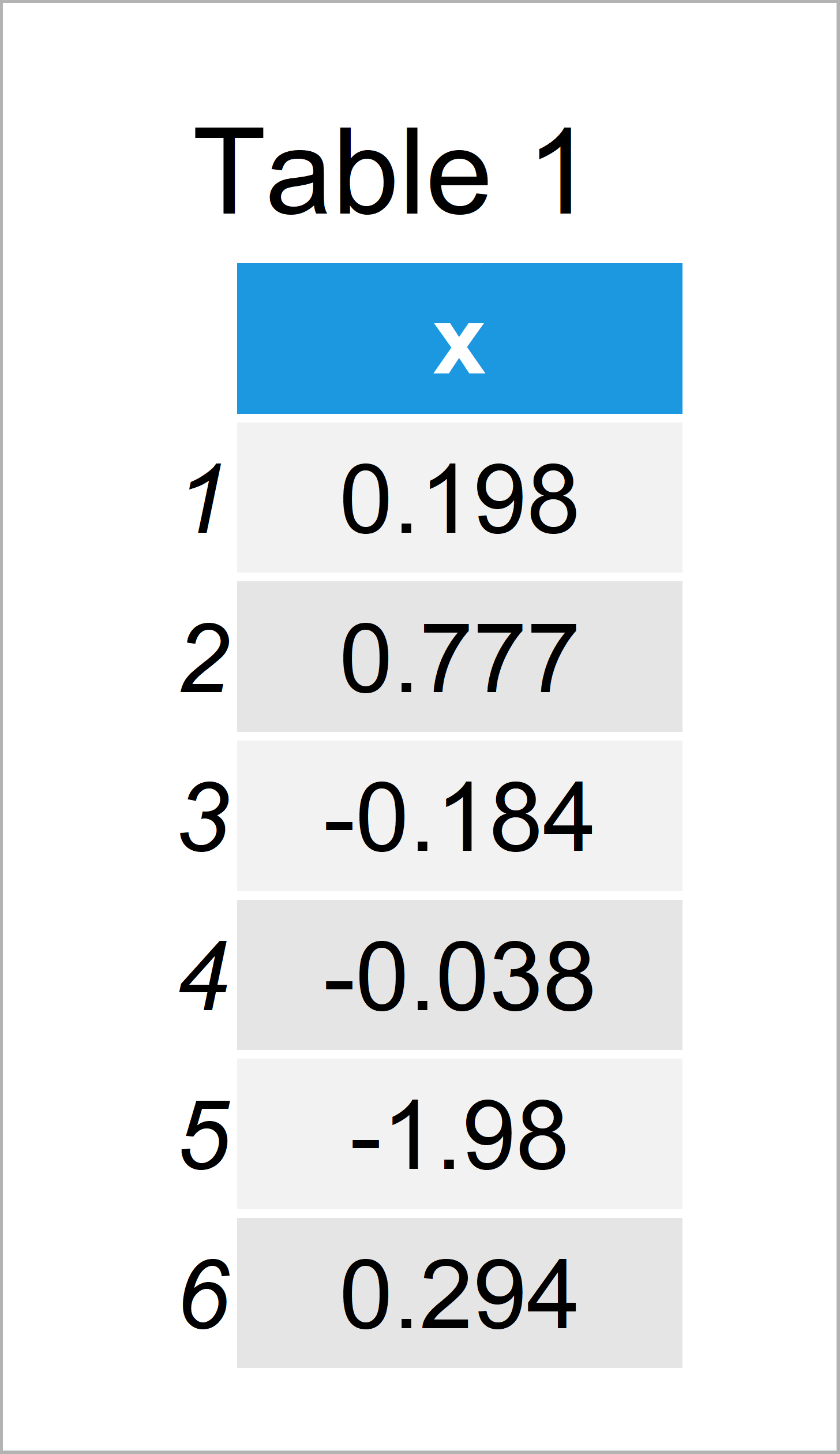
Have a look at the table that got returned after executing the previous R programming syntax. It shows that our example data has 300 observations and one column.
If we want to plot the data using the ggplot2 add-on package, we also have to install and load ggplot2:
install.packages("ggplot2")   # Install & load ggplot2
library("ggplot2")
Next, we can create a plot of the data using the ggplot2 package:
ggplot(data, aes(x)) +        # Draw regular histogram without density
  geom_histogram()

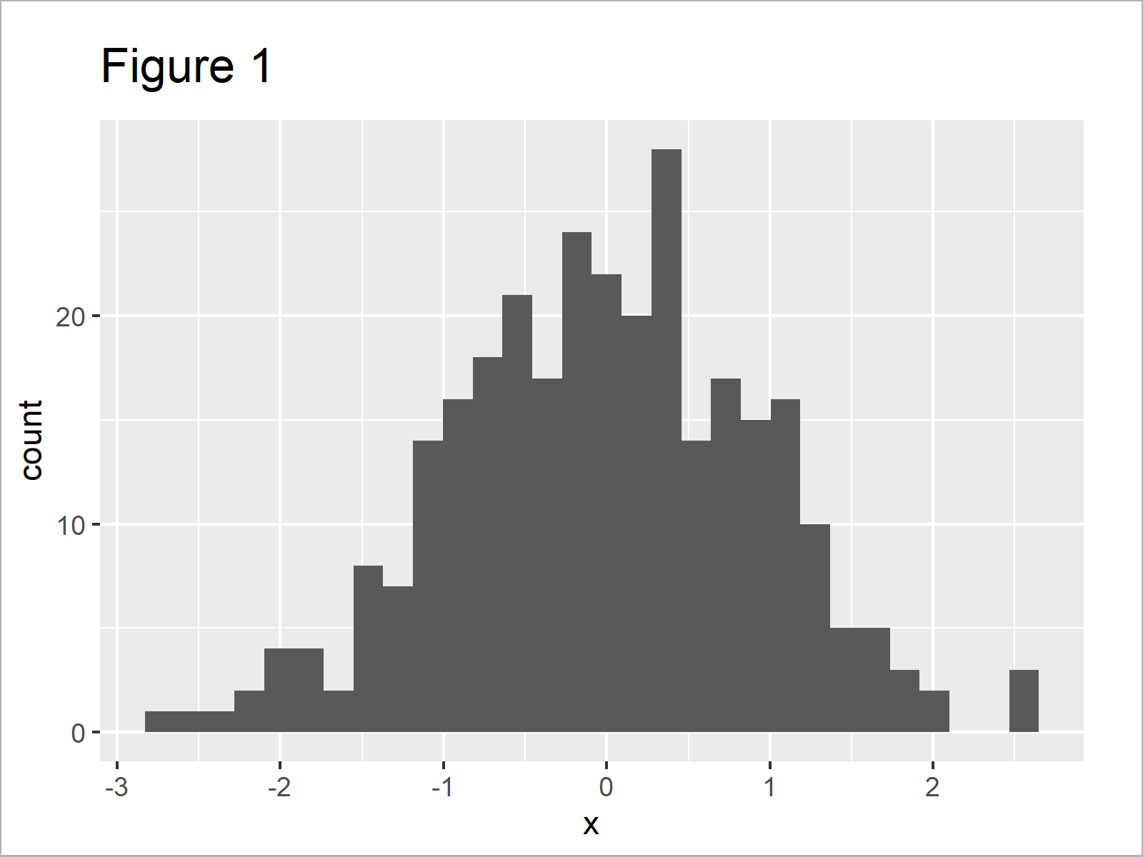
As shown in Figure 1, we have created a ggplot2 histogram with default specifications and without a normal density curve on top.
Example: Add Normal Density Curve to ggplot2 Histogram Using stat_function()
This example explains how to create a ggplot2 histogram with overlaid normal density curve.
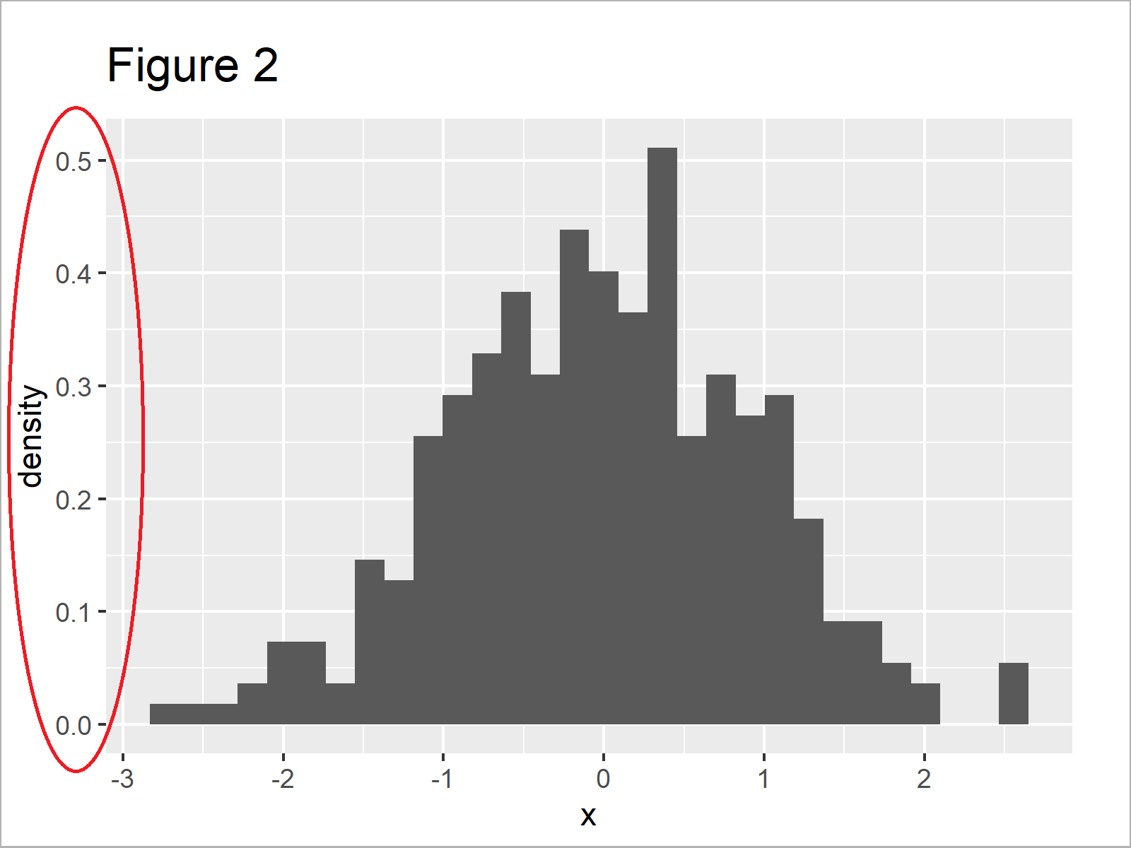
First, we have to convert the y-axis values of our histogram to probabilities. Otherwise, our density curve will not be shown properly.
Have a look at the following R code and the resulting graphic:
ggplot(data, aes(x)) +        # Draw histogram with probabilities
  geom_histogram(aes(y = ..density..))

Figure 2 shows the output of the previous code: A ggplot histogram with probabilities on the y-axis. However, there’s still no normal density line in the plot…
We can add such a normal density curve to our plot using the stat_function command as shown below:
ggplot(data, aes(x)) +        # Draw histogram with density
  geom_histogram(aes(y = ..density..)) +
  stat_function(fun = dnorm,
                args = list(mean = mean(data$x),
                            sd = sd(data$x)),
                col = "#1b98e0",
                size = 5)

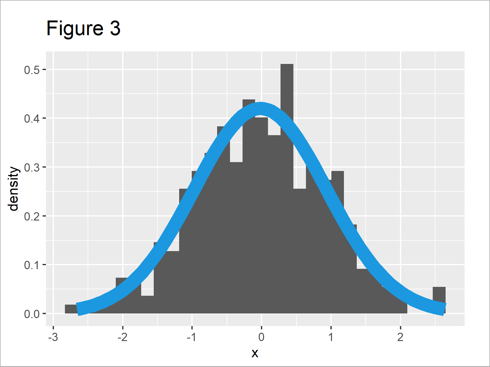
After running the previous R syntax the ggplot2 histogram with normal density curve shown in Figure 3 has been drawn.
Looks great!
Video, Further Resources & Summary
Do you want to know more about ggplot2 graphics? Then you may watch the following video of my YouTube channel. I’m illustrating the topics of this article in the video.
In addition, you may have a look at some of the related articles on this homepage.
- Create ggplot2 Histogram in R
- Plot Frequencies on Top of Stacked Bar Chart with ggplot2
- Add Image to Plot in R
- Add Count Labels on Top of ggplot2 Barchart
- Overlay Histogram with Fitted Density Curve in Base R & ggplot2 Package
- Graphics Gallery in R
- The R Programming Language
Summary: In this R tutorial you have learned how to overlay a normal distribution line on top of a ggplot2 histogram. Tell me about it in the comments below, in case you have further questions.
Subscribe to the Statistics Globe Newsletter
Get regular updates on the latest tutorials, offers & news at Statistics Globe.
I hate spam & you may opt out anytime: Privacy Policy.
Thank you!
Welcome to the Statistics Globe newsletter. From now on, I’ll send you regular emails about statistics, data science, AI, and programming with R and Python.
I’m Joachim Schork. On this website, I provide statistics tutorials as well as code in Python and R programming.
Statistics Globe Newsletter
Get regular updates on the latest tutorials, offers & news at Statistics Globe. I hate spam & you may opt out anytime: Privacy Policy.
Thank you!
Please check your email inbox and click the confirmation link to complete your subscription. If you don’t see the email within a few minutes, please also check your spam/junk folder.


