Avoid Overplotting in R (4 Examples)
In this article, you’ll learn how to improve your data visualizations by avoiding overplotted data points (also called “overplotting”) in R programming.
Table of contents:
Let’s dive into it!
What is Overplotting?
Overplotting is a term used in data visualization to describe a situation where too many data points are plotted in a single graph, leading to a cluttered, confusing, or misleading representation.
This usually occurs when the dataset being visualized has a large number of points or overlapping points, making it difficult to discern individual data points, trends, or patterns.
Overplotting can be problematic because it may obscure important information or make it challenging to interpret the visual representation accurately.
To address overplotting, various techniques can be employed. In the following examples, I demonstrate different techniques that reduce the problem of overplotting.
Let’s first define some example data!
Exemplifying Data, Software Packages & Default Graph
The following data is used as a basement for this R programming tutorial:
set.seed(75357)                           # Create example data
data <- data.frame(x = c(rnorm(10000),
                         rnorm(10000, 5, 2),
                         rnorm(10000, 1, 3)),
                   y = c(rnorm(10000),
                         rnorm(10000, 1, 4),
                         rnorm(10000, 2, 2)),
                   group = rep(LETTERS[1:3], each = 10000))
head(data)                                # Print head of example data
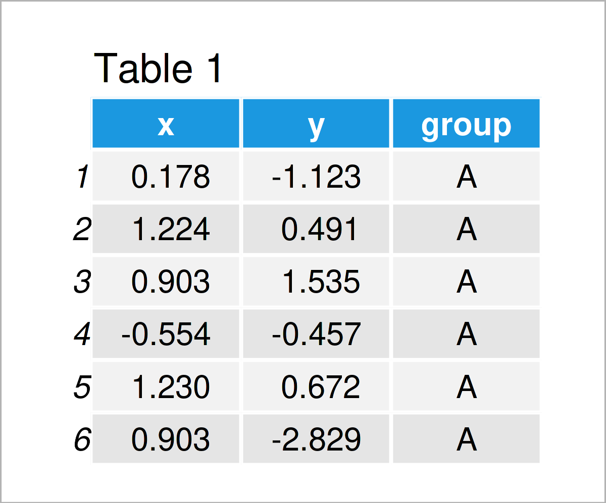
As you can see based on Table 1, our example data is a data frame containing three columns.
In this R programming tutorial, we also need to install and load the ggplot2 package to R:
install.packages("ggplot2")               # Install & load ggplot2 package
library("ggplot2")
Next, we can plot our data in a scatterplot with the default specifications of the ggplot2 package:
ggplot(data, aes(x, y)) +                 # Plot with default specifications
  geom_point()
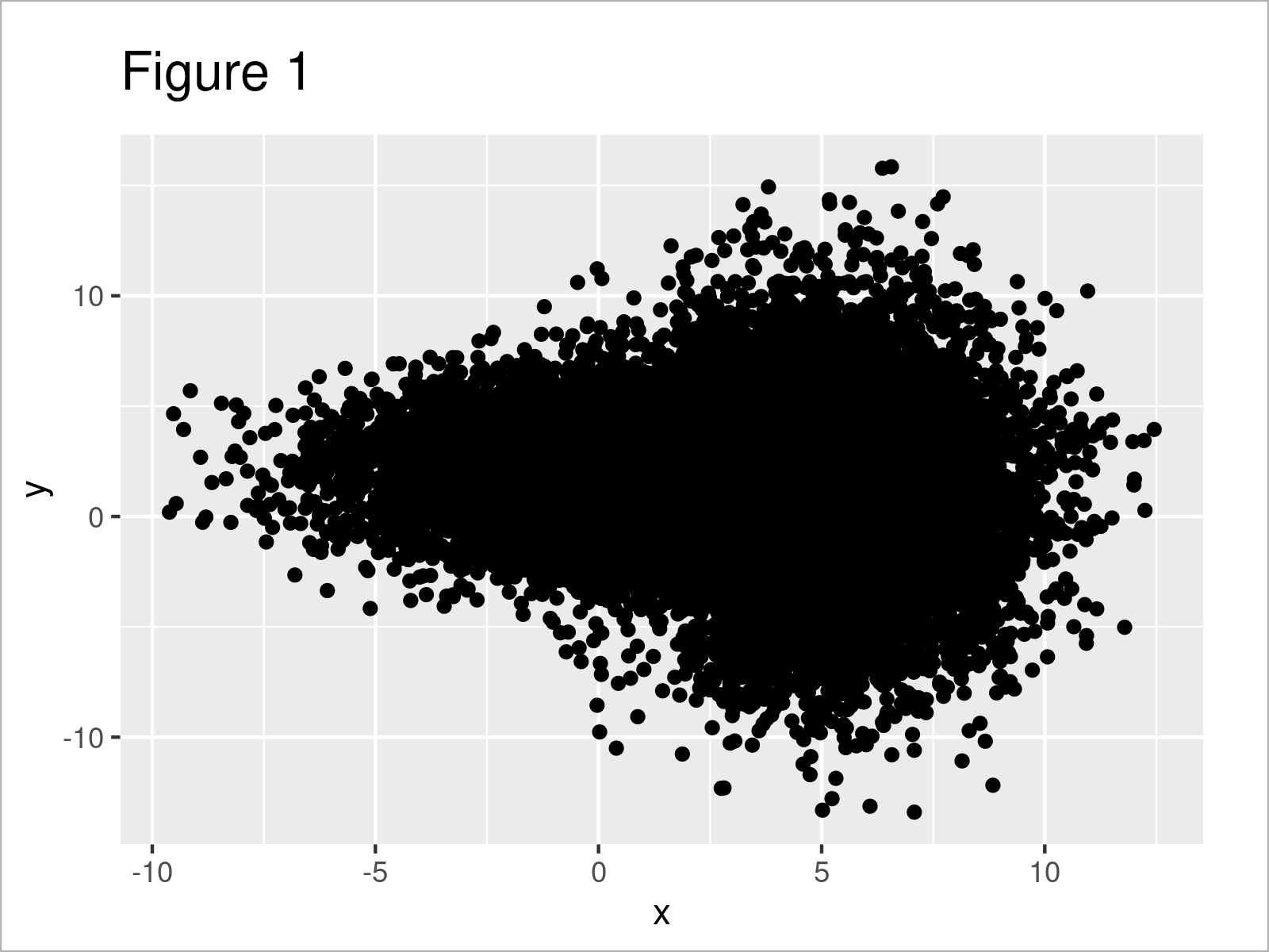
After executing the previous code, the scatterplot shown in Figure 1 has been created.
Unfortunately, there are so many data points in our plot that it’s hardly possible to see anything besides a big black bulk of points.
Let’s deal with this!
Example 1: Avoid Overplotting by Reducing Point Sizes
In Example 1, I’ll illustrate how to reduce the problem of overplotting by reducing the size of the data points in our scatterplot.
For this, we can specify the size argument within the geom_point function:
ggplot(data, aes(x, y)) +                 # Reduce point size
  geom_point(size = 0.01)
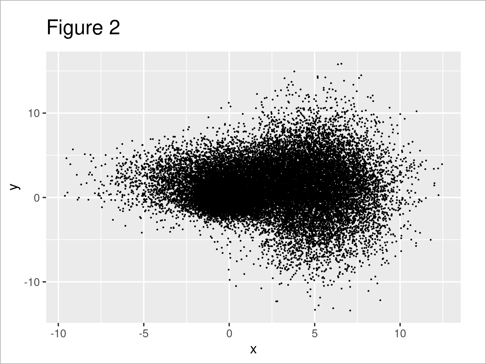
The output of the previous R programming syntax is shown in Figure 2: It’s still not perfect, but the different data points can already be distinguished a little bit better.
Let’s have a look at further techniques for the handling of overplotting!
Example 2: Avoid Overplotting by Making Points Transparent
In Example 2, I’ll demonstrate how to change the opacity of our data points to reduce the overplotting in our graphic.
All we have to do for this is to change the alpha level of our points. The lower the alpha value, the more transparent are the data points in our plot.
ggplot(data, aes(x, y)) +                 # Draw transparent points
  geom_point(alpha = 0.1)
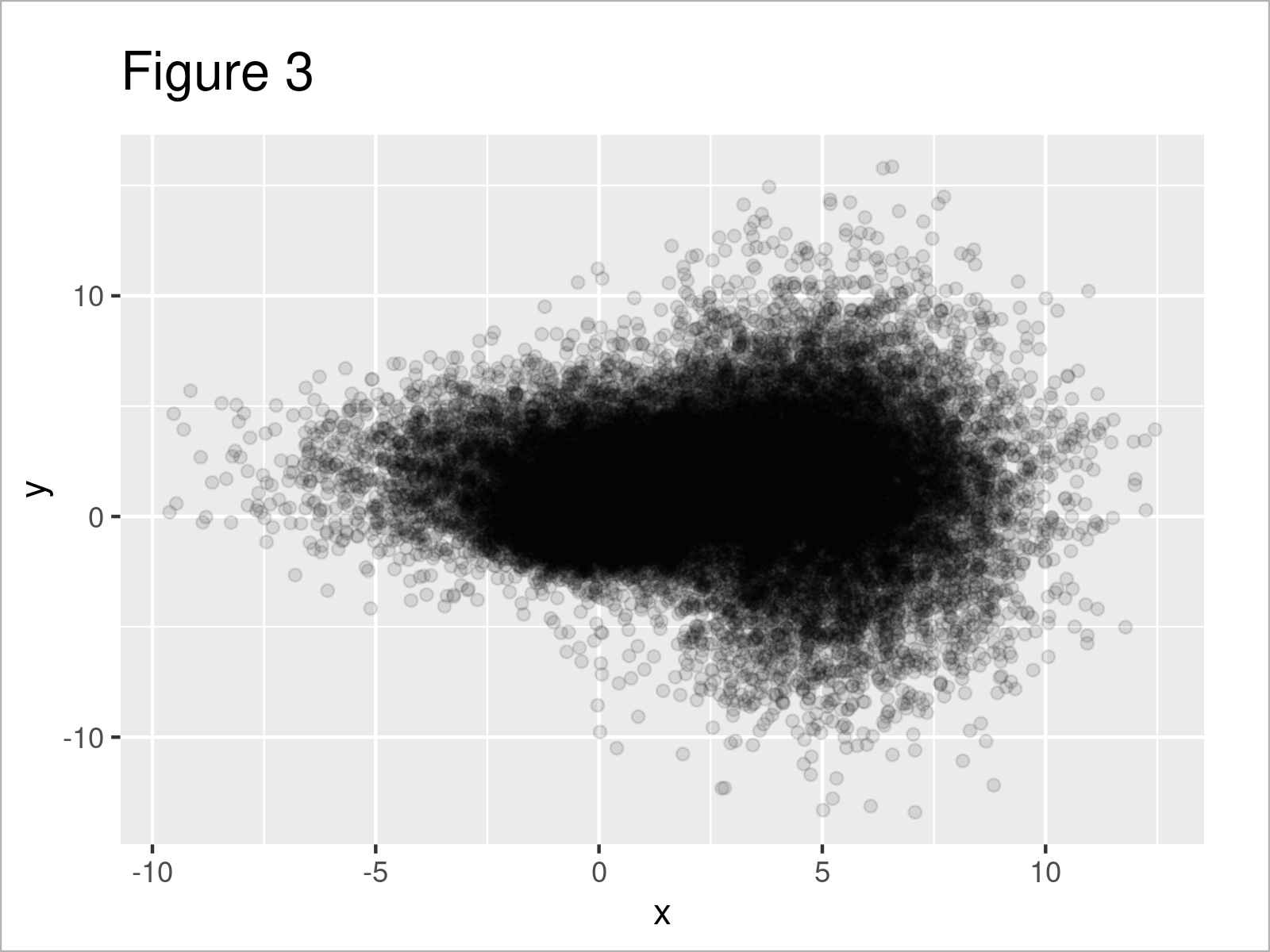
Figure 3 shows the output of the previous R programming code: Still not perfect, but we’re slowly getting there.
Example 3: Avoid Overplotting by Adding Group Colors
In this example, I’ll illustrate how to change the point color by groups in our data frame.
To achieve this, we have to set the col argument within the aesthetics of our ggplot2 plot to be equal to the group column in our data frame.
ggplot(data, aes(x, y, col = group)) +    # Add color to groups
  geom_point()
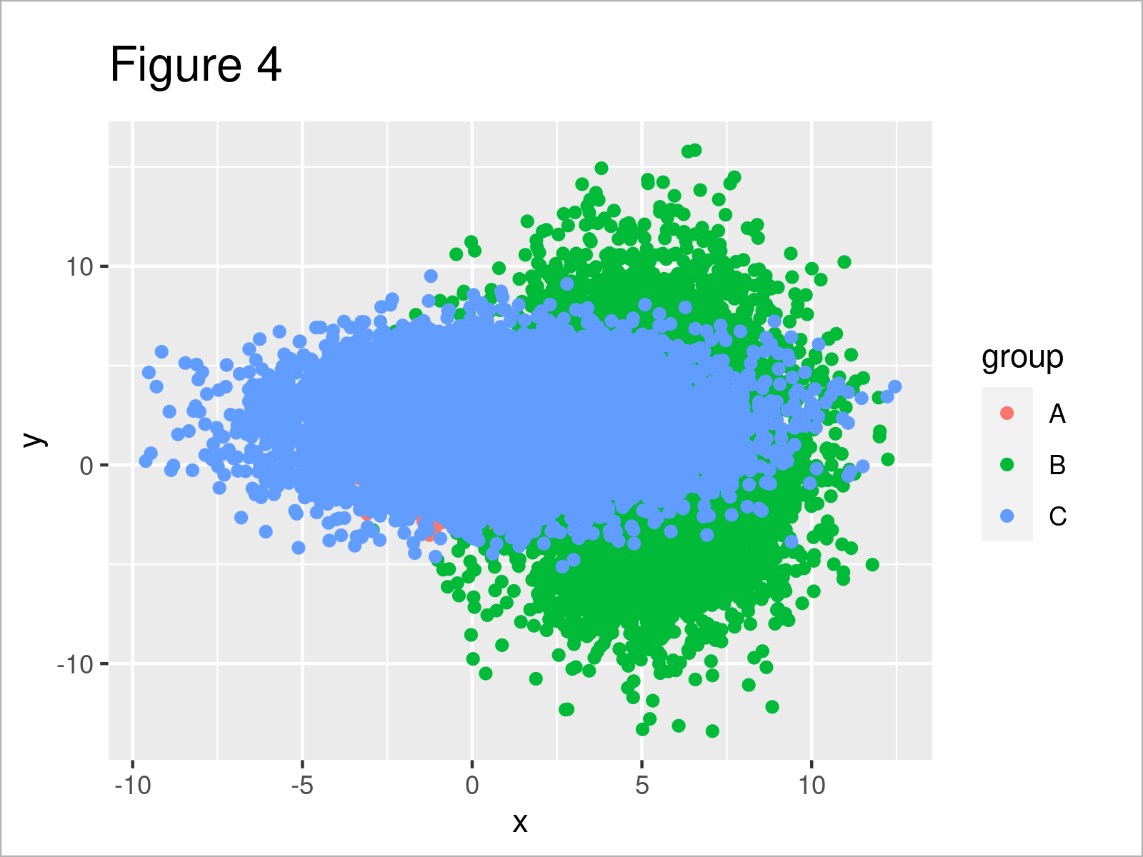
As shown in Figure 4, we have created another scatterplot by running the previous R programming code. It’s already easier to interpret the plot, but the points are still too overlapping.
Here’s the final trick…
Example 4: Combine All Methods
In the previous examples, I’ve demonstrated several different techniques to avoid overplotting. However, none of them worked perfectly.
So, why shouldn’t we combine all of these techniques in a single plot?
Let’s do this:
ggplot(data, aes(x, y, col = group)) +    # Combine all methods
  geom_point(size = 0.01, alpha = 0.1)
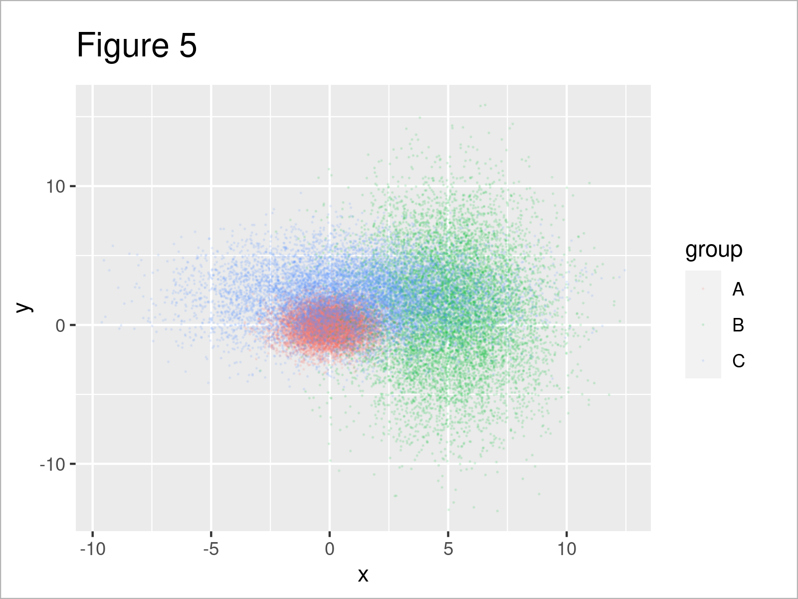
Figure 5 shows the output of the previous code: This time we can distinguish the points in our graph much better, and can hence analyze our data.
Looks great! 🙂
Video & Further Resources
If you need further information on the R codes of this article, I recommend having a look at the following video on my YouTube channel. I’m explaining the R programming codes of the present tutorial in the video.
The YouTube video will be added soon.
Furthermore, you may read the other R posts on this website.
In the present tutorial, I have shown you a selection of tools that I find useful to handle overplotting. However, there are many more methods for this task available, e.g. sampling, jittering of perfect matches or in case of categorical data, and so on…
In case you are interested in learning more about these topics, you may have a look at the related articles below:
- The jitter Function in R
- Sampling Data Using the sample Function in R
- Draw ggplot2 Plot with Two Different Continuous Color Scales
- Display Labels of ggplot2 Facet Plot in Bold or Italics
- Specify Different Colors for Points that are Connected by Lines
- Jitter & Position Dodge Simultaneously in ggplot2 Plot
- Plots in R
- Introduction to R Programming
Summary: You have learned in this tutorial how to avoid overplotting in ggplot2 graphs in the R programming language. If you have any additional questions, kindly let me know in the comments section.
Subscribe to the Statistics Globe Newsletter
Get regular updates on the latest tutorials, offers & news at Statistics Globe.
I hate spam & you may opt out anytime: Privacy Policy.
Thank you!
Welcome to the Statistics Globe newsletter. From now on, I’ll send you regular emails about statistics, data science, AI, and programming with R and Python.
I’m Joachim Schork. On this website, I provide statistics tutorials as well as code in Python and R programming.
Statistics Globe Newsletter
Get regular updates on the latest tutorials, offers & news at Statistics Globe. I hate spam & you may opt out anytime: Privacy Policy.
Thank you!
Please check your email inbox and click the confirmation link to complete your subscription. If you don’t see the email within a few minutes, please also check your spam/junk folder.


