Draw Grouped Barplot in R (3 Examples)
This tutorial illustrates how to create a bargraph with groups in the R programming language.
The post will consist of this:
Let’s take a look at some R codes in action!
Creation of Example Data
The following data will be used as basement for this R programming tutorial:
data <- data.frame(values = c(4, 1, 3, 6, 7, 3),  # Create example data
                   group = rep(c("group 1",
                                 "group 2",
                                 "group 3"),
                               each = 2),
                   subgroup = LETTERS[1:2])
data                                              # Print example data
#   values   group subgroup
# 1      4 group 1        A
# 2      1 group 1        B
# 3      3 group 2        A
# 4      6 group 2        B
# 5      7 group 3        A
# 6      3 group 3        B
Have a look at the previous output of the RStudio console. It shows that our example data has six rows and three columns.
The variable values contains the height of our bars, the variable group defines three different groups, and the variable subgroup divides each of our three main groups into two subgroups A and B.
The following examples show three different alternatives on how to draw grouped barplots in R. So keep on reading!
Example 1: Drawing Grouped Barchart Using Base R
In this example, I’ll show how to use the basic installation of the R programming language to draw a barplot with groups.
For this, we first have to convert our data frame to a properly formatted matrix:
data_base <- reshape(data,                        # Modify data for Base R barplot
                     idvar = "subgroup",
                     timevar = "group",
                     direction = "wide")
row.names(data_base) <- data_base$subgroup
data_base <- data_base[ , 2:ncol(data_base)]
colnames(data_base) <- c("group 1", "group 2", "group 3")
data_base <- as.matrix(data_base)
data_base                                         # Print modified data
#   group 1 group 2 group 3
# A       4       3       7
# B       1       6       3
Have a look at the previous output of the RStudio console. It shows our matrix that we will use to draw a Base R barchart.
The grouping column was converted to be the variables of our matrix and the subgroups are now specified by the row names.
Now, we can use the barplot() function to draw our grouped barplot in Base R:
barplot(height = data_base,                       # Grouped barplot using Base R
        beside = TRUE)

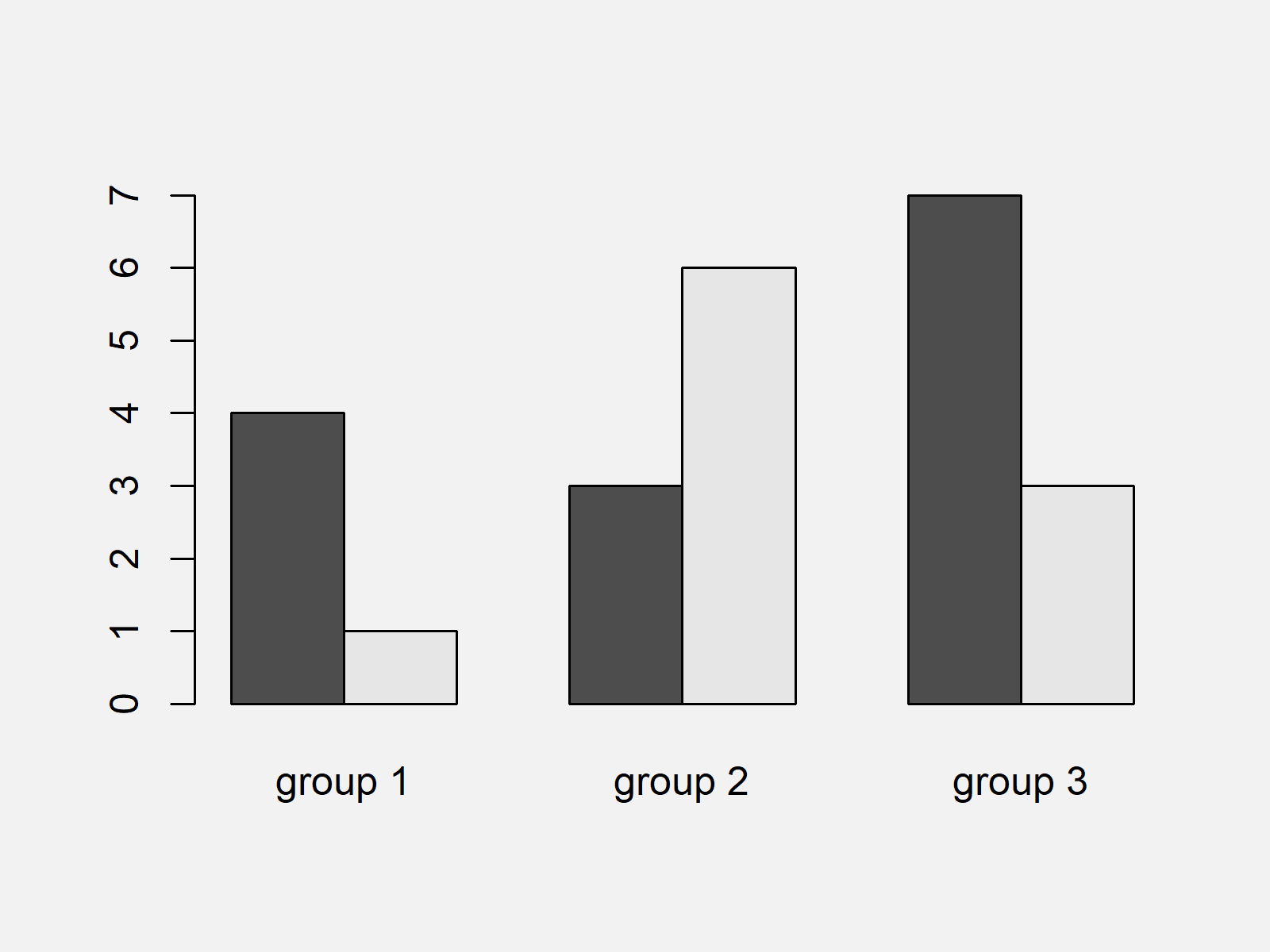
As shown in Figure 1, we drew a bargraph with groups with the previous syntax.
However, the previous R code was kind of complicated and often the layouts of other graphical packages are preferred over the Base R graphics layout.
In the following examples, I’ll explain how to draw grouped barcharts using R add-on packages.
Example 2: Drawing Grouped Barchart Using ggplot2 Package
In Example 2, I’ll illustrate how to create a grouped barplot using the ggplot2 add-on package.
In case we want to apply the functions of the ggplot2 package, we first need to install and load ggplot2:
install.packages("ggplot2")                       # Install & load ggplot2 package
library("ggplot2")
Now, we can use the ggplot2 and the geom_bars functions to draw a grouped ggplot2 barchart.
Note that we are using the subgroup column to define the filling color of each category of the bars, and we are specifying the position argument within the geom_bar function to be equal to “dodge”.
ggplot(data,                                      # Grouped barplot using ggplot2
       aes(x = group,
           y = values,
           fill = subgroup)) +
  geom_bar(stat = "identity",
           position = "dodge")

As shown in Figure 2, the previous R syntax drew a ggplot2 barchart with groups side-by-side.
Note that we did not have to convert our input data in the forefront. In other words, the data type that is used by the basic installation of the R programming language (see Example 1) is different compared to the data type used by the ggplot2 package.
Example 3: Drawing Grouped Barchart Using lattice Package
Another popular add-on package for graphics in R is the lattice package.
If we want to use the functions of the lattice add-on package, we first have to install and load lattice to RStudio.
install.packages("lattice")                       # Install lattice package
library("lattice")                                # Load lattice package
Now, we can use the barchart function provided by the lattice package and the groups argument to create a grouped barchart:
barchart(values ~ group,                          # Grouped barplot using lattice
         data = data,
         groups = subgroup)

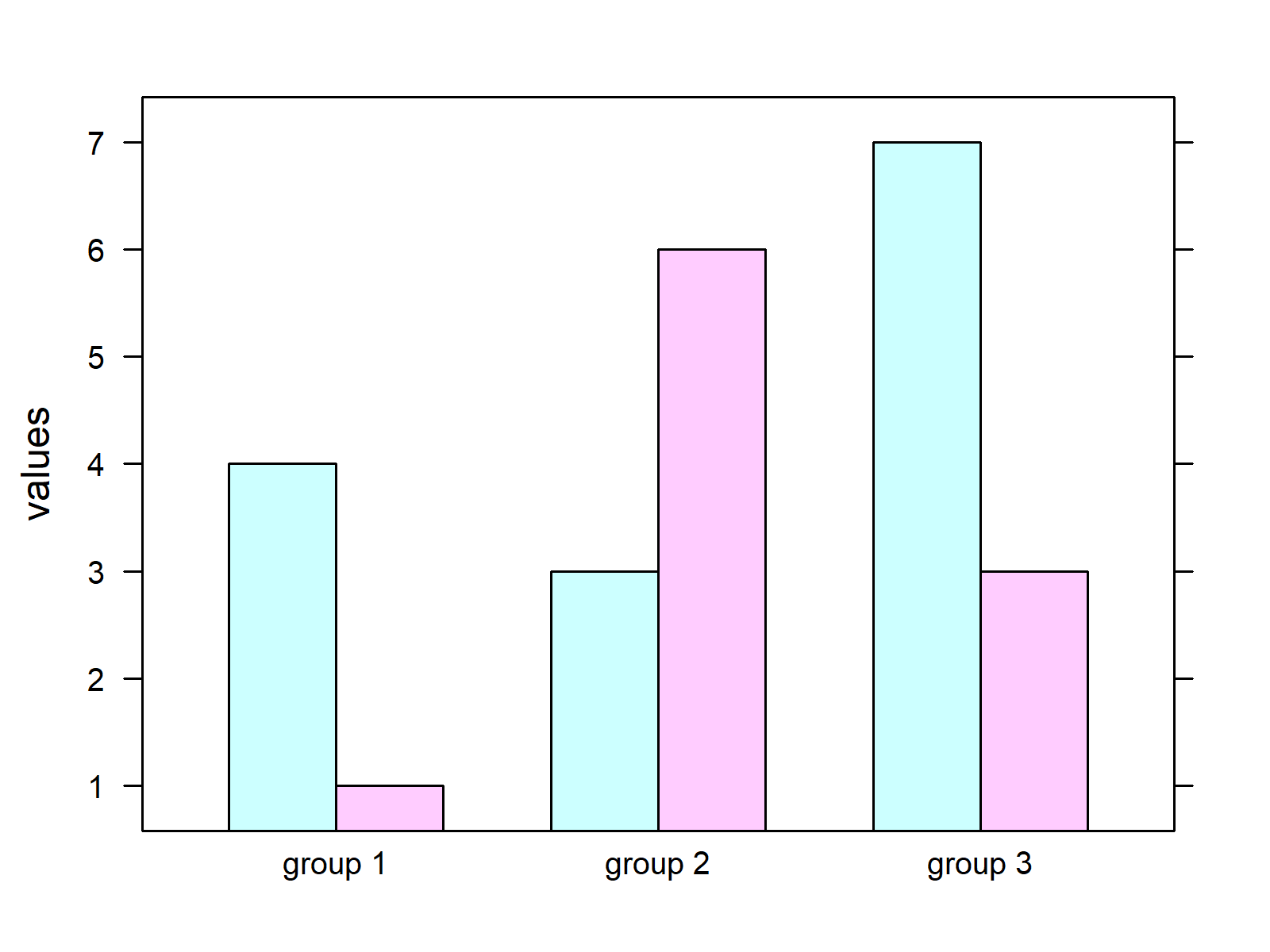
As shown in Figure 3, we created a barplot with groups using the functions of the lattice package with the previous R programming syntax.
Video & Further Resources
Have a look at the following video of my YouTube channel. In the video, I’m showing the R codes of this page:
The YouTube video will be added soon.
In addition, I can recommend having a look at some of the related tutorials of my website:
- Barplot in R
- Stacked Barplot in R
- Add Count Labels on Top of ggplot2 Barchart
- Change Colors of Bars in ggplot2 Barchart
- Plotting Data in R
- R Programming Examples
In this R tutorial you learned how to construct grouped barplots with multiple bars representing each category of our data. If you have further comments or questions, don’t hesitate to tell me about it in the comments section.


14 Comments. Leave new
You saved me some lots of work using the ‘melt’ argument and now also stacking bars side by side using the ggplot function.
Hey Samuel,
Thank you for the very kind comment, glad my tutorials are helpful to you! 🙂
Regards,
Joachim
So helpful, you allowed me go ahead in my data analysis. Thank so much
Hey Somda,
Thanks a lot, this is great to hear!
Regards,
Joachim
Great and helpful post! What to do if I want to have more variables in each group?
I am examining climate decision making in agriculture and have an IV with three levels (condition), a binary DV (climate policy support, yes/no), and then I have two binary control variables I want to plot (land ownership: renter/owner and work status: work outside/full time). So I’m trying to produce a grouped bar chart with three groups x four bars, one group for each condition and one bar for each of the combinations of renters, owners, work outside, and full time. The y axis indicates share of respondents in favor of climate policy.
Or is there some other way that is perhaps better to present my data–correlation or some other form? Many thanks in advance!
Hello Andrea,
What should be your final combined grouping? I didn’t get that well. Could you please explain it a bit more precisely?
Best,
Cansu
Hello,
Thanks for your reply!
I am trying to understand how these two variables, land ownership and work status, influence the effect of my treatment conditions on the DV. So I was envisaging a grouped bar chart with three groups, one for each condition, where each group had four bars, one for land renters who work outside, one for land renters who work full time on farm, one for land owners who work outside, and one for owners (full time).
I use group_by and summarise to get the means, SD and SE of the data, however I can’t get a ggplot-code to work.
However, I am also slightly concerned as the n becomes quite low when segregating them into these groups. I am also wondering if there might be a better way to present it, through correlation plots or something similar?
Still quite new to r and these posts are super helpful, thanks again!
Hello Andrea,
I think barplot is not a bad choice. I am just not sure how relevant to show the mean and se of data is. However, you said that your ns are getting too low when you separate your data into combinations of groups. When you don’t have a sufficient sample size, your estimations will also be unreliable. So here you have a bigger issue, I think.
I understand that you are interested in interaction effects. But if your sample size is limited. Maybe investigating the main effects would be wiser.
Best,
Cansu
Hi,
how do you plot label values in a clustered graph (geom_bar) without overlapping?
Thanks
Panos
Hello Panos,
The solutions in the tutorials: Rotate ggplot2 Axis Labels in R and Wrap Long Axis Labels of ggplot2 Plot into Multiple Lines in R may be helpful.
Best,
Cansu
Hi, your article helped me a lot!!
Was just wondering how I could change the name of subgroups A and B in the legend to the variables they actually represent? Thank you!
Hello Rachel,
If you want to rename your subgroups, you can rename the values. Please see the tutorial dplyr mutate Function with Logical ifelse Condition in R for the guide.
Best,
Cansu
Hi there! could you send me a tibble of your data for example 2, so I can see how it is structured. I am having trouble replicating the grouped barplot in ggplot 2. I beleive my data is not in the correct form.
Hello Timothy,
You can use as_tibble() function to convert the data frame to a tibble. See the explanatio here.
Best,
Cansu