Set Color by Group in ggplot2 Plot in R (4 Examples)
On this page, I’ll show how to specify different group colors in a ggplot2 graph in the R programming language.
The content of the post looks like this:
Let’s dig in:
Example Data, Packages & Default Plot
As a first step, we’ll need to construct some data that we can use in the examples later on:
set.seed(68117534)              # Set random seed
data <- data.frame(x = 1:15,    # Create example data frame
                   y = c(runif(15, 0, 2),
                         runif(15, 2, 6),
                         runif(15, 3, 4),
                         runif(15, 1, 3)),
                   group = rep(LETTERS[1:4], each = 15))
head(data)                      # Print head of example data frame
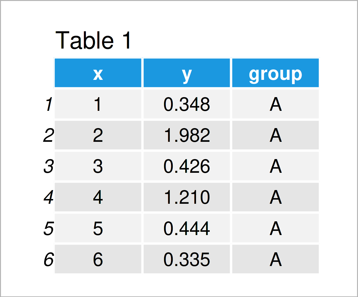
Table 1 shows the first six rows of our example data: it is also shown that the data contains three columns.
For the examples of this tutorial, I’ll also need to install and load the ggplot2 package to RStudio:
install.packages("ggplot2")     # Install & load ggplot2 package
library("ggplot2")
As a next step, we can plot our data without colors:
ggplot(data,                    # Draw ggplot2 plot without colors
       aes(x = x,
           y = y,
           group = group)) +
  geom_line() +
  geom_point()
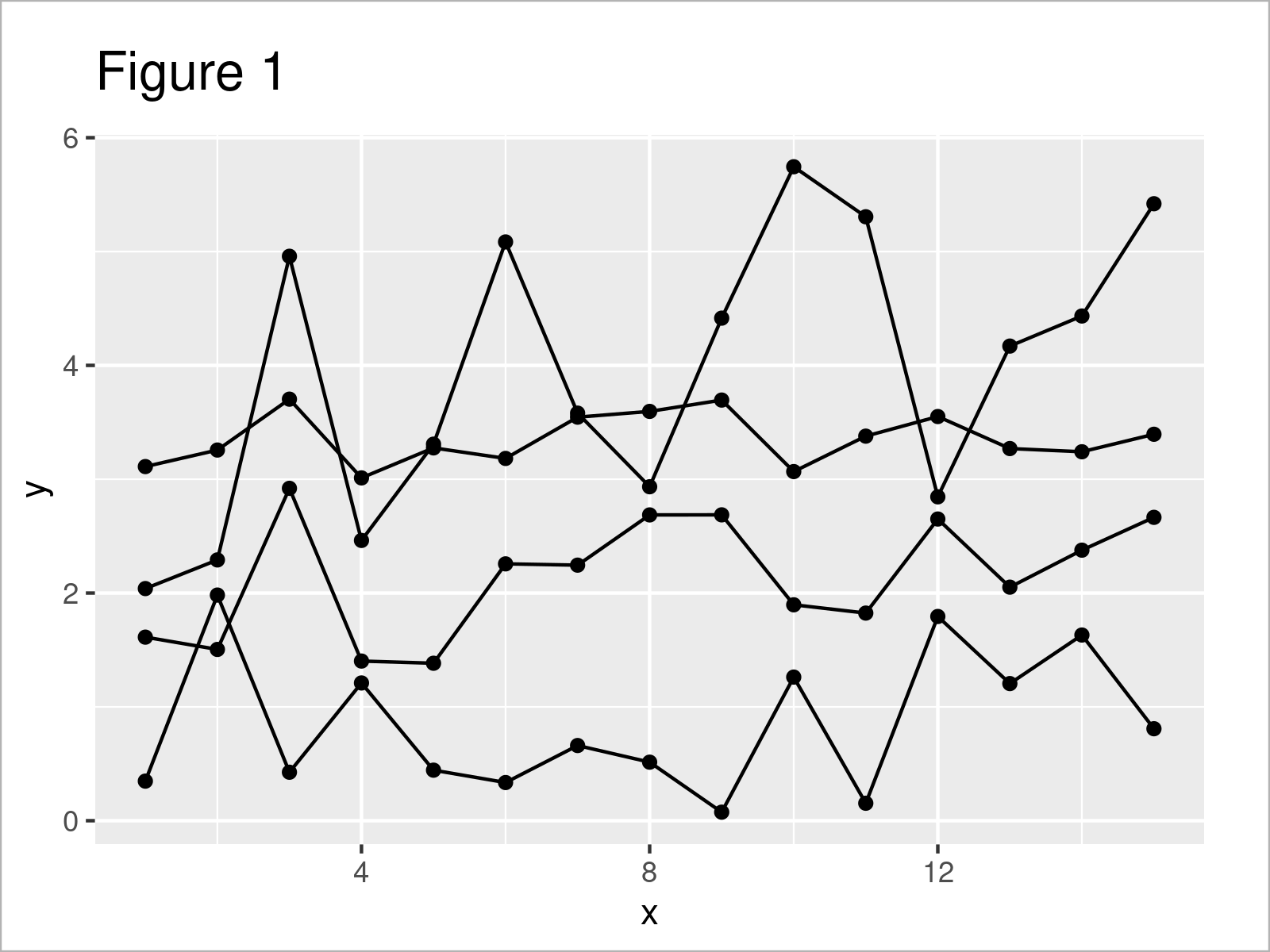
By executing the previously shown R programming syntax, we have drawn Figure 1, i.e. a ggplot2 line and point graphic without any colors.
Example 1: Modify Colors of Single Geom by Group
Example 1 shows how to adjust the colors in a ggplot2 plot by group for a single geom.
In this specific example, we are changing the line colors of our plot:
ggplot(data,                    # Change colors of lines by group
       aes(x = x,
           y = y,
           group = group)) +
  geom_line(aes(col = group)) +
  geom_point()
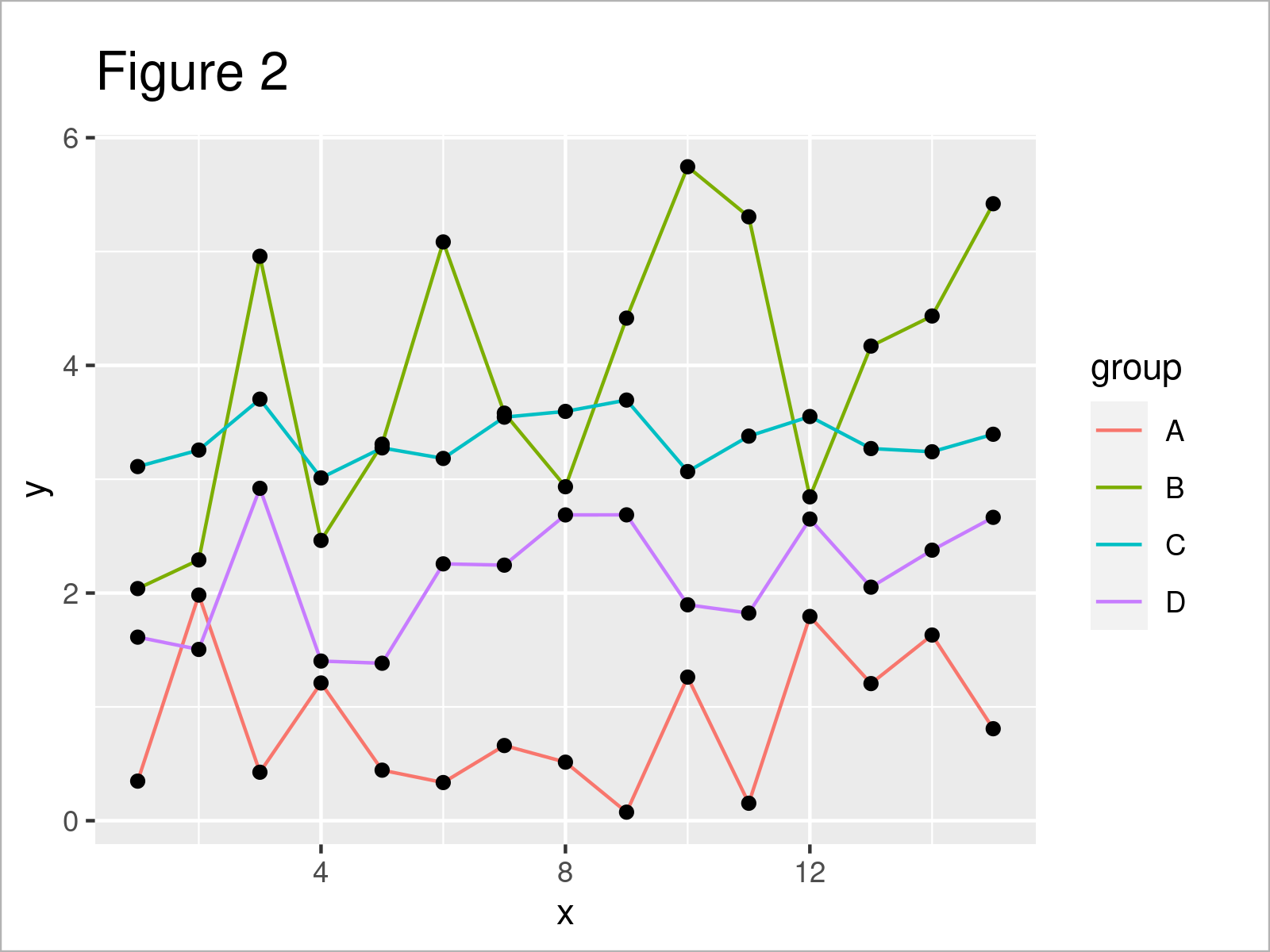
Figure 2 shows the output of the previous syntax: We have adjusted the line colors. However, the color of the points has been kept the same.
Example 2: Modify Colors of All Geoms by Group
It is also possible to change all colors according to the groups in a data set.
To achieve this, we have to specify the col argument within the aesthetics of the ggplot function:
ggplot(data,                    # Change colors of lines & points by group
       aes(x = x,
           y = y,
           col = group)) +
  geom_line() +
  geom_point()
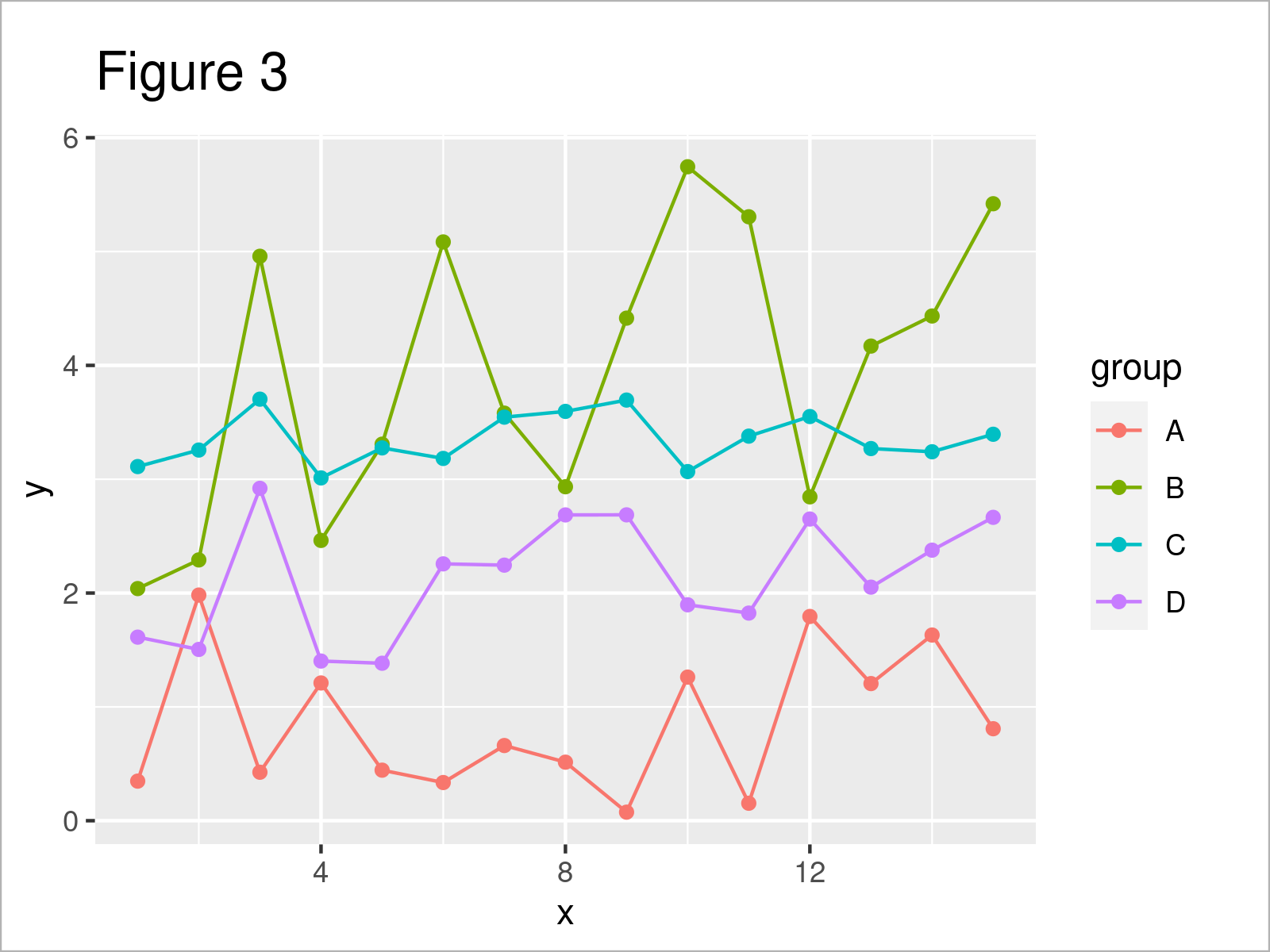
As shown in Figure 3, the previous code has created a new ggplot2 plot where all colors have been changed by group.
Example 3: Using Manual Color Codes by Group
In this example, I’ll demonstrate how to set manual color codes for each group in a ggplot2 graphic.
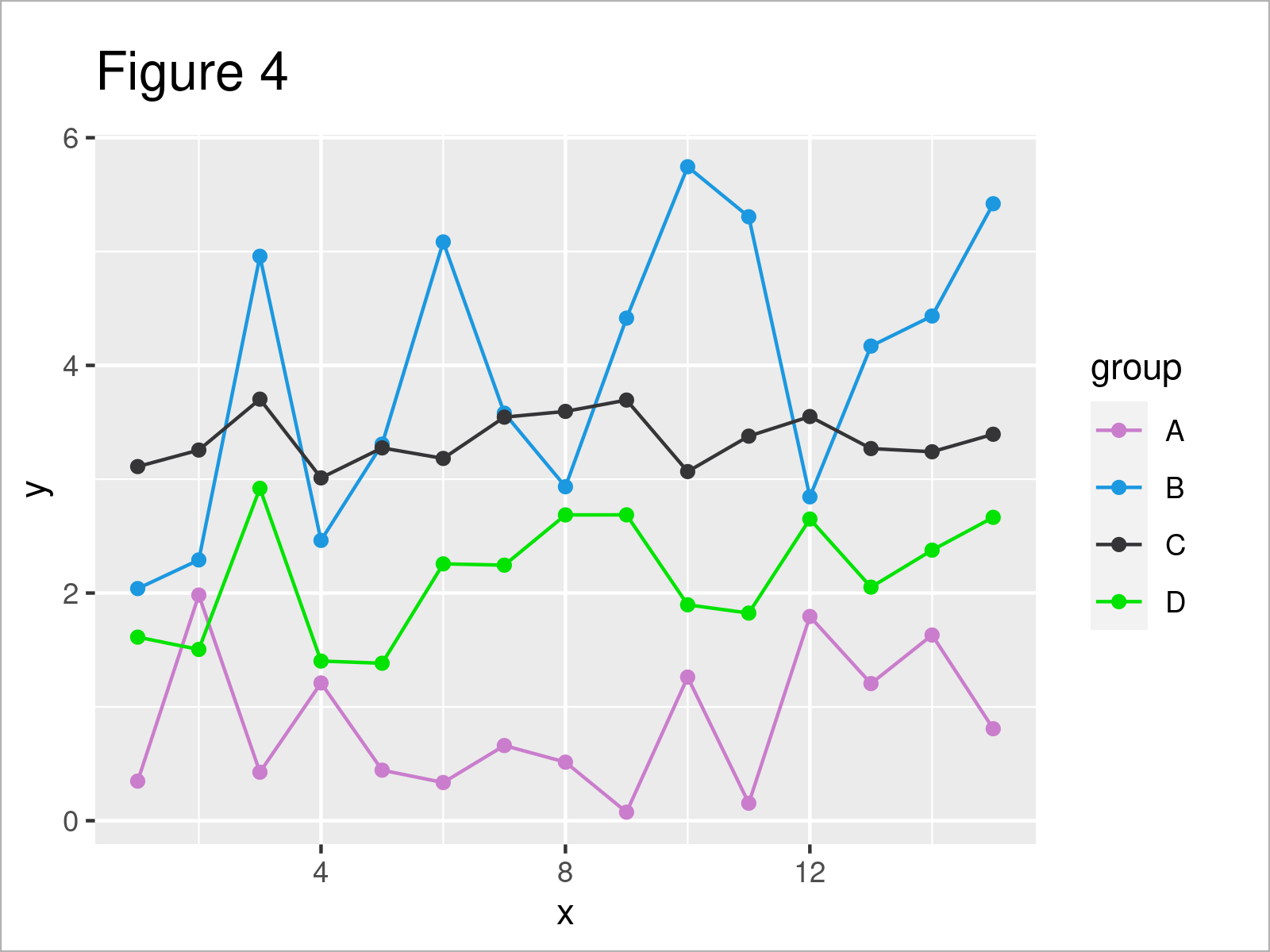
For this task, we have to use the scale_color_manual function as shown below. Within this function, we can set a different hex color code for each group:
ggplot(data,                    # Specify colors manually
       aes(x = x,
           y = y,
           col = group)) +
  geom_line() +
  geom_point() +
  scale_color_manual(values = c("#ca7dcc",
                                "#1b98e0",
                                "#353436",
                                "#02e302"))
Example 4: Modify Fill Colors of Boxplots by Group
Until now, we have changed the colors in a ggplot2 line and point graph. This example illustrates how to modify the colors of a boxplot graphic.
For this, we can use the fill argument within the aesthetics of the ggplot function:
ggplot(data,                    # Change colors of boxplots
       aes(y = y,
           fill = group)) +
  geom_boxplot()
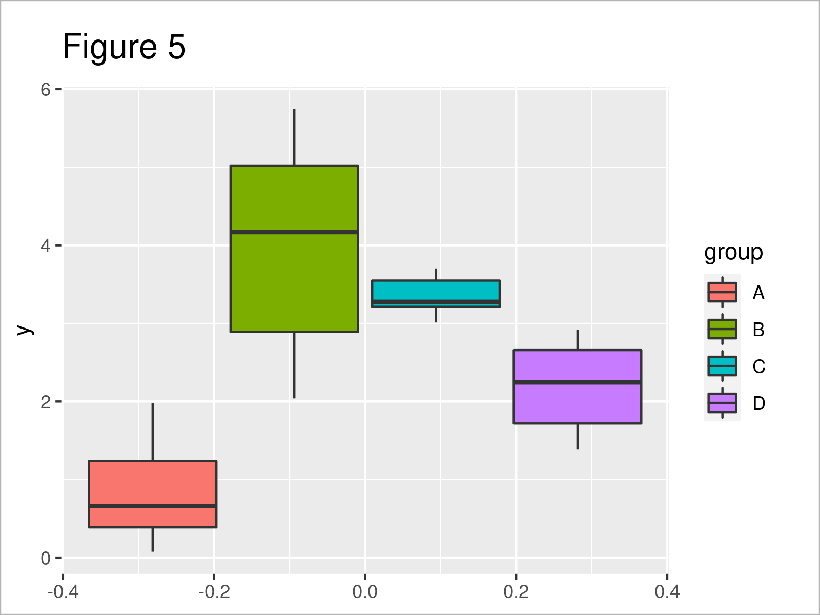
By executing the previous code, we have created Figure 5, i.e. several boxplots side-by-side where each box has a different fill color.
Video, Further Resources & Summary
Have a look at the following video which I have published on my YouTube channel. I explain the examples of this article in the video.
Furthermore, you might have a look at the other tutorials on my website.
- Change Fill and Border Color of ggplot2 Plot
- Set Axis Limits of ggplot2 Facet Plot
- Control Line Color & Type in ggplot2 Plot Legend
- Change Theme Color in ggplot2 Plot in R
- Change Continuous Color Range in ggplot2 Plot
- Plots in R
- Introduction to R
To summarize: You have learned in this article how to set certain group colors in a ggplot2 graphic in the R programming language. In case you have any further questions, don’t hesitate to kindly let me know in the comments section.
Subscribe to the Statistics Globe Newsletter
Get regular updates on the latest tutorials, offers & news at Statistics Globe.
I hate spam & you may opt out anytime: Privacy Policy.
Thank you!
Welcome to the Statistics Globe newsletter. From now on, I’ll send you regular emails about statistics, data science, AI, and programming with R and Python.
I’m Joachim Schork. On this website, I provide statistics tutorials as well as code in Python and R programming.
Statistics Globe Newsletter
Get regular updates on the latest tutorials, offers & news at Statistics Globe. I hate spam & you may opt out anytime: Privacy Policy.
Thank you!
Please check your email inbox and click the confirmation link to complete your subscription. If you don’t see the email within a few minutes, please also check your spam/junk folder.


2 Comments. Leave new
Be blessed brother long live
Thank you for the wonderful words. Be blessed as well!
Regards, Matthias