Overlay ggplot2 Density Plots in R (2 Examples)
In this tutorial, I’ll explain how to plot several ggplot2 densities in the same graph in the R programming language.
The page is structured as follows:
Let’s get started:
Example Data & Add-On Package
I’ll use the following data as basement for this tutorial:
set.seed(9210367)                     # Create example data
data <- data.frame(value = c(rnorm(100),
                             rpois(100, 3),
                             runif(100)),
                   group = rep(c("rnorm",
                                 "rpois",
                                 "runif"),
                               each = 100))
head(data)                            # Head of example data
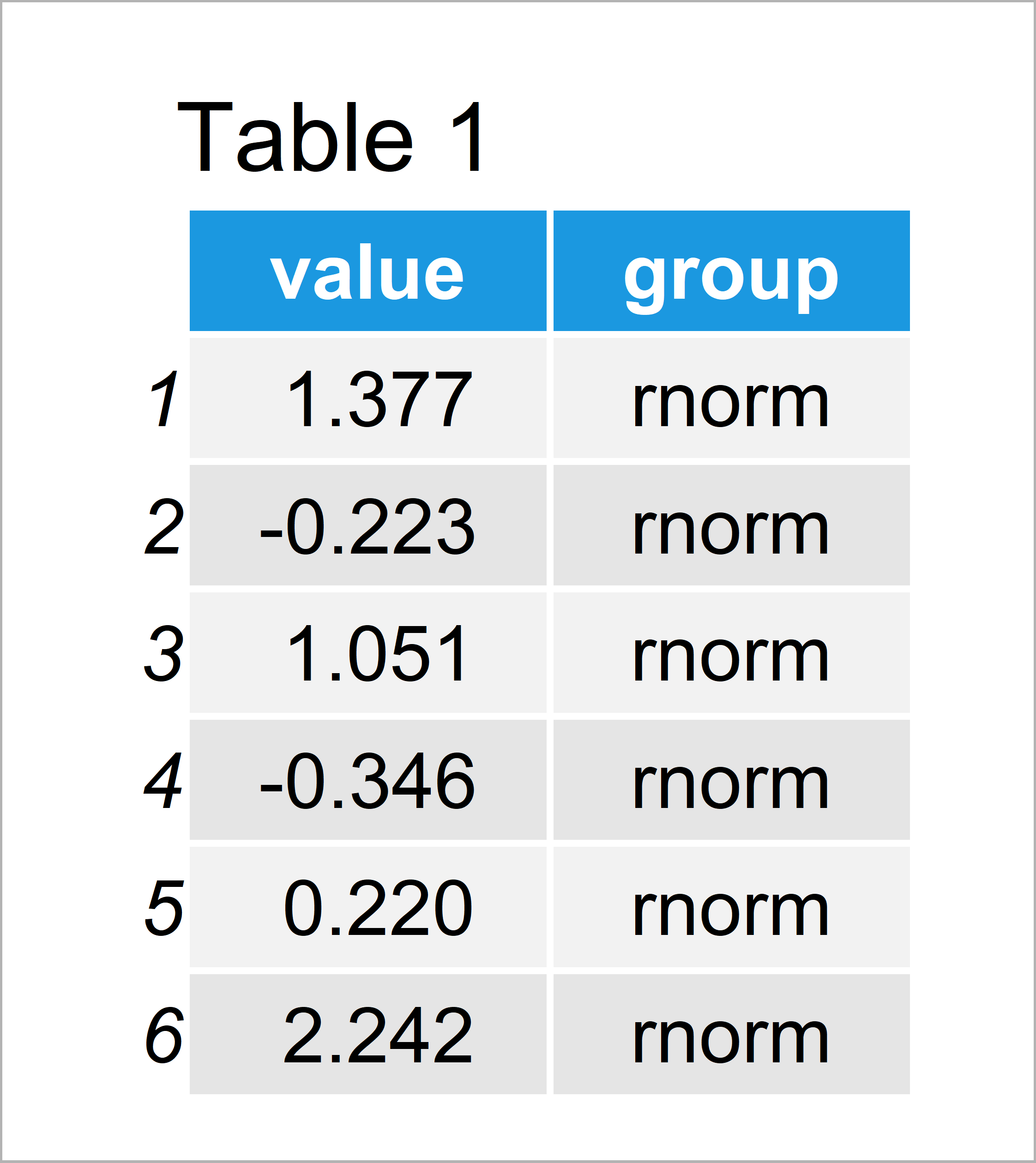
Have a look at the table that has been returned after executing the previous syntax. It shows that our example data is composed of 300 rows and two variables.
The variable “value” contains the data points and the variable “group” consists of the corresponding groups.
To be able to use the functions of the ggplot2 package, we also need to install and load ggplot2:
install.packages("ggplot2")           # Install ggplot2 package
library("ggplot2")                    # Load ggplot2 package
Now, we have prepared everything and can move on to the plot examples.
Example 1: Draw Multiple ggplot2 Density Plots in Same Graph
In Example 1, I’ll illustrate how to create a ggplot2 graphic showing several overlaid density plots.
For this, we have to specify the values of our data as x and the groups of our data as fill. Hereby, it is important to specify these arguments within the aesthetics of our plot (i.e. within the aes function).
Consider the following R syntax:
ggplot(data,                          # Overlaid densities
       aes(x = value,
           fill = group)) +
  geom_density()
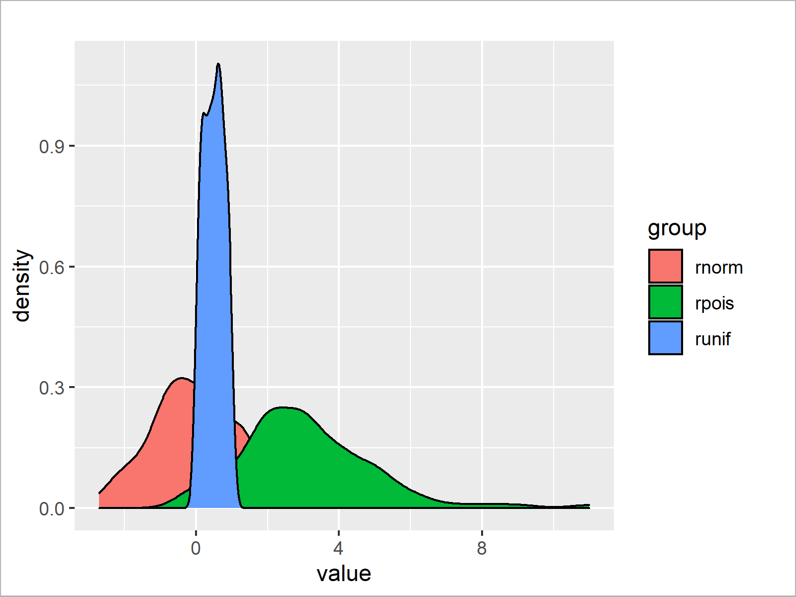
By executing the previous syntax we have managed to create Figure 1, i.e. a ggplot2 graph containing three different density plots.
Example 2: Draw Multiple Transparent ggplot2 Density Plots in Same Graph
In the plot that we have created in Example 1, the overlapping parts of the densities make it impossible to see the shape of the density in the background.
For this reason, it may be useful to make our densities transparent.
Example 2 explains how to decrease the opacity of our density plots by specifying the alpha argument within the geom_density function.
Have a look at the following R code:
ggplot(data,                          # Overlaid transparent densities
       aes(x = value,
           fill = group)) +
  geom_density(alpha = 0.3)
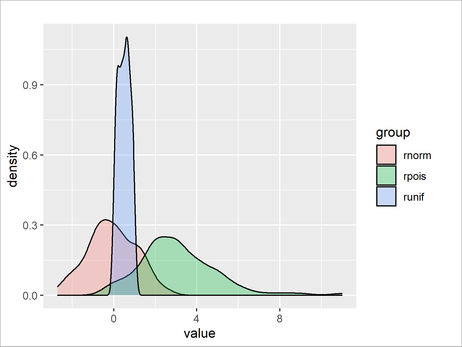
The output of the previous R programming code is shown in Figure 2: A ggplot2 graphic containing multiple transparent density plots.
To make our densities transparent, we just had to specify the alpha argument within the geom_density function. Everything else was kept the same as in Example 1.
Video, Further Resources & Summary
Do you need more explanations on the R programming syntax of this tutorial? Then you may want to watch the following video of my YouTube channel. In the video, I’m explaining the contents of this tutorial.
Furthermore, you could read some of the other tutorials of this website:
- Overlay Density Plots in Base R in R
- Overlay Histogram with Fitted Density Curve in Base R & ggplot2 Package
- R Graphics Gallery
- All R Programming Tutorials
On this page, I have illustrated how to overlay multiple density plots using the ggplot2 package in R. Please let me know in the comments section, if you have further comments or questions.
Subscribe to the Statistics Globe Newsletter
Get regular updates on the latest tutorials, offers & news at Statistics Globe.
I hate spam & you may opt out anytime: Privacy Policy.
Thank you!
Welcome to the Statistics Globe newsletter. From now on, I’ll send you regular emails about statistics, data science, AI, and programming with R and Python.
I’m Joachim Schork. On this website, I provide statistics tutorials as well as code in Python and R programming.
Statistics Globe Newsletter
Get regular updates on the latest tutorials, offers & news at Statistics Globe. I hate spam & you may opt out anytime: Privacy Policy.
Thank you!
Please check your email inbox and click the confirmation link to complete your subscription. If you don’t see the email within a few minutes, please also check your spam/junk folder.




2 Comments. Leave new
How to make boxplot with standard error in R. How to arrange data for this excel.
Hey Shweta,
Please have a look here: https://statisticsglobe.com/boxplot-in-r
Regards
Joachim