Add Polynomial Regression Line to Plot in R (2 Examples) | Base R & ggplot2
In this article, I’ll demonstrate how to draw a polynomial regression line in R programming.
The article consists of two examples for the addition of a polynomial regression line to a graph. To be more precise, the page will contain the following contents:
Let’s jump right to the examples!
Creation of Example Data
The following data will be used as a basis for this R tutorial:
set.seed(7355826)                   # Create example data frame
x <- rnorm(200)
y <- rnorm(200) + 0.2 * x^3
data <- data.frame(x, y)
head(data)                          # Print example data frame
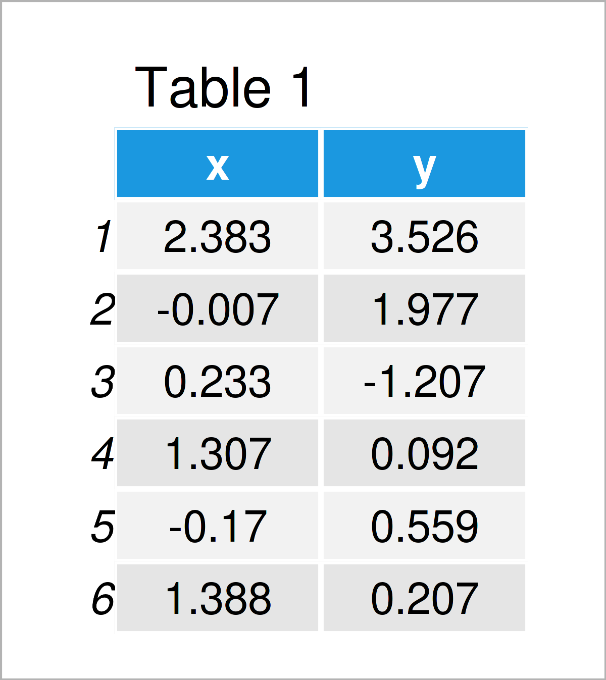
Table 1 shows the head of our example data: it is also visualized that our data consists of two numerical columns.
Next, we can estimate a polynomial regression model of our data using the lm() function. We are using the variable x as predictor and the variable y as target variable.
my_mod <- lm(y ~ poly(x, 4),        # Estimate polynomial regression model
             data = data)
summary(my_mod)                     # Summary statistics of polynomial regression model
# Call:
# lm(formula = y ~ poly(x, 4), data = data)
#
# Residuals:
#      Min       1Q   Median       3Q      Max
# -2.39966 -0.59298  0.05659  0.71013  2.07603
#
# Coefficients:
#              Estimate Std. Error t value Pr(>|t|)
# (Intercept) -0.002771   0.067208  -0.041   0.9672
# poly(x, 4)1 11.898044   0.950459  12.518  < 2e-16 ***
# poly(x, 4)2 -2.125837   0.950459  -2.237   0.0264 *
# poly(x, 4)3  7.945027   0.950459   8.359 1.18e-14 ***
# poly(x, 4)4 -0.202329   0.950459  -0.213   0.8316
# ---
# Signif. codes:  0 ‘***’ 0.001 ‘**’ 0.01 ‘*’ 0.05 ‘.’ 0.1 ‘ ’ 1
#
# Residual standard error: 0.9505 on 195 degrees of freedom
# Multiple R-squared:  0.5429,	Adjusted R-squared:  0.5336
# F-statistic: 57.91 on 4 and 195 DF,  p-value: < 2.2e-16
The previous output shows some descriptive statistics for our model. Let’s draw our data and the corresponding polynomial regression line!
Example 1: Draw Polynomial Regression Curve to Base R Plot
The following R syntax shows how to create a scatterplot with a polynomial regression line using Base R.
Let’s first draw our data in a scatterplot without regression line:
plot(y ~ x, data) # Draw Base R plot
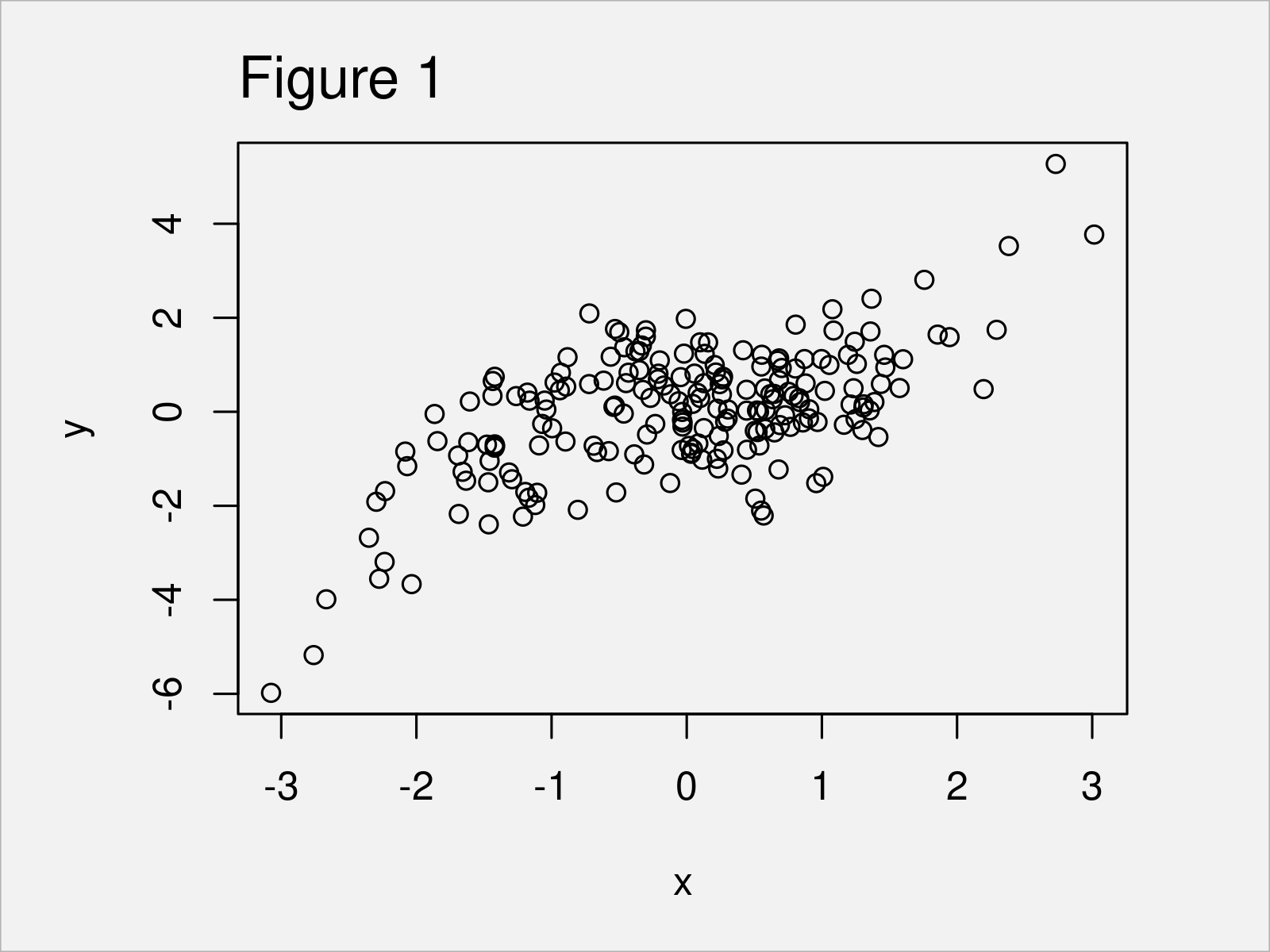
In Figure 1 you can see that we have created a scatterplot showing our independent variable x and the corresponding dependent variable y.
Next, we can apply the lines function to add a polynomial regression curve on top of this plot:
lines(sort(data$x),                 # Draw polynomial regression curve
      fitted(my_mod)[order(data$x)],
      col = "red",
      type = "l")
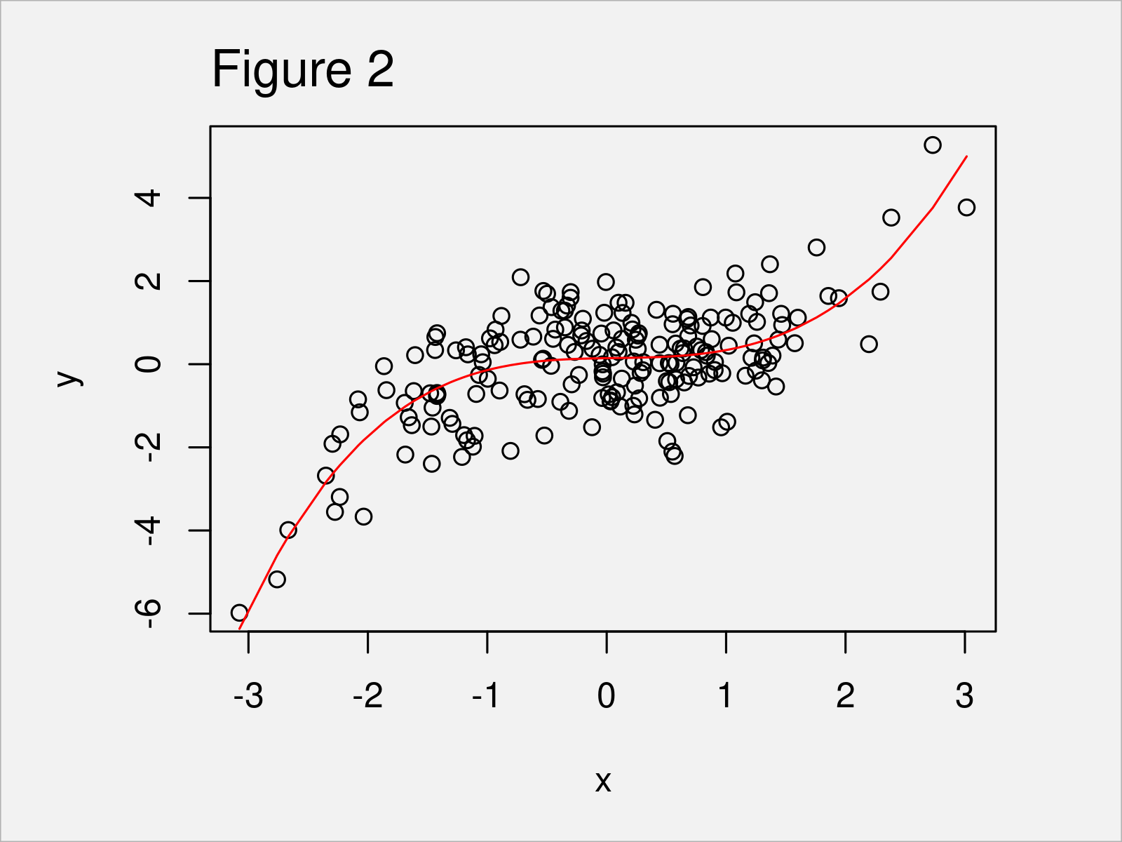
After executing the previous syntax the scatterplot with polynomial regression line shown in Figure 2 has been plotted.
Example 2: Draw Polynomial Regression Curve to ggplot2 Plot
Example 2 shows how to use the ggplot2 package to add a polynomial regression line to a graphic.
To be able to use the functions of the ggplot2 package, we first have to install and load ggplot2:
install.packages("ggplot2")         # Install & load ggplot2 package
library("ggplot2")
Next, we can visualize our data in a ggplot2 scatterplot without regression curve as shown below:
ggp <- ggplot(data, aes(x, y)) +    # Create ggplot2 scatterplot
  geom_point()
ggp                                 # Draw ggplot2 scatterplot
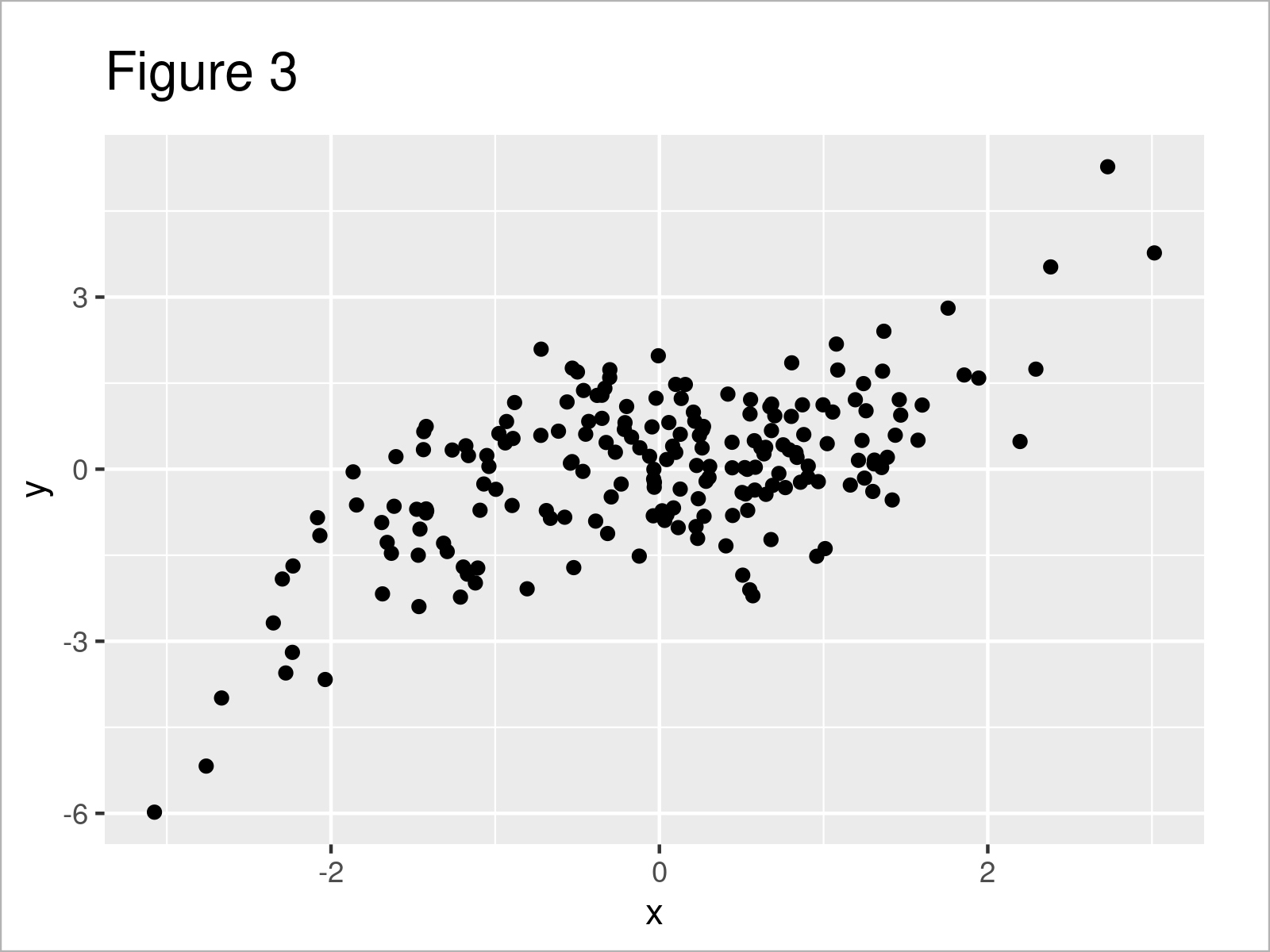
Figure 3 shows the output of the previous R code – A ggplot2 scatterplot.
In the next step, we can add a polynomial regression line to our ggplot2 plot using the stat_smooth function:
ggp +                               # Add polynomial regression curve
  stat_smooth(method = "lm",
              formula = y ~ poly(x, 4),
              se = FALSE)
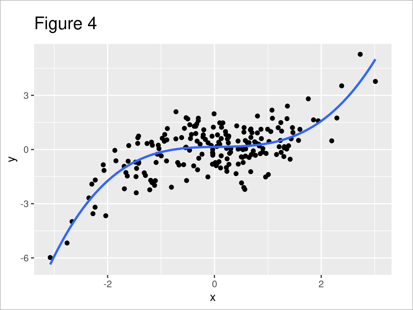
After executing the previous R syntax the ggplot2 scatterplot with polynomial regression line shown in Figure 4 has been created.
If we want, we can also add confidence bands to our polynomial regression line.
For this, we have to set the se argument to be equal to TRUE (i.e. the default specification of the ggplot2 package):
ggp +                               # Regression curve & confidence band
  stat_smooth(method = "lm",
              formula = y ~ poly(x, 4))
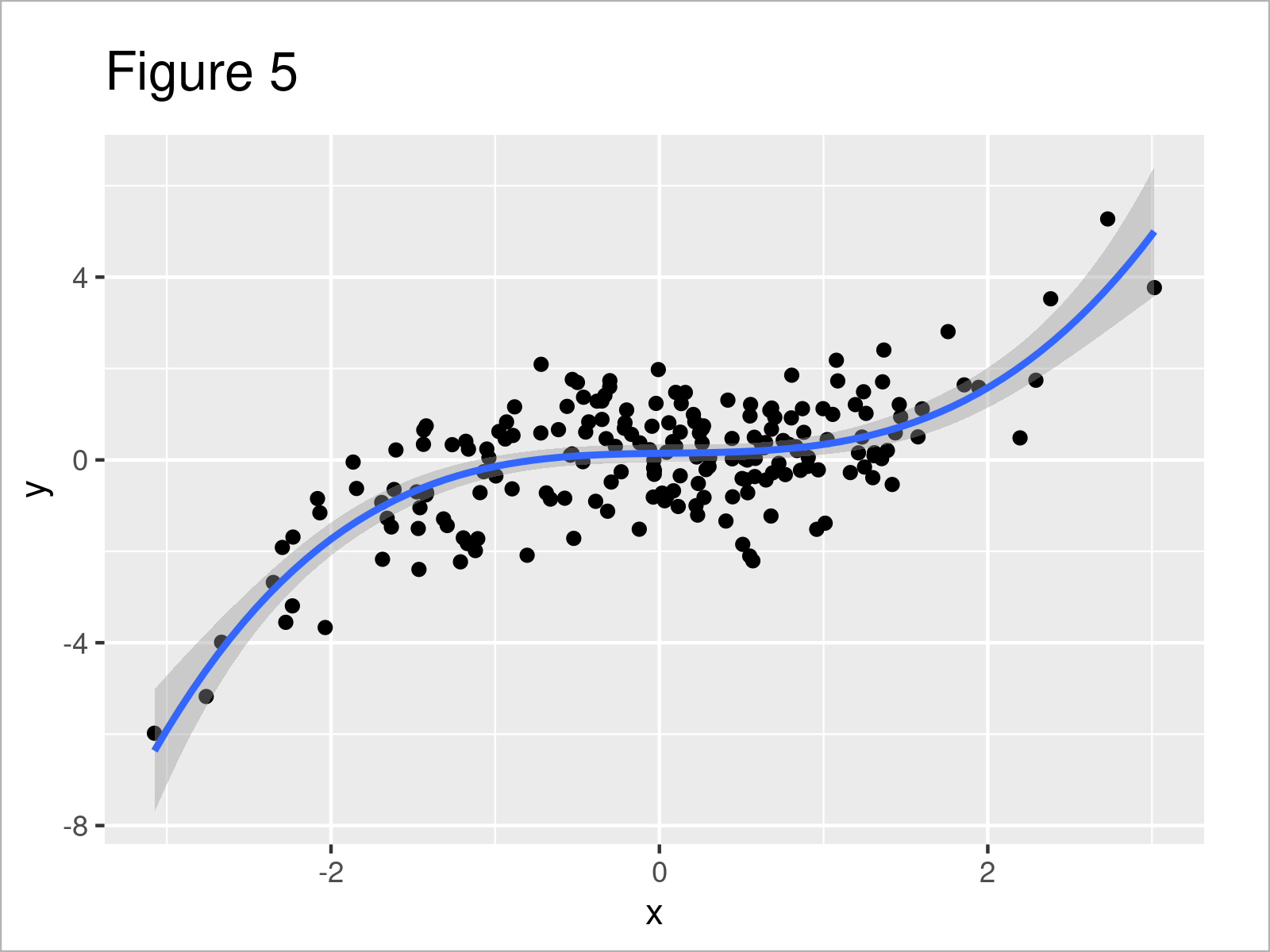
The output of the previous R programming code is shown in Figure 5 – A ggplot2 xyplot with polynomial regression line and standard errors for this regression line.
Video & Further Resources
Would you like to learn more about the addition of a polynomial regression line to a graph? Then you may want to have a look at the following video on my YouTube channel. I illustrate the R syntax of this article in the video.
In addition, you might read the related R tutorials on my website. Some posts are listed below.
- Fitting Polynomial Regression Model in R
- Remove Intercept from Regression Model in R
- Add Different Line to Each Facet of ggplot2 Plot
- Extract stat_smooth Regression Line Fit from ggplot2 Plot
- Add Grid Line Consistent with Ticks on Axis to Plot
- Add Regression Line to ggplot2 Plot in R
- R Graphics Gallery
- R Programming Tutorials
In this R tutorial you have learned how to add a polynomial regression line to a plot. In case you have additional questions, let me know in the comments section.
Subscribe to the Statistics Globe Newsletter
Get regular updates on the latest tutorials, offers & news at Statistics Globe.
I hate spam & you may opt out anytime: Privacy Policy.
Thank you!
Please check your email inbox and click the confirmation link to complete your subscription. If you don’t see the email within a few minutes, please also check your spam/junk folder.
I’m Joachim Schork. On this website, I provide statistics tutorials as well as code in Python and R programming.
Statistics Globe Newsletter
Get regular updates on the latest tutorials, offers & news at Statistics Globe. I hate spam & you may opt out anytime: Privacy Policy.
Thank you!
Please check your email inbox and click the confirmation link to complete your subscription. If you don’t see the email within a few minutes, please also check your spam/junk folder.


