Draw Stacked Barplot in R (3 Examples)
In this R tutorial you’ll learn how to create a stacked barchart.
Table of contents:
Let’s start right away!
Construction of Example Data
As a first step, I’ll have to create some data that we can use in the following examples:
data <- data.frame(A = 1:5,        # Create example data
                   B = 6:2,
                   C = 3,
                   D = c(3, 5, 1, 1, 2))
data                               # Print example data
#   A B C D
# 1 1 6 3 3
# 2 2 5 3 5
# 3 3 4 3 1
# 4 4 3 3 1
# 5 5 2 3 2
Have a look at the previous output of the RStudio console. It shows that our example data has five rows and four columns. Each variable represents one group of our data and each value reflects the value of a subgroup.
Example 1: Drawing Stacked Barchart Using Base R
The following R programming code explains how to draw a stacked barplot with the basic installation of the R programming language. For this, we have to use the barplot and the as.matrix functions:
barplot(as.matrix(data)) # Stacked barplot using Base R

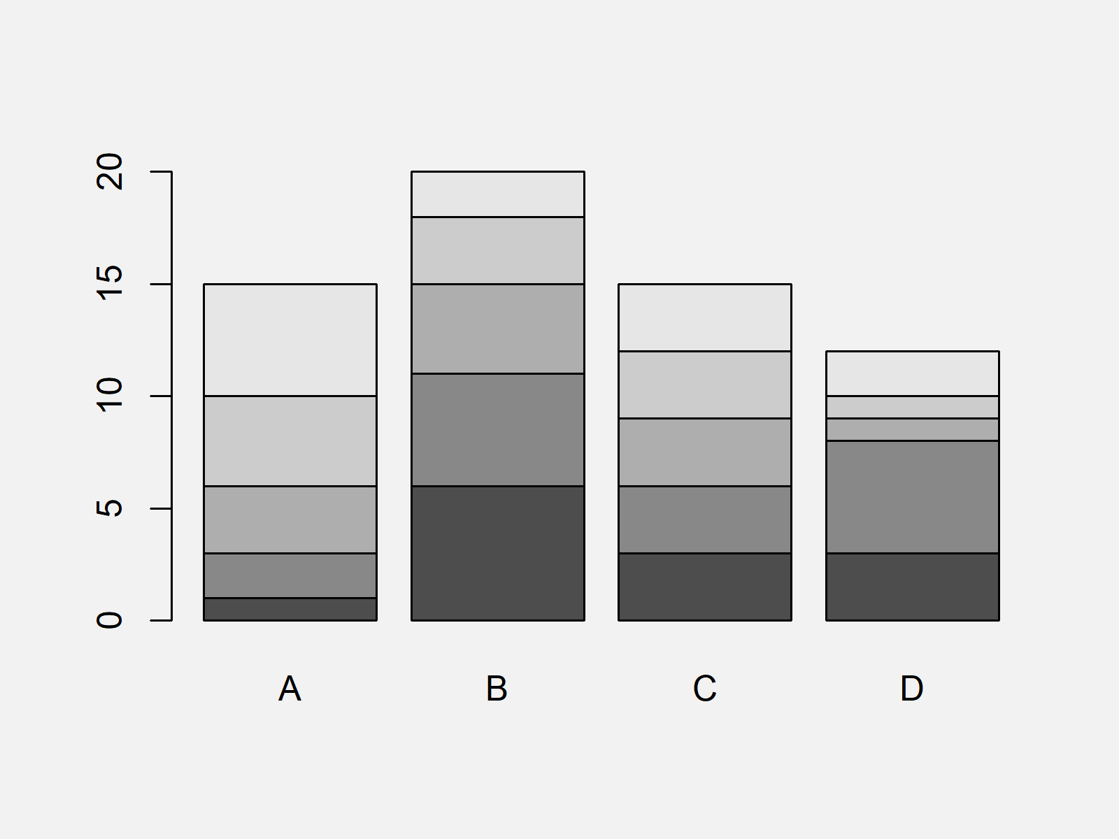
As shown in Figure 1, we have drawn a Base R barplot showing the categories of our data with the previous R syntax. Plain and simple!
Example 2: Drawing Stacked Barchart Using ggplot2 Package
Example 2 shows how to use the ggplot2 package to draw a stacked barplot in R.
First, we have to reshape our data frame from wide to long format.
We can do that with the functions of the reshape2 package. As a first step, we have to install and load the reshape2 package:
install.packages("reshape2")       # Install & load reshape2
library("reshape2")
Now, we can convert our data frame to long format as shown below:
data_long <- data                  # Converting data from wide to long format
data_long$subgroup <- as.factor(1:nrow(data_long))
data_long <- melt(data_long, id.vars = "subgroup")
data_long                          # Printing long data
#    subgroup variable value
# 1         1        A     1
# 2         2        A     2
# 3         3        A     3
# 4         4        A     4
# 5         5        A     5
# 6         1        B     6
# 7         2        B     5
# 8         3        B     4
# 9         4        B     3
# 10        5        B     2
# 11        1        C     3
# 12        2        C     3
# 13        3        C     3
# 14        4        C     3
# 15        5        C     3
# 16        1        D     3
# 17        2        D     5
# 18        3        D     1
# 19        4        D     1
# 20        5        D     2
If we want to draw a stacked ggplot2 barchart, we need to install and load the ggplot2 package to RStudio:
install.packages("ggplot2")        # Install & load ggplot2
library("ggplot2")
Next, we can use the ggplot and geom_bar functions to draw a stacked bargraph in the typical ggplot2 layout:
ggplot(data_long,                  # Stacked barplot using ggplot2
       aes(x = variable,
           y = value,
           fill = subgroup)) +
  geom_bar(stat = "identity")

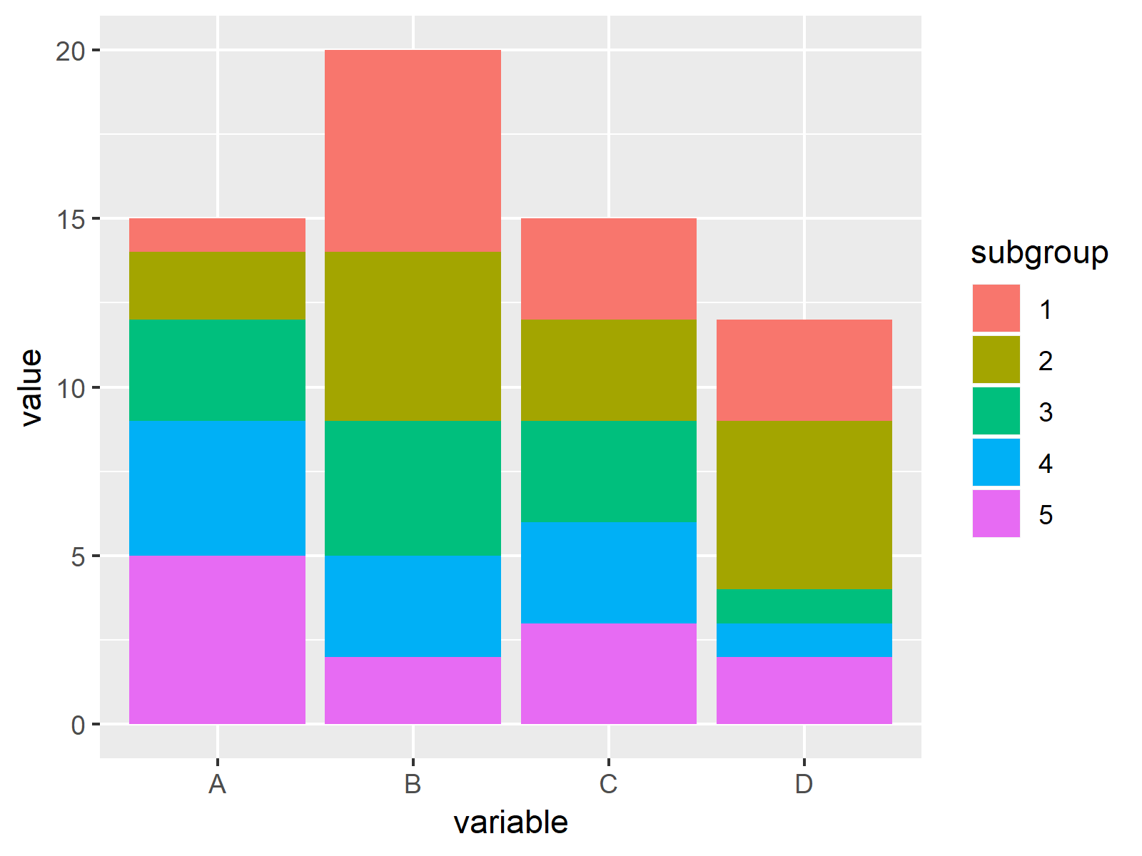
Figure 2 visualizes the output of the previous syntax: A ggplot2 graphic showing a stacked barplot.
Example 3: Drawing Stacked Barchart Using lattice Package
We can also use the functions of the lattice package to draw a stacked barplot. We first have to install and load lattice:
install.packages("lattice")        # Install lattice package
library("lattice")                 # Load lattice
Now, we can use the barchart function of the lattice package and the stack argument to draw a stacked barchart. Note that we are using the data frame in long format that we have created in Example 2.
barchart(value ~ variable,         # Stacked barplot using lattice
         data = data_long,
         groups = subgroup,
         stack = TRUE)

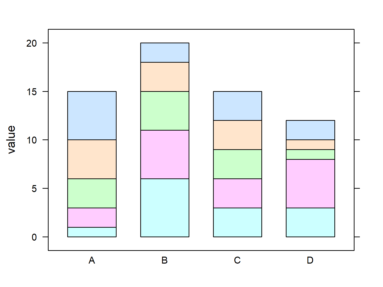
As shown in Figure 3, the previous syntax created a stacked lattice barplot.
Video, Further Resources & Summary
Do you want to know more about barplots in R? Then you may want to have a look at the following video of my YouTube channel. In the video, I illustrate the R programming syntax of this article.
The YouTube video will be added soon.
Furthermore, you might want to have a look at the other articles on my website.
- How to Draw Barplots in R
- Draw Grouped Barplot in R
- Graphics Gallery in R
- Introduction to R Programming
To summarize: On this page you learned how to draw stacked barplots of categorical data in R programming. If you have any additional questions, don’t hesitate to let me know in the comments. Furthermore, please subscribe to my email newsletter to receive updates on the newest articles.
Subscribe to the Statistics Globe Newsletter
Get regular updates on the latest tutorials, offers & news at Statistics Globe.
I hate spam & you may opt out anytime: Privacy Policy.
Thank you!
Welcome to the Statistics Globe newsletter. From now on, I’ll send you regular emails about statistics, data science, AI, and programming with R and Python.
I’m Joachim Schork. On this website, I provide statistics tutorials as well as code in Python and R programming.
Statistics Globe Newsletter
Get regular updates on the latest tutorials, offers & news at Statistics Globe. I hate spam & you may opt out anytime: Privacy Policy.
Thank you!
Please check your email inbox and click the confirmation link to complete your subscription. If you don’t see the email within a few minutes, please also check your spam/junk folder.


2 Comments. Leave new
Very informative, keep going.
That’s great to hear Jackleen, thank you for the nice comment! 🙂