Set Axis Limits in ggplot2 R Plot (3 Examples)
This tutorial explains how to set the axis limits of a ggplot in the R programming language.
The article consists of the following contents:
- Creation of Example Data & Basic Plot
- Example 1: Modification of Axis Limits with scale_x_continuous
- Example 2: Modification of Axis Limits with coord_cartesian
- Example 3: Cutting off Values with Zoom In
- Video & Further Resources
Let’s get started!
Creation of Example Data & Basic Plot
The following examples are based on this example data:
set.seed(10101)                             # Set seed
data <- data.frame(x = rnorm(1000))         # Create example data
To create plots with the ggplot2 package, we need to install and load the package to RStudio:
install.packages("ggplot2")                 # Install ggplot2 package
library("ggplot2")                          # Load ggplot2 package
Without any specifications of our axes, a basic density plot created with the ggplot2 package would look as follows:
ggplot(data, aes(x = x)) +                  # Create basic density ggplot
  geom_density()
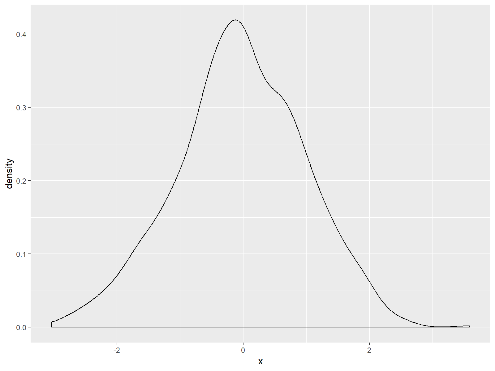
Figure 1: Basic Density Plot of ggplot2 R Package.
As you can see based on Figure 1, ggplot2 automatically adjusts the axes so that all data points are shown. Furthermore the ggplot2 package leaves some space around the plotted data.
In the following examples, I’ll show you how to modify the axes of such ggplots. Note that this example is based on a density plot. However, the following R codes could be applied to any other types of plots and graphics (e.g. histogram, barchart, scatterplot, and so on…).
Example 1: Modification of Axis Limits with scale_x_continuous
We have basically two alternatives, if we want to change our ggplot2 axis ranges. The first alternative is based on the scale_x_continuous function:
ggplot(data, aes(x = x)) +                  # Density plot with scale_x_continuous
  geom_density() +
  scale_x_continuous(limits = c(-10, 10))
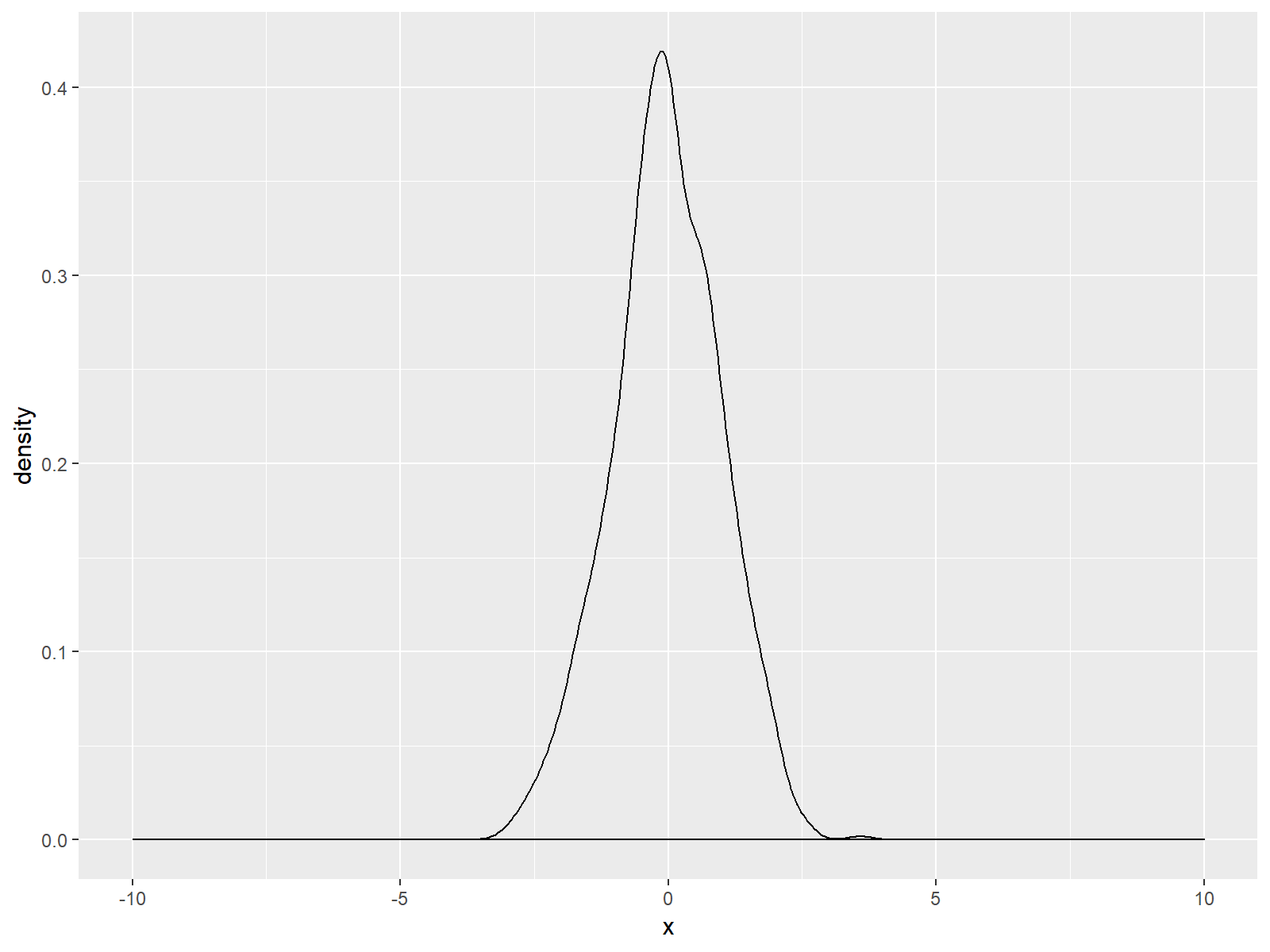
Figure 2: ggplot2 Density Plot with Broader x-Axis due to scale_x_continuous Function.
As you can see based on the previous R syntax, we specified the axis limits within the scale_x_continuous command to be within the range of -10 and 10. Of cause you could use any range you want.
Note: Equivalently to scale_x_continuous there also exists the scale_y_continuous function, which can be applied in the same manner in order to move the scale of the y-axis of a ggplot.
Let’s move on to the second alternative and its differences compared to Example 1…
Example 2: Modification of Axis Limits with coord_cartesian
Another way to widen the axis ranges of our plot relies on the coord_cartesian function:
ggplot(data, aes(x = x)) +                  # Density plot with coord_cartesian
  geom_density() +
  coord_cartesian(xlim = c(-10, 10))
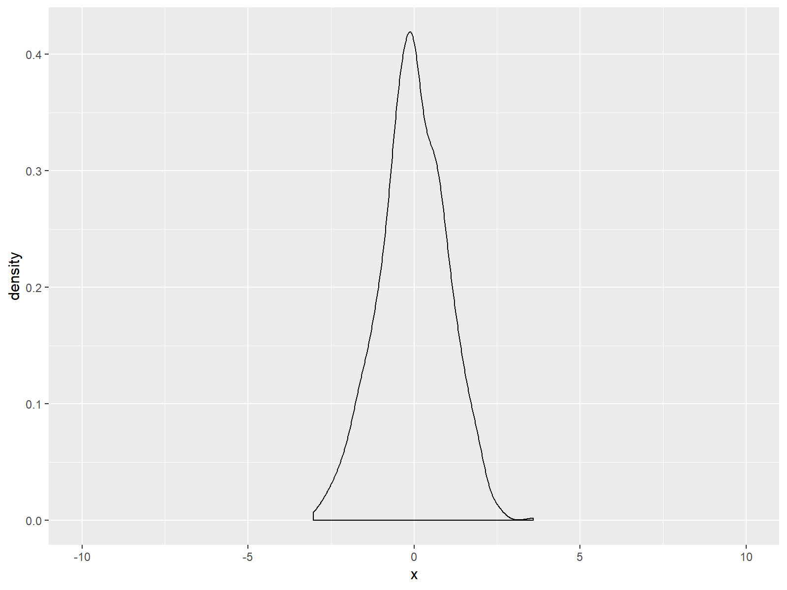
Figure 3: ggplot2 Density Plot with Broader x-Axis due to coord_cartesian Function.
If you compare Figure 2 and Figure 3, you can see the difference between the two alternatives. The scale_x_continuous draws a black line at the bottom of our graph; but the coord_cartesian function does not.
Note: Within coord_cartesian you could also specify the ylim argument in order to adjust the y-axis.
Example 3: Cutting off Values with Zoom In
In the previous examples, I explained how to extent the x-axis range of a ggplot. However, we can also make the shown range smaller than the default:
ggplot(data, aes(x = x)) +                  # Zoom in
  geom_density() +
  scale_x_continuous(limits = c(-1, 1))
# Warning message:
# Removed 328 rows containing non-finite values (stat_density).
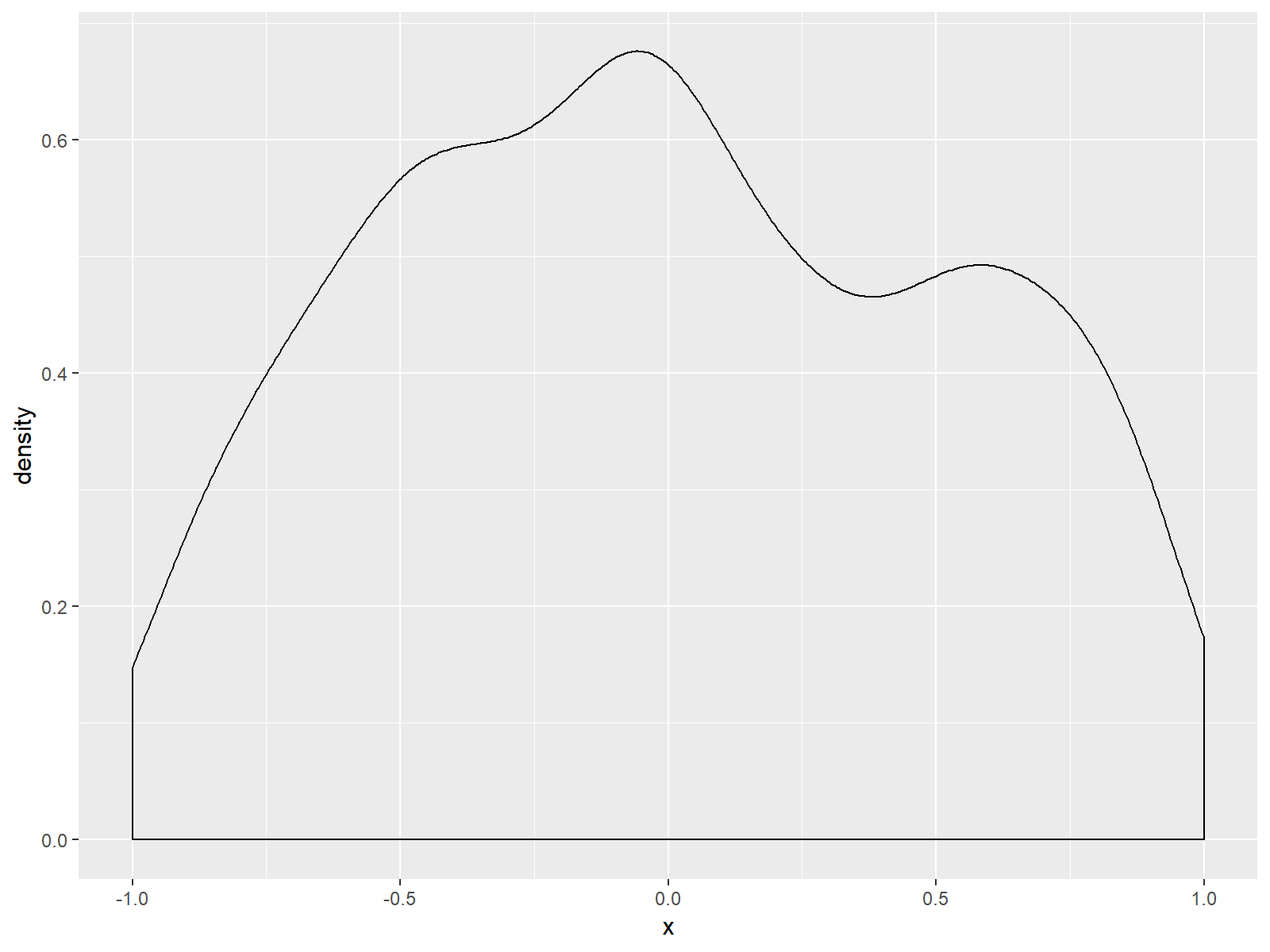
Figure 4: Zoomed In Density Plot is Cutting of Some Values.
As you can see based on Figure 4, we zoomed in and cut off several values of our data. This is also the reason why the RStudio console returned the following warning message:
Warning message:
Removed 328 rows containing non-finite values (stat_density)
328 observations of our example are not shown in the zoomed in version of our plot.
Video & Further Resources
In case you need further explanations for the examples shown in this tutorial, you could have a look at the following video of the Statistics Globe YouTube channel. In the video, I’m explaining the examples of this article in more detail:
In addition, you may want to have a look at the other R tutorials of my website. You can find some interesting tutorials for handling of the ggplot2 package below. These tutorials are definitely a good basement for the data visualization with ggplot2:
- Adjust Space Between ggplot2 Axis Labels and Plot Area
- Rotate ggplot2 Axis Labels in R
- Remove Axis Labels & Ticks of ggplot2 Plot
- Change ggplot2 Legend Title
- Remove ggplot2 Legend Entirely
- Change Position of ggplot Title
- R Graphics Gallery
- The R Programming Language
In this article you learned how to set the axis limits of a ggplot in the R programming language. If you have comments or questions, don’t hesitate to let me know in the comments section below.
Subscribe to the Statistics Globe Newsletter
Get regular updates on the latest tutorials, offers & news at Statistics Globe.
I hate spam & you may opt out anytime: Privacy Policy.
Thank you!
Welcome to the Statistics Globe newsletter. From now on, I’ll send you regular emails about statistics, data science, AI, and programming with R and Python.
I’m Joachim Schork. On this website, I provide statistics tutorials as well as code in Python and R programming.
Statistics Globe Newsletter
Get regular updates on the latest tutorials, offers & news at Statistics Globe. I hate spam & you may opt out anytime: Privacy Policy.
Thank you!
Please check your email inbox and click the confirmation link to complete your subscription. If you don’t see the email within a few minutes, please also check your spam/junk folder.


12 Comments. Leave new
Hi Joachim, I’m trying to scale the z-axis in a 3D plot I made using plotrgl(). I tried 2 approaches:
1) Physically removing data points in the 2-dimensional data matrix which are above/below a certain value, and then letting plotrgl() scale automatically.
2) Scaling using arguments in the plotrgl() function.
Unfortunately, I haven’t succeeded at either.
For approach 1) I followed your tutorial: https://statisticsglobe.com/remove-multiple-values-from-vector-in-r . However, the output is a vector rather than the original matrix, so information is lost. I would like to get the original matrix but with zeros for values and/or ranges which I specify.
Do you know how to implement approach 1) or approach 2) ? Both would be extremely useful for different purposes.
Hey Noah,
I have not much experience with 3D plots. However, if you want to retain the matrix structure (i.e. Approach 1)), you may use a code like this:
Could you try if this works for your case?
Regards
Joachim
Your suggestion is very helpful. Thank you!
It is not exactly what I needed, because I am working with a large dataset with many thousands of elements. So I cannot replace values one at a time, and I don’t know the exact values of the elements I want to replace. I only know that I would like to remove values which are greater than some cutoff. Also, I would like to avoid filling the matrix with “0” values, because these will appear in the 3D plot.
A friend found a solution that is almost the same as yours, and gives what I need:
my_matrix 4] my_matrix
# [,1] [,2] [,3]
# [1,] 1 NaN NaN
# [2,] 2 NaN NaN
# [3,] 3 2 NaN
# [4,] 4 NaN NaN
The plotting function I am using in R is smart enough to automatically ignore the NaN values, so they are not displayed in the 3D plot.
Hey Noah,
The code I have posted before is just an example on how to replace values in a matrix. You can use basically any logical condition to replace values in a matrix. To give you another example that shows how to replace values larger than 3 by NaN:
You can find more info on replacing values based on logical conditions in the following tutorial: https://statisticsglobe.com/replace-values-in-data-frame-conditionally-in-r
Regards
Joachim
Oops. I noticed the above code is not showing up correctly. If you email me I can send you the R script.
Hey, please see my response to your other comment.
Yes! Your line of code is the same one I tried to post. You can see the result in the example matrix above. Though in my example matrix I randomly put the value 2 in the 2nd column, 3rd row, and set the cutoff to replace values > 4 with NaN.
Ah, so now it works? 🙂
Thanks
You are very welcome Vincenzo!
Excellent explanation thanks Joachim.
However, in your examples a small length of x axis remains below and above the limits you set.
How can we trim these?
Hey Jeff,
Thank you very much for the kind comment, glad it was useful!
Regarding your question, please have a look here.
Regards,
Joachim