Add Regression Line to ggplot2 Plot in R (Example) | Draw Linear Slope to Scatterplot
In this R tutorial you’ll learn how to add regression lines on scatterplots.
The article contains one examples for the addition of a regression slope. More precisely, the content of the tutorial looks as follows:
- Creation of Example Data
- Example 1: Adding Linear Regression Line to Scatterplot
- Video, Further Resources & Summary
With that, let’s start right away.
Creation of Example Data
In the following R programming tutorial, we’ll use the data frame below as basement:
set.seed(8743)                             # Create example data
x <- rnorm(1000)
y <- rnorm(1000) + 0.3 * x
data <- data.frame(x, y)
head(data)                                 # Print first rows of data
#            x          y
# 1  1.2138865 -0.3500503
# 2 -1.8828867 -1.1576045
# 3 -0.2739309 -0.9035707
# 4  1.0028479 -0.1521459
# 5  0.6276009 -0.4914815
# 6 -0.9443908 -1.3845497
As you can see based on the output of the RStudio console, our example data contains two numeric columns x and y.
Furthermore, we have to install and load the ggplot2 package to R:
install.packages("ggplot2")                # Install & load ggplot2
library("ggplot2")
Now, we can draw a basic scatterplot with the ggplot2 package with the ggplot & geom_point functions as follows:
ggp <- ggplot(data, aes(x, y)) +           # Create basic ggplot
  geom_point()
ggp                                        # Print ggplot

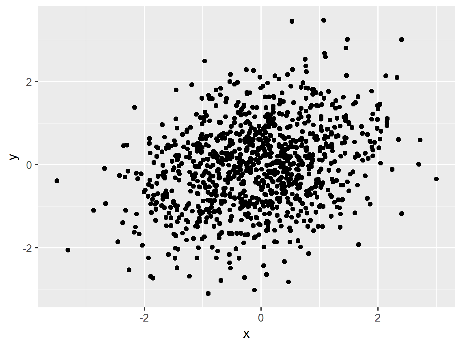
Figure 1: Basic ggplot2 Scatterplot without Regression Line.
Figure 1 shows the graphic that we have just created. It’s a simple dotplot showing the correlation of our variables x and y.
Example 1: Adding Linear Regression Line to Scatterplot
As you have seen in Figure 1, our data is correlated. We may want to draw a regression slope on top of our graph to illustrate this correlation.
With the ggplot2 package, we can add a linear regression line with the geom_smooth function. Have a look at the following R code:
ggp +                                      # Add regression line
  geom_smooth(method = "lm",
              formula = y ~ x)

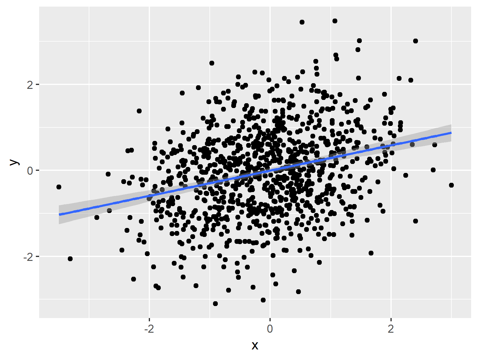
Figure 2: ggplot2 Scatterplot with Linear Regression Line and Variance.
Figure 2 shows our updated plot. As you can see, it consists of the same data points as Figure 1 and in addition it shows the linear regression slope corresponding to our data values. The shaded area around the trend line illustrates the variance.
Video, Further Resources & Summary
Do you want to know more about regression slopes and graphics in R? Then you may watch the following video which I have published on my YouTube channel. In the video, I’m explaining the R programming codes of this tutorial.
Besides the video, you may want to read the other tutorials of my website. You can find some tutorials here.
- Scatterplot in R
- Draw Vertical Line to X-Axis in ggplot2 Plot
- R Graphics Gallery
- The R Programming Language
In summary: In this post, I showed how to insert a linear regression equation line to a ggplot2 graph in R. In case you have any additional questions, let me know in the comments section.
Subscribe to the Statistics Globe Newsletter
Get regular updates on the latest tutorials, offers & news at Statistics Globe.
I hate spam & you may opt out anytime: Privacy Policy.
Thank you!
Please check your email inbox and click the confirmation link to complete your subscription. If you don’t see the email within a few minutes, please also check your spam/junk folder.
I’m Joachim Schork. On this website, I provide statistics tutorials as well as code in Python and R programming.
Statistics Globe Newsletter
Get regular updates on the latest tutorials, offers & news at Statistics Globe. I hate spam & you may opt out anytime: Privacy Policy.
Thank you!
Please check your email inbox and click the confirmation link to complete your subscription. If you don’t see the email within a few minutes, please also check your spam/junk folder.


4 Comments. Leave new
How can I add co-factors to a linear model “lm” when I insert a linear regression equation line to a ggplot2 graph ?
Hi Thomas,
Please have a look at this tutorial for more explanations on this.
Regards,
Joachim
That’s very good
Thank you so much, glad you think so!
Regards,
Joachim