Create Legend in ggplot2 Plot in R (2 Examples)
In this article you’ll learn how to add a legend to a ggplot2 plot in the R programming language.
The table of content is structured as follows:
- Creation of Example Data & Setting Up ggplot2 Package
- Example 1: Create Legend in ggplot2 Plot
- Example 2: Specifying Legend within geom
- Video & Further Resources
Let’s do this…
Creation of Example Data & Setting Up ggplot2 Package
In the examples of this tutorial, we’ll use the following data frame as basement:
set.seed(9649)                              # Set seed
data <- data.frame(x = rnorm(100),          # Create data
                   y = rnorm(100),
                   group = factor(round(runif(100, 1, 5))))
head(data)                                  # Inspect data
#          x          y group
# -1.0921645 -0.3706229     3
#  0.9588898 -0.8429466     2
#  0.3344750  0.5165524     5
# -1.1279515 -1.1160412     3
# -2.0441421  2.6587881     1
# -0.1690488 -0.1737171     2
Our example data contains three columns and 100 rows. The first and second column contain the values that we will draw in a scatterplot later on and the third column is the grouping variable that we need to assign colors and to add a legend to our plot.
If we want to draw a plot with the ggplot2 package, we need to install and load the package:
install.packages("ggplot2")                 # Install ggplot2
library("ggplot2")                          # Load ggplot2 library
Now, we can create a scatterplot with the ggplot2 package as follows:
ggplot(data, aes(x, y)) +                   # ggplot without legend
  geom_point(col = data$group)

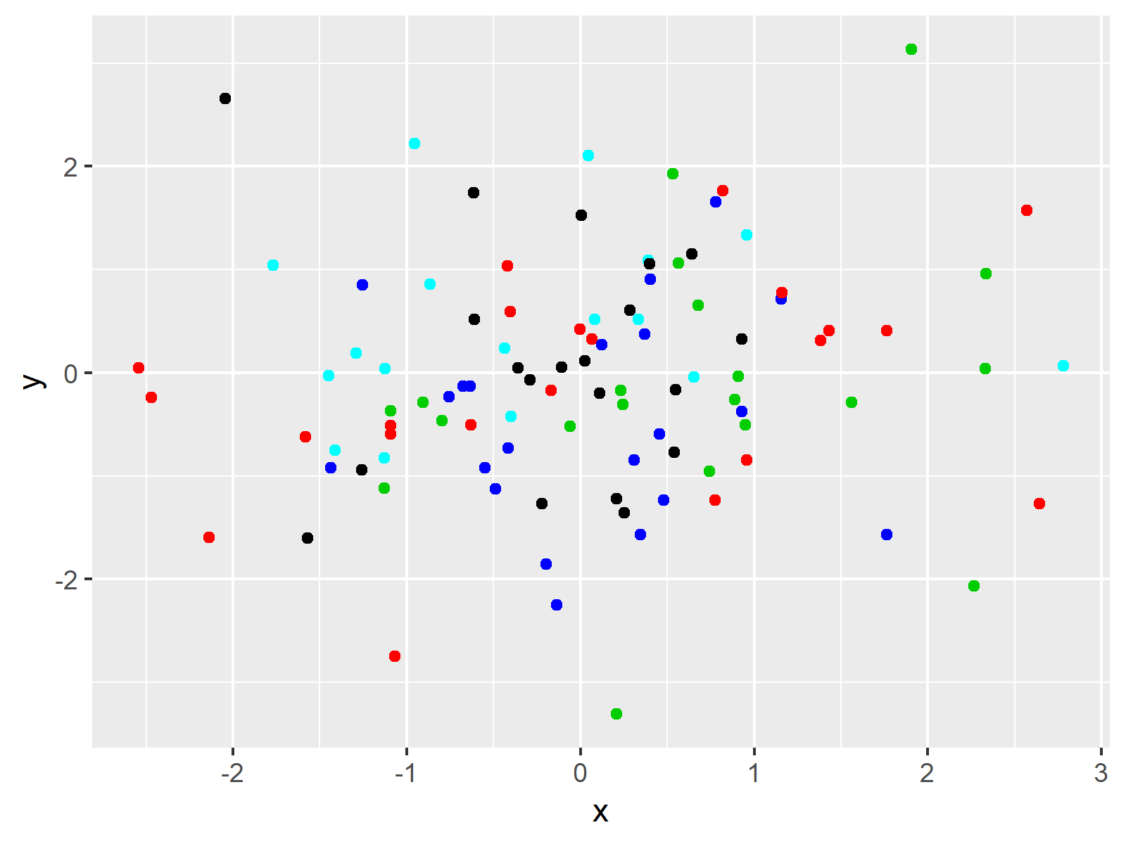
Figure 1: ggplot2 Plot without Legend.
Figure 1 shows the plot we creates with the previous R code. Note that we colored our plot by specifying the col argument within the geom_point function. However, our plot is not showing a legend for these colors.
Example 1: Create Legend in ggplot2 Plot
If we want to add a legend to our ggplot2 plot, we need to specify the colors within the aes function (i.e. the aesthetics) of our ggplot2 code. Have a look at the following R syntax:
ggplot(data, aes(x, y, col = group)) +      # ggplot with legend
  geom_point()

Figure 2: ggplot2 Plot with Legend.
As you can see based on Figure 2, we just added a legend to our plot, by moving the col argument within the aes function in the first line of the code.
Note that the colors are different compared to Figure 1, since the aes function is using the default colors of the ggplot2 package. Here, you can learn how to modify colors of a ggplot2 plot manually.
Example 2: Specifying Legend within geom
The ggplot2 package provides several alternatives on the creation of legends. Another alternative is that you specify the col argument within the aesthetics of the geom function (i.e. geom_point):
ggplot(data, aes(x, y)) +                   # Specifying legend in geom
  geom_point(aes(col = group))
The output is the same as in Example 2.
Note that I illustrated how to create a legend based on a scatterplot. Of case we could apply the same R codes to other types of plots such as histograms, barcharts, line plots and so on.
Video & Further Resources
I have recently published a video on my YouTube channel, which explains the contents of this article. You can find the video below.
In addition, I can recommend to have a look at some of the related posts of this homepage. A selection of interesting tutorials can be found here.
- Remove Legend in ggplot2
- Change Legend Title in ggplot2
- Remove Legend Title from ggplot2 Plot in R
- Add Common Legend to Combined ggplot2 Plot
- R Graphics Gallery
- The R Programming Language
In summary: On this page, I showed how to add a legend to a ggplot2 graphic in the R programming language. In case you have additional questions, tell me about it in the comments.
Subscribe to the Statistics Globe Newsletter
Get regular updates on the latest tutorials, offers & news at Statistics Globe.
I hate spam & you may opt out anytime: Privacy Policy.
Thank you!
Welcome to the Statistics Globe newsletter. From now on, I’ll send you regular emails about statistics, data science, AI, and programming with R and Python.
I’m Joachim Schork. On this website, I provide statistics tutorials as well as code in Python and R programming.
Statistics Globe Newsletter
Get regular updates on the latest tutorials, offers & news at Statistics Globe. I hate spam & you may opt out anytime: Privacy Policy.
Thank you!
Please check your email inbox and click the confirmation link to complete your subscription. If you don’t see the email within a few minutes, please also check your spam/junk folder.


