Visualization of PCA in R (Examples)
In this tutorial, you will learn different ways to visualize your PCA (Principal Component Analysis) implemented in R.
The tutorial follows this structure:
Let’s see the different possibilities!
Load Data and Libraries
The first step is to install the packages: FactoMineR, ggfortify, factoextra, and scatterplot3d that will be used in this tutorial. You can use the code below to install them.
install.packages("FactoMineR")
install.packages("ggfortify")
install.packages("factoextra")
install.packages("scatterplot3d")
Now, we can load the libraries.
library(FactoMineR)
library(ggfortify)
library(factoextra)
library(scatterplot3d)
For this tutorial, we will use the wine dataset of the FactoMineR package. This data frame displays the sensory descriptors for 21 kinds of wine of Val de Loire. The first two columns show the label of origin and the soil; the rest of the columns shows the 29 sensory descriptors.
data(wine)
dim(wine)

# [1] 21 31
In this tutorial, we will subset the wine dataset to deal with a fewer number of components. The variables of preference are selected as follows.
wine_data <- wine[,c(1,11,13,22,24,26,27,28,29,30)]
Now we can call the head() function to observe the first rows of the data.
head(wine_data)

#           Label Odor.Intensity Fruity Acidity Alcohol Smooth Bitterness Intensity Harmony Overall.quality
# 2EL      Saumur          3.407  2.885   2.107   2.500  2.731      1.926     2.857   3.143           3.393
# 1CHA     Saumur          3.370  2.560   2.107   2.654  2.500      1.926     2.893   2.964           3.214
# 1FON Bourgueuil          3.250  2.769   2.179   2.643  2.679      2.000     3.074   3.143           3.536
# 1VAU     Chinon          3.160  2.391   3.179   2.500  1.680      1.963     2.462   2.038           2.464
# 1DAM     Saumur          3.536  3.160   2.571   2.786  3.036      2.071     3.643   3.643           3.741
# 2BOU Bourgueuil          3.179  2.800   2.393   2.857  2.857      2.179     3.464   3.500           3.643
Without losing too much time, let’s dive into PCA!
Perform PCA
We will perform a PCA for all selected variables except for the factor variable: Label as PCA is essentially designed for continuous variables. If you are interested in PCAs working with categorical variables, you can visit our tutorial: Can PCA be Used for Categorical Variables? Now, let’s run the analysis!
wine_pca <- prcomp(wine_data[,-1],
                   scale=TRUE)
For further information on conducting PCA in R, please check Principal Component Analysis (PCA) in R. In the next sections, we will explore various ways of visualizing the computed PCA results.
Visualisation of Observations
After a PCA, the observations are expressed in principal component scores. Therefore, it is important to visualize the observations along the new axes (principal components) to interpret the relations in the dataset. For further information on transforming data to a new coordinate system via PCA, see our extensive tutorial PCA Explained.
Visualizing the observations in terms of principal components can be achieved by drawing a scatterplot. To do so, first, we need to retrieve the principal component scores by calling wine_pca$x, and then we will store them in a data set called PC.
PC <- as.data.frame(wine_pca$x)
head(PC)
#             PC1        PC2        PC3         PC4         PC5         PC6         PC7         PC8        PC9
# 2EL   0.6499775 -1.5108856  0.7907005  0.44285981  0.04705066 -1.01088744  0.38804219 -0.03649349 0.22258457
# 1CHA  1.3720200 -0.8411859  1.3942787 -0.11316088  0.35041093  0.36539984  0.18734792  0.02024997 0.10082546
# 1FON  0.3652570 -1.1959865  0.4914341 -0.33690140 -0.37419016  0.07316512  0.23081961  0.16857035 0.04330209
# 1VAU  5.5670041  1.5893480 -1.8906062 -0.94969535  0.69200237  0.21749556  0.19352246 -0.22967913 0.07878102
# 1DAM -2.3736452  0.0910899 -1.1218275 -0.04814811  0.46104892 -0.73681584 -0.03738153  0.23406684 0.04007036
# 2BOU -1.1342450 -0.2372057 -0.3179134 -1.06731577 -0.80006867  0.79867985 -0.41335699  0.05683096 0.05423312
In addition to that, if the user has a factor variable, like in this case, he might be interested in showing the grouping on the plot as well. In such as case, the Label variable of wine_data can be added to the PC set as follows.
PC$Label<-wine_data$LabelThe visualization of the observation points (point cloud) could be in 2D or 3D. Let’s see in the next section how to visualize them in 2D space!
2D Scatterplot
The scatterplot in 2D can be plotted using the plot() function and the data points can be colored by Label by assigning the color argument to PC$Label. We can also add a legend using the legend() function to show the matching colors for each label.
plot(PC$PC1,
     PC$PC2,
     col = PC$Label,
     pch = 19,
     main="Figure 1: 2D Scatterplot",
     xlab="PC1",
     ylab="PC2")

legend("bottomright",
       legend = levels(PC$Label),
       col = seq_along(levels(PC$Label)),
       pch = 19)

legend("bottomright",
       legend = levels(PC$Label),
       col = seq_along(levels(PC$Label)),
       pch = 19)
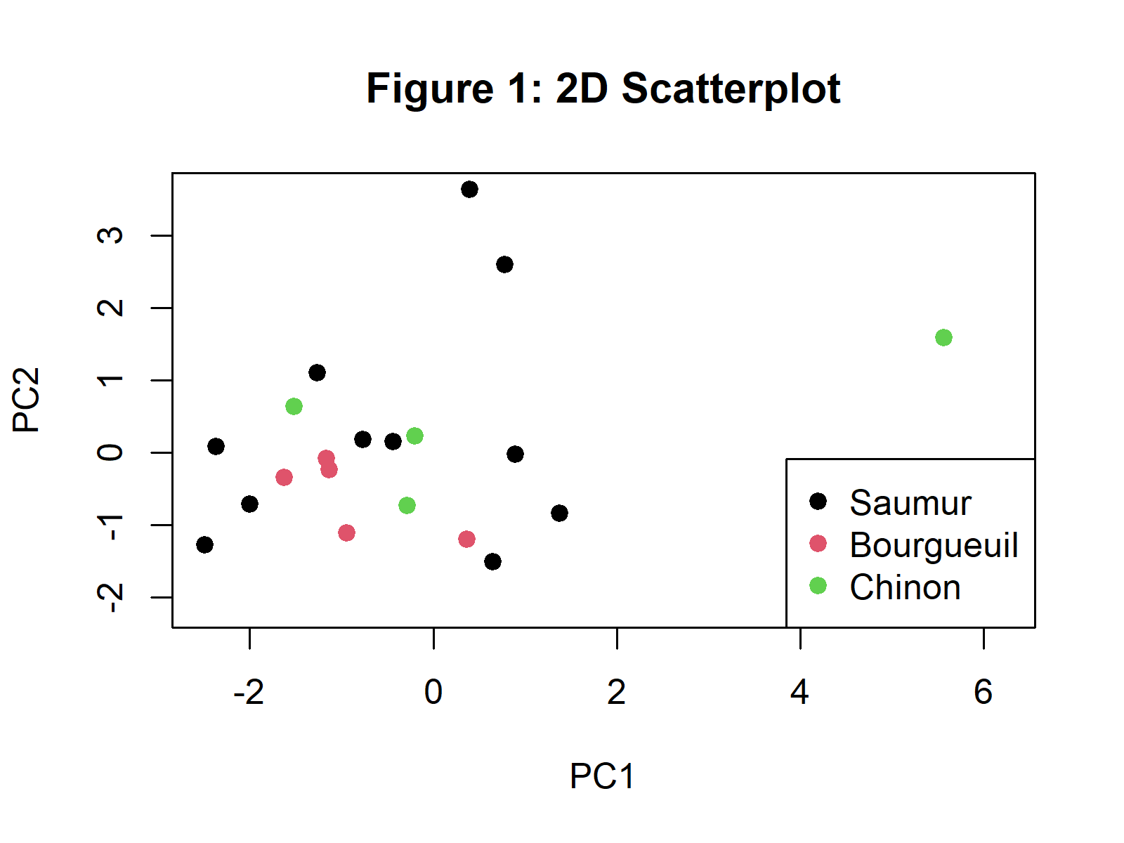
In Figure 1, you can see a 2D scatterplot visualizing the observations based on the first two principal components. If you are interested in other ways of plotting a scatterplot of the observations, please see our tutorial: Scatterplot of PCA in R.
Ellipse Plot
Confidence ellipses can also be added to a grouped scatter plot visualized after a PCA. Using the same dataset, we can plot them via the ggplot2 package. The grouping is indicated by the color argument in ggplot(); the geom_point() is used to plot the point cloud; then, the stat_ellipse() function is called to add the ellipses per wine group.
ggplot(PC,
       aes(x = PC1,
       y = PC2,
       color = Label)) +
       geom_point() +
       scale_color_manual(values=c("black", "#CC0066", "green2")) +
       stat_ellipse() + ggtitle("Figure 2: Ellipse Plot") +
       theme_bw()
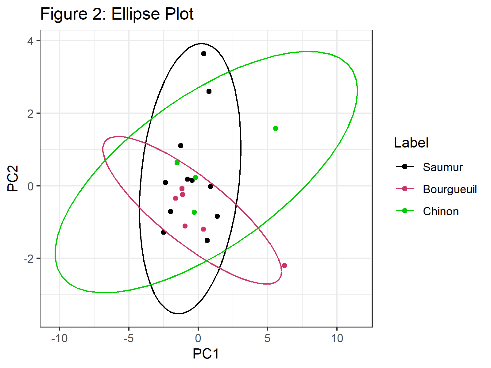
In Figure 2, we can see that confidence ellipses frame the observations per group. You can check our tutorial Draw Ellipse Plot for Groups in PCA in R if you need more examples of this type of graph.
3D Scatterplot
To draw a 3d scatterplot of observations, one needs the first three principal components’ scores. For the implementation, the scatterplot3d() function of the scatterplot3d package is called with the color argument assigned to the Label variable. To add a legend, we will use the legend() function and specify its coordinates via the xyz.convert() function.
plot_3d <- with(PC,
                scatterplot3d(PC$PC1,
                              PC$PC2,
                              PC$PC3,
                              color = as.numeric(Label),
                              pch = 19,
                              main ="Figure 3: 3D Scatter Plot",
                              xlab="PC1",
                              ylab="PC2",
                              zlab="PC3"))

legend(plot_3d$xyz.convert(0.5, 0.7, 0.5),
       pch = 19,
       yjust=0,
       legend = levels(PC$Label),
       col = seq_along(levels(PC$Label)))
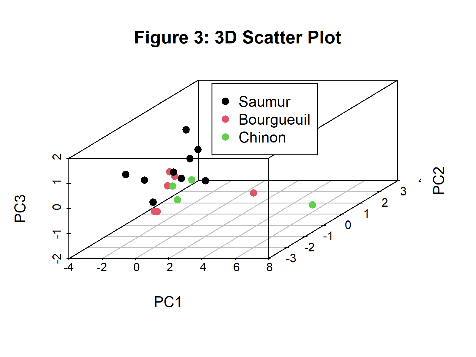
Figure 3 shows the scatterplot of observations in 3D based on the first three principal components. You can find alternative ways of displaying the observations in 3D in our tutorial: 3D Plot of PCA in R.
Visualisation of Component-Variable Relation
In order to understand the relation between the principal components and the original variables, a visual that displays both elements are needed. Biplots are used in general for this purpose. They enable the user to understand what the components represent and each variable’s share in these representations.
Biplot
The fviz_pca_biplot() function from the factoextra package can help us to build a biplot. We will specify the deep sky blue color for the variables, or more specifically, for the loading vectors. Besides, the observation points will be colored in black by default. To find out different ways of plotting biplots in R please see our Biplot in R tutorial.
fviz_pca_biplot(wine_pca,
                repel = TRUE,
                col.var = "deepskyblue",
                title = "Figure 4: Biplot", geom="point")
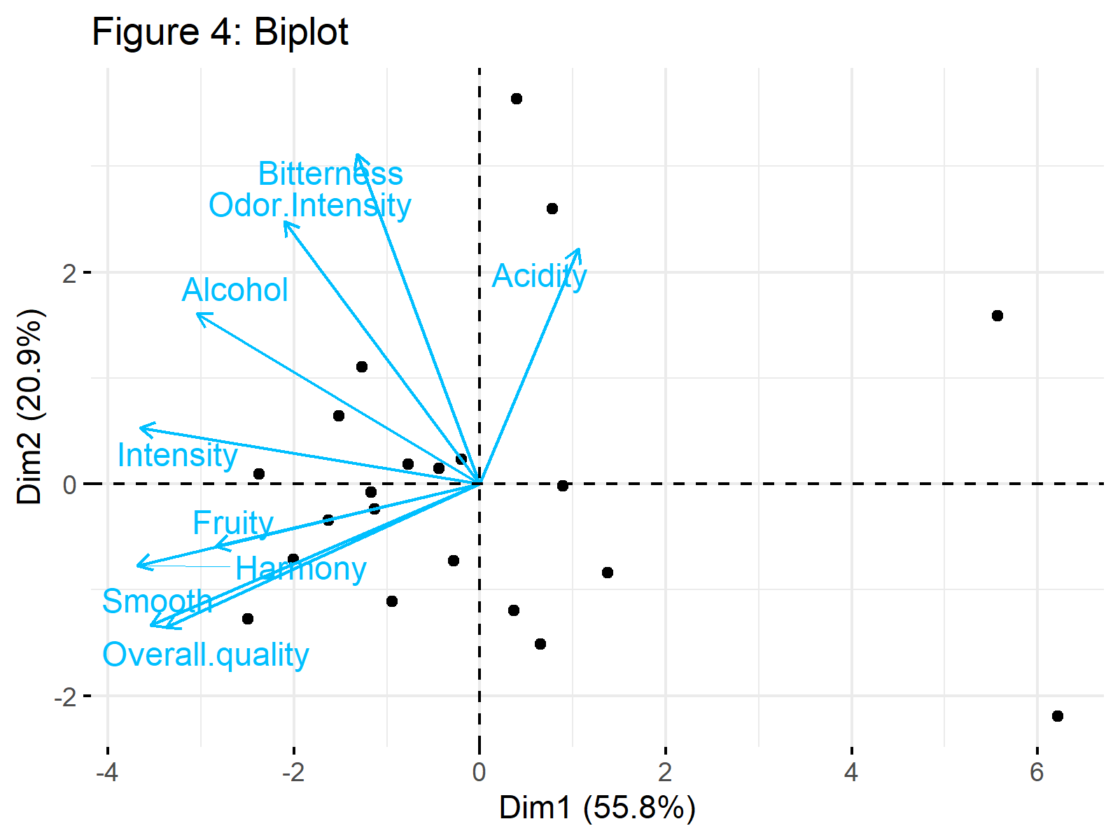
Figure 4 shows a biplot of our PCA results. Would you be interested in learning how to interpret it? Then see our tutorial: Biplot for PCA Explained.
Visualisation of Explained Variance
Visualizing the explained variance per principal component is useful for deciding on the ideal number of components to retain in the analysis. The scree plots are specialized for this kind of visualization in factor analyses.
Scree Plot
A scree plot can be visualized by using the fviz_eig() function of the factoextra package. We can set the addlabels = argument to TRUE so that the percentage of explained variance per component is shown on top of each bar plot.
fviz_eig(wine_pca,
         addlabels = TRUE,
         ylim = c(0, 70),
         main="Figure 5: Scree Plot")
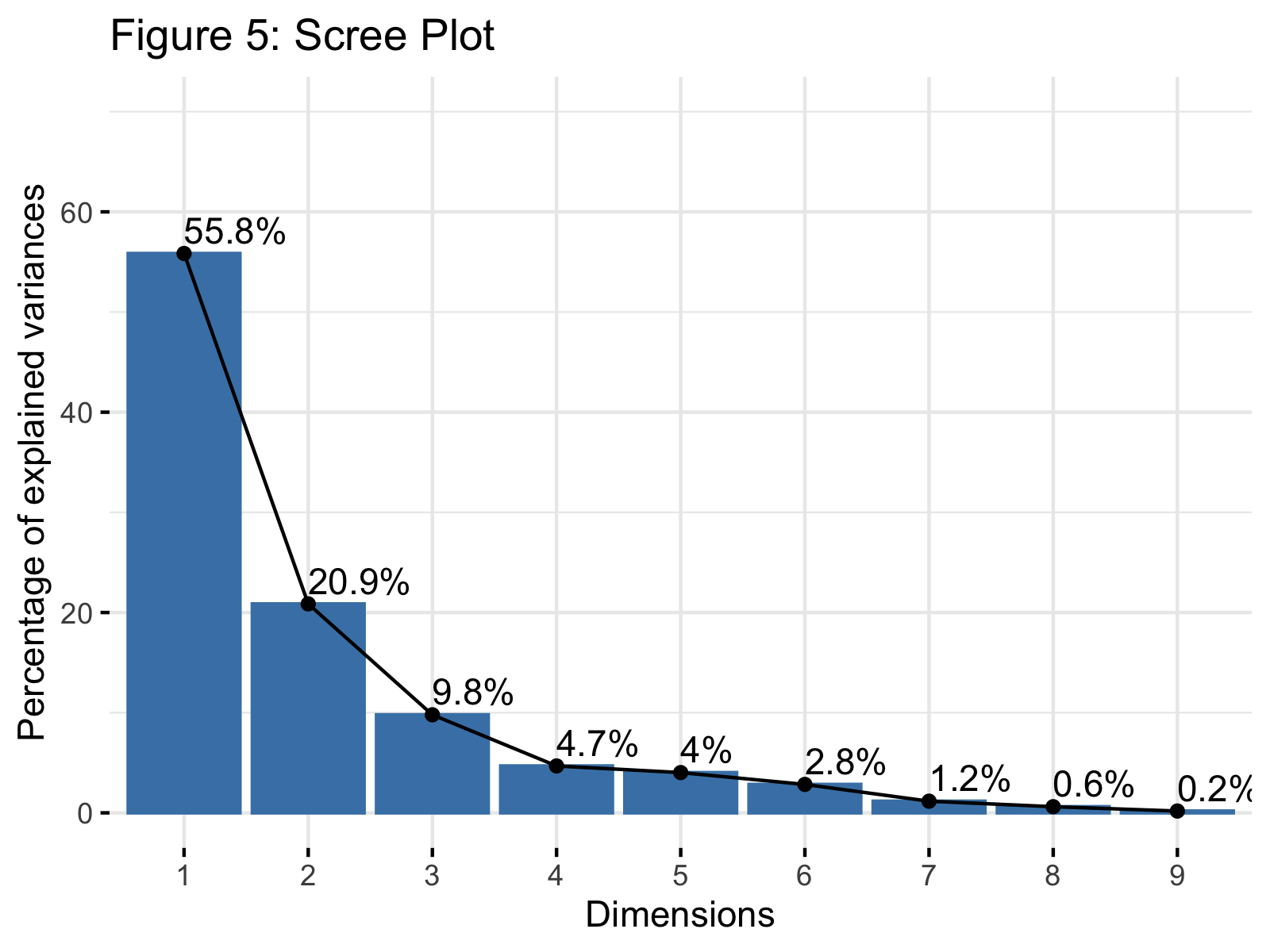
Figure 5 shows a scree plot showing the explained variance per principal component in our PCA. If you need more information to understand this plot, please check our tutorial: Scree Plot for PCA Explained and see the Scree Plot in R tutorial for other alternatives of the display.
Video, Further Resources & Summary
Do you need more explanations on how to visualize your PCA in R or perform a PCA in R in general? Then you should have a look at the following YouTube video of the Statistics Globe YouTube channel.
Moreover, you could check some of the other tutorials on Statistics Globe:
- What is PCA?
- PCA Using Correlation & Covariance Matrix
- Choose Optimal Number of Components for PCA
- Can PCA be Used for Categorical Variables?
- Principal Component Analysis in R
- Point Cloud of PCA in R
- Scatterplot of PCA in R
- 3D Plot of PCA in R
- Biplot of PCA in R
- Scree Plot for PCA Explained
- Biplot for PCA Explained – How to Interpret
- Draw Ellipse Plot for Groups in PCA in R
This post has shown how to visualize your PCA results in R. In case you have further questions, you may leave a comment below.
Subscribe to the Statistics Globe Newsletter
Get regular updates on the latest tutorials, offers & news at Statistics Globe.
I hate spam & you may opt out anytime: Privacy Policy.
Thank you!
Welcome to the Statistics Globe newsletter. From now on, I’ll send you regular emails about statistics, data science, AI, and programming with R and Python.
I’m Joachim Schork. On this website, I provide statistics tutorials as well as code in Python and R programming.
Statistics Globe Newsletter
Get regular updates on the latest tutorials, offers & news at Statistics Globe. I hate spam & you may opt out anytime: Privacy Policy.
Thank you!
Please check your email inbox and click the confirmation link to complete your subscription. If you don’t see the email within a few minutes, please also check your spam/junk folder.


10 Comments. Leave new
I don’t see how principal component analysis helps with the discrimination of the classes, they all look mixed up.
Hello George,
I advise you to check our PCA Explained tutorial for better insight.
Regards,
Cansu
I would advise you to take the same procedure with t-SNE and see how different the data looks, PCA does not work here, from the ellipse plot we don’t see any useful discrimination of the classes.
https://towardsdatascience.com/interesting-projections-where-pca-fails-fe64ddca73e6
Hello George,
Thanks. The main use of PCA is not the discrimination of classes. It is a variable reduction method to enhance the interpretability of the data. But it may also well help with discrimination. But I wouldn’t be surprised if it can’t. A more relevant method, like discriminant analysis, might be more useful in your case.
Regards,
Cansu
With the reduction of the dimensions, logically would expect to see some class discrimination due to the projections to fewer dimensions. PCA does not always work or produces better results than not applying it at all to the data.
Hello George,
I don’t know about your data. It is possible that PCA didn’t give you what you wanted. I hope you can find the appropriate analysis method for your data and purpose.
Regards,
Cansu
Hi,
Thank you very much for this content.
in the different plots, eg. the 3D scatter plot, I would like to identify the individual dots.
I would like to identify the dots that lie far out and are “alone”, how can I do that?
Thank you.
Hello Charlotte,
You are very welcome. You can use the Mahalanobis distance to identify the outliers, then call the plot_3d$xyz.convert() function to convert the 3d coordinates into 2d and the text() function to label the outliers. See how I implemented it below.
I hope this helps.
Best,
Cansu
After doing pca how can I make scatter plot using pca scores …and from that scatter plot I want to identify the different cluster….and from there I want to do cluster analysis using principal components …may data have 50 genotype measured on 16 biometrical characters
Hello,
You can read our tutorials, Scatterplot of PCA in R and PCA Before k-means Clustering in R as guidance.
Best,
Cansu