PCA Before k-means Clustering in R (Example)
In this post, you’ll learn how to apply PCA before k-means clustering in the R programming language.
The content of the post is structured as follows:
Let’s dig in!
Example Data & Packages
We first need to install and load the factoextra, ggplot2 and ggrepel packages and libraries, which will be used for the visualization in this tutorial. For performing the analyses, we only need the functions of the stats package loaded by default.
install.packages("factoextra")            # Install & load factoextra
library("factoextra")
install.packages("ggplot2")               # Install & load ggplot2 package
library("ggplot2")
install.packages("ggrepel")               # Install & load ggrepel package
library("ggrepel")
For demonstration, the built-in mtcars dataset, which contains the fuel consumption (mpg) and 10 aspects of automobile design and performance for 32 automobiles (1973-74 models), will be used.
data(mtcars)                              # Load mtcars

head(mtcars)                              # Print first rows of mtcars
#                    mpg cyl disp  hp drat    wt  qsec vs am gear carb
# Mazda RX4         21.0   6  160 110 3.90 2.620 16.46  0  1    4    4
# Mazda RX4 Wag     21.0   6  160 110 3.90 2.875 17.02  0  1    4    4
# Datsun 710        22.8   4  108  93 3.85 2.320 18.61  1  1    4    1
# Hornet 4 Drive    21.4   6  258 110 3.08 3.215 19.44  1  0    3    1
# Hornet Sportabout 18.7   8  360 175 3.15 3.440 17.02  0  0    3    2
# Valiant           18.1   6  225 105 2.76 3.460 20.22  1  0    3    1
As seen, the variables cyl, vs, am, gear and carb are discrete. Since PCA is designed for working with continuous data, I will exclude these variables from the analysis. For alternatives of PCA working with categorical and mixed data, see our tutorial: Can PCA be Used for Categorical Variables?
mtcarsub <- mtcars[, c(1, 3:7)]           # Remove discrete variables

head(mtcarsub)                            # Print first rows of final data
#                    mpg disp  hp drat    wt  qsec
# Mazda RX4         21.0  160 110 3.90 2.620 16.46
# Mazda RX4 Wag     21.0  160 110 3.90 2.875 17.02
# Datsun 710        22.8  108  93 3.85 2.320 18.61
# Hornet 4 Drive    21.4  258 110 3.08 3.215 19.44
# Hornet Sportabout 18.7  360 175 3.15 3.440 17.02
# Valiant           18.1  225 105 2.76 3.460 20.22
Now our data is clean and ready to perform the combined PCA and k-means cluster analysis. Let’s see the implementation in an example!
Example: k-means Clustering Combined with PCA
First, we will conduct a PCA based on the standardized data by specifying the scale argument in the prcomp() function. This step will help to reduce the dimensionality of the dataset.
pca <- prcomp(mtcarsub,                   # Perform PCA
              scale=TRUE)

summary(pca)                              # Summary of explained variance
# Importance of components:
#                           PC1    PC2     PC3     PC4    PC5     PC6
# Standard deviation     2.0463 1.0715 0.57737 0.39289 0.3533 0.22799
# Proportion of Variance 0.6979 0.1913 0.05556 0.02573 0.0208 0.00866
# Cumulative Proportion  0.6979 0.8892 0.94481 0.97054 0.9913 1.00000
Based on the PCA summary, the first two principal components explain around 90% of the variance in total. Finding this amount sufficient, we can select the first two principal components to describe our data and neglect the rest. For further information on how to select the components, see Choose Optimal Number of Components for PCA.
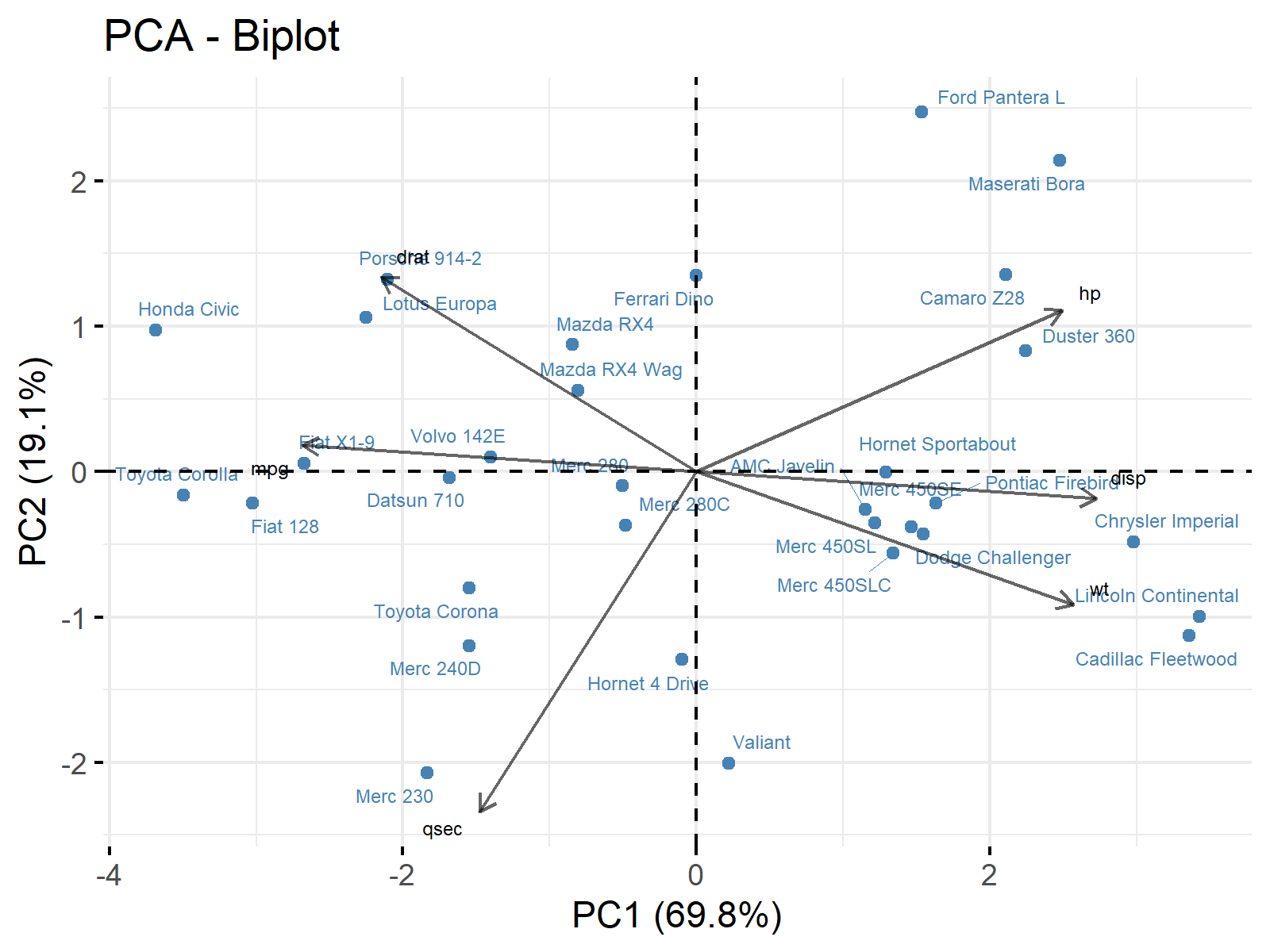
Now our data is 2-dimensional, enabling us to visualize it via a biplot. See the respective code below.
ggp0 <- fviz_pca_biplot(pca,              # Visualize PCA via biplot
                        col.var = "black",
                        col.ind = "steelblue",
                        alpha.var = 0.6,
                        repel = TRUE,
                        labelsize = 2) +
        labs(x = "PC1 (69.8%)",
             y = "PC2 (19.1%)")

ggp0                                      # Print biplot
The written piece of code prints the following biplot. To learn more about drawing biplots in R, please see Biplot of PCA in R.

Plotting biplots is crucial to understand what the principal components represent and how they describe the data. If you want to learn more about this topic, visit Biplot for PCA Explained.
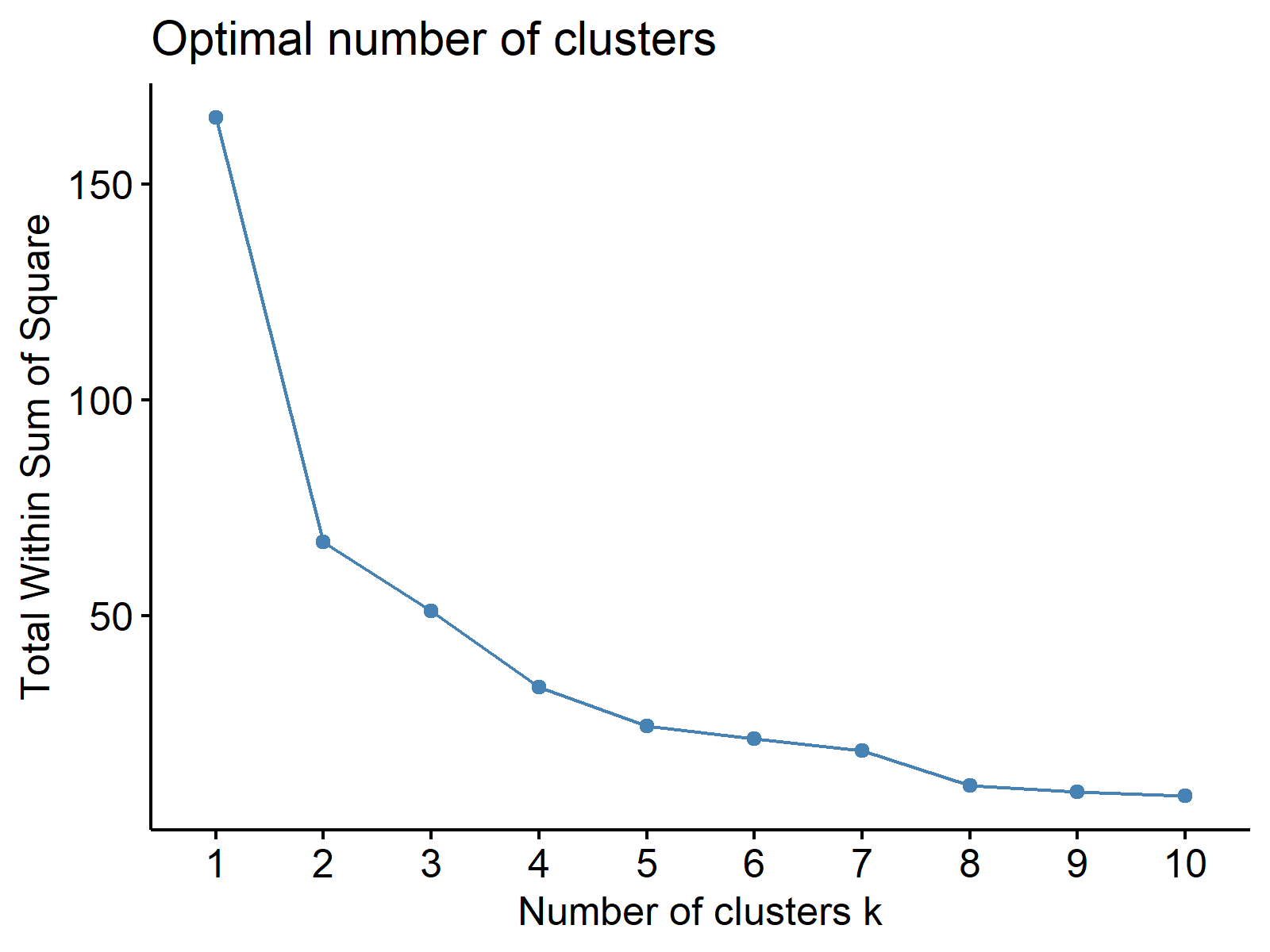
Knowing what the principal components represent, we can run the k-means clustering analysis. But, first, we will extract the component values (scores) and calculate the within-cluster sum of squares for different numbers of clusters to check the ideal cluster number via the elbow method. Let’s plot the corresponding plot.
pca_scores <- data.frame(pca$x[, 1:2])    # Extract PC1 and PC2

ggp1 <- fviz_nbclust(pca_scores,          # Determine number of clusters
                     FUNcluster = kmeans,
                     method = "wss")

ggp1                                      # Print within sum of squares plot

Based on Figure 2, four clusters seem sufficient to group similar cars, which means we will run a 4-means cluster analysis. See the code performing clustering below.
set.seed(123)                             # Set seed for randomization
kmeans_clust <- kmeans(pca_scores,        # Perform k-means clustering
                        centers = 4)

kmeans_clust                              # Summary of clustering results
# K-means clustering with 4 clusters of sizes 5, 3, 13, 11
#
# Cluster means:
#         PC1         PC2
# 1  1.672544  1.62890454
# 2  3.254961 -0.86916067
# 3 -2.069583  0.03393735
# 4  0.797907 -0.54347511
#
# Clustering vector:
#           Mazda RX4       Mazda RX4 Wag          Datsun 710      Hornet 4 Drive
#                   3                   3                   3                   4
#   Hornet Sportabout             Valiant          Duster 360           Merc 240D
#                   4                   4                   1                   3
#            Merc 230            Merc 280           Merc 280C          Merc 450SE
#                   3                   4                   4                   4
#          Merc 450SL         Merc 450SLC  Cadillac Fleetwood Lincoln Continental
#                   4                   4                   2                   2
#   Chrysler Imperial            Fiat 128         Honda Civic      Toyota Corolla
#                   2                   3                   3                   3
#       Toyota Corona    Dodge Challenger         AMC Javelin          Camaro Z28
#                   3                   4                   4                   1
#    Pontiac Firebird           Fiat X1-9       Porsche 914-2        Lotus Europa
#                   4                   3                   3                   3
#      Ford Pantera L        Ferrari Dino       Maserati Bora          Volvo 142E
#                   1                   1                   1                   3
#
# Within cluster sum of squares by cluster:
# [1]  5.7490194  0.3470918 21.5751388 10.4767395
#  (between_SS / total_SS =  76.9 %)
#
# Available components:
#
# [1] "cluster"      "centers"      "totss"        "withinss"     "tot.withinss"
# [6] "betweenss"    "size"         "iter"         "ifault"
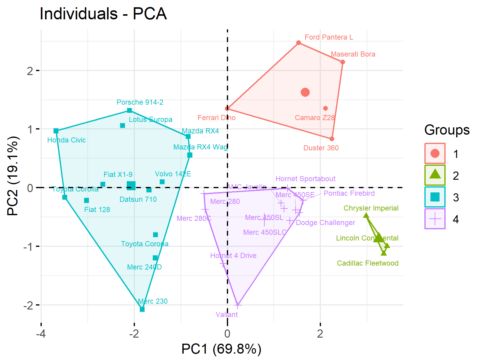
Above, you see the 4-means clustering results, such as the mean (centroid) coordinates of clusters, cluster sizes and cluster partitioning. Now, based on the resulting partitioning and cluster means, we can visualize our clusters.
We will use the fviz_pca_ind() function of the factoextra package to visualize the component scores of cars and we will color and frame them by cluster parsing the habillage and addEllipses arguments, see Draw Ellipse Plot for Groups in PCA in R.
ggp2 <- fviz_pca_ind(pca,                 # Visualize clusters
                   habillage = kmeans_clust$cluster,
                   repel = TRUE,
                   addEllipses = TRUE,
                   ellipse.type = "convex",
                   labelsize = 2) +
     guides(color = guide_legend(override.aes = list(label = ""))) +
     labs(x = "PC1 (69.8%)", y = "PC2 (19.1%)")

ggp2                                      # Print cluster plot
You can observe that we also called the ellipse.type argument to specify the shape of framing. Furthermore, we customized the display of the legend and axis labels via the guides() and labs() functions. See Draw Ellipse Plot for Groups in PCA in R, for the default settings.

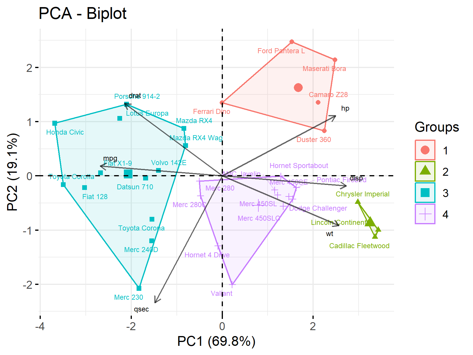
At this point, you can interpret the clusters based on the principal components. You can revisit the biplot shown in Figure 1 to remember what each component represents. Alternatively, you can combine the cluster plot and biplot graph, as coded below.
ggp3 <- fviz_pca_biplot(pca,              # Visualize clusters in biplot
                      col.var = "black",
                      alpha.var = 0.6,
                      label = "all",
                      habillage = kmeans_clust$cluster,
                      repel = TRUE,
                      addEllipses = TRUE,
                      ellipse.type = "convex",
                      labelsize = 2) +
      guides(color = guide_legend(override.aes = list(label = ""))) +
      labs(x ="PC1 (69.8%)", y = "PC2 (19.1%)")

ggp3                                      # Print combined plot
As seen, we have used the fviz_pca_biplot() function as done for Figure 1 and set the arguments of habillage, addEllipse and ellipse_type as specified in fviz_pca_ind() for Figure 3. Let’s run it now!

Now you have a combined plot effectively gathering all information on a single visual. But please be aware that this type of graph may not be the best option in the presence of a large dataset.
The plot titles are set by default by the factoextra package. You can also overwrite them using the labs() function parsing the title argument.
For the interpretation of the outputs in this tutorial, please visit How to Combine PCA and k-means Clustering Explained.
Video & Further Resources
Take a look at the following video instruction, which I have published on my YouTube channel. In the video, I’ll explain how to apply PCA before K-means clustering in R, and I use a different example as in the present tutorial.
Furthermore, you might take a look at the more general video below. In this video, you’ll get the main information on how to perform a Principal Component Analysis in R:
Furthermore, you might take a look at the other tutorials on my website:
- How to Combine PCA & k-means Clustering
- What is PCA?
- PCA Using Correlation & Covariance Matrix
- Choose Optimal Number of Components for PCA
- Can PCA be Used for Categorical Variables?
- Principal Component Analysis in R
- Biplot of PCA in R
- Biplot for PCA Explained – How to Interpret
- Draw Ellipse Plot for Groups in PCA in R
In summary: This article has illustrated how to combine PCA and k-means clustering in R programming. Don’t hesitate to let me know in the comments if you have additional questions.
This page was created in collaboration with Cansu Kebabci. Have a look at Cansu’s author page to get more information about her professional background, a list of all his tutorials, as well as an overview on her other tasks on Statistics Globe.
Subscribe to the Statistics Globe Newsletter
Get regular updates on the latest tutorials, offers & news at Statistics Globe.
I hate spam & you may opt out anytime: Privacy Policy.
Thank you!
Welcome to the Statistics Globe newsletter. From now on, I’ll send you regular emails about statistics, data science, AI, and programming with R and Python.
I’m Joachim Schork. On this website, I provide statistics tutorials as well as code in Python and R programming.
Statistics Globe Newsletter
Get regular updates on the latest tutorials, offers & news at Statistics Globe. I hate spam & you may opt out anytime: Privacy Policy.
Thank you!
Please check your email inbox and click the confirmation link to complete your subscription. If you don’t see the email within a few minutes, please also check your spam/junk folder.


2 Comments. Leave new
Error in .is_grouping_var(habillage) : object ‘Kmeans_clust’ not found
Me da este error !
Hello Isaac,
It seems like you had a typo. The clustering analysis object is called kmeans_clust in the tutorial, not Kmeans_clust. R is case-sensitive. If the problem persists, let me know.
Best,
Cansu