What is Principal Component Analysis (PCA)? – Tutorial & Example
High dimensional data is hard to explore and visualize. Thus, the main idea of the PCA (Principal Component Analysis) is to reduce the number of variables in a data set while preserving as much information as possible.
In this tutorial, you’ll learn about the steps and application of the Principal Component Analysis.
The table of content is structured as follows:
What is Principal Component Analysis (PCA)?
Principal Component Analysis (PCA) is a mathematical algorithm in which the objective is to reduce the dimensionality while explaining the most of the variation in the data set.
The variable reduction is accomplished by the linear transformation of the original variables into the new components, which are smaller in number and account for most of the variation in the data.
Step by Step PCA (Example)
There are several steps involved while conducting a PCA. Let’s dive into it.
Step 1: Standardize the Data Set
Let’s say we have a data set with 4 variables and 4 observations, as shown below:

The first step is to standardize, which means transforming all variables as they will have means of zeros and standard deviations of one, hence variances of one.
This is done to ensure that there is no imbalance in the contribution of the variables due to unit differences. Otherwise, the variables that have higher variances would contribute more than the ones with lower variances in identifying the principal components, although it does not reflect reality. For further explanation, see the PCA Using Correlation & Covariance Matrix tutorial.
Regarding standardization formula is given below:
For each feature, the mean and the standard deviation were as follows before the standardization.

As you see, the variability does not vary much for this sample; hence standardization is not a must in this case. However, for the sake of illustration, the variables were standardized, and the following values they have taken.

Step 2: Calculate the Covariance Matrix
In this step, we want to observe the association between the variables in our data set. Therefore, we will calculate the covariance matrix, which actually corresponds to the correlation matrix as the variables are standardized. The following formula is used for the computation.
The resulting covariance matrix is given below.

Positive covariance implies that the variable pair is positively related. In other words, when the magnitude of one variable tends to increase (or decrease), the other does too.
Negative covariance implies that the variable pair is inversely related. In other words, when the magnitude of one variable tends to increase, the other tends to decrease or vice versa.
In our case, only the variables x3 and x4 are negatively correlated, whereas the other variables are positively correlated.
Step 3: Calculate the Eigenvalues and Eigenvectors of the Covariance Matrix
To determine principal components, we need eigenvectors and eigenvalues, which inform us about the directions and the magnitude of the spread of our data. The first thing we need to understand is that they always come in pairs: every eigenvector has an eigenvalue to describe its magnitude.
As early stated, the “principal components” are the new variables that are formed via the linear transformations of the original variables. Eigenvectors give the weights to be used in this linear transformation and eigenvalues tell how much variance is explained by those newly transformed variables.
Ranking our eigenvectors based on their eigenvalues, from the highest to the lowest, allows us to select the principal components, which explain most of the variation in the dataset.
The following decomposition is employed for a (nonzero) vector v of dimension N for a N × N square matrix A to compute the eigenvectors and eigenvalues:
\(\large Aν = λν\)
In our case, solving the equation leads to the result below:
λ1 = 1.6698239685
λ2 = 1.0144883673
λ3 = 0.3151205250
λ4 = 0.0005671392
Now we can calculate the eigenvectors. The following result is obtained:
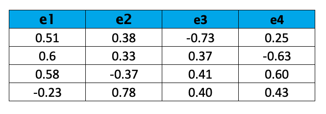
The eigenvalues are ranked in descending order as λ1, λ2, λ3, and λ4. Based on the result, we can choose the top 2 eigenvectors:
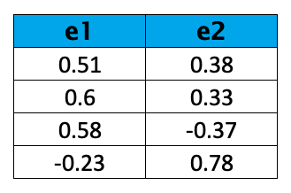
For more information on how to select the ideal number of components, you can see our tutorial.
Step 4: Recast the Data
Now we can reorient the data to the new axes: the ones represented by the principal components, hence the original (standardized) variables can be expressed in terms of principal component scores.
Regarding linear transformation is shown below:

The resulting transformed data is as follows:
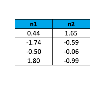
By this example, it is shown how PCA allows us to reduce the dimensions of our data set while keeping most of the valuable information. For a more profound understanding of the theoretical background of the Principal Component Analysis, you can take a look at:
What is Principal Component Analysis? by Markus Ringnér, published in 2008
Principal Component Analysis by Ian Jolliffe, published in 2002
We also advise you to check our tutorial discussing the pros and cons of conducting PCA.
PCA in Practice (Example)
So far, we explained the PCA theoretically. But we haven’t shown the use of PCA in practice yet. Then let’s see it in an application now!
We will use the pizza dataset for the illustration. The dataset contains the id, brand, and nutritional content for the 300 samples and 10 brands. For a quick overview, see the output below.

In the data, moist, prot, fat, ash, sodium, carb and cal refer to the amount of water, protein, fat, ash, sodium, carbohydrates and calories per 100 grams of the sample.
Based on the given, which brand is the best for you? It should be hard to evaluate all brands and their nutritional contents in one look.
The good news is: If there are meaningful associations among the nutrients, the variability of the brands can be explained by fewer pieces of information than given in the dataset. Let’s take a look at the associations then! See the correlation matrix given in Table 11 below.
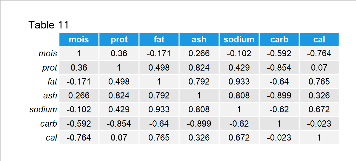
As seen in the output, the moisture is negatively correlated with the carbohydrates and calories; the protein is positively associated with the fat, ash and sodium, whereas it is negatively correlated with the carbohydrates; the fat is positively correlated with the ash, sodium and calories whereas it is negatively correlated with the carbohydrates, and so on.
The relations observed in the first three columns already show some patterns. For instance, usually, there is a contrast between the carbohydrates and other nutrients, or the ash, protein, fat, and sodium increase or decrease in the ingredients together.
The data is promising to employ a PCA, considering the observed relational patterns. In other words, new variables (principal components), which are less in number, can be introduced to account for the variability instead of the original variables. For example, a new component can indicate that the pizza is low in ash, protein, fat, and sodium as all these nutrients tend to increase or decrease together.
Without losing too much time, let’s implement the PCA! In the present tutorial, we focus on the theoretical explanation of PCAs only. You can visit our tutorials to learn how to conduct the PCA in R and PCA in Python. So, let’s move straight to the results regarding the pizza dataset.

The proportion of variance in the Table 12 refers to the scaled eigenvalues, which are theoretically explained in Step 3 in the previous section. Based on the result, the first two principal components account for 0.596 + 0.327 = 92.3% of the variance in the data.
Since 92% is a considerable amount, it is sufficient to retain the first two principal components in the analysis. For more information on how to select the ideal number of components, you can visit the tutorial: Choose Optimal Number of Components for PCA.
Now it is time to see the relationship between the retained components and the original variables. The plots showing these relations are called loadings plots, which show the weights (loadings) used in the linear transformation of the original variables to the principal components. See the loadings table and plot below.

Be aware that each row represents the eigenvectors, which are theoretically explained in Step 3 in the previous section. Based on the weights given in Table 13, it is fair to say that PC1 represents being rich in fat, ash and sodium, and poor in carbohydrates, whereas PC2 represents being rich in calories and poor in moisture/water. Let’s now visualize these relations on a loadings plot.
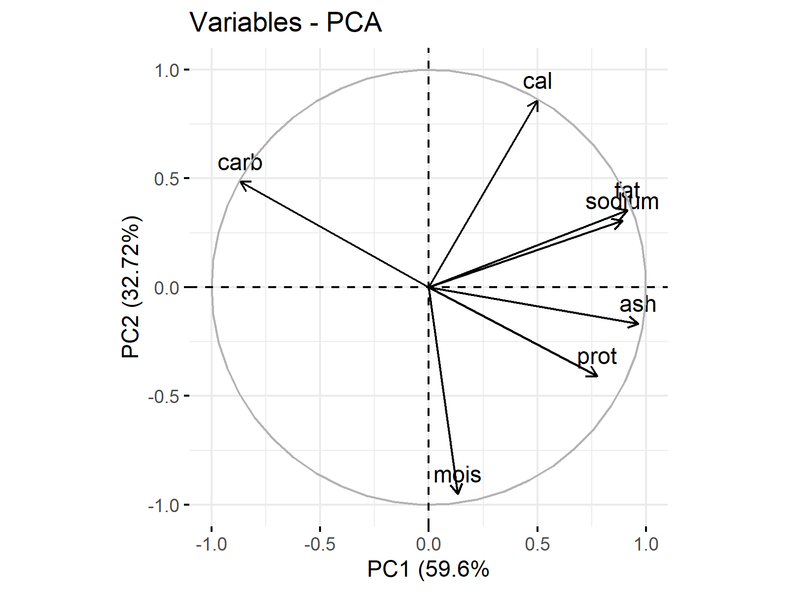
The vectors in Figure 1 show the loadings per variable in Table 13. You can observe that the vector components are 0.065 and -0.628 for moist, 0.379 and -0.27 for prot, etc. The visualization enables a better understanding of what PCs represent and each variable’s share in those representations. For the interpretation, the vector projections are made use of.
Concerning the projections on the PC1 axis, cal, fat, sodium, ash, prot and moist are in the same direction with PC1 in differing magnitudes, whereas carb is in the opposite direction. Considering the projections on the PC2 axis, carb, cal, fat and sodium are in the same direction as PC2 in changing magnitudes, while moist, prot and ash are in the opposite direction in differing magnitudes.
If the relatively higher magnitudes are taken into account:
- PC1 refers to the richness in fat, sodium, ash and protein, and the lack of carbohydrates.
- PC2 refers to the richness in calories and the lack of moisture.
Now it’s time to use this inference in deciding on which brand works the best for you. To do that, we need to plot the PC scores of the pizza samples and the variable loadings on a single plot, which is called biplot in terminology. For further info on biplots, visit the tutorial: Biplot for PCA Explained . Concerning the pizza samples of 10 brands, the following biplot is plotted.
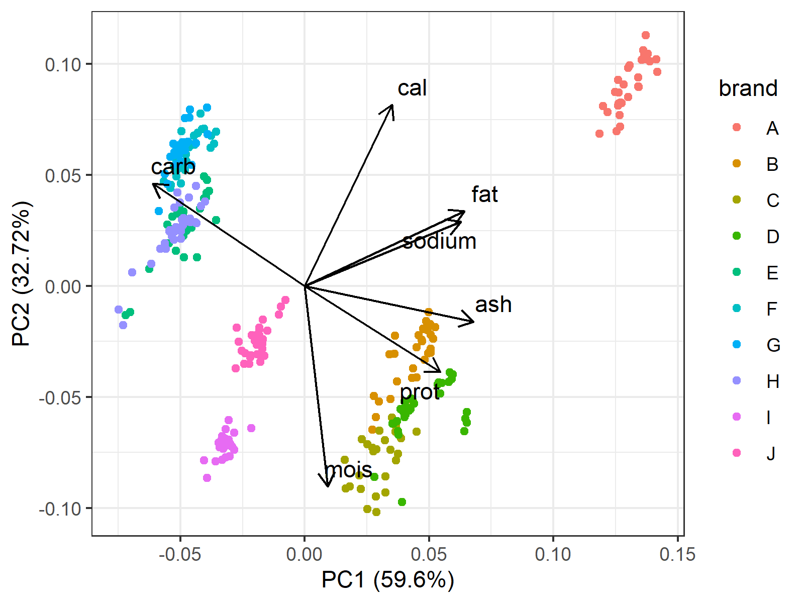
In Figure 2, the axes show the PC scores and the points refer to the individual pizza samples colored by the brand. Additionally, the loading vectors are placed in the center that guide the user through the underlying relations between the original variables and the principal components.
Now we know the samples’ PC scores, the brands, and what PC scores refer to. In light of that information, you can pick the pizza of your preference.
Here are some possible options:
- If you want a fatty and crispy pizza, Brand A would be a good option.
- If you want a soft and non-fat pizza, Brand I would be a good choice.
- If you prefer a balance of nutrients, Brand B and J could be the brands. However, the pizza from Brand B would be still more fat-based than Brand J, which would be more carbohydrate-based.
Which brand would you prefer and why? You can share it in the comments below 🙂 🍕
Video, Further Resources & Summary
Do you need more explanations on how to perform a Principal Component Analysis? Then you should have a look at the following YouTube video of the Statistics Globe YouTube channel. In the video the theoretical parts of this article will be explained in much more detail:
Furthermore, you could have a look at some of the other tutorials on Statistics Globe:
- PCA Using Correlation & Covariance Matrix
- Advantages & Disadvantages of Principal Component Analysis
- Choose Optimal Number of Components for PCA
- Principal Component Analysis in R
- Principal Component Analysis in Python
- Biplot for PCA Explained
- Can PCA be Used for Categorical Variables?
- Statistical Methods
This post has shown what a PCA is, how to perform it step by step and its use in practice. In case you have further questions, you may leave a comment below.


11 Comments. Leave new
how about using a real data example (e.g., height, weight, age, etc of people) and then do the transformations and then – most importantly – describe how you interpret the results in terms of these real world observations
the example above does not tell me WHY and WHEN i should perform PCA, and that should really be the goal!
Hello,
Thank you for your feedback. You have a point. Maybe you check our tutorial which focuses on the application of a PCA in R and uses a real dataset. But I am afraid it might still lack an explanation of when and why. I will discuss this with our team and hopefully, we’ll create a tutorial, which explains the topic from that perspective.
Regards,
Cansu
Hello Flemming,
We extended the tutorial considering your criticism. We hope you like it and understand better when and why the PCA is employed. Keep following and sharing your thoughts 🙂
Best,
Cansu
Thanks for onformation and go head
Hey Gabisa,
Thank you for your nice words 🙂 It is glad to hear.
Regards,
Cansu
Thanks for using examples with numbers, rea life example and interpretation!
You’re welcome! Thanks for the positive feedback. Great to hear that you like our work.
Regards,
Matthias
Hi , Thanks to your vdo which help me with understanding more about PCA.
Need more help about :
1. If we kept more than 2PCs (may be 3 or 4) how can I interpret the observation?
2.in PCA , do I have to do a AHC to cluster the observations?
And need to know more in VDO about pizza B,C,D that clustered together, how to interpret these 3.
Thanks,KC
Hello Katalee,
I am glad that you found the video helpful. Unfortunately, the visualization gets complicated when the number of components is higher than 3.
In case three principal components are retained, you can use the 3D visualization; please see 3D Plot of PCA in R. You can use Biplot for each pair of components separately for larger component numbers. Alternatively, you can use heatmaps, where each row of your heatmap could represent one of the principal components, and each column could represent the original variables. This will help you to understand the variable-component relations. Then, you can visualize the data points by scatterplots for each component pair to understand how your data is explained by these components.
I didn’t get well, your second question. In the video, we don’t do any clustering. So clustering is not a step of PCA. However, you can make use of PCA before implementing clustering to ensure selecting the relevant variables. See my tutorial How to Combine PCA & k-means Clustering.
Regarding the pizza brands, B, C, and D have similar ratio of nutritional ingredients, yet C is more moisturized, and D is a little higher in fat, sodium, ash, and protein. I hope it is clear. If you have any further questions, please let me know.
Best,
Cansu
Excellent explanation, folks. A question: I am analysing 9 year weather data (6 parameters) and wanted to know from the biplot, which variable is influencing which year. Will you be able to advise on that? Unfortunately, your comment box doesn’t allow to paste an image, so couldn’t upload the plot. The bipot has 6 loading vectors and 9 scatter points, one for each year, which is the mean value for that year.
Best wishes,
Hello Amanjot,
If you want to see the causal effect of some variables on others, you need an inferential analysis, principal component analysis is an exploratory analysis used for variable reduction. Based on your description, I can imagine that a multivariate regression model for repeated measurements can be an alternative. However, you should apply it to the raw data, not the summary statistics, 9 as a sample size is too small for a statistical analysis.
Best,
Cansu