Add Legend to Plot in Base R (8 Examples)
In this article, I’ll show how to add a legend to a plot using the legend() function in the R programming language.
Table of contents:
Let’s just jump right in!
Example Data
First, we’ll need to create some example data:
set.seed(298346)                     # Create example data
x <- rnorm(300)
y <- rnorm(300) + x
group <- rep(1:2, each = 150)
Have a look at the previous R code. It shows that the example data consists of three vectors. The variables x and y contain numeric values and the variable group defined two different groups.
Now, we can plot our data as shown below:
plot(x, y, pch = 16, col = group) # Plot example data
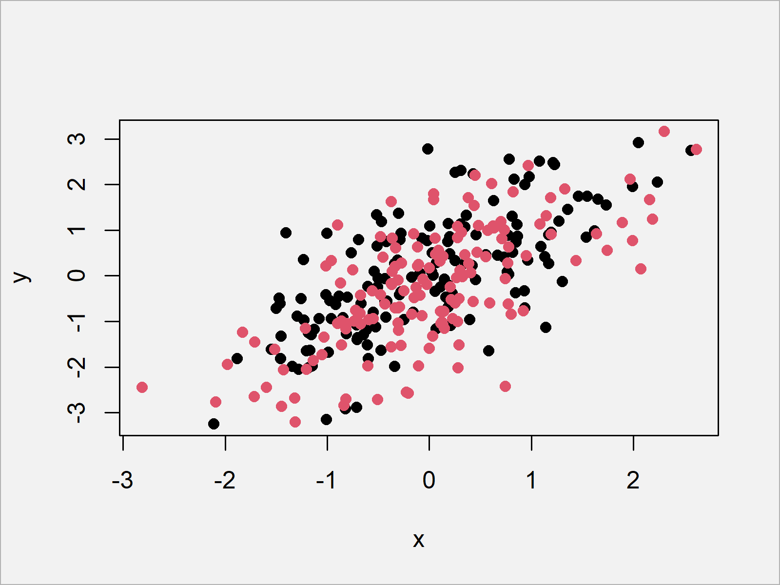
Figure 1 shows the output of the previous R programming code – A Base R scatterplot.
Example 1: Adding Simple Legend to Plot
Example 1 explains how to add a legend to our plot using the legend() function in R.
For this, we first have to draw our plot (as we already did before) and then we have to apply the legend function as shown below:
plot(x, y, pch = 16, col = group)    # Draw plot without legend
legend("topleft",                    # Add legend to plot
       legend = c("Group 1", "Group 2"),
       col = 1:2,
       pch = 16)
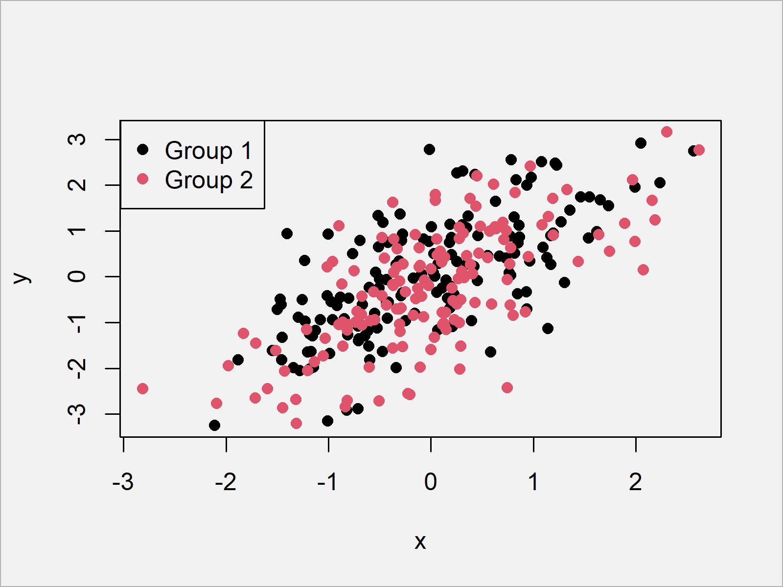
As illustrated in Figure 2, the previous R syntax created an xy-plot with a legend on the top left of our plot.
Example 2: Adjusting Legend Position
The following R programming code explains how to move our legend to a different corner of the plot.
Generally speaking, the legend function provides four different commands for each of the four corners of our plot.
In the previous example we have used the “topleft” command to show our legend at the corner in the top left.
Besides that, we can also use “topright”, “bottomleft”, or “bottomright”.
Let’s relocate our legend to the bottom right of the graphic:
plot(x, y, pch = 16, col = group)    # Draw plot without legend
legend("bottomright",                # Add legend to plot
       legend = c("Group 1", "Group 2"),
       col = 1:2,
       pch = 16)
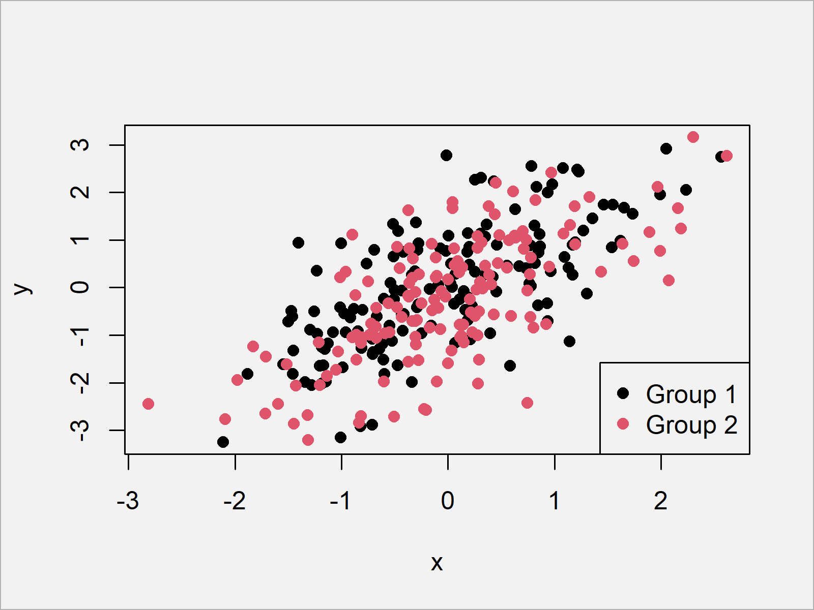
As shown in Figure 3, we created a graph with a legend at the bottom right with the previous R syntax.
Example 3: Manually Specify X- & Y-Coordinates of Legend
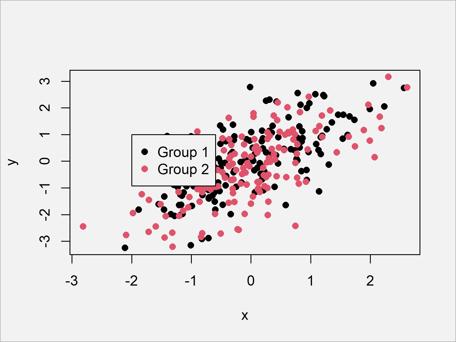
The following R syntax shows how to use coordinates to move the location of our position to the middle of our plot. Have a look at the following R syntax:
plot(x, y, pch = 16, col = group)    # Draw plot without legend
legend(x = - 2, y = 1,               # Add legend to plot
       legend = c("Group 1", "Group 2"),
       col = 1:2,
       pch = 16)
Example 4: Changing Background & Border Colors of Legend
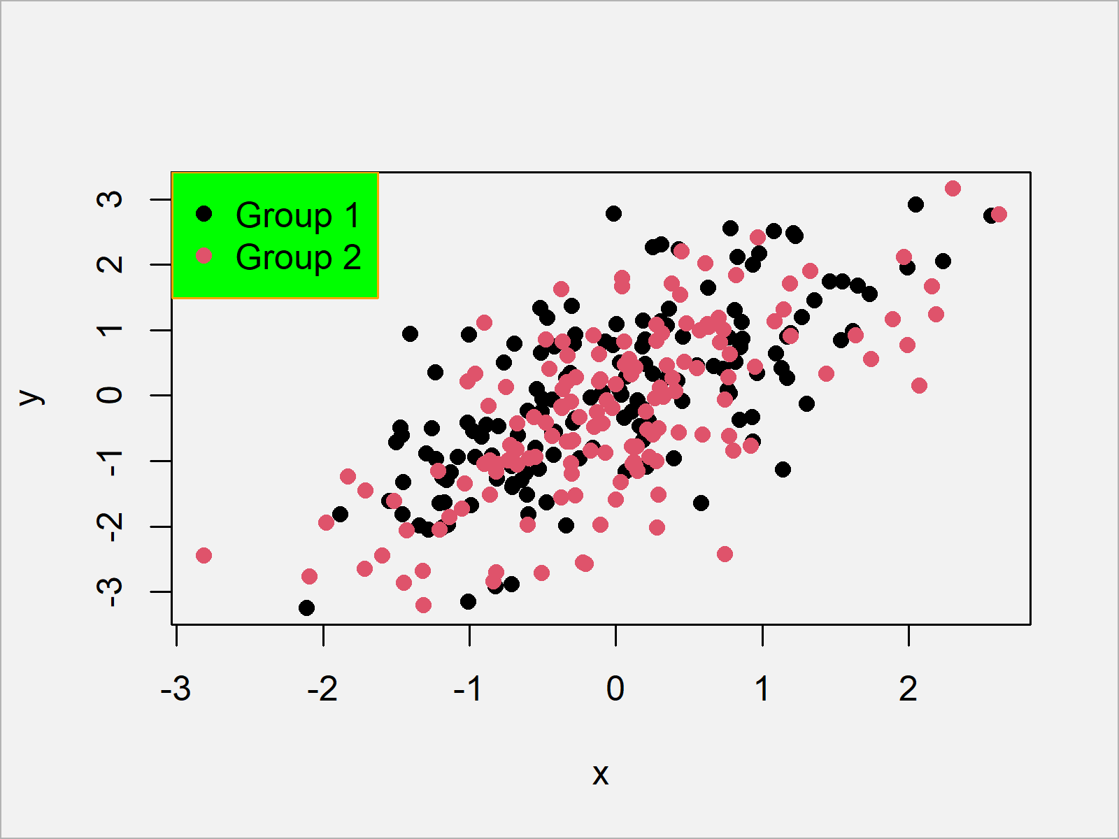
In this example, I’ll explain how to switch the color of our legend borders and its background. For this, we can use the box.col and bg arguments:
plot(x, y, pch = 16, col = group)    # Draw plot without legend
legend("topleft",                    # Add legend to plot
       legend = c("Group 1", "Group 2"),
       col = 1:2,
       pch = 16,
       box.col = "orange",
       bg = "green")
Example 5: Increasing Legend Size
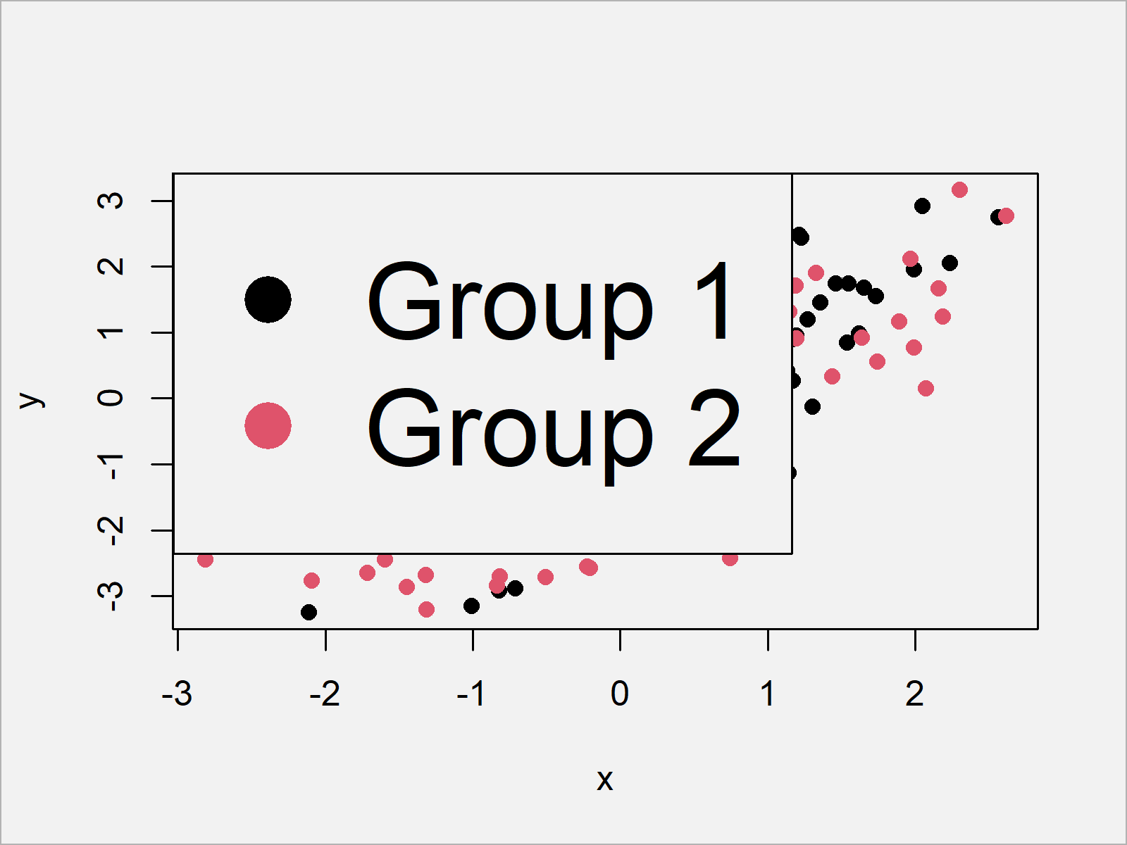
This section shows how to increase (or decrease) the size of our legend using the cex argument:
plot(x, y, pch = 16, col = group)    # Draw plot without legend
legend("topleft",                    # Add legend to plot
       legend = c("Group 1", "Group 2"),
       col = 1:2,
       pch = 16,
       cex = 3)
Example 6: Drawing Horizontal Legend
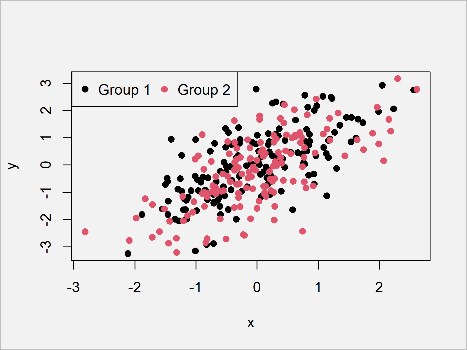
This example illustrates how to show the legend items side-by-side to each other with horizontal alignment:
plot(x, y, pch = 16, col = group)    # Draw plot without legend
legend("topleft",                    # Add legend to plot
       legend = c("Group 1", "Group 2"),
       col = 1:2,
       pch = 16,
       horiz = TRUE)
Example 7: Changing Point / Line Type of Legend
In this example, I’ll illustrate how to change the type of our legend items. So far, we have only used points within our legend. By using the lty argument, we can use lines instead:
plot(x, y, pch = 16, col = group)    # Draw plot without legend
legend("topleft",                    # Add legend to plot
       legend = c("Group 1", "Group 2"),
       col = 1:2,
       lty = 1)

Example 8: Multiple Line Types in Same Legend
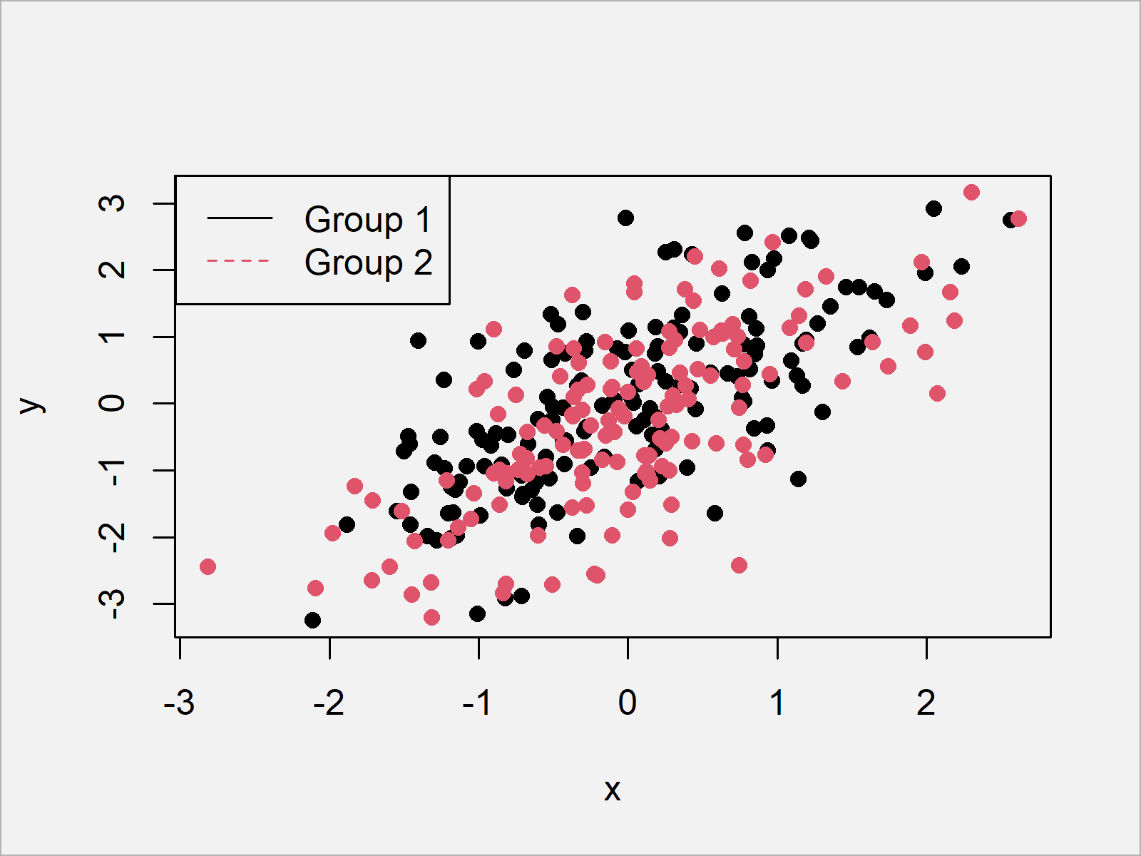
Example 8 illustrates how to use different line types for each legend item. For this, we have to specify different line types for each of our lines using the lty argument:
plot(x, y, pch = 16, col = group)    # Draw plot without legend
legend("topleft",                    # Add legend to plot
       legend = c("Group 1", "Group 2"),
       col = 1:2,
       lty = 1:2)
As you have seen in the previous examples, the legend function provides many options for the manipulation of legends in Base R plots.
Note that we have used a scatterplot in the examples of this tutorial. However, it would also be possible to add a legend to other types of plots such as histograms, boxplots, barcharts, line plots, and so on…
Video, Further Resources & Summary
Some time ago I have released a video on my YouTube channel, which explains the R codes of this article. Please find the video below:
In addition, I can recommend having a look at the other tutorials of my homepage.
- Change Legend Size in Base R Plot
- Add Legend without Border & White Background to Plot
- Draw Legend Outside of Plot Area in Base R Graphic
- Add Text to Plot Using text() Function in Base R
- Creating Plots in R
- R Programming Tutorials
Summary: In this R article you learned how to apply the legend function. In case you have further questions, let me know in the comments. Furthermore, don’t forget to subscribe to my email newsletter in order to receive updates on the newest articles.
Subscribe to the Statistics Globe Newsletter
Get regular updates on the latest tutorials, offers & news at Statistics Globe.
I hate spam & you may opt out anytime: Privacy Policy.
Thank you!
Please check your email inbox and click the confirmation link to complete your subscription. If you don’t see the email within a few minutes, please also check your spam/junk folder.
I’m Joachim Schork. On this website, I provide statistics tutorials as well as code in Python and R programming.
Statistics Globe Newsletter
Get regular updates on the latest tutorials, offers & news at Statistics Globe. I hate spam & you may opt out anytime: Privacy Policy.
Thank you!
Please check your email inbox and click the confirmation link to complete your subscription. If you don’t see the email within a few minutes, please also check your spam/junk folder.


2 Comments. Leave new
How to put legend outside of graph without border?
How to insert regression equation, R2, and P values inside the graph?
Thanks.
Hey,
You can remove the border around a legend as shown here: https://statisticsglobe.com/plot-legend-without-border-and-white-background-in-r
You can add text or statistical metrics to a plot as shown here: https://statisticsglobe.com/text-function-plot-r/
Regards,
Joachim