Biplot of PCA in R (Examples)
In this article, you will learn how to draw a biplot of a Principal Component Analysis (PCA) in the R programming language.
The table of content looks as follows:
Let’s take a look!
Load Data and Add-On Libraries
First of all, we will use the factoextra package. If you haven’t installed it yet, now is the right time to do it.
install.packages("factoextra")
The next step (or the first step if you have already installed this package) is to load the library.
library("factoextra")
Now, we will load our data. For this tutorial, we will use the iris dataset, which contains information about the measurements of sepal length, sepal width, petal length, and petal width from 3 species of iris and 50 flowers.
data(iris)
Now let’s check the number of columns and rows, and the overview of the first few rows, as shown below.
dim(iris)
# [1] 150   5

head(iris)
#   Sepal.Length Sepal.Width Petal.Length Petal.Width Species
# 1          5.1         3.5          1.4         0.2  setosa
# 2          4.9         3.0          1.4         0.2  setosa
# 3          4.7         3.2          1.3         0.2  setosa
# 4          4.6         3.1          1.5         0.2  setosa
# 5          5.0         3.6          1.4         0.2  setosa
# 6          5.4         3.9          1.7         0.4  setosa
All is set, time to start the analysis!
PCA
Since PCA is designed for continuous variables, we will perform our PCA for the numerical variables, excluding the “species” column. If you are interested in PCAs using categorical variables, check our tutorial: Can PCA be Used for Categorical Variables? First, we need to call the prcomp() function to run the analysis.
pca <- prcomp(iris[, -5],
              scale = TRUE)
We have specified scale = TRUE inside the function to conduct a PCA using a correlation matrix, which ensures that the sensitivity to larger variable variations is taken into account.
Using the command pca$rotation, we can see the loadings, which are represented by the vectors in biplots.
pca$rotation
#                     PC1         PC2        PC3        PC4
# Sepal.Length  0.5210659 -0.37741762  0.7195664  0.2612863
# Sepal.Width  -0.2693474 -0.92329566 -0.2443818 -0.1235096
# Petal.Length  0.5804131 -0.02449161 -0.1421264 -0.8014492
# Petal.Width   0.5648565 -0.06694199 -0.6342727  0.5235971
We can also check the principal component scores stored in x, which are shown by the scatter points in biplots.
head(pca$x)
#           PC1        PC2         PC3          PC4
# [1,] -2.257141 -0.4784238  0.12727962  0.024087508
# [2,] -2.074013  0.6718827  0.23382552  0.102662845
# [3,] -2.356335  0.3407664 -0.04405390  0.028282305
# [4,] -2.291707  0.5953999 -0.09098530 -0.065735340
# [5,] -2.381863 -0.6446757 -0.01568565 -0.035802870
# [6,] -2.068701 -1.4842053 -0.02687825  0.006586116
In the next sections, we will plot some biplots using the data discussed above. We don’t need to extract the data as previously shown to plot the biplots. However, if you are interested in having the exact numeric values, you can use the shared scripts above.
Example 1: Biplot of PCA Using base R
To create a biplot using base R, we need to call the biplot() function, specifying the pca object and scale = 0 since we need to scale the scores and loadings to fit the data on the same plot. For the other scaling options, see the documentation of the biplot() function.
biplot(pca,
       scale = 0)
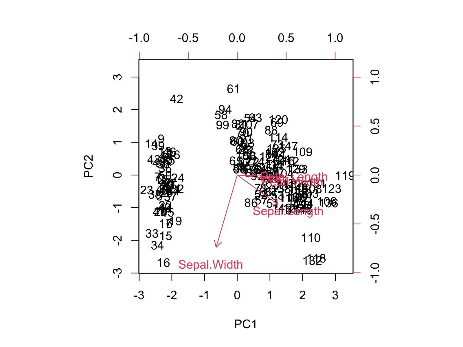
The biplot shows the distribution of data points and variables concerning the first and second principal components. If you want to learn more about how to interpret the biplot, you can check our tutorial Biplot for PCA Explained.
Alternatively, we can change the color of the loading vectors and the scatter points using the col argument and remove the labels of the data points using the xlabs argument. In the rep() function, 150 refers to the number of data points, and * refers to the marker type.
biplot(pca,
col = c('darkblue', 'red'),
scale = 0, xlabs = rep("*", 150))
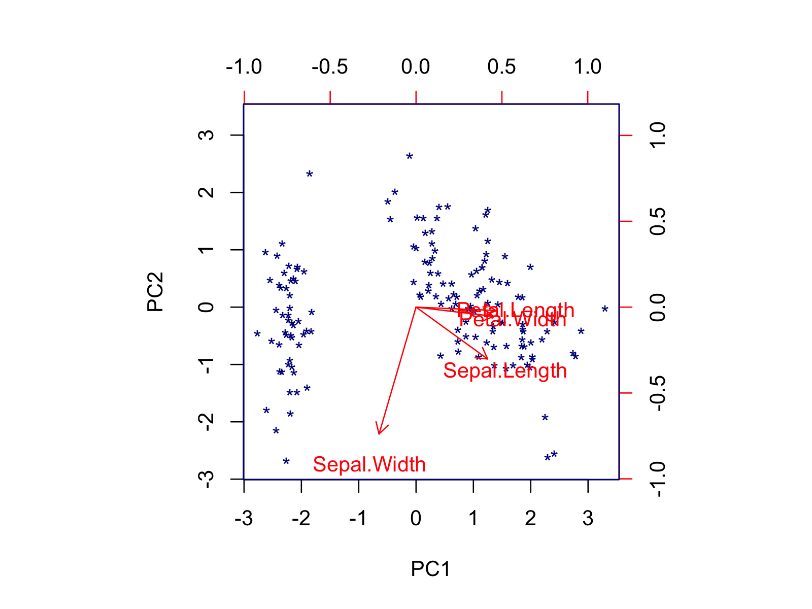
Using the biplot() function, you can also modify the font size, axis limits, or length of arrows via the cex, xlim, and expand arguments, respectively. If you want to customize your biplot in a more advanced way, you should use the factoextra package. In the next section, some alternatives are shown.
Example 2: Biplot of PCA Using factoextra Package
It’s also possible to create a biplot using the fviz_pca_biplot() function of the factoextra package, which is specialized to visualize PCA output. Like in base R, we must input the initialized pca object to run the function. Please note that we don’t specify a scaling parameter, as the scaling is done by default.
fviz_pca_biplot(pca)
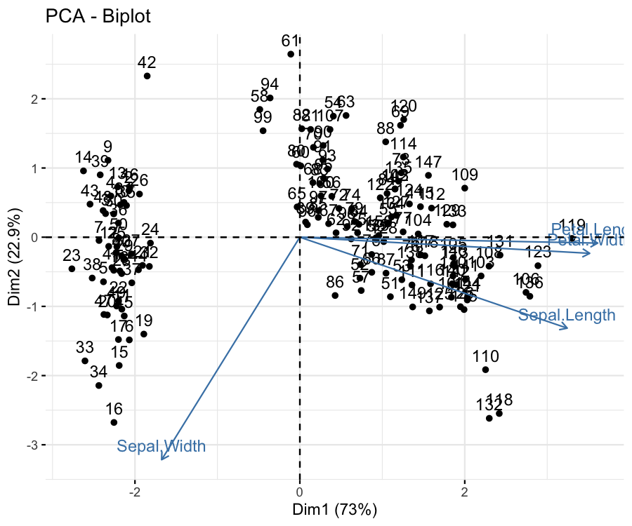
The data points and the loading vectors are labeled by default, like in base R. However, different from base R, the grid lines and title are plotted, and the explained percentage of variance is shown in the axis labels.
Please be aware that the principal components are called as dimensions in factoextra, e.g., Dim1, Dim2. The labels can be modified by the labs function of ggplot2. You can also use other ggplot2 functions by appending them using the + operator.
We can customize the default output in different ways. For instance, we can keep only the vector labels by using label = "var" and color the data points by the specie using the habillage argument. Note that this argument also automatically changes the marker type per specie.
fviz_pca_biplot(pca,
                label="var",
                habillage = iris$Species)
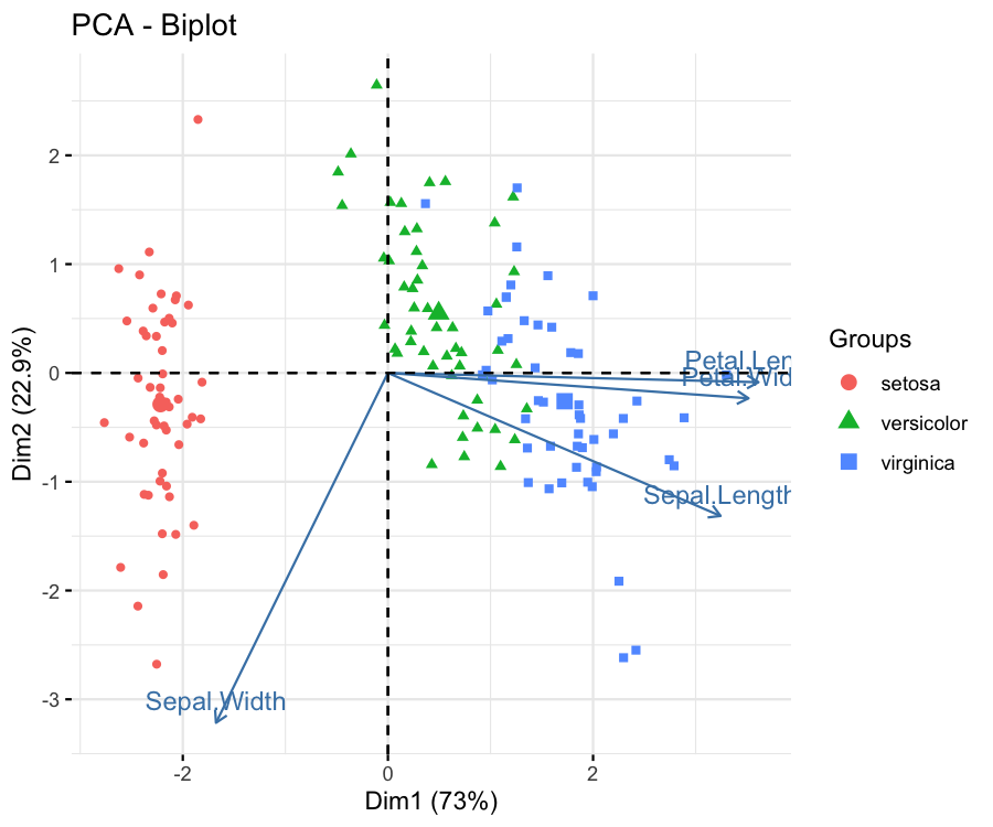
The group coloring can be changed using the scale_color_manual() function of ggplot2 by setting the values argument to a vector of colors or using the scale_color_brewer() function of ggplot2 by specifying the color palette via the paletteargument. If you are also interested in framing the data points by group, you can visit our Draw Ellipse Plot for Groups in PCA in R tutorial.
One might also be interested in coloring the data points based on their quality of representation by the first two components. In such a case, the col.ind argument should be set to "cos2", as shown below. The default colors can be changed using the argument gradient.cols and the vector colors can be set to a unique black color via col.var = "black".
fviz_pca_biplot(pca,
                label = "var",
                col.ind = "cos2",
                col.var = "black",
                gradient.cols = c("blue","green","red"))
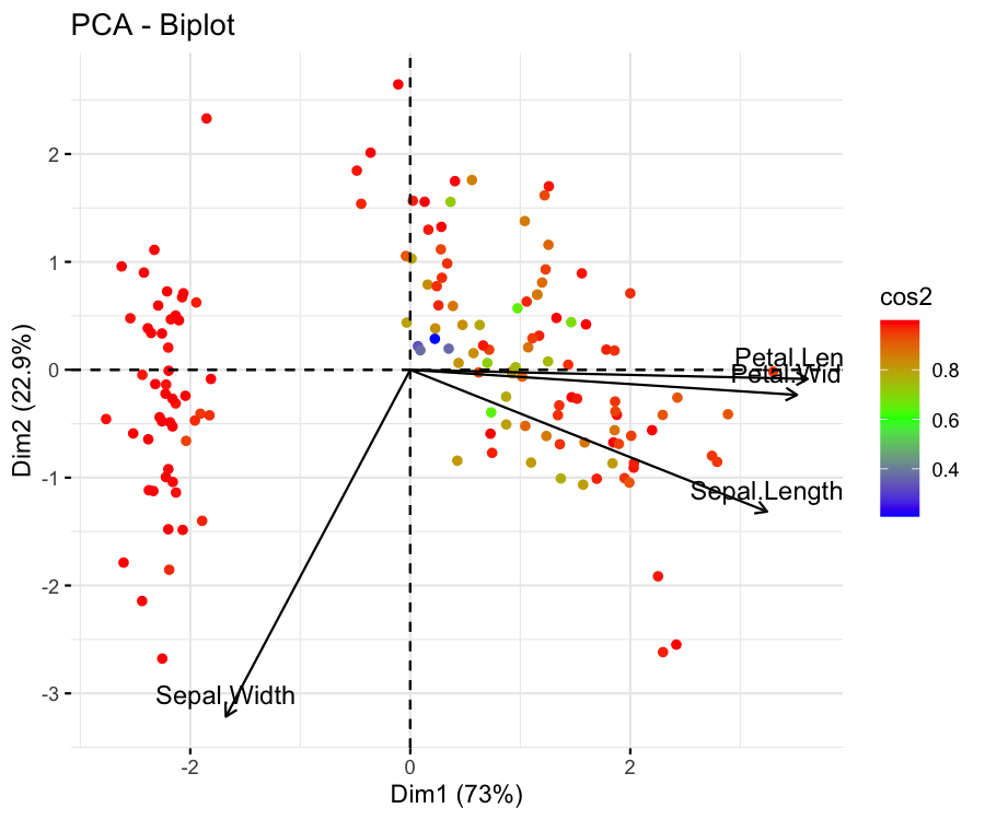
The figure shows that the flower samples are represented well if they are colored red and poorly represented if colored blue. The same coloring can also be set for the loading vectors via col.var = "cos2".
Another way of coloring by statistics is coloring by the contribution to the components. See below how the variable’s contributions are shown through the colors of loading vectors by setting col.var = "contrib".
fviz_pca_biplot(pca,
                label = "var",
                col.ind = "black",
                col.var = "contrib",
                gradient.cols = c("blue","green","red"))
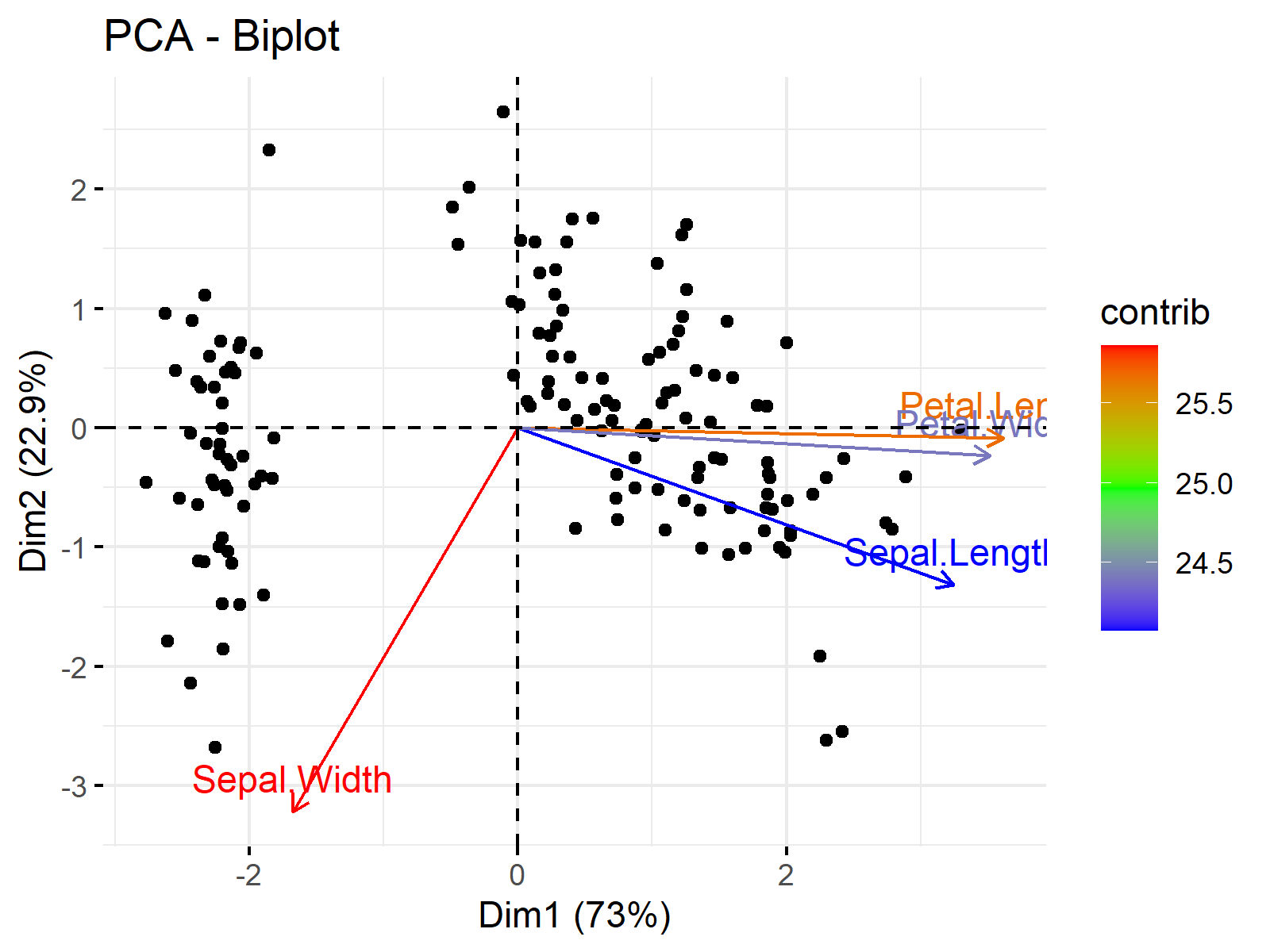
This is the end of our tutorial explaining how to plot biplots in R. We have shown the options provided by the base and factoextra libraries. Alternatively, the autoplot() function of ggfortify, which is a more generic function to visualize multivariate data, can be used for plotting biplots. If interested, see Autoplot of PCA in R.
Video, Further Resources & Summary
Do you want to know more about performing a PCA in R? Then you should have a look at the following YouTube video of the Statistics Globe YouTube channel.
In addition, you may want to have a look at some of the other tutorials on Statistics Globe:
- What is PCA?
- Principal Component Analysis (PCA) in R
- PCA Using Correlation & Covariance Matrix
- Choose Optimal Number of Components for PCA
- Biplot for PCA Explained
- Biplot of PCA in R
- Draw Ellipse Plot for Groups in PCA in R
- Autoplot of PCA in R
In this post you have learned two examples of how to make a biplot of a PCA in R. Leave a comment if you have any questions.
Subscribe to the Statistics Globe Newsletter
Get regular updates on the latest tutorials, offers & news at Statistics Globe.
I hate spam & you may opt out anytime: Privacy Policy.
Thank you!
Welcome to the Statistics Globe newsletter. From now on, I’ll send you regular emails about statistics, data science, AI, and programming with R and Python.
I’m Joachim Schork. On this website, I provide statistics tutorials as well as code in Python and R programming.
Statistics Globe Newsletter
Get regular updates on the latest tutorials, offers & news at Statistics Globe. I hate spam & you may opt out anytime: Privacy Policy.
Thank you!
Please check your email inbox and click the confirmation link to complete your subscription. If you don’t see the email within a few minutes, please also check your spam/junk folder.


8 Comments. Leave new
Dear all,
Can someone help me?
I would like to format the biplot variables in different ways. For example, the names Sepal.Width and Sepal.Length wanted the first to be Sepal subscribed Width and the other Sepal.Length in italics.
Congratulations on your work and thank you for your attention.
Yours sincerely,
Alexandre Jardim.
Hello Alexandre,
Renaming the variables is very easy using the names function. With that, you can rewrite Sepal.Width as Sepal_Width as follows.
Then you can perform pca. As you said, it is not trivial to label the vectors in italics since, in the factoextra package, the fviz_pca_biplot function doesn’t provide an option to change the font style of loading labels directly. However, you can do it manually using the geom_segment and geom_text functions of ggplot2.
Please be aware that I rescaled the arrow lengths, which is done by default if you use the default settings of fviz_pca_biplot, to ensure that the arrows are visible in the graph. You can observe the visual below.
Regards,
Cansu
Dear Cansu,
Thank you very much for your contribution.
Unfortunately, my problem has been partially resolved. I would really like my variable to be subscripted (i.e., Sepal””Width).
I tried using the “” tag but it didn’t work. Do you know of any solutions?
Regards,
Alexandre.
Hello Alexandre,
You can easily change it by using the names function as I previously shared names(data)<-c("anyformat",...). If it doesn't answer your question, could you please give some examples for me to understand? Regards, Cansu
how to rename the data points (individual), for example, the individuals are names of varieties/species
Hello Enik,
Do you like to label the data point by the group name? If so, isn’t it better to color them by group, like in the tutorial?
Best,
Cansu
How can I plot multiple biplots say like PC1 & PC2, PC2 & PC3, PC3 & PC4 in R
Hey Wagatua,
You may use the patchwork package to combine multiple biplots in a single graph. Take a look at the code and the resulting graph below:
I hope this helps!
Regards,
Joachim