Scatterplot of PCA in R (2 Examples)
In this tutorial, you’ll learn how to create a scatterplot of a Principal Component Analysis (PCA) in the R programming language.
We will be showing the following content:
Let’s go straight to the code.
Example Data & Add-On Libraries
The first step in this tutorial is to install the needed packages: ggfortify and ggplot2.
You can install them using the following code:
install.packages("ggfortify")
install.packages("ggplot2")
Next, you can load the libraries before we continue with the implementation:
library(ggfortify)
library(ggplot2)
Now we need to create some data to be used in the following examples.
set.seed(999991)
x <- abs(rnorm(100))
y <- abs(rnorm(100) + 0.3 * x^3)
z<-abs(rnorm(100) + 0.3*y)
data <- data.frame(x,y,z)
head(data)

#       x         y          z
# 1 1.7647252 1.5626330 0.20379365
# 2 0.9950984 0.1961558 0.07370991
# 3 2.1333172 4.6483993 1.11783870
# 4 0.1789901 0.9066008 0.35732718
# 5 0.4838006 1.1706268 1.25779152
# 6 0.6438660 1.3055564 1.73172039
After a quick view of the data, it is time to perform the PCA!
Principal Component Analysis
To perform the PCA, we will use the prcomp() function. We will specify scale=TRUE to scale the data. If you wonder why, check out our tutorial PCA Using Correlation & Covariance Matrix.
df_pca <- prcomp(data,
                 scale=TRUE)

summary(df_pca)

# Importance of components:
#                         PC1    PC2    PC3
# Standard deviation     1.320 0.9387 0.6130
# Proportion of Variance 0.581 0.2937 0.1253
# Cumulative Proportion  0.581 0.8747 1.0000
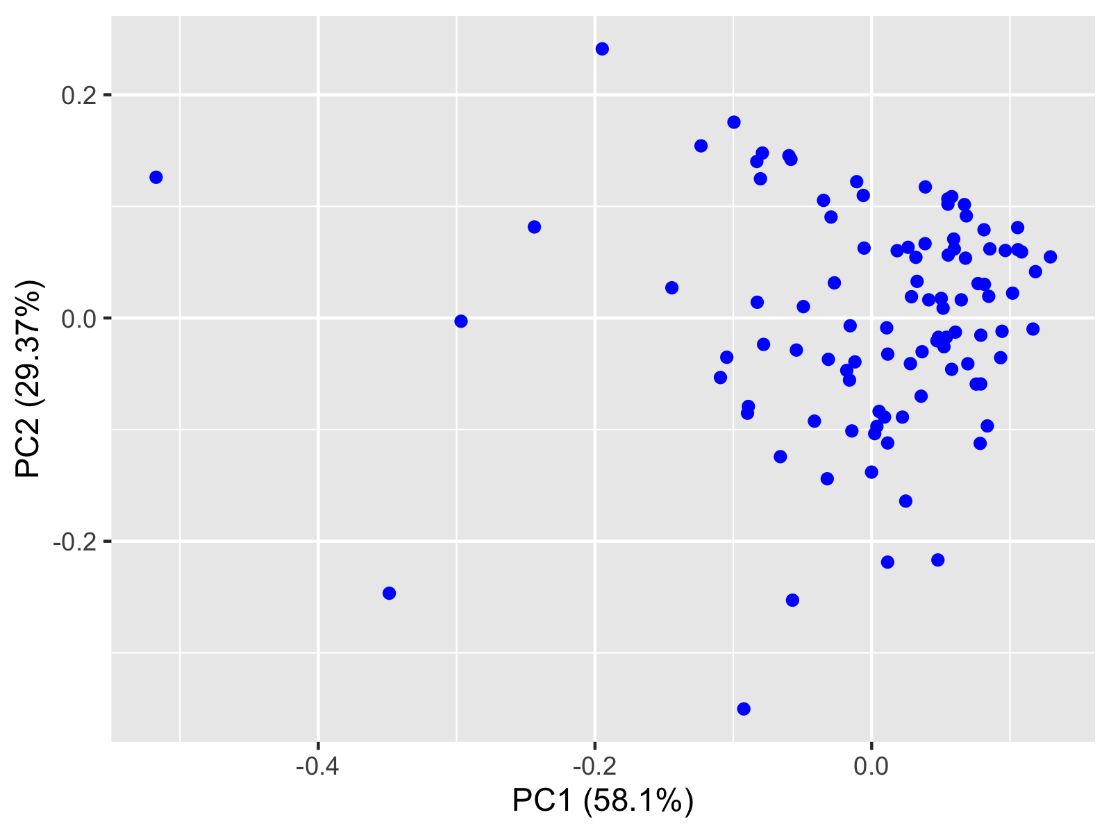
As shown in the output above, the first two principal components explain enough variance by 87.5% in total. Now, we can visualize on a scatterplot how the first two principal components represent our observations.
Example 1: Scatterplot of PCA Using ggfortify
To create a scatterplot using the ggfortify package, we need to use the autoplot() function as follows.
autoplot(df_pca,
         colour="blue")

Thanks to the autoplot() function, the original data is shown in a reduced dimensional space, which is 2 dimensional in this case. For visualizations in 3D, see our tutorial: 3D Plot of PCA.
Example 2: Scatterplot of PCA Using ggplot2
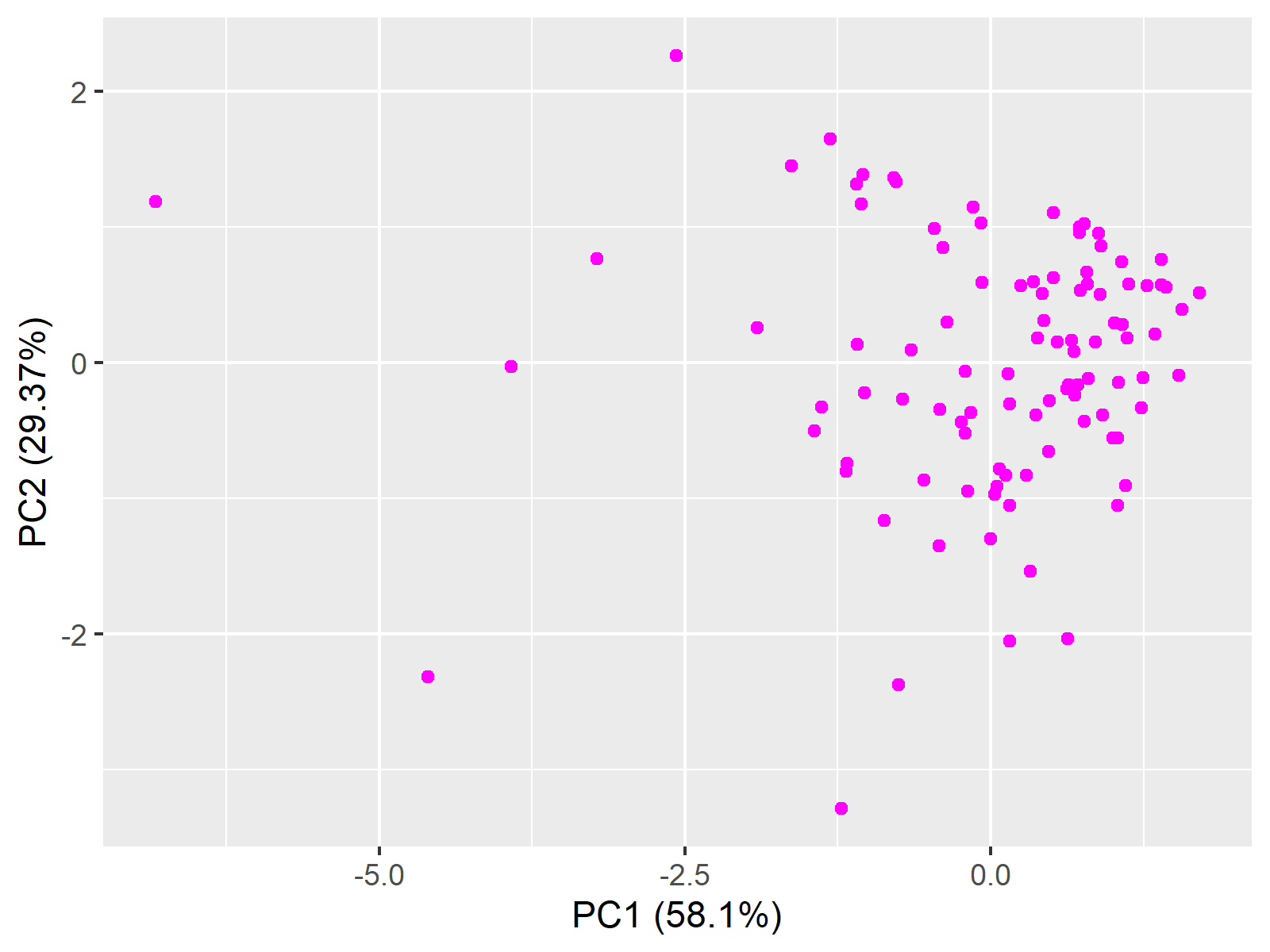
Alternatively, we can visualize the PCA results using the ggplot2 package. To accomplish this, first, we need to extract the first and second principal components as seen in the following code:
PC1 <- df_pca$x[,1]
PC2 <- df_pca$x[,2]
Now, we can employ the ggplot2 package to visualize our observations in 2D space. To draw the scatterplot, we need the geom_point() function together with ggplot(). Since ggplot2 is not specialized for PCA like ggfortify, we should explicitly specify the axis labels to show the percentages of explained variance per component, like in the first visual.
ggplot(data = data,
       aes(x = PC1,
           y = PC2)) +
  geom_point(colour="magenta")+
  xlab("PC1 (58.1%)") +
  ylab("PC2 (29.37%)")

This is the end of the Scatterplot of PCA in R tutorial. If you are interested in other alternatives for visualizing the PCA results, see our tutorial: Visualization of PCA in R.
Video, Further Resources & Summary
Do you need more explanations on how to perform a Principal Component Analysis in R? Then you should have a look at the following YouTube video of the Statistics Globe YouTube channel.
Don’t forget to have a look at some other tutorials on Statistics Globe:
- What is PCA?
- PCA Using Correlation & Covariance Matrix
- Principal Component Analysis in R
- 3D Plot of PCA in R
- Visualization of PCA in R
This post has shown how to draw a scatterplot of PCA. In case you have further questions, you may leave a comment below.
Subscribe to the Statistics Globe Newsletter
Get regular updates on the latest tutorials, offers & news at Statistics Globe.
I hate spam & you may opt out anytime: Privacy Policy.
Thank you!
Welcome to the Statistics Globe newsletter. From now on, I’ll send you regular emails about statistics, data science, AI, and programming with R and Python.
I’m Joachim Schork. On this website, I provide statistics tutorials as well as code in Python and R programming.
Statistics Globe Newsletter
Get regular updates on the latest tutorials, offers & news at Statistics Globe. I hate spam & you may opt out anytime: Privacy Policy.
Thank you!
Please check your email inbox and click the confirmation link to complete your subscription. If you don’t see the email within a few minutes, please also check your spam/junk folder.


