
Can PCA be Used for Categorical Variables? (Alternatives & Example)
If you want to reduce the dimensionality of your data frame, you might have thought of using the Principal Component Analysis (PCA). But can PCA be used on a data frame that contains categorical (qualitative) variables?
In this tutorial, you’ll learn how to conduct PCA using categorical variables. You will also learn how to implement these alternatives using the R programming language.
We will talk about the following:


Can PCA Be Performed with Categorical Data?
The answer to this question isn’t easy. Performing PCA on a data frame containing categorical variables is possible, but this isn’t the best option. The main reason is that the PCA is designed to work better with numerical (quantitative) data since it involves breaking down its variance structure, and categorical variables don’t have a variance structure.
A possibility to perform PCA on a data set containing categorical variables is to convert these variables into a series of binary variables with values 0 and 1. For example, if you have a variable “color” with categories “red”, “green”, and “blue”, you would create three new variables for each category. However, this can significantly increase the dimensionality of your data, which might be a problem for PCA as it’s a dimensionality reduction technique.
In this tutorial, we suggest conducting an alternative analysis called Multiple Correspondence Analysis (MCA). It is a dimensionality reduction technique similar to PCA but designed for categorical data.
In the presence of mixed data with numerical and categorical variables, another alternative is Factorial Analysis of Mixed Data (FAMD). FAMD employs PCA-alike operations for the numerical data and MCA-alike operations for the categorical data within a unified framework.
Let’s see both MCA and FAMD in practice!
Add-On Libraries
For this tutorial, we will use the functions of the FactoMineR, vcd and factoextra packages. If they are not installed yet, you can install these packages using the code below:
install.packages("FactoMineR")
install.packages("vcd")
install.packages("factoextra")
Next, we will load the respective libraries:
library(FactoMineR)
library(vcd)
library(factoextra)
Now, we can use the relevant functions to reduce the dimensionality of categorical or mixed data. Let’s start with categorical data!
Multiple Correspondence Analysis (MCA)
MCA treats each variable category as a separate point and calculates distances between these points based on their associations. More specifically, these distances are calculated using a chi-square metric.
Essentially, this involves comparing the observed frequency of each pair of categories (how often they actually appear together in the data) with the expected frequency (how often we would expect them to appear together just by chance). If a pair of categories appears together more often than expected by chance, they are considered “close” in the MCA space. Conversely, if they appear together less often than expected by chance, they are considered “far apart”.
The goal is only to choose the directions that explain most of the variation, based on the calculated distances. These directions become the new dimensions of data. For the interpretation, the data can be visualized in the new dimensional space via a biplot.
Example of MCA
We can implement MCA in R by using the MCA() function from the FactoMineR package. For demonstration, we will be using a subset from the Arthritis data set from the vcd package. It is a data frame with 84 observations and 5 variables recorded in a double-blind clinical trial investigating a new treatment for rheumatoid arthritis.
In this example, we will only use the categorical variable indicating the treatment (Treatment), sex (Sex), and treatment outcome (Improved). Let’s take a look at it!
data(Arthritis)

arthritis_data <- Arthritis[,c(2,3,5)]

head(arthritis_data)
#   Treatment  Sex Improved
# 1   Treated Male     Some
# 2   Treated Male     None
# 3   Treated Male     None
# 4   Treated Male   Marked
# 5   Treated Male   Marked
# 6   Treated Male   Marked
Now, we can implement the MCA() function to reduce the dimensionality.
arthritis_mca <- MCA(arthritis_data,
                     ncp = 2,
                     graph = FALSE)

arthritis_mca
# **Results of the Multiple Correspondence Analysis (MCA)**
# The analysis was performed on 84 individuals, described by 3 variables
# *The results are available in the following objects:

#    name              description
# 1  "$eig"            "eigenvalues"
# 2  "$var"            "results for the variables"
# 3  "$var$coord"      "coord. of the categories"
# 4  "$var$cos2"       "cos2 for the categories"
# 5  "$var$contrib"    "contributions of the categories"
# 6  "$var$v.test"     "v-test for the categories"
# 7  "$ind"            "results for the individuals"
# 8  "$ind$coord"      "coord. for the individuals"
# 9  "$ind$cos2"       "cos2 for the individuals"
# 10 "$ind$contrib"    "contributions of the individuals"
# 11 "$call"           "intermediate results"
# 12 "$call$marge.col" "weights of columns"
# 13 "$call$marge.li"  "weights of rows"
In this function, we need to specify the number of dimensions ncp that we want to keep in the final results. In our case, we’ve chosen two dimensions since, usually, the first few dimensions explain most of the variation. However, you can also check the output saved in $eig showing eigenvalues for all dimensions. Thus you can evaluate if fewer or more dimensions are optimal.
Additionally, you can set the graph = TRUE if you wish to see the category-dimension relations and the scatter of observations separately.
Next, we will plot the biplot showing the individuals and categories in 2-dimensional reduced space. We will use the fviz_mca_biplot() function from the factoextra package for the implementation. For further details about plotting biplots in R see Biplot of PCA in R.
fviz_mca_biplot(arthritis_mca,
               repel = TRUE,
               ggtheme = theme_minimal())

Thanks to this biplot, we can see the most associated categories in one look and how our data is distributed in terms of these categories. Please be aware that many individuals have overlapping locations due to the categorical data. This is why we see less than 84 blue data points in the biplot above.
Now, let’s take a look at the other alternative, FAMD!
Factorial Analysis of Mixed Data (FAMD)
FAMD begins by constructing a matrix representing the relationships between all the variables in your dataset. For the numerical variables, this involves computing a variance-covariance matrix, which is similar to what happens in Principal Component Analysis (PCA). For the categorical variables, this involves computing categorical dissimilarities, which is similar to what happens in Multiple Correspondence Analysis (MCA).
Based on that matrix, the directions of the maximized variance for numerical variables and discrimination for categorical variables are found. These directions form the new dimensions that the data is represented.
The visualized results can show the relations between the variable categories and new dimensions, also how the observations are scattered based on the new dimensions.
Example of FAMD
We can implement FAMD in R by using the FAMD() function from the FactoMineR package. We will use the same Arthritis data, however, we will also use the Age variable, showing the ages of participants this time. Let’s have an overview of the data!
arthritis_data2 <- Arthritis[,c(2,3,4,5)]

head(arthritis_data2)
#   Treatment  Sex Age Improved
# 1   Treated Male  27     Some
# 2   Treated Male  29     None
# 3   Treated Male  30     None
# 4   Treated Male  32   Marked
# 5   Treated Male  46   Marked
# 6   Treated Male  58   Marked
We now have mixed data with quantitative Age and qualitative Treatment, Sex, and Improved variables to deal with. Let’s run FAMD!
arthiris_famd <- FAMD(arthritis_data2,
                      ncp = 2,
                      graph = TRUE)

arthiris_famd
# *The results are available in the following objects:
#
#   name          description
# 1 "$eig"        "eigenvalues and inertia"
# 2 "$var"        "Results for the variables"
# 3 "$ind"        "results for the individuals"
# 4 "$quali.var"  "Results for the qualitative variables"
# 5 "$quanti.var" "Results for the quantitative variables"
Please note that this time we have set graph = TRUE since the FAMD function also creates the biplot once the graph argument is set to TRUE. However, the biplot only shows the categorical variable categories with the data points representing the individuals. To show the numerical variable – dimension relation we should check the loadings plot plotted by the call of graph argument. You can see the regarding visualizations below.
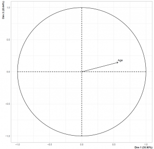
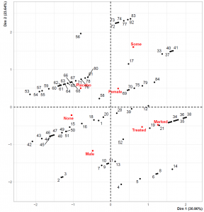
Please be aware that the data points representing individuals overlap less than the MCA biplot. This is related to the introduction of the numerical variable. Also, the loadings plot on the left-hand side shows that Dimension 1 and the Age variable are in the same direction, implying that the individuals with higher Dimension 1 values are older.
Video, Further Resources & Summary
In case you are new to the field of Principal Component Analysis (PCA), then you can have a look at the following YouTube video of the Statistics Globe YouTube channel:
You might be interested in some other tutorials on Statistics Globe:
- Principal Component Analysis (PCA) in R
- Advantages & Disadvantages of Principal Component Analysis
- Choose Optimal Number of Components for PCA
- Biplot for PCA Explained
- Biplot of PCA in R
Here you’ve seen which PCA alternatives for categorical variables can be implemented. Leave a comment below if you have any questions.

I’m Joachim Schork. On this website, I provide statistics tutorials as well as code in Python and R programming.
Statistics Globe Newsletter
Get regular updates on the latest tutorials, offers & news at Statistics Globe. I hate spam & you may opt out anytime: Privacy Policy.


2 Comments. Leave new
Hello
Is there any other way to create a plot (especially the circle one) for FAMD because the
arthiris_famd arthiris_famd <- FAMD(temp3,
+ ncp = 2,
+ graph = TRUE)
Error in `geom_segment()`:
! Problem while computing aesthetics.
ℹ Error occurred in the 3rd layer.
Caused by error:
! object 'df_var' not found
Run `rlang::last_trace()` to see where the error occurred.
Warning messages:
1: ggrepel: 18 unlabeled data points (too many overlaps). Consider increasing max.overlaps
2: ggrepel: 24 unlabeled data points (too many overlaps). Consider increasing max.overlaps
3: ggrepel: 18 unlabeled data points (too many overlaps). Consider increasing max.overlaps
4: Removed 1 rows containing missing values (`geom_point()`).
5: Removed 1 rows containing missing values (`geom_text_repel()`).
6: ggrepel: 24 unlabeled data points (too many overlaps). Consider increasing max.overlaps
while running it with graph = FALSE work with no problem.
So isn't it possible to do like for MCA, run the MCA first then input it into a plot ?
kind regards,
barnabe Malandain
Hello Barnable!
Normally, you can plot the circle graph via the fviz_famd_var() function setting the choice argument to “quanti.var”. However, maybe due to an update in the function, it is not possible anymore or it is not applicable in the latest version of Rstudio. Therefore, I didn’t show that option. But if you want to plot the right graph using a separate function, you can use the fviz_famd_ind() function, see the documentation, please.
Best,
Cansu