Point Cloud of PCA in R (2 Examples)
In this tutorial, you’ll learn how to draw a point cloud based on a PCA (Principal Component Analysis) using the R programming language.
The table of content has the following structure:
Let’s take a look at the code.
Add-On Libraries, Sample Data & PCA
For this tutorial, we will use the ggfortify and rgl packages, which you can install by running the following code:
install.packages("ggfortify")
install.packages("rgl")
You can ignore the previous step if you had already installed the packages in the past. Now, let’s load them:
library(ggfortify)
library(rgl)
Next, we will create the data set to be used for the point cloud:
set.seed(999991)

x <- rnorm(200, sd = 1)
y <- rnorm(200, sd = 0.5)
z <- 0.1 * x - 0.1 * y

sample_data <- data.frame(x,y,z)
We can see how the first rows look like using the head() function:
head(sample_data)

#            x           y            z
# 1 -1.7647252 -0.13249812 -0.163222706
# 2  0.9950984  0.00743159  0.098766683
# 3  2.1333172 -0.13834054  0.227165777
# 4  0.1789901  0.04267347  0.013631667
# 5 -0.4838006 -0.80448978  0.032068919
# 6  0.6438660  0.67002674 -0.002616078
Now it’s time to compute the PCA. We can use the summary() function to see the output of our analysis:
pca <- prcomp(sample_data)
summary(pca)

# Importance of components:
#                           PC1    PC2       PC3
# Standard deviation     1.0229 0.4923 4.736e-17
# Proportion of Variance 0.8119 0.1881 0.000e+00
# Cumulative Proportion  0.8119 1.0000 1.000e+00
Based on the previous output of our PCA, we can already see that the third component is not providing much additional information. Later, we will be able to see that in our graphics as well. If you are interested in visually exploring added information per component, see our tutorial Scree Plots in R.
Point Cloud of PCA in 2D
Then, we can create our 2D point cloud of the PCA using the autoplot() function of the ggfortify package:
autoplot(pca)
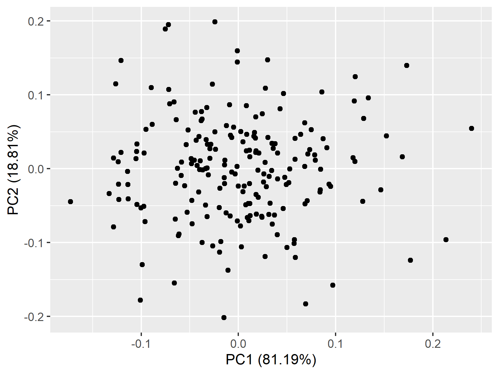
Above, you see a 2d point cloud, also called a scatterplot, showing the principal component scores for each observation.
Point Cloud of PCA in 3D
We can also create a 3D point cloud, which is much more informative, using the rgl package. To achieve this, we will first calculate the maximum value of the x, y, and z variables and the centroid. We will also keep the eigenvectors contained in the variable pca$rotation:
max <- max(x, y, z)
centroid <- c(mean(x),
              mean(y),
              mean(z))
eigenvectors <- pca$rotation
Now, we can plot the data and the centroid:
plot3d(x,y,z,
       type="s",
       radius=0.08,
       xlim=c(-max,max),
       ylim=c(-max, max),
       zlim=c(-max,max),
       xlab="PC1",
       ylab="PC2",
       zlab="PC3",
       col="deepskyblue")

spheres3d(centroid[1],
          centroid[2],
          centroid[3],
          radius=0.09,
          col="red")
Then we can add the eigenvectors to be centered around the centroid in our 3D point cloud:
segments3d(c(centroid[1],
             centroid[1] + eigenvectors[1,1]),
           c(centroid[2],
             centroid[2] + eigenvectors[2,1]),
           c(centroid[3],
             centroid[3] + eigenvectors[3,1]),
           col="deeppink", lwd=3)

segments3d(c(centroid[1],
             centroid[1] + eigenvectors[1,2]),
           c(centroid[2],
             centroid[2] + eigenvectors[2,2]),
           c(centroid[3],
             centroid[3] + eigenvectors[3,2]),
           col="orange", lwd=3)

segments3d(c(centroid[1],
             centroid[1] + eigenvectors[1,3]),
           c(centroid[2],
             centroid[2] + eigenvectors[2,3]),
           c(centroid[3],
             centroid[3] + eigenvectors[3,3]),
           col="purple", lwd=3)
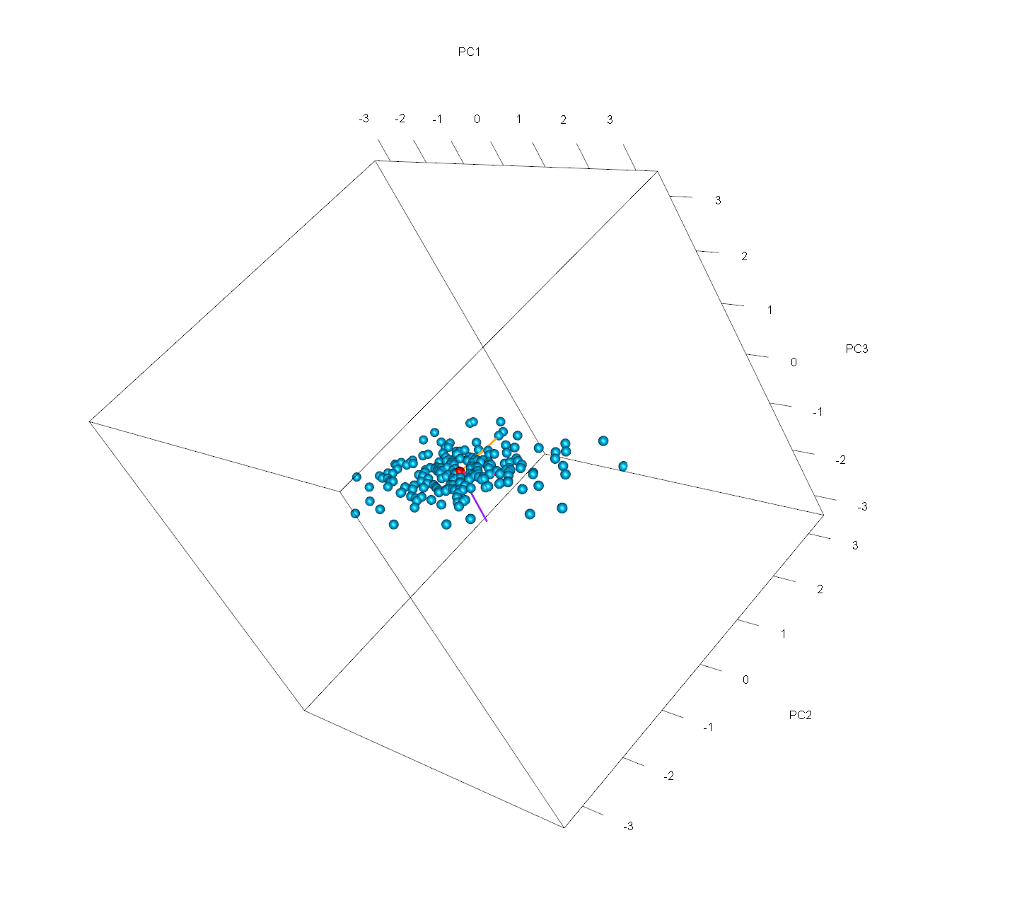
Eventually, we will obtain this final 3D point cloud of our PCA. Note that you can see the graph from different perspectives by clicking and dragging the mouse. By doing that, you will see that the third component is almost irrelevant. If you are interested in other visualization options in 3D for PCA output, see our tutorial 3D Plot of PCA in R.
Video, Further Resources & Summary
Do you need more explanations on how to perform a PCA in R? Then you should have a look at the following YouTube video of the Statistics Globe YouTube channel.
Moreover, you could have a look at some other tutorials on Statistics Globe:
- What is PCA?
- Principal Component Analysis in R
- Scatterplot of PCA in R
- 3D Plot of PCA in R
- Autoplot of PCA in R
- Scree Plot in R
This post has shown how to plot a point cloud based on a principal component analysis. In case you have further questions, please let us know by writing a comment:
This page was created in collaboration with Paula Villasante Soriano. Please have a look at Paula’s author page to get further information about her academic background and the other articles she has written for Statistics Globe.


