Scree Plot of PCA in R (2 Examples)
This article will explain how to create a scree plot based on a Principal Component Analysis (PCA) to decide on the ideal number of principal components in R.
The table of content has the following structure:
Let’s start with it!
Add-On Libraries, Sample Data & PCA
The first step is to install the packages to be used in this tutorial.
install.packages("MASS")
install.packages("factoextra")
install.packages("tidyverse")
install.packages("ggplot2")
You could skip this first step if you have already installed these packages in the past. In order to continue, please load the libraries next.
library(MASS)
library(factoextra)
library(tidyverse)
library(ggplot2)
Now, we will import the biopsy dataset from the MASS package, which contains 699 observations for 11 variables.
data(biopsy)
head(biopsy)

#        ID V1 V2 V3 V4 V5 V6 V7 V8 V9     class
# 1 1000025  5  1  1  1  2  1  3  1  1    benign
# 2 1002945  5  4  4  5  7 10  3  2  1    benign
# 3 1015425  3  1  1  1  2  2  3  1  1    benign
# 4 1016277  6  8  8  1  3  4  3  7  1    benign
# 5 1017023  4  1  1  3  2  1  3  1  1    benign
# 6 1017122  8 10 10  8  7 10  9  7  1 malignant
We will exclude the non-numerical variables on the first and eleventh columns before conducting the PCA, as PCA is mainly compatible with numerical data with some exceptions. We will also exclude the observations with missing values using the na.omit() function. We could also impute the missing values employing some missing data imputation techniques. However, to keep the context simple, we will simply remove them from the biopsy data.
data_biopsy <- na.omit(biopsy[,-c(1,11)]))
Now, let’s perform the PCA and use the summary() function in order to see the results.
biopsy_pca <- prcomp(data_biopsy,
                     scale=TRUE)

summary(biopsy_pca)

# Importance of components:
#                           PC1     PC2     PC3     PC4     PC5     PC6     PC7     PC8     PC9
# Standard deviation     2.4289 0.88088 0.73434 0.67796 0.61667 0.54943 0.54259 0.51062 0.29729
# Proportion of Variance 0.6555 0.08622 0.05992 0.05107 0.04225 0.03354 0.03271 0.02897 0.00982
# Cumulative Proportion  0.6555 0.74172 0.80163 0.85270 0.89496 0.92850 0.96121 0.99018 1.00000
Now, we’re ready to create our scree plot based on the output above!
Example 1: Scree Plot Using factoextra Package
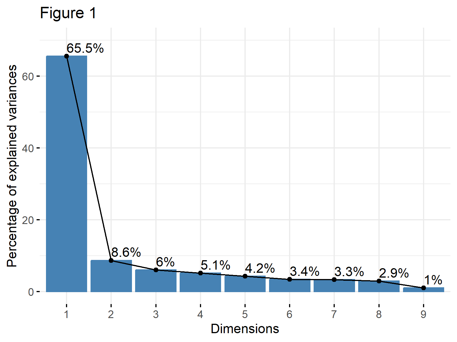
We can create a simple and informative scree plot using the fviz_eig() function from the factoextra package. This function creates a scree plot composed of line and bar plots. We will add the labels to the line plot using addlabels = TRUE so that we can see the exact percentage of variance explained by each component.
fviz_eig(biopsy_pca,
         addlabels = TRUE,
         ylim = c(0, 70),
         main="Figure 1")

As shown, the first principal component explains 65.5% of the variance, and the second principal component explains 8.6%. The line flattens out starting from the third component, which means that the elbow occurs at the second principal component.
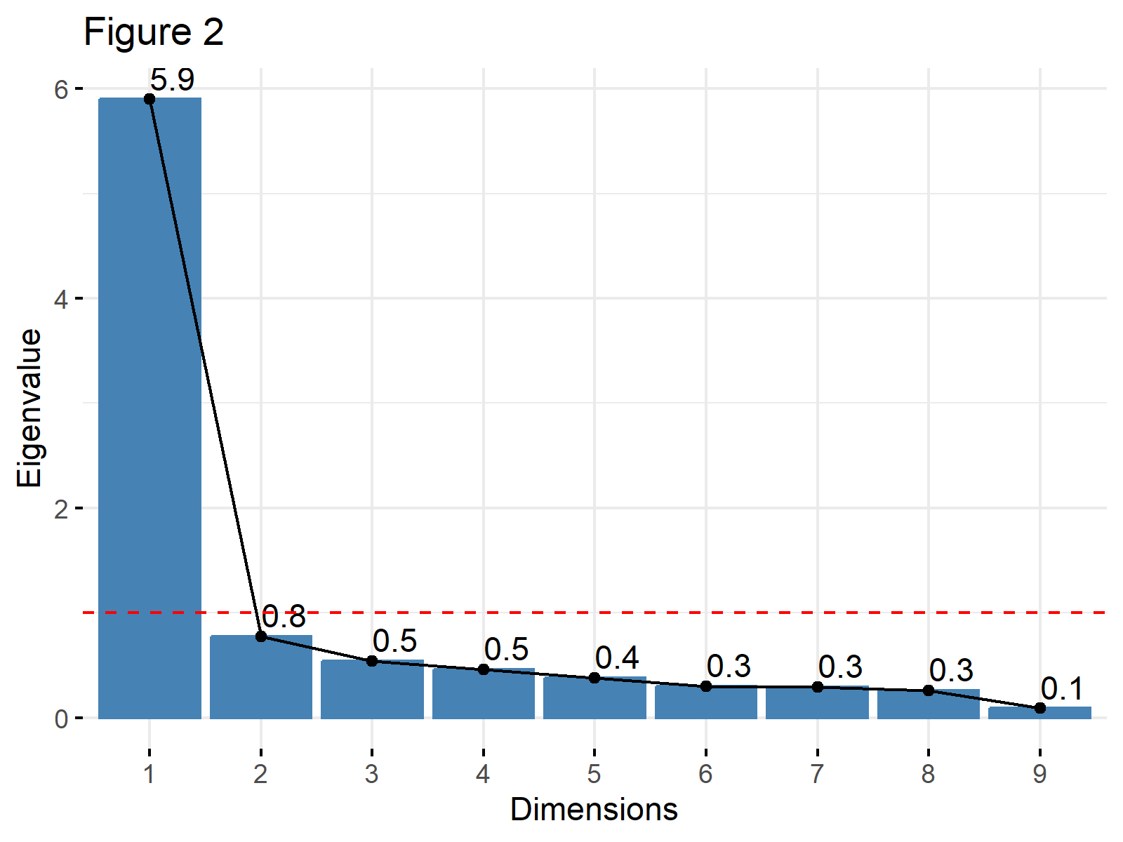
The same plot can also be visualized using the eigenvalues instead of the percentage of explained variance. This is a common approach when the Kaiser’s method is in consideration. In such a case, the choice argument should be set to "eigenvalue" and a horizontal line intersecting the y-axis at 1 could be added. See the related code below.
fviz_eig(biopsy_pca,
         addlabels = TRUE,
         choice="eigenvalue",
         main="Figure 2") +
         geom_hline(yintercept=1,
         linetype="dashed",
         color = "red")

Example 2: Scree Plot Using tidyverse Package
The tidyverse package allows to create a scree plot too. The first step, in this case, is to create a data frame that contains the ratios of explained variance and the respective principal components. We will compute these variance ratios in R by extracting the standard deviations from the biopsy_pca object and applying some mathematical operations.
explained_variance <- data.frame(PC= paste0("PC",1:9),
                               var_explained=(biopsy_pca$sdev)^2/sum((biopsy_pca$sdev)^2))

head(explained_variance)

#    PC var_explained
# 1 PC1    0.65549993
# 2 PC2    0.08621632
# 3 PC3    0.05991692
# 4 PC4    0.05106972
# 5 PC5    0.04225287
# 6 PC6    0.03354183
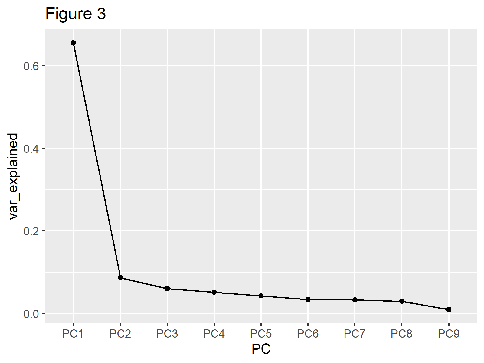
Now, we can create a scree plot showing the explained variance using the ggplot2 package. In the aes() function, we will plug our data and assign group to 1, indicating that the whole dataset will be used. Also, we will use geom_line() to plot the line and geom_point() to plot the observations.
  ggplot(explained_variance,
             aes(x=PC,
             y=var_explained,
             group=1))+
  geom_point()+
  geom_line()+
  labs(title="Figure 3")

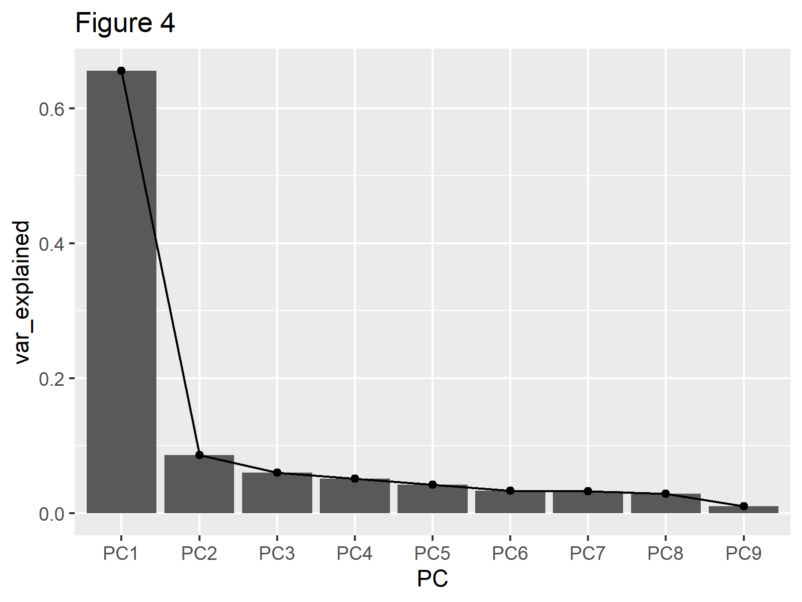
You can observe that the same line is plotted as in Figures 1 and 2 in Figure 3. If showing the bars is also of interest, like in Example 1, the geom_col()function can be added as follows.
ggplot(explained_variance,
       aes(x=PC,
           y=var_explained,
           group=1))+
geom_col()+
geom_point()+
geom_line()+
labs(title="Figure 4")

If one is interested in using eigenvalues instead of the percentage of variance then var_explained should be set to (biopsy_pca$sdev)^2.
As shown, we can create a scree plot in the R programming language using different packages: factoextra or the tidyverse. Feel free to pick the one you like!
Video, Further Resources & Summary
Do you need further explanations on how to perform a PCA in R? Then you should have a look at the following YouTube video of the Statistics Globe YouTube channel.
Moreover, you can read some of the other tutorials on Statistics Globe:
- Choose Optimal Number of Components for PCA
- Principal Component Analysis (PCA) Explained
- Principal Component Analysis (PCA) in R
- Scree Plot for PCA Explained
This post has shown how to create a scree plot of PCA in R. If you have any questions, don’t hesitate to leave a comment.


