Draw Ellipse Plot for Groups in PCA in R (2 Examples)
In this tutorial, you’ll learn how to draw ellipses for each group in a scatterplot visualizing Principal Component Analysis (PCA) results in R.
Take a look at the table of content:
Let’s check the implementation!
Sample Data, Add-on Libraries & PCA
Before we start, you may need to install the packages: factoextra and ggplot2 that will be used in this tutorial:
install.packages("factoextra")
install.packages("ggplot2")
Now, let’s load the libraries:
library(factoextra)
library(ggplot2)
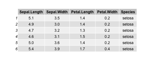
To illustrate the topic, we will use the iris dataset. We can see how the first few rows of the data frame look like using the head() function:
head(iris)

Now, we will perform a PCA for all the columns except for Species since it is categorical. For PCA designed for categorical variables, see our tutorial: Can PCA be Used for Categorical Variables? Hence, the PCA is performed for a subset of the iris data frame.
iris.pca <- prcomp(iris[, -5],
                   scale = TRUE)

summary(iris.pca)

# Importance of components:
#                           PC1    PC2     PC3     PC4
# Standard deviation     1.7084 0.9560 0.38309 0.14393
# Proportion of Variance 0.7296 0.2285 0.03669 0.00518
# Cumulative Proportion  0.7296 0.9581 0.99482 1.00000
Example 1: Scatterplot of PCA with Groups in Ellipses Using factoextra Package
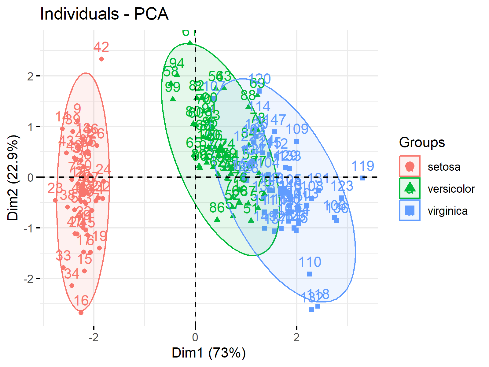
To plot a scatterplot of the component scores, we call the fviz_pca_ind() function of the factoextra package. By setting habillage= argument to Species, we color the data points by the iris species and by specifying addEllipses=TRUE, we add ellipses per group.
fviz_pca_ind(iris.pca,
             habillage=iris$Species,
             addEllipses=TRUE)

For other uses of the factoextra package in visualizing PCA results, see Biplot in R.
Example 2: Scatterplot of PCA with Groups in Ellipses Using ggplot2 Package
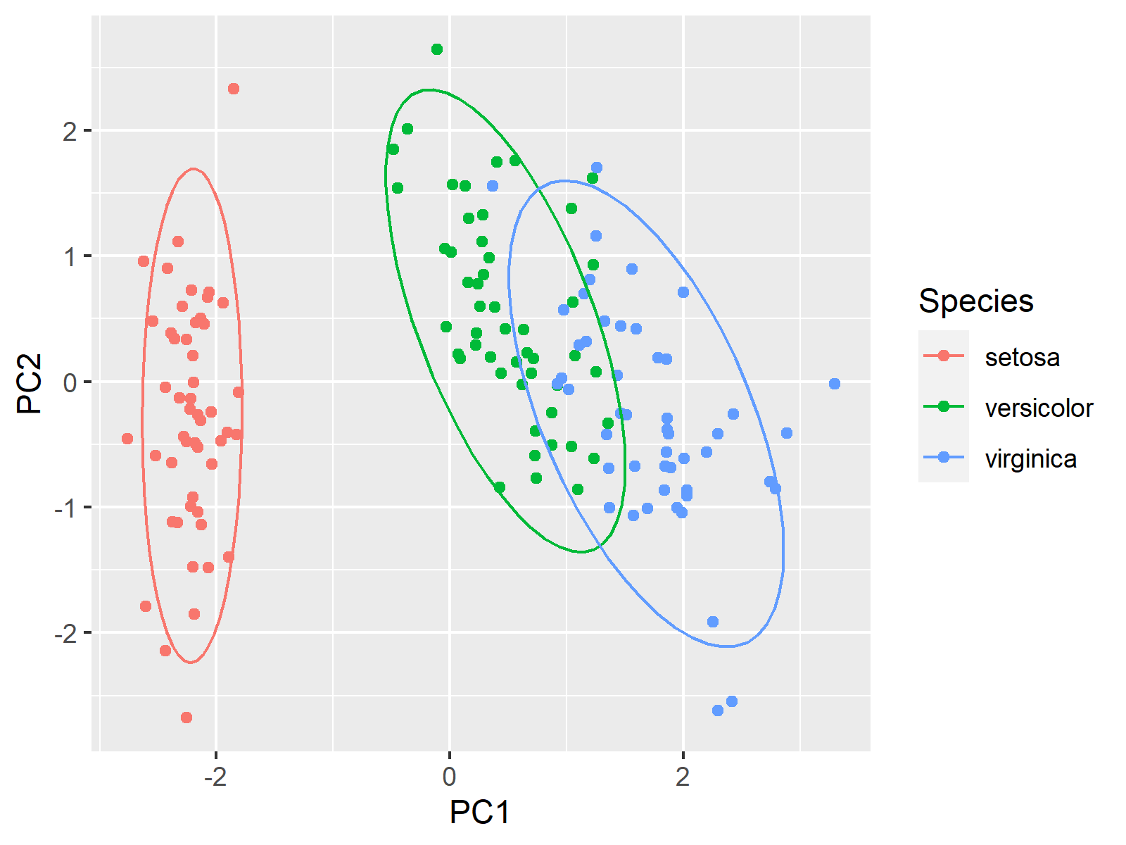
We can also use the ggplot2 package to plot ellipses framing the iris species. To achieve this, we will first extract the first two principal components of our PCA:
PC1<-iris.pca$x[,1]
PC2<-iris.pca$x[,2]
Now, we can use the ggplot() function, which will plot the observations by points using geom_point() and the ellipses for each group using stat_ellipse():
ggplot(iris,
       aes(x = PC1,
           y = PC2,
           color = Species)) +
  geom_point() +
  stat_ellipse()

Please note that the axes are labeled differently depending on the loaded package. In case of using the factoextra package, the axes are labeled Dim1 and Dim2 and contain the percentage of explained variance by default. In case of using the ggplot2 package, the axes are labeled based on the variable names.
Video, Further Resources & Summary
In case you need more explanations on performing a PCA in R, you should have a look at the following YouTube video of the Statistics Globe YouTube channel.
There are other contents you could check on Statistics Globe:
- What is PCA?
- Principal Component Analysis (PCA) in R
- Biplot of PCA in R
- Can PCA be Used for Categorical Variables?
- Autoplot of PCA in R
This post has shown how to draw an ellipse plot for groups in a PCA in R. In case you have further questions, you may leave a comment below.
This page was created in collaboration with Paula Villasante Soriano. Please have a look at Paula’s author page to get further information about her academic background and the other articles she has written for Statistics Globe.
Subscribe to the Statistics Globe Newsletter
Get regular updates on the latest tutorials, offers & news at Statistics Globe.
I hate spam & you may opt out anytime: Privacy Policy.
Thank you!
Welcome to the Statistics Globe newsletter. From now on, I’ll send you regular emails about statistics, data science, AI, and programming with R and Python.
I’m Joachim Schork. On this website, I provide statistics tutorials as well as code in Python and R programming.
Statistics Globe Newsletter
Get regular updates on the latest tutorials, offers & news at Statistics Globe. I hate spam & you may opt out anytime: Privacy Policy.
Thank you!
Please check your email inbox and click the confirmation link to complete your subscription. If you don’t see the email within a few minutes, please also check your spam/junk folder.


