Biplot for PCA Explained
Biplot is a type of scatterplot used in PCA. In this special plot, the original data is represented by principal components that explain the majority of the data variance using the loading vectors and PC scores.
In this tutorial, you’ll learn how to interpret the biplots in the scope of PCA.
The table of content is structured as follows:
Let’s dive right in!
Example Data
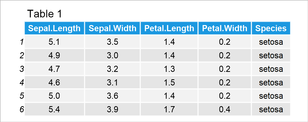
For demonstration, the iris dataset is used. The dataset contains the measurements of sepal length and width, and petal length and width in centimeters for 50 samples of each of three Iris flower species: Iris Setosa, Versicolor, and Virginia. Let’s take a quick look at the first six rows of the dataset!

Perform PCA
The next step is to perform the PCA to get the principal component scores and loadings that will be used in the biplot. As we only focus on the interpretation of biplots in this tutorial, the content is limited to the statistical explanation of biplots. For further information on the theoretical background of PCA please see our tutorial PCA Explained and regarding the programming, you can visit our other tutorials: PCA in R and PCA in Python.
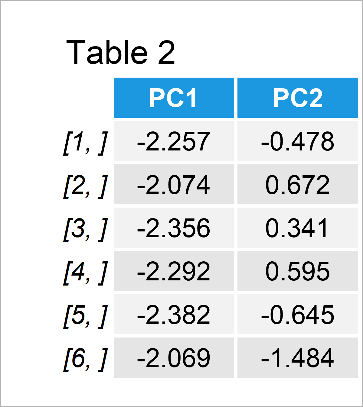
The principal component scores and loadings for the first two principal components are given in Tables 2 and 3 below. If you wonder why it is only the first two components, see our tutorials Choose Optimal Number of Components for PCA and Scree Plot for PCA explaining the relationship between the components and explained variance theoretically and visually.

Table 2 shows only the first six rows of the complete table of scores since the complete table with 150 rows is huge to fit here.

In Table 3, you can see the loadings, in other words, weights that show the association between the original variables and principal components.
Visualize & Interpret PCA Results via Biplot
As early mentioned, biplots have two components: scores and loading vectors. So far, we perform the PCA and extract the component scores and loadings. Now it is time to use the extracted data shown in Tables 2 and 3 to plot a biplot to interpret the results. For information on how to plot biplots in R and Python please see our tutorials: Biplot in R and Biplot in Python.
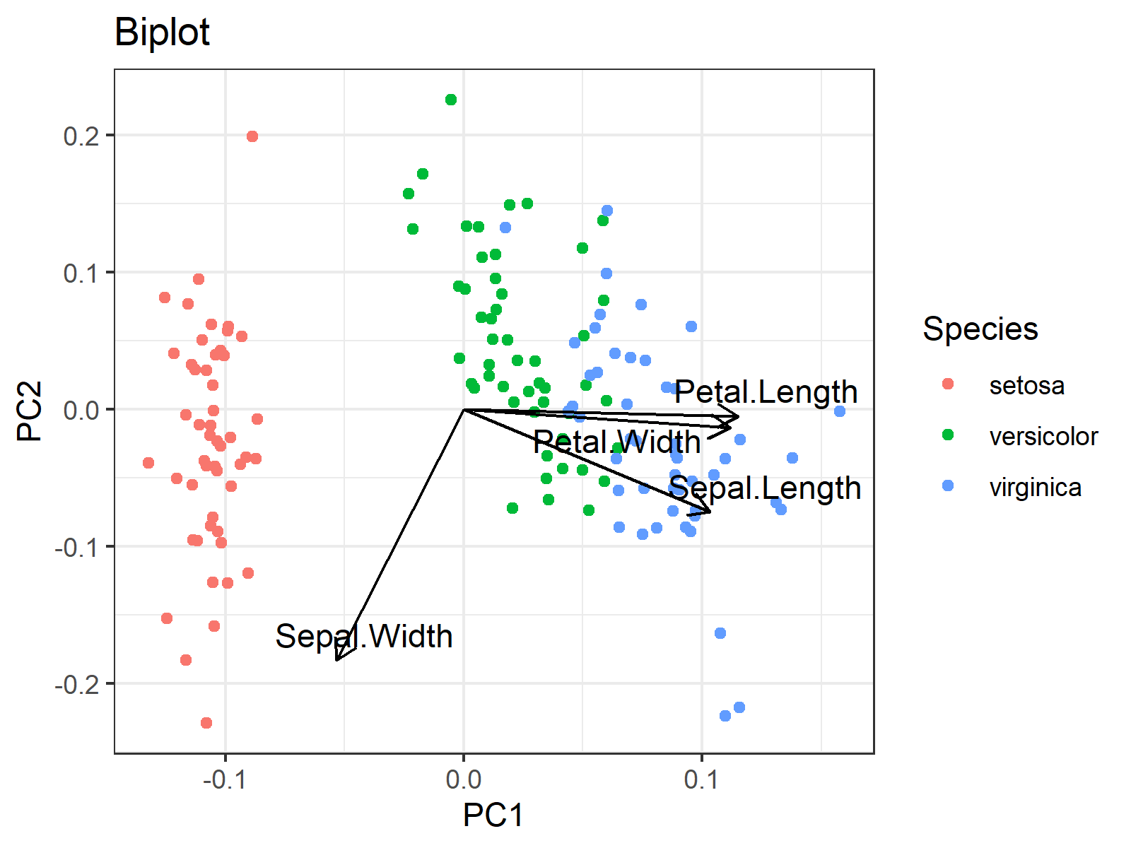
In the biplot below, each point represents a sample of an iris flower. The axes show the principal component scores, and the vectors are the loading vectors, whose components are in the magnitudes of the loadings in Table 3. Each loading vector represents the loading pair per original variable.

You can see that the flowers that belong to the same species are located closer to each other, which indicates that they have similar principal component scores. More specifically, Setosa species have relatively lower PC1 scores, Versicolar species have somewhat higher PC2 scores and Virginica species have rather higher PC1 scores.
Okay, but what do low and high scores of PC1 or PC2 refer to? There come the loading vectors! One can take the vector projections on the principal component axes to interpret the direction and the strength of the association among the variable-component pairs. The projections on the PC1 axis guide in the relations with PC1 whereas the projections on the PC2 axis show the associations with PC2.
For instance, if one takes the projection on the PC1 axis, it can simply be said that the petal length, sepal length and petal width are in the same direction as PC1, hence they are positively correlated with PC1. On the other hand, the sepal width is in the opposite direction with PC1, which implies a negative association. Therefore, simply say, PC1 represents having smaller sepal widths and larger sepal lengths. One can also add the information: being larger in petal measurements.
By the same reasoning, PC2 represents being lower in all measurements at different levels for each width and length measurement. For example, the magnitudes of the projections of the petal vectors are negligible compared to the sepal measurements. Therefore, it is even better to only say that PC2 refers to having lower sepal measurements.
Thus, for the iris dataset, we can summarise the results in Table 4 below.

In Table 4, S. Sep-W./L. Sep-L. refers to small sepal width and large sepal length; L. Sep-W./S. Sep-L. refers to large sepal width and small sepal length; S. Sep. refers to small sepals (length and width); L. Sep. refers to large sepals.
Accordingly, Setosa differs from the other two species by its large sepal widths and small sepal lengths; Versicolar is identified by its small sepal widths and lengths; Virginica is distinguished by its small sepal widths and large sepal lengths.
As you see, it is fun to interpret biplots! Would you be interested in finding your favorite pizza type via PCA? Then check the PCA in Practice section in the PCA Explained tutorial.
Video, Further Resources & Summary
Do you need more explanations on the theoretical background of a PCA? Then you should have a look at the following YouTube video of the Statistics Globe YouTube channel.
Additionally, you could have a look at some of the other tutorials on Statistics Globe:
- Principal Component Analysis (PCA) Explained
- Principal Component Analysis (PCA) in R
- Principal Component Analysis in Python
- Choose Optimal Number of Components for PCA/li>
- Scree Plot for PCA Explained
- Draw Biplot of PCA in Python
- Biplot of PCA in R
This post has shown how to interpret biplots in PCA. In case you have questions or comments, you can write them below.


8 Comments. Leave new
Good, clear explanation I think. It would have been very helpful to have the R-commands that generated these tables and the graph. I was able to figure out all the output except Table 4 from the other PCA articles. What command was used to create Table 4?
Hello Scott,
Thank you for your nice words and feedback. We didn’t add the R commands to keep the tutorial in statistical focus. But we have a separate tutorial explaining the computation of PCA in R. You may want to have a look at that. I am also attaching the R commands of this tutorial here in the comment in case others ask for the same. As you can see, Table 4 was created by me manually to show the conclusion in a compact way.
Regards,
Cansu
PC1 is positively correlated with sepal length and negatively correlated with sepal width. Therefore, since the species Setosa have negative PC1 values, that must mean they have large sepal widths and small sepal lengths (L. Sep-W./S. Sep-L.), right? If so, why does Setosa has “small sepal widths and large sepal lengths”?
Also, the species Virginica have positive PC1 values, which must mean they have small sepal widths and large sepal lengths (S. Sep-W./L. Sep-L.). Again, the article indicates the opposite where Virginica has “large sepal widths and small sepal lengths”.
Could you help me if my interpretation is correct or not, please? Thanks
Hey Mike!
Thank you for your attention, and sorry for the inconvenience; your interpretation is indeed correct. We have updated the tutorial and the code shared in the comments accordingly. Have a good one!
Regards,
Cansu
Hi, I am trying to PCA for F6,F5 and backcross populations with a dataset having varied number of individuals in each population and I am encountering error while using habillage function to group the populations in PCA biplots. Give me a solution to rectify this. Thank you
Hello Partha,
Could you please share your code and also the error?
Best,
Cansu
Hello, thank you for your explanation. I am just confused about the part about what the high or low PC scores refer to. What is the relationship between the PC scores and each principal component? Whether high PC scores represent high relations with PC? And how the PC scores can be calculated?
Hello,
You are welcome. As you know, we create new variables in PCA, and these new variables are called principal components. Principal component scores are nothing but the principal component values, in other words, new variable values. In the graph, the x-axis represents the first principal component values (scores), and the y-axis represents the second principal component values (scores). If you have any further questions, let me know. I also advise you to check our YouTube tutorial about PCA; you can find it at the bottom of this tutorial. If you prefer written material, then you can check our main PCA tutorial, What is Principal Component Analysis?.
Best,
Cansu