Scree Plot for PCA Explained
When we perform a Principal Component Analysis (PCA), the main idea is to capture the most of the variance of our data using a lower-dimensional space. To accomplish this, we use newly defined components, which are lower in numbers than the original variables.
But how much lower? One way of deciding on this is to use a scree plot. In this tutorial, you’ll learn how to interpret a scree plot in a PCA.
This is the content you will find on this page:
Let’s dive right in.
What is Scree Plot?
Scree plot is a graphic that shows the explained variance per newly defined component (principal component). The measure of the plot can be the percentage or the absolute value of the explained variance (eigenvalues). It’s common in practice that the first few principal components explain the major amount of variance.
Number of Components to Keep
In order to decide how many components to keep after creating our scree plot, there are two different methods we can use:
The Elbow Method
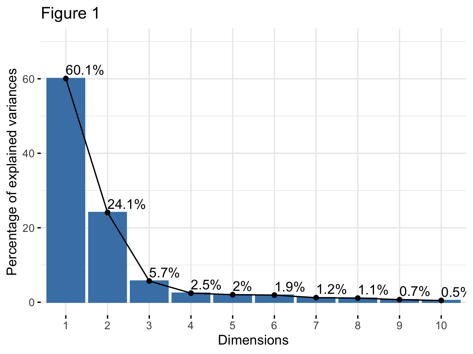
A method of interpreting a scree plot is to use the elbow rule. This method is about looking for the “elbow” shape on the curve and retaining all components before the point where the curve flattens out. For the demonstration, we used the built-in mtcars data and the measure of explained variance percentage. See Figure 1 below.

In Figure 1, the x-axis shows the principal components (dimensions), which are 10 in this case. The y-axis shows the percentage of the explained variance per principal component. The elbow appears to occur at the third principal component. This means that the first three components should be kept for the analysis.
Kaiser’s Rule
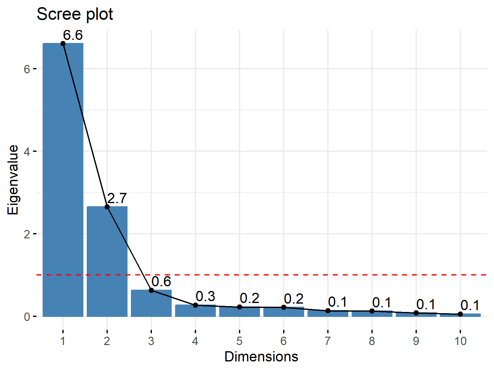
Kaiser’s rule is a commonly used method to select the number of components in a PCA. It’s based on keeping the components with eigenvalues greater than 1. If we create the scree plot by showing the eigenvalues this time, the graph will look like in Figure 2.

We can see that the first two principal components have eigenvalues greater than 1. Thus, this method also leads us to keep two components.
As shown, the elbow method and Kaiser’s rule help us to decide on the number of components to keep. Also you can check the Scree Plot in R and Scree Plot in Python tutorials if you want to learn how to draw them in R and Pyhton.
Video, Further Resources & Summary
Do you need more explanations and background on how to use a Principal Component Analysis? Then you should have a look at the following YouTube video of the Statistics Globe YouTube channel.
There are other tutorials on Statistics Globe you can take a look at:
- Choose Optimal Number of Components for PCA
- Principal Component Analysis (PCA) Explained
- Principal Component Analysis (PCA) in R
- Draw Scree Plot in Pyhton
- Draw Scree Plot in R
This post has shown how to interpret scree plots in PCA. In case you have further questions, don’t hesitate to leave a comment.
Subscribe to the Statistics Globe Newsletter
Get regular updates on the latest tutorials, offers & news at Statistics Globe.
I hate spam & you may opt out anytime: Privacy Policy.
Thank you!
Welcome to the Statistics Globe newsletter. From now on, I’ll send you regular emails about statistics, data science, AI, and programming with R and Python.
I’m Joachim Schork. On this website, I provide statistics tutorials as well as code in Python and R programming.
Statistics Globe Newsletter
Get regular updates on the latest tutorials, offers & news at Statistics Globe. I hate spam & you may opt out anytime: Privacy Policy.
Thank you!
Please check your email inbox and click the confirmation link to complete your subscription. If you don’t see the email within a few minutes, please also check your spam/junk folder.


