Increase Font Size in Base R Plot (5 Examples)
In this article you’ll learn how to increase font sizes in a plot in the R programming language.
The page contains these contents:
- Creation of Example Data
- Example 1: Increase Font Size of Labels
- Example 2: Increase Font Size of Axes
- Example 3: Increase Font Size of Main Title
- Example 4: Increase Font Size of Subtitle
- Example 5: Increase Font Size of All Text
- Video & Further Resources
Here’s how to do it:
Creation of Example Data
In the examples of this tutorial, I’ll use the following data:
set.seed(7531)                                    # Create random data
x <- rnorm(100)
y <- x + rnorm(100)
We can create a plot with default font sizes as follows:
plot(x, y,                                        # Default plot
     main = "My Title", sub = "My Subtitle")
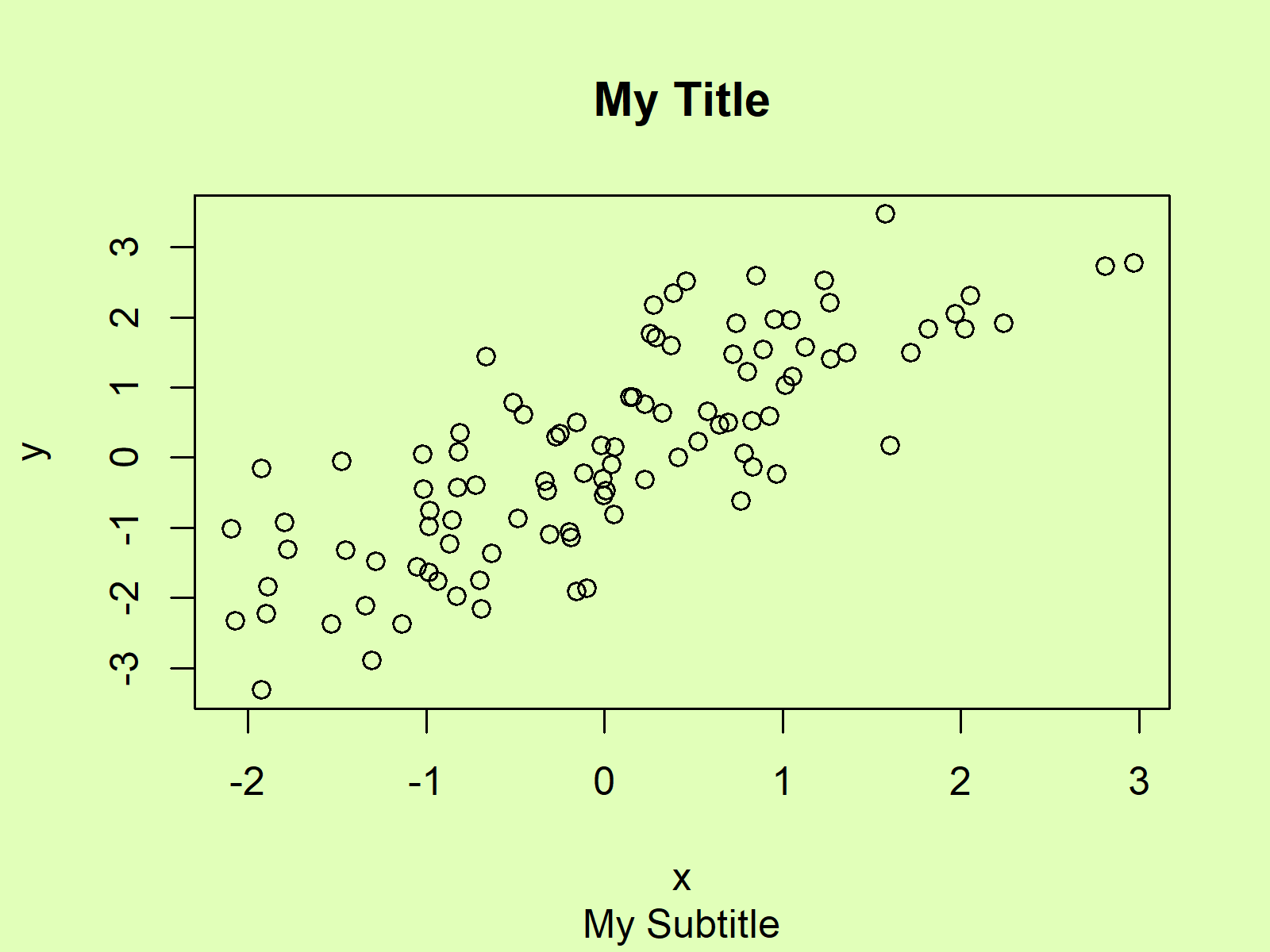
Figure 1: Base R Plot with Default Font Sizes.
Now, if we want to increase certain font sizes, we can use the cex arguments of the plot function. Have a look at the following examples…
Example 1: Increase Font Size of Labels
We can increase the labels of our plot axes with the cex.lab argument:
plot(x, y,                                        # Increase label size
     main = "My Title", sub = "My Subtitle",
     cex.lab = 3)
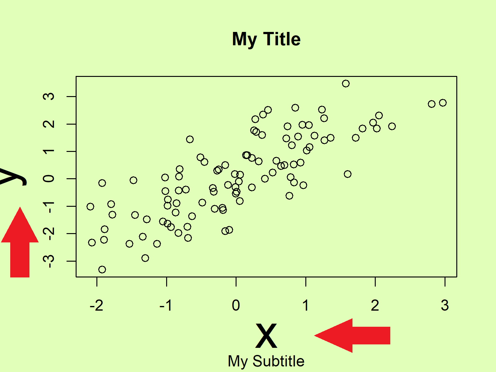
Figure 2: Base R Plot with Increased Font Size of Labels.
Example 2: Increase Font Size of Axes
The axis text can be increased with the cex.axis argument:
plot(x, y,                                        # Increase axis size
     main = "My Title", sub = "My Subtitle",
     cex.axis = 3)
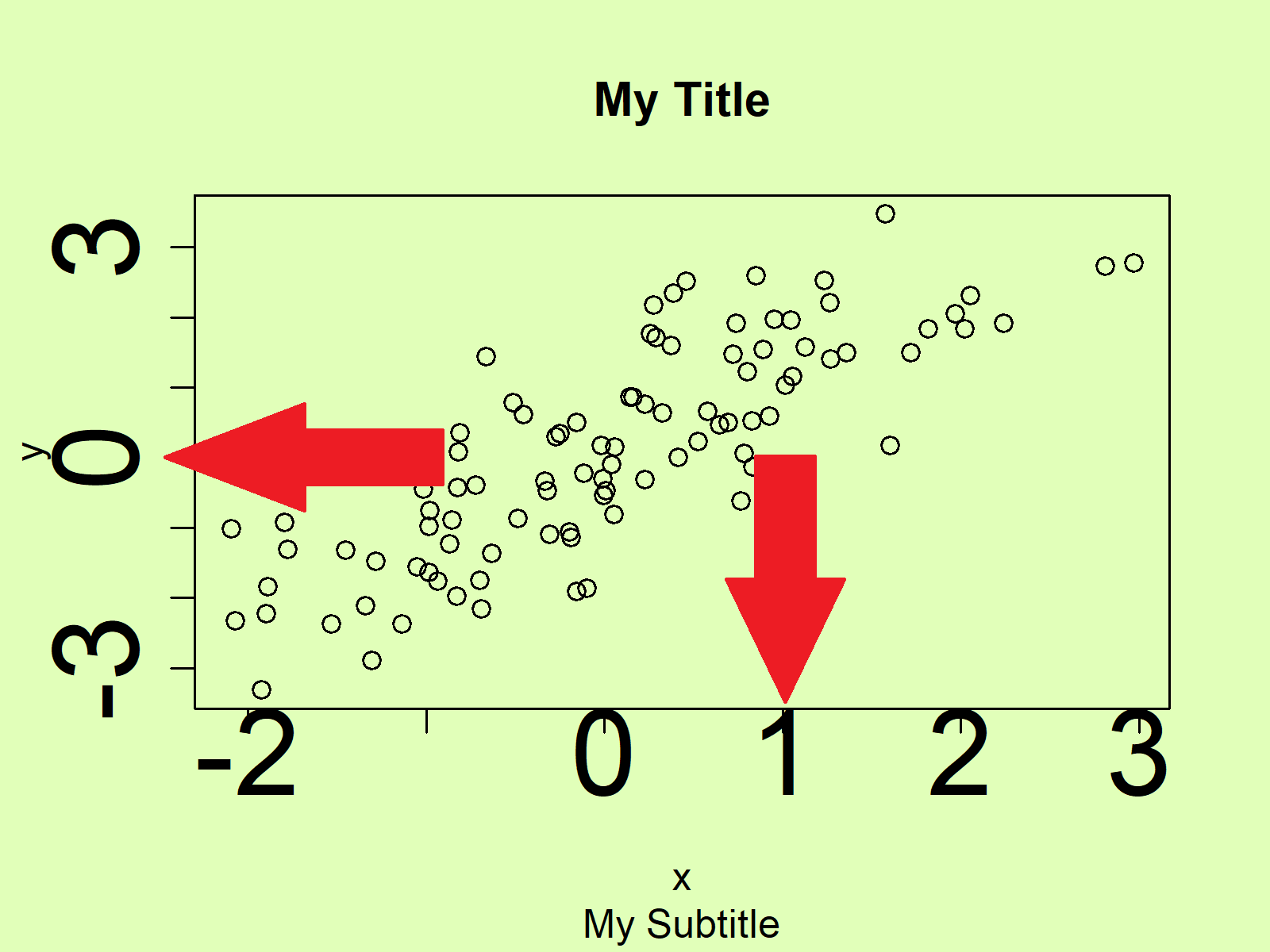
Figure 3: Base R Plot with Increased Font Size of Axes.
Example 3: Increase Font Size of Main Title
The font size of the main title can be increased with the cex.main argument:
plot(x, y,                                        # Increase title size
     main = "My Title", sub = "My Subtitle",
     cex.main = 3)
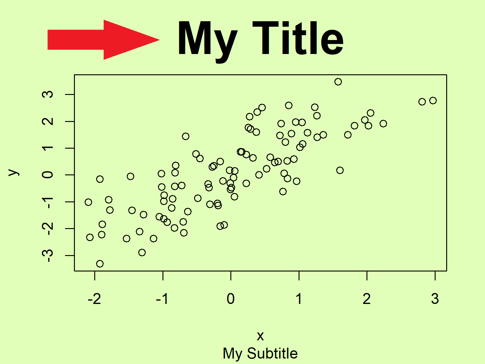
Figure 4: Base R Plot with Increased Font Size of Main Title.
Example 4: Increase Font Size of Subtitle
The font size of the subtitle is getting larger by specifying a larger value for the cex.sub argument:
plot(x, y,                                        # Increase subtitle size
     main = "My Title", sub = "My Subtitle",
     cex.sub = 3)
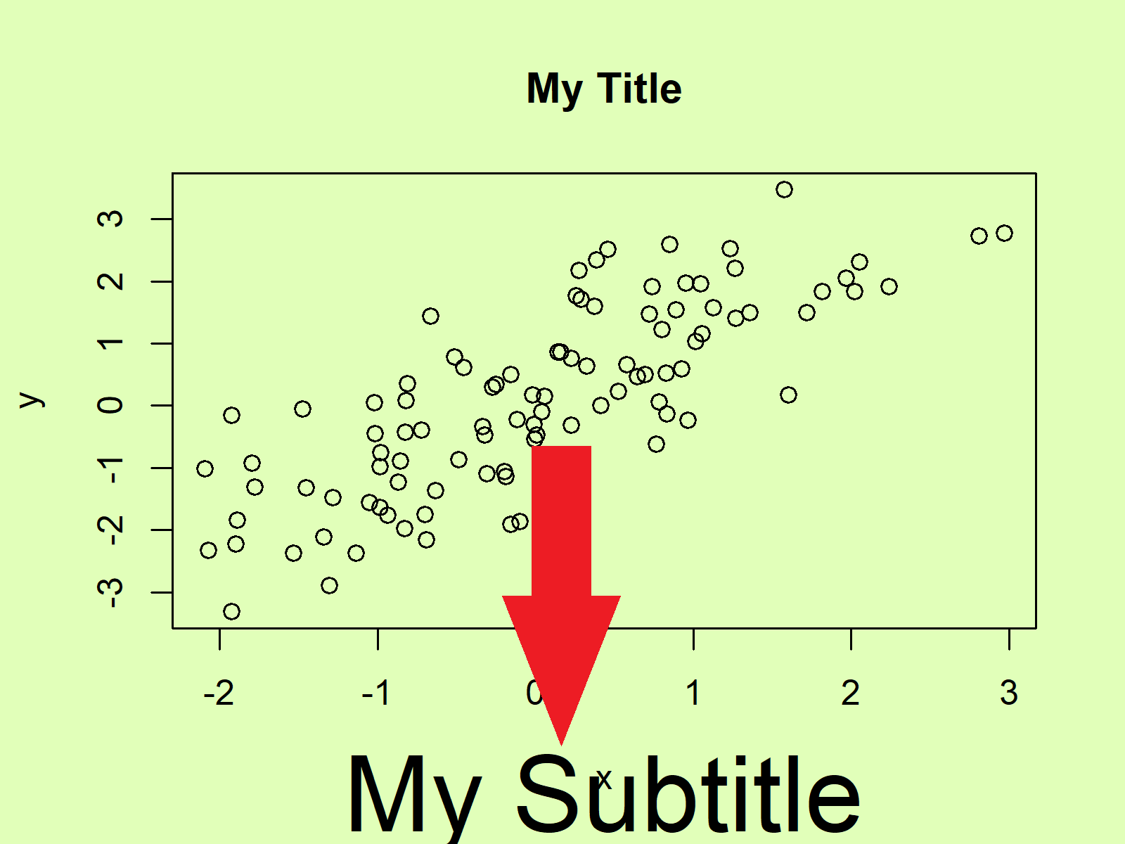
Figure 5: Base R Plot with Increased Font Size of Subtitle.
Example 5: Increase Font Size of All Text
And finally, if we want to increase all font sizes of all plot elements, we can apply all cex arguments simultaneously:
plot(x, y,                                        # Increase all text sizes
     main = "My Title", sub = "My Subtitle",
     cex.lab = 3,
     cex.axis = 3,
     cex.main = 3,
     cex.sub = 3)
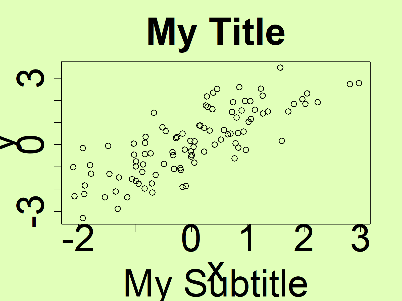
Figure 6: Base R Plot with Increased Font Size of All Text Elements.
Note that I always specified the cex arguments to be equal to 3. You may change this value to whatever value you want. The larger the cex value gets, the larger is the font size. You may also decrease the font size.
Video & Further Resources
I have recently published a video on my YouTube channel, which shows the contents of this article. You can find the video below.
Furthermore, I can recommend reading some of the other tutorials on my homepage:
Summary: This tutorial illustrated how to adjust text sizes in a plot in R programming.
In this tutorial, we have used a scatterplot to illustrate how to increase font sizes. Please note that we could apply the same kind of code to other types of graphics such as boxplot names, histograms, density plots, line charts, and so on.
Don’t hesitate to let me know in the comments, if you have additional questions. Furthermore, don’t forget to subscribe to my email newsletter for regular updates on the newest tutorials.
Subscribe to the Statistics Globe Newsletter
Get regular updates on the latest tutorials, offers & news at Statistics Globe.
I hate spam & you may opt out anytime: Privacy Policy.
Thank you!
Welcome to the Statistics Globe newsletter. From now on, I’ll send you regular emails about statistics, data science, AI, and programming with R and Python.
I’m Joachim Schork. On this website, I provide statistics tutorials as well as code in Python and R programming.
Statistics Globe Newsletter
Get regular updates on the latest tutorials, offers & news at Statistics Globe. I hate spam & you may opt out anytime: Privacy Policy.
Thank you!
Please check your email inbox and click the confirmation link to complete your subscription. If you don’t see the email within a few minutes, please also check your spam/junk folder.


16 Comments. Leave new
Hi, I was wondering what changes there would be to the code if I only wanted to change the font size of the X axis but not the Y axis. I’m plotting categorical data where variables report a range of income. For example: “$150,000 or more.”
The result is that my X axis is very crowded, so I wanted to see if I could somehow isolate the text size of the x axis.
Thanks so much for your videos by the way. I’m a college student and I learned a lot of R code from you–so much that I have an A in the class (and I was initially afraid to take it). Anyway, thanks again.
Hi Vanessa,
First of all, thank you very much for this awesome feedback, and congratulations on your A-grade! 🙂
Regarding your question: You can change only the x-axis size using the axis() function. See the following example code:
I hope that helps!
Joachim
hi, Joachim. Thanks for sharing your knowledge. Same problem here as Vanessa. Your code does not work. My x axis is categorical.
Hello Darma,
Sorry for the late reply, I was on a vacation. In the presence of a categorical variable on the x-axis, it is beneficial to use the at argument. See the following exmaple.
If you use a barplot, then you can use the cex.names argument to increase the x-axis label size.
Best,
Cansu
Hi Jo,
Thanks for putting these beautiful codes. I am wondering whether there are ways to combine base R plot and save base R plot for 300 dpi.
Kind Regards,
Synat
Hey Synat,
Thank you, glad you like the tutorial!
There are many ways to export Base R plots to files. For instance, you may use the pdf() function to save your plot as a PDF. Within the pdf() function, you may use the width and height arguments to change the size of the output:
Regards,
Joachim
Hi Joachim, thank you very much for the tutorials. I’m new to R and find them very helpful. My combination plot has no title. How do I modify/reduce the font size of the x-axis?
Note: I used the following code to come up with the plot: aggr(data, numbers=TRUE, prop=FALSE)
Please mote that my x-axis is text
Hello Franco,
Could you please tell me what kind of plot and data you are dealing with? Is it a scatter plot like in the tutorial? What is the text data that you use on the x-axis?
Regards,
Cansu
Hi, It is a combinations plot. The data on the x-axis comprises brands of different beers. I managed to fix the problem when I re-run the code with a bigger window. Thx.
However I have another issue with the clustering algorithm. How can I fix messy dendrogram?
Hello Franco,
It is usually an issue when you work with rather big datasets. Check the link. There different dendrogram configurations are provided.
Regards,
Cansu
Thank you very much for the useful post. I am doing some random forest modelling with time series and because the names of my images which correspond to a month, and the dates are quite longer, and therefore are cutting. When I reduce the cex.axis, the labels are getting quite too small and unreadable. Is there a way to increase the margins of the entire plot or what can I do to make sure my labels fit very well and they don’t cut?
Hello Nangula,
What kind of plot and package are you using? Here are some helpful tutorials regarding this issue: Display All X-Axis Labels of Barplot in R and Fit Vertical Labels to Plotting Window in R. Let me know if they are adaptable to your case.
Regards,
Cansu
Hi Cansu,
I am using plot.
Here is my script:
plot(Importance_76_100_train__2019_FIX, xlab = “”, xaxt = “n”)
lz<-lapply(1:ncol(Importance_76_100_train__2019_FIX$ImpHistory),function(i)
Importance_76_100_train__2019_FIX$ImpHistory[is.finite(Importance_76_100_train__2019_FIX$ImpHistory[,i]),i])
names(lz) <- colnames(Importance_76_100_train__2019_FIX$ImpHistory)
Labels <- sort(sapply(lz,median))
axis(side = 1,las=2,labels = names(Labels),
at = 1:ncol(Importance_76_100_train__2019_FIX$ImpHistory),cex.axis = 0.3)
Hello Nangula,
This means you want to plot a scatterplot, right? Then I suggest you use the ggplot2 package for more flexibility in modifying your graph. Please see the 9th Example of our tutorial Draw Scatterplot. Then you can adapt Example 2s in the previously provided tutorials: Display All X-Axis Labels of Barplot in R and Fit Vertical Labels to Plotting Window in R. One solution rotates the axis tick labels, and the other increases the space under the graph.
Regards,
Cansu
I have about 65 long text variables to plot on the x-axis