Increase Y-Axis Scale of Barplot in R (2 Examples)
This tutorial illustrates how to adjust the range of barchart ylim values in the R programming language.
The tutorial will consist of these contents:
If you want to learn more about these topics, keep reading!
Example Data & Default Graph
The following data is used as basement for this R tutorial:
data <- data.frame(x = LETTERS[1:5],    # Create example data
                   y = c(5, 1, 4, 7, 3))
data                                    # Print example data
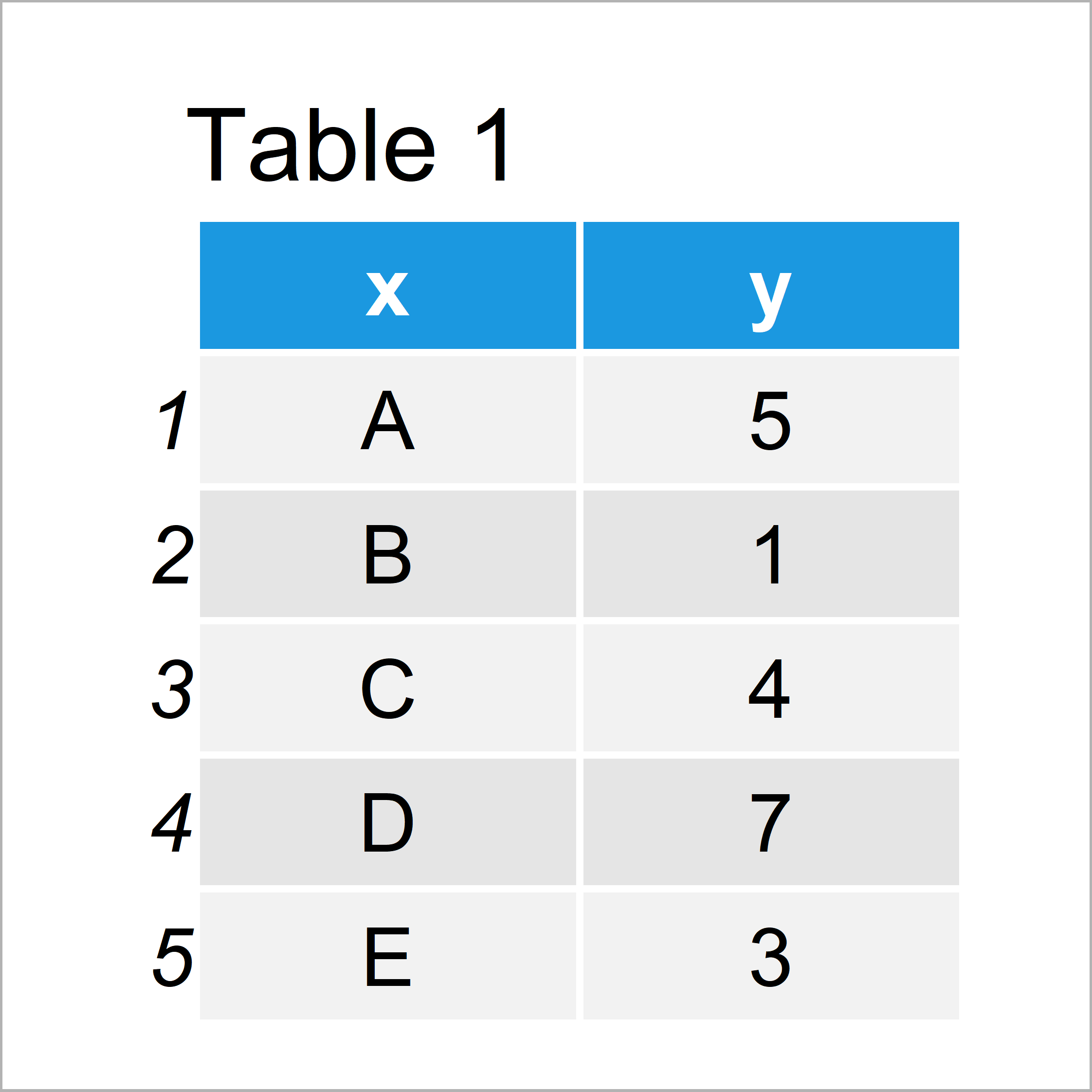
Table 1 shows that our example data is constituted of five rows and two columns.
Example 1: Increase Y-Axis Scale of Barchart Using Base R
The following syntax shows how to adjust the ylim range of a barplot created in Base R. Let’s first draw a barchart with default axis specifications:
barplot(data$y) # Base R barchart with default y-axis
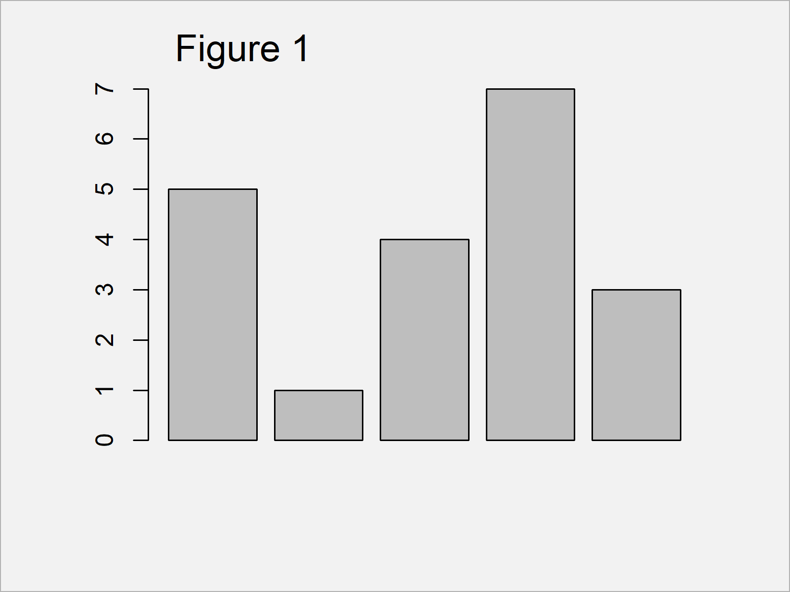
The output of the previous syntax is shown in Figure 1: A bargraph with default y-axis values.
We can now increase the y-axis scale using the ylim argument:
barplot(data$y,                         # Base R barchart with manual y-axis
        ylim = c(0, 15))
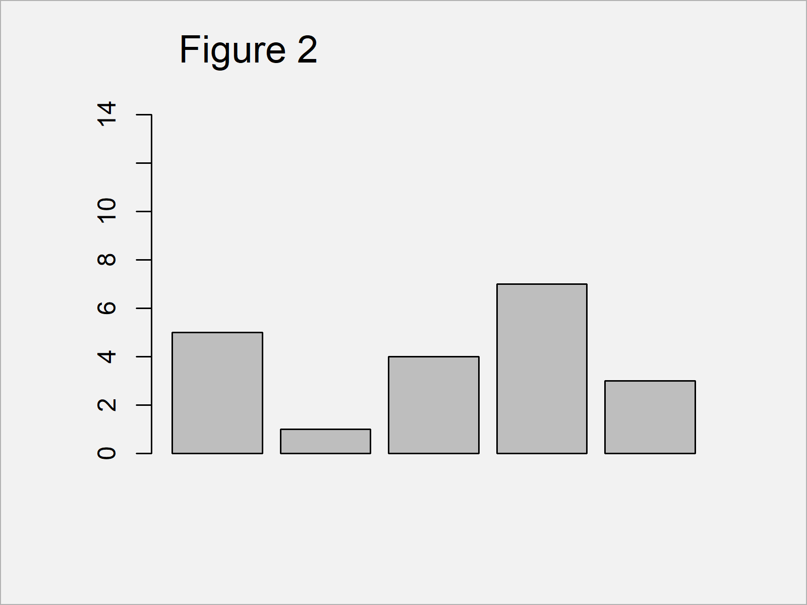
As shown in Figure 2, the previous syntax created a barplot with a y-axis ranging from 0 to 15.
Example 2: Increase Y-Axis Scale of Barchart Using ggplot2 Package
In Example 2, I’ll illustrate how to change the y-axis scale of a ggplot2 barplot.
We first need to install and load the ggplot2 package:
install.packages("ggplot2")             # Install ggplot2 package
library("ggplot2")                      # Load ggplot2 package
Next, we can create and draw a ggplot2 barchart with default axes:
ggp <- ggplot(data, aes(x, y)) +        # Create ggplot2 barchart with default y-axis
  geom_bar(stat = "identity")
ggp                                     # Draw ggplot2 barchart with default y-axis
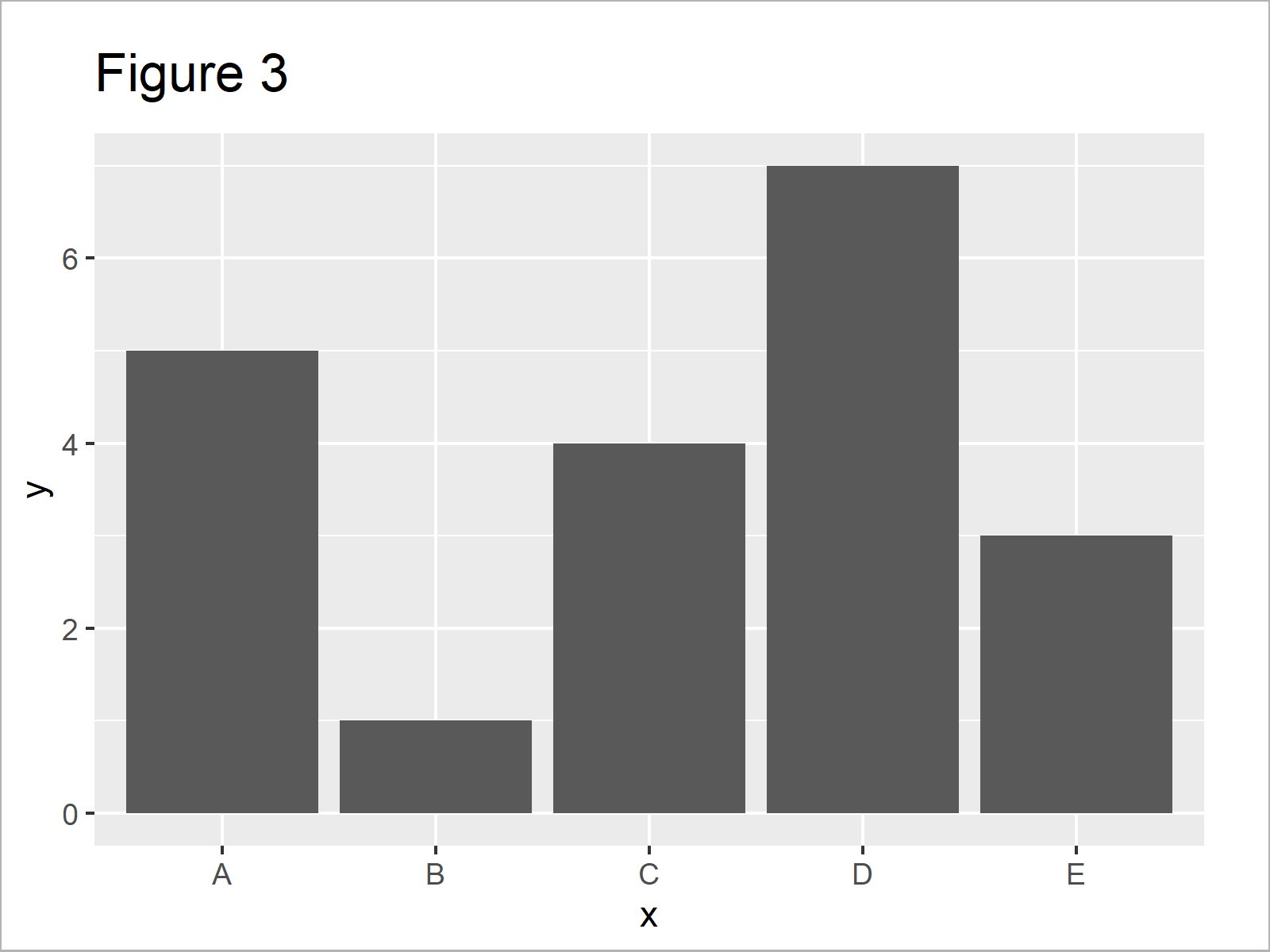
The output of the previous syntax is shown in Figure 3: A ggplot2 barplot with default axis ranges.
We can now use the ylim function to change our y-axis scale:
ggp +                                   # Draw ggplot2 barchart with manual y-axis
  ylim(0, 15)
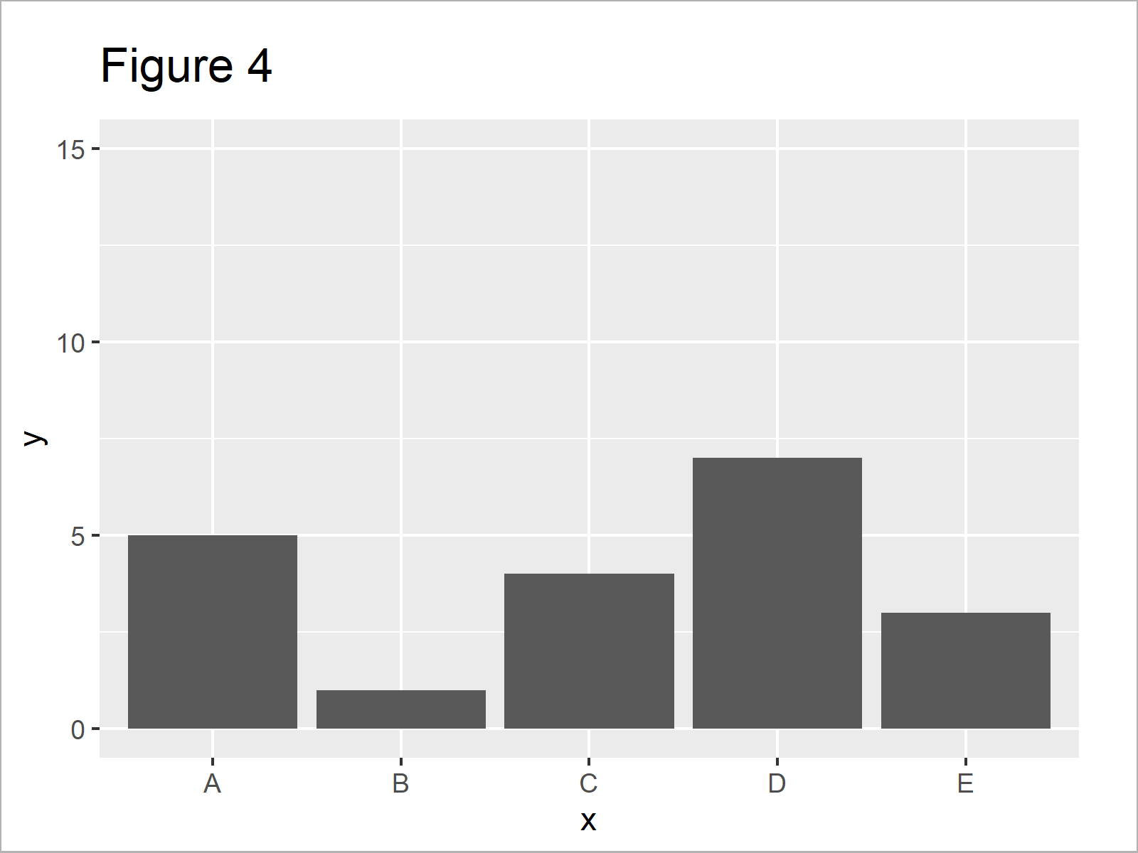
As shown in Figure 4, we created a ggplot2 graphic with ylim ranging from 0 to 15with the previous R code.
Video & Further Resources
In case you need more explanations on the R programming codes of this tutorial, you could have a look at the following video on my YouTube channel. I’m explaining the R code of this article in the video:
Furthermore, I can recommend having a look at the related articles of this website:
- Change Y-Axis to Percentage Points in ggplot2 Barplot
- Scale Bars of Stacked Barplot to a Sum of 100 Percent
- Keep Unused Factor Levels in ggplot2 Barplot
- Graphics Gallery in R
- R Programming Language
To summarize: This article explained how to modify y-axis scales of barplots in the R programming language. Please let me know in the comments section, in case you have additional questions.


