Draw Legend Outside of Plot Area in Base R Graphic (Example Code)
On this page you’ll learn how to draw a legend outside the plotting area of a Base R graphic in the R programming language.
Table of contents:
- Introducing Example Data
- Example: Draw Legend Outside of Plotting Area
- Video, Further Resources & Summary
You’re here for the answer, so let’s get straight to the example.
Introducing Example Data
Let’s first create some data that we can plot later on:
set.seed(123)                                             # Set seed
data <- data.frame(x = c(rnorm(100), rnorm(100, 2)),      # Create example data
                   y = c(rnorm(100), rnorm(100, 2)),
                   group = c(rep(1, 100), rep(2, 100)))
As you can see, our example data contains an x-column, a y-column, as well as a grouping variable. Now let’s create a graph illustrating this data!
Example: Draw Legend Outside of Plotting Area
Here comes the trick: We have to specify the xpd argument within the par function to be TRUE. Furthermore, we leave some additional space around the plot with the mar argument:
par(mar = c(5, 4, 4, 8),                                  # Specify par parameters
    xpd = TRUE)
Now, we can display our plot in Base R as usual:
plot(data$x, data$y,                                      # Create plot
     pch = data$group,
     col = data$group)
In order to draw our legend outside of the plotting area, we can use a combination of the “topright” argument and an additional specification of inset.
The “topright” argument specifies that the legend should be in the upper right corner of the graph. The inset argument allows to change the position of the legend (i.e. a bit more to the right).
Let’s have a look at the R code and the output:
legend("topright", inset = c(- 0.4, 0),                   # Create legend outside of plot
       legend = c("Group 1","Group 2"),
       pch = 1:2,
       col = 1:2)

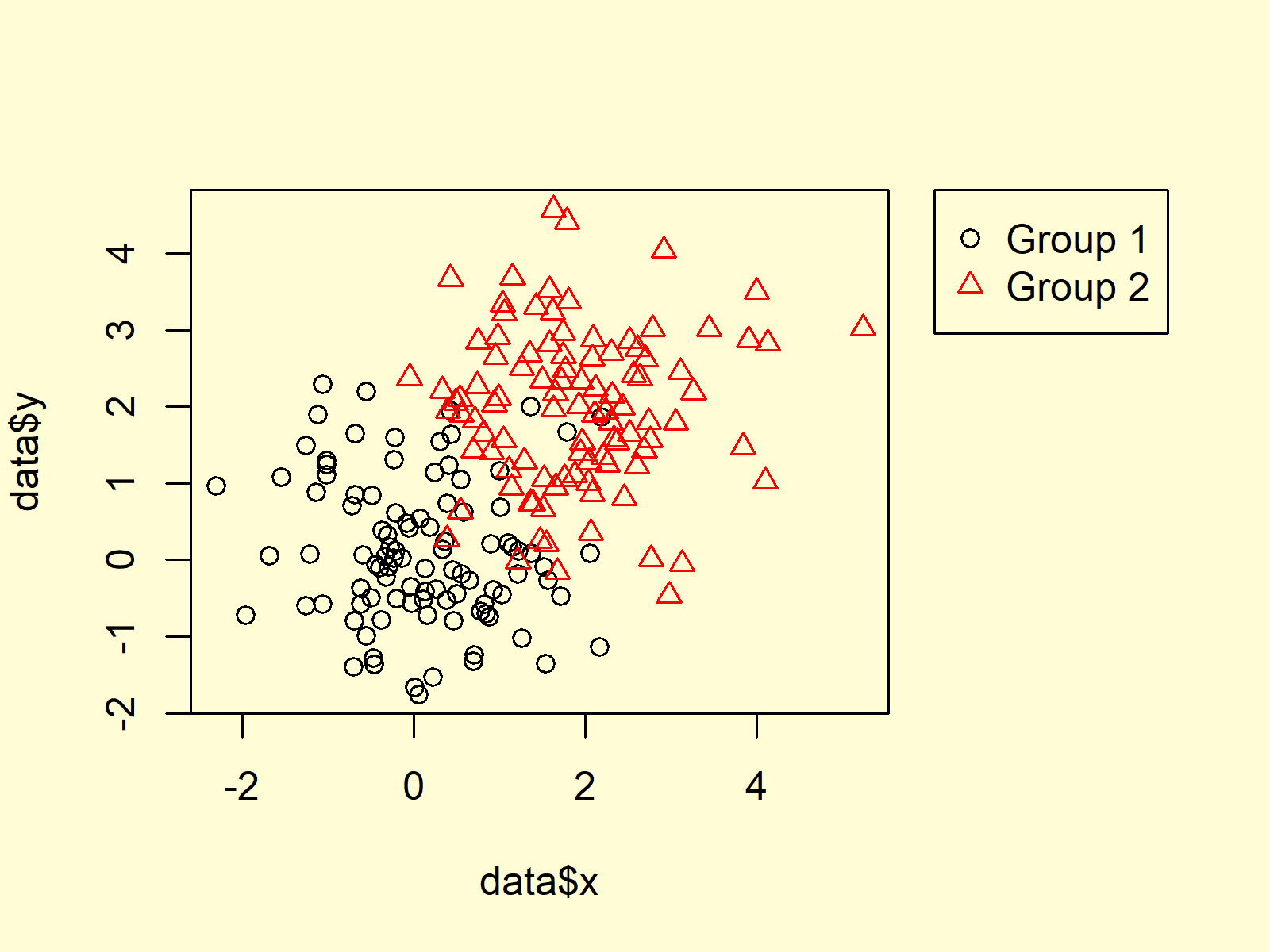
Figure 1: Base R Plot with Legend Outside of Plotting Area.
Figure 1 illustrates the output of the previous R syntax. A plot with a legend outside the plotting region.
Video, Further Resources & Summary
Some time ago I have published a video on the Statistics Globe YouTube channel, which explains the R syntax of this article. You can find the video below.
In addition, you may have a look at the other RStudio tutorials on this homepage.
At this point you should have learned how to visualize a legend outside of an R plot in R programming. Please let me know in the comments, in case you have further questions.


6 Comments. Leave new
How to create a legend outside of the following barplot in R programming?
barplot(c(42,47,38,15,20,81),names=c(“Control”,”2.5µM CCT”,”5µM CCT”,”10µM CCT”,”BAPN 250″,”BAPN 2mM”),col=c(“blue”,”red”,”yellow”,”purple”,”pink”,”brown”),main =”DAPI”,xlab=”Treatment”, ylab=”Cell Proliferation”)
legend(“topleft”,title=”Treatment”,c(“Control “,”2.5µM”,”5µM CCT”,”10µM CCT”,”BAPN 250″,”BAPN 2mM”),fill = c(“blue”,”red”,”yellow”,”purple”,”pink”,”brown”))
Hi Anas,
Basically as explained in this tutorial:
Regards,
Joachim
When I inset the legend as shown above my legend disappears from the plot?
tsne1 <- Rtsne(featureMatrix, perplexity=3, theta=0.5, dims=2, col=(values=colors), fill=(values=colors)+
geom_point(size=4)+
labs(title= "tSNE: PC1 vs PC2" ,x=paste0("PC1(",pca_data_perc[1],"%)"),y=paste0("PC2 (",pca_data_perc[2],"%)")) +
theme_bw() +
theme(plot.title = element_text(hjust = 0.5)) +
theme(panel.grid.major = element_blank(),
panel.grid.minor = element_blank(), axis.line = element_line(colour = "black"))+
geom_text_repel(aes(label=type$Sample), point.padding = 0.5)+
scale_color_manual(values=colors))
set.seed(1)
plot(tsne1$Y, col=(values=colors))
legend("right", inset = c(- 0.1, 0),
legend = c("Control","T/P","T/P + Inhibitors"),
title = c("Treatment"),
fill = (values=colors),
border = "black")
Hey Ruth,
Thank you for your question! Unfortunately, I don’t have any experience with the Rtsne package.
However, I have recently created a Facebook discussion group where people can ask questions about R programming and statistics. Could you post your question there? This way, others can contribute/read as well: https://www.facebook.com/groups/statisticsglobe
Regards
Joachim
Hi 🙂 we really appreciate your Youtube videos and explanations, they are really helpful. We are new to R Studio and have this issue where we are creating two legends, one inside the plot and one outside, we are not sure why! We were hoping you could help us so that we only have one outside the plot.
Code:
Cat_vs_Attr.data3$Activity <- recode(Cat_vs_Attr.data3$Activity, '1 = "Activity"; 2 = "No Activity";')
Cat_vs_Attr.data3$Facial.Expression<- recode(Cat_vs_Attr.data3$Facial.Expression, '1 = "Serious"; 2 = "Neutral"; 3 = "Happy";')
par(mar = c(5, 4, 4, 8),
xpd = TRUE)
interaction.plot(Cat_vs_Attr.data3$Facial.Expression, Cat_vs_Attr.data3$Activity, Cat_vs_Attr.data$Vision.loss,
xlab = "Facial Expression", ylab = "Vision loss",
fun = median,
main = "Interaction between Activity and Facial Expression",
ylim = c(1,70), trace.label = "Activity", type = "b", col = c("purple" , "green"),
pch = c(19,17), fixed = TRUE)
legend("topright", inset = c(- 0.35, 0),
legend = c("Activity", "No Activity"),
pch = c(19,17), col = c("purple" , "green"))
Hey Sam and Priya,
Thank you very much for the very kind words! It’s great to hear that you find my tutorials helpful! 🙂
Regarding your question: I have not experience with the interaction.plot function, but I think you would have to add legend = FALSE within the interaction.plot function.
Does this work for you?
Regards,
Joachim