Change Theme Color in ggplot2 Plot in R (Example) | Introduction to ggthemr Package
In this tutorial you’ll learn how to modify the colors of ggplot2 graphics using different themes in the R programming language.
Table of contents:
Let’s do this.
Example Data
Let’s first create some example data in R:
set.seed(2342435)                                # Create example data
data <- data.frame(x = rnorm(100),
                   y = rnorm(100),
                   group = paste0("group_", LETTERS[1:5]))
head(data)                                       # Print head of example data
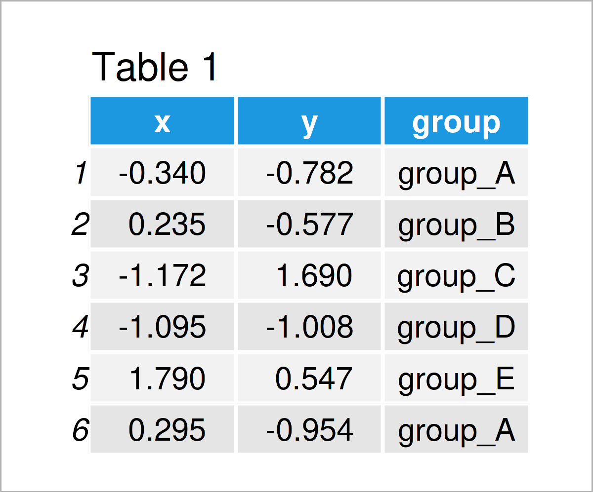
Table 1 shows the head of our example data – it is also shown that our data is made up of three variables. The variables x and y are numerical, and the variable group is a character.
To draw our data using the ggplot2 package, we first need to install and load the ggplot2 package to R:
install.packages("ggplot2")                      # Install ggplot2 package
library("ggplot2")                               # Load ggplot2
Next, we can create a ggplot2 scatterplot of our data using the R syntax below:
ggp <- ggplot(data, aes(x, y, col = group)) +    # Create ggplot2 plot with default colors
  geom_point()
ggp                                              # Draw ggplot2 plot
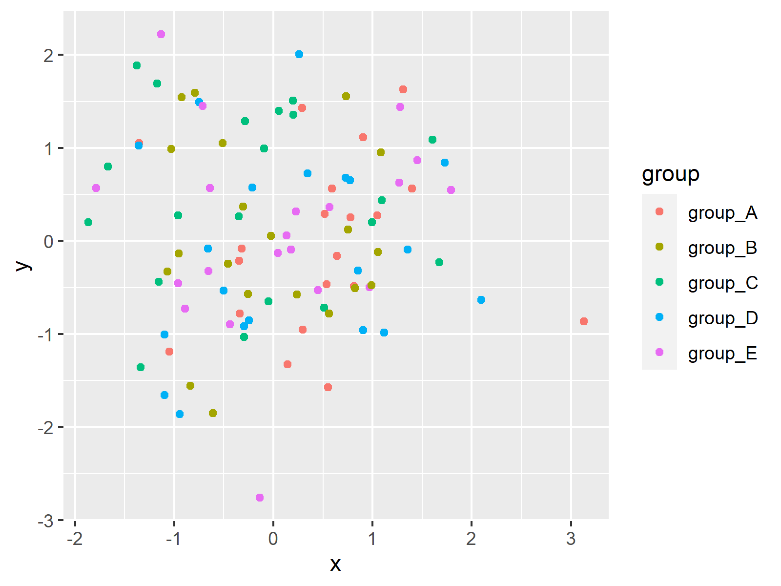
In Figure 1 it is shown that we have created a ggplot2 plot with default color specifications by running the previous R syntax.
Let’s change these colors!
Example 1: Change Color Scheme of ggplot2 Plot Using Default Themes
The following R code demonstrates how to use the default themes of the ggplot2 package to adjust the colors of our graphic.
For this task, we can use the different pre-defined theme functions that are provided by the ggplot2 package as shown below:
ggp_bw <- ggp + theme_bw() + ggtitle("theme_bw()") # Switch ggplot2 themes
ggp_classic <- ggp + theme_classic() + ggtitle("theme_classic()")
ggp_dark <- ggp + theme_dark() + ggtitle("theme_dark()")
ggp_gray <- ggp + theme_gray() + ggtitle("theme_gray()")
ggp_linedraw <- ggp + theme_linedraw() + ggtitle("theme_linedraw()")
ggp_light <- ggp + theme_light() + ggtitle("theme_light()")
ggp_minimal <- ggp + theme_minimal() + ggtitle("theme_minimal()")
ggp_test <- ggp + theme_test() + ggtitle("theme_test()")
ggp_void <- ggp + theme_void() + ggtitle("theme_void()")
The previous R code has created nine ggplot2 plots with different theme design.
Next, we can use the patchwork package to draw a comparison grid of these plots. For this, we first need to install and load the patchwork package:
install.packages("patchwork")
library("patchwork")
Now, we can draw a grid layout of our nine plots as shown below:
(ggp_bw + ggp_classic + ggp_dark) / # Draw layout of ggplot2 plots
  (ggp_gray + ggp_linedraw + ggp_light) /
  (ggp_minimal + ggp_test + ggp_void)
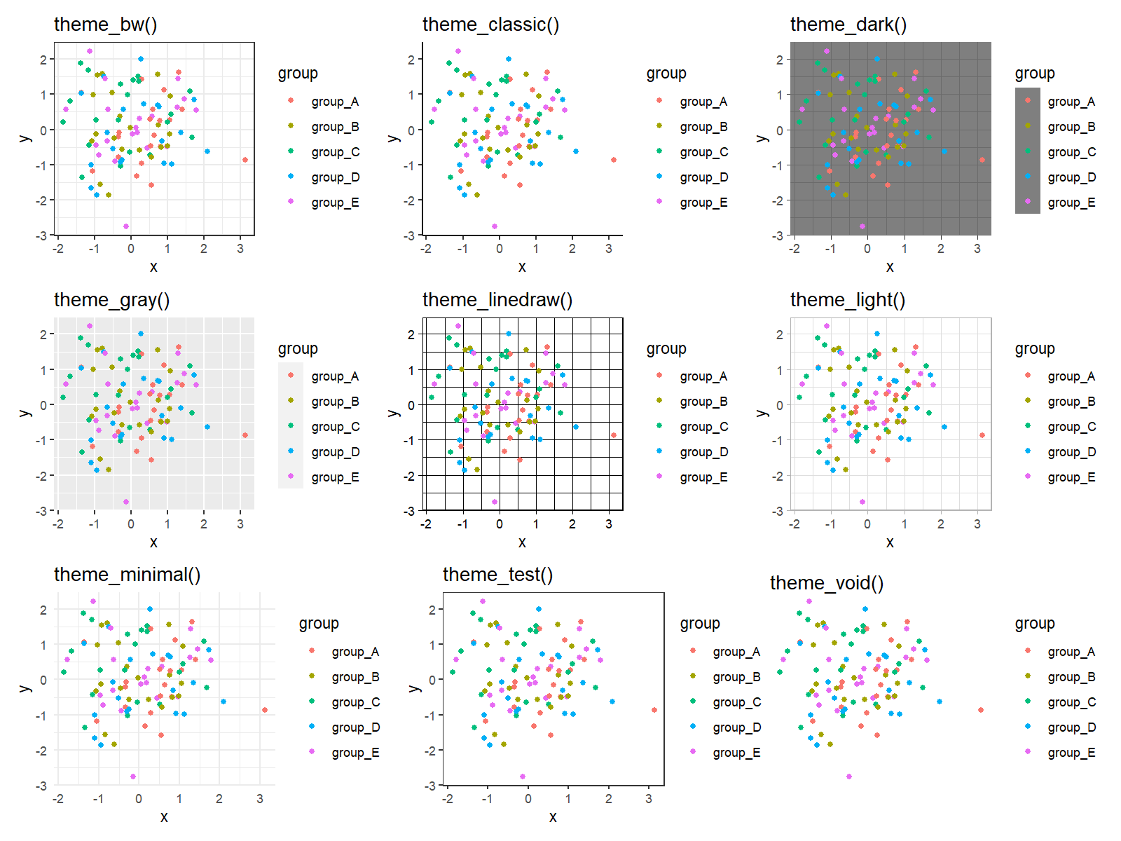
The previously shown figure visualizes the different themes and their different color codings.
As you can see, most of these themes are relatively plain and simple. Let’s add some more colors to our plots!
Example 2: Change Color Scheme of ggplot2 Plot Using ggthemr Package
A powerful package when it comes to designs, styles, and colors of ggplot2 plots is the ggthemr package by Ciarán Tobin that is nowadays maintained by Mikata Project.
The package can be installed and loaded via the R code below:
library("devtools")
devtools::install_github("Mikata-Project/ggthemr")
library("ggthemr")
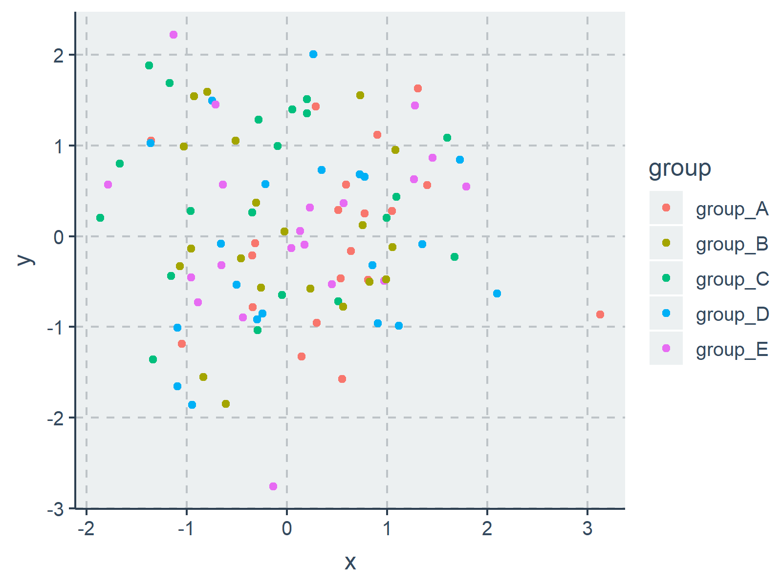
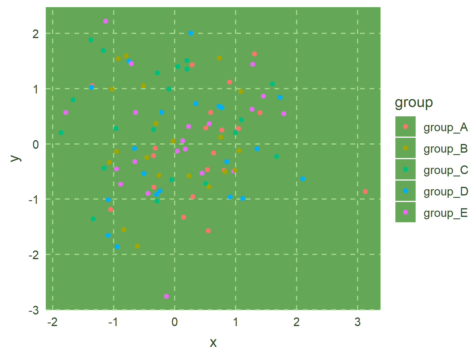
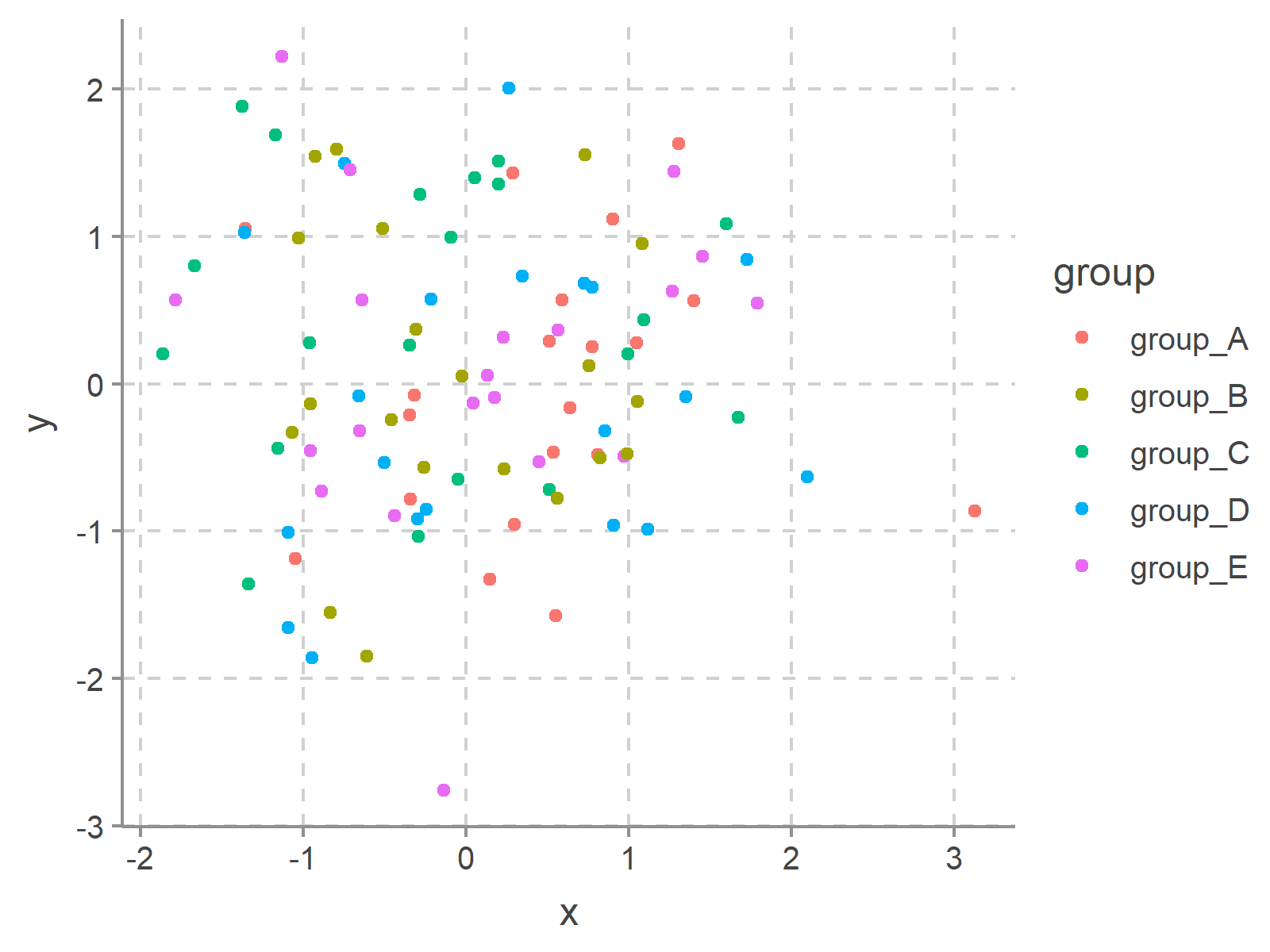
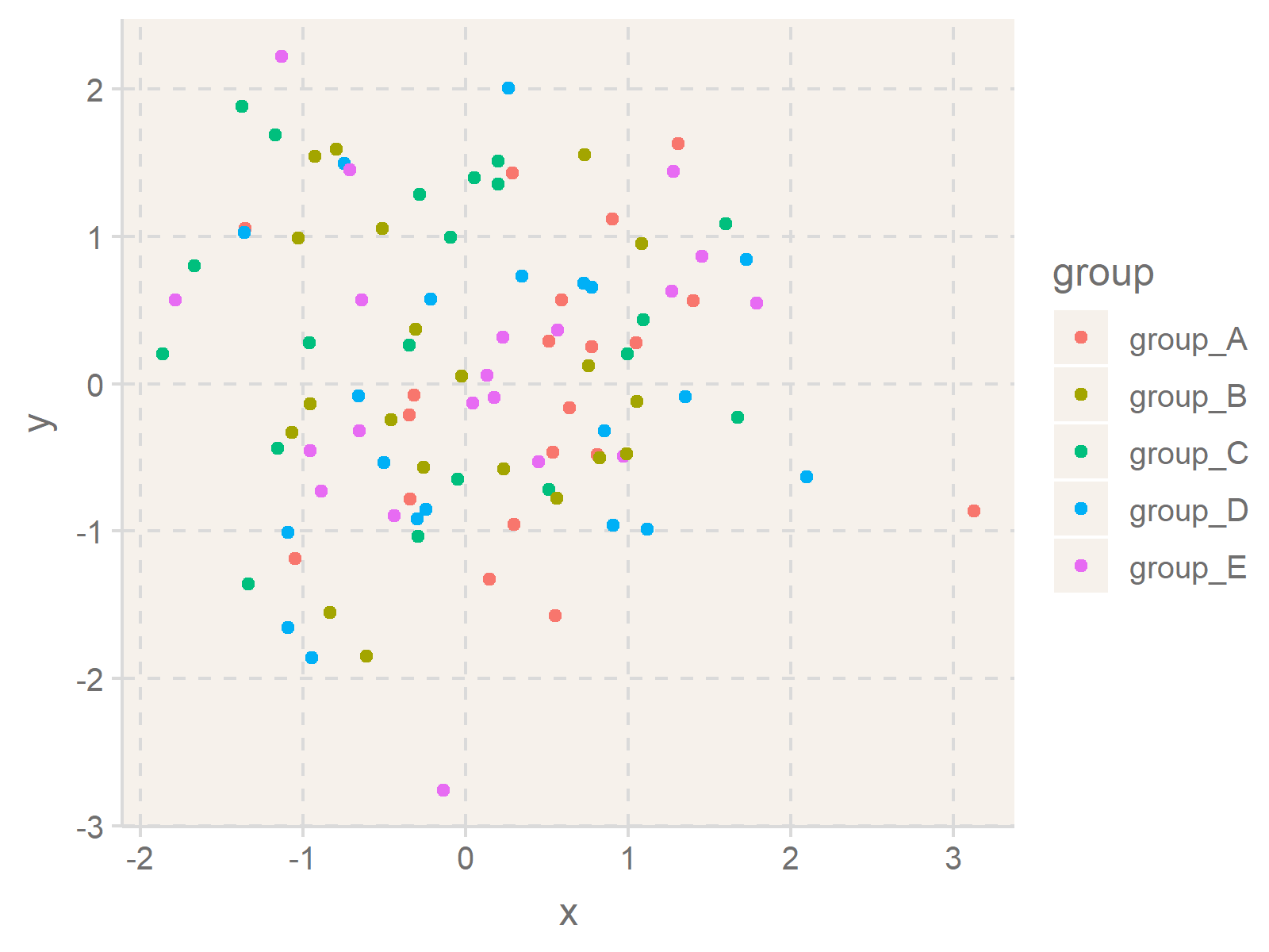
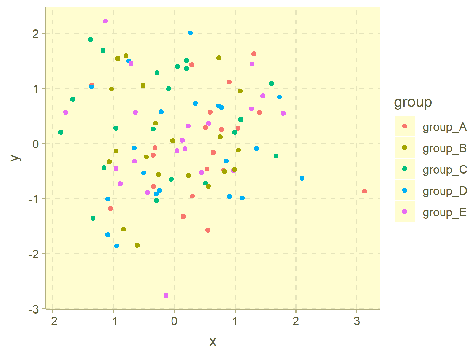
Now, we can apply the ggthemr function to change the ggplot2 theme layout. The following R codes and their graphical outputs demonstrate how to adjust the theme options of our example plot to different styles.
ggthemr("flat")
ggp
ggthemr("flat dark")
ggp
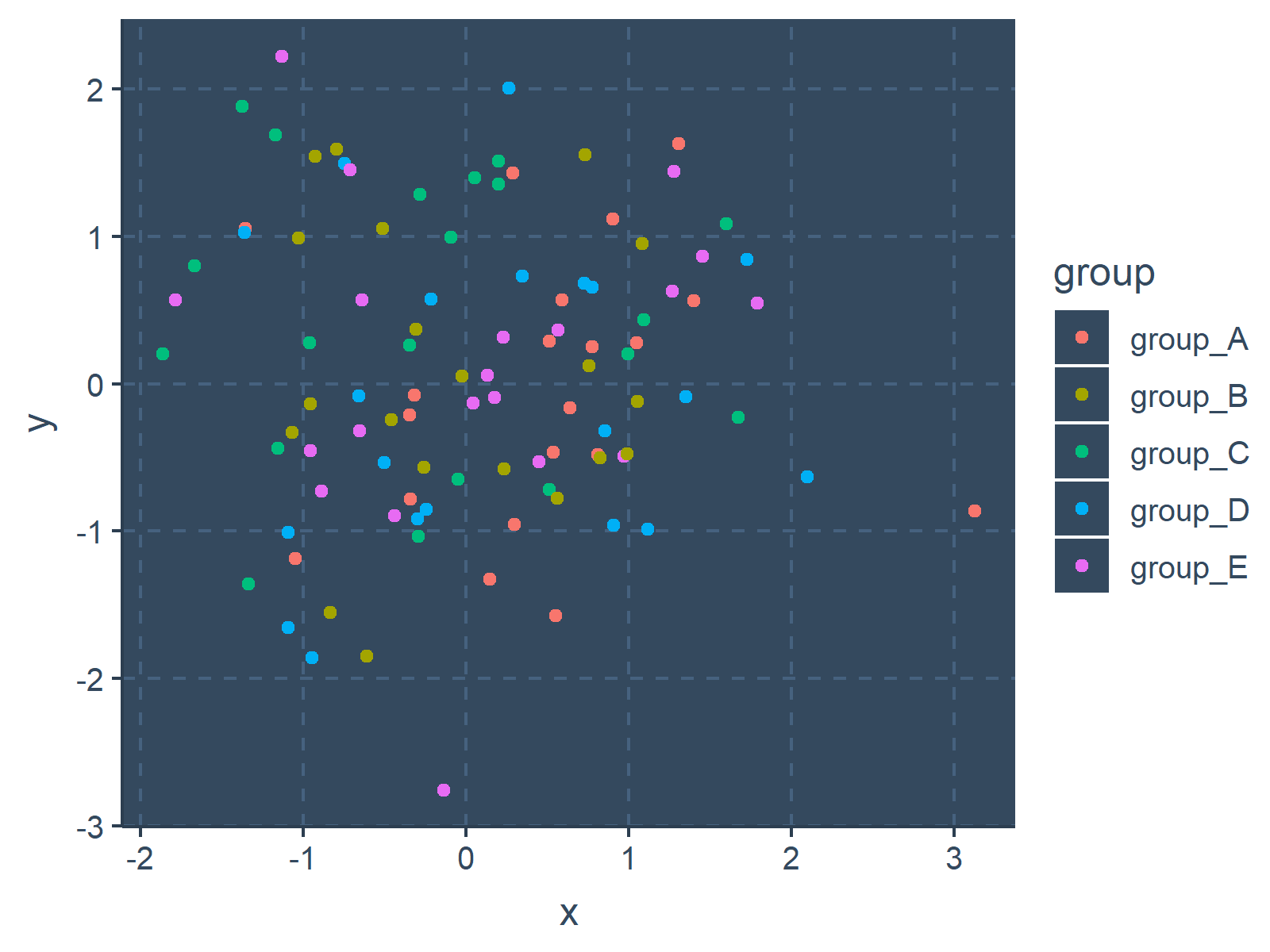
ggthemr("camouflage")
ggp
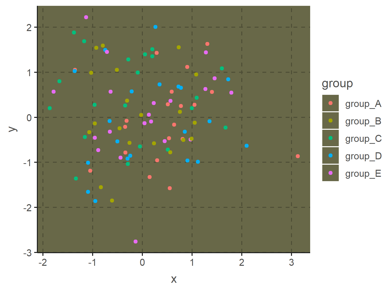
ggthemr("chalk")
ggp
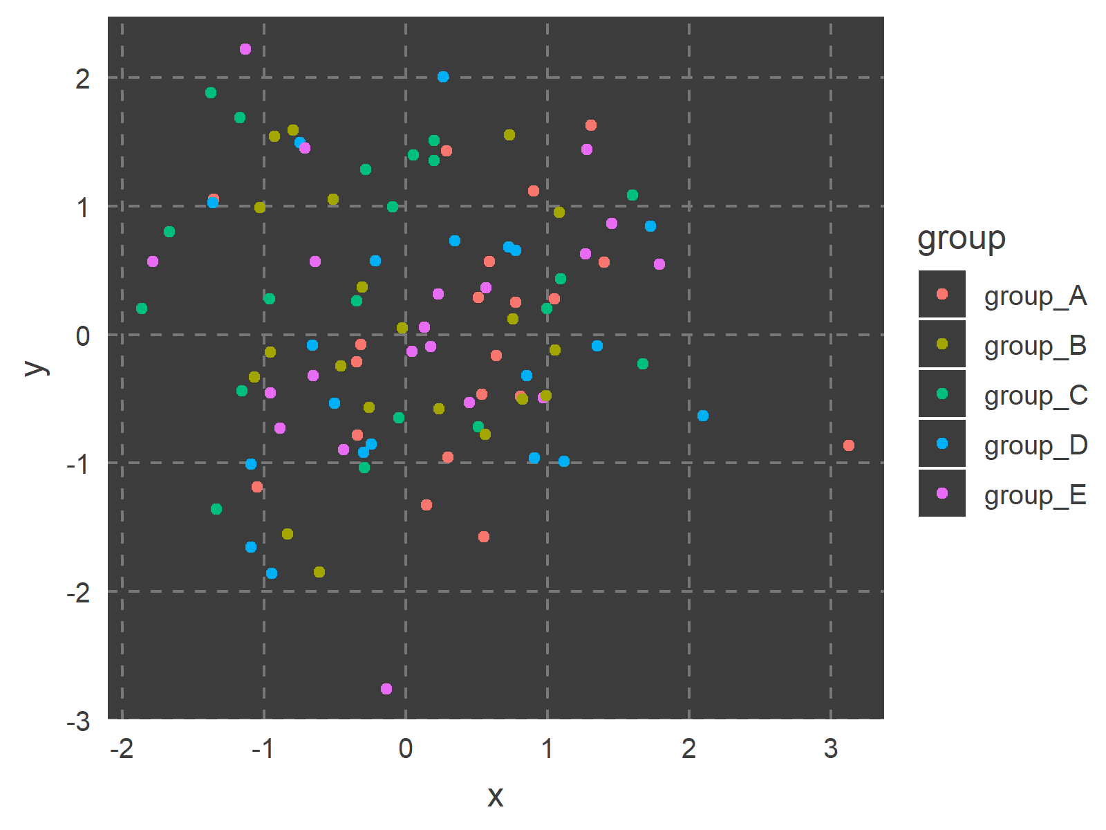
ggthemr("copper")
ggp
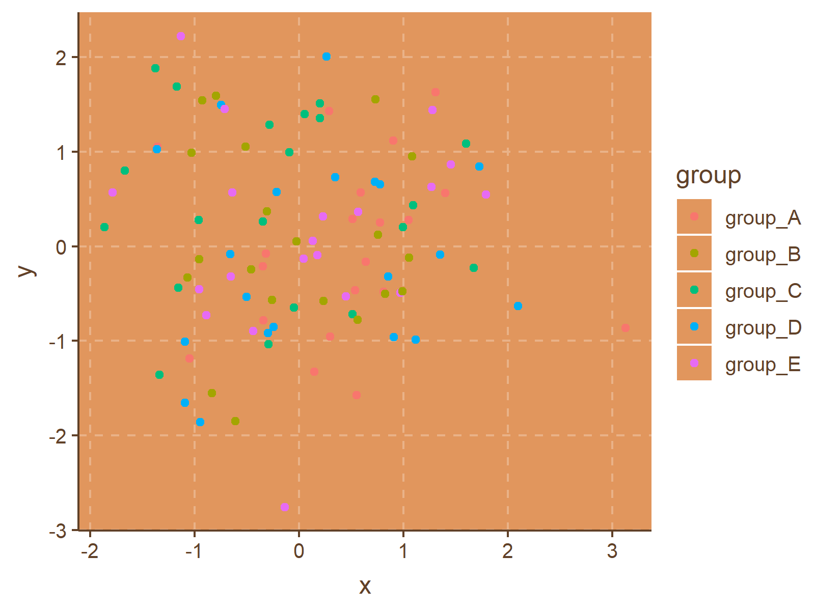
ggthemr("dust")
ggp
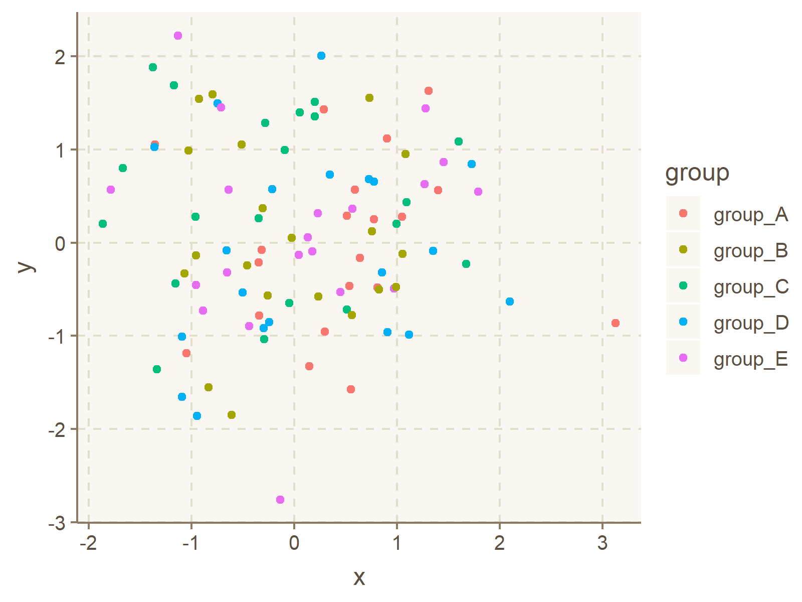
ggthemr("earth")
ggp
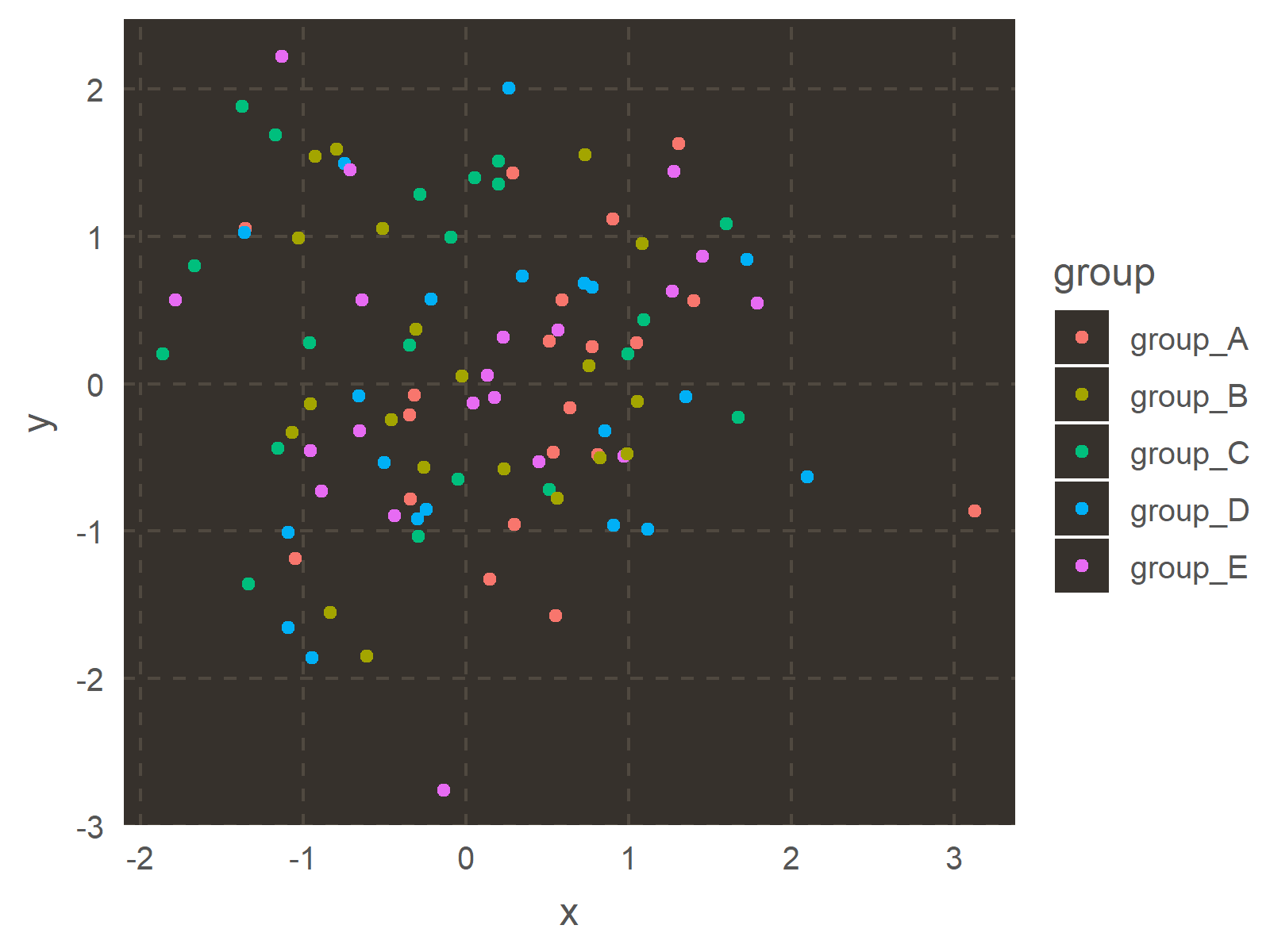
ggthemr("fresh")
ggp
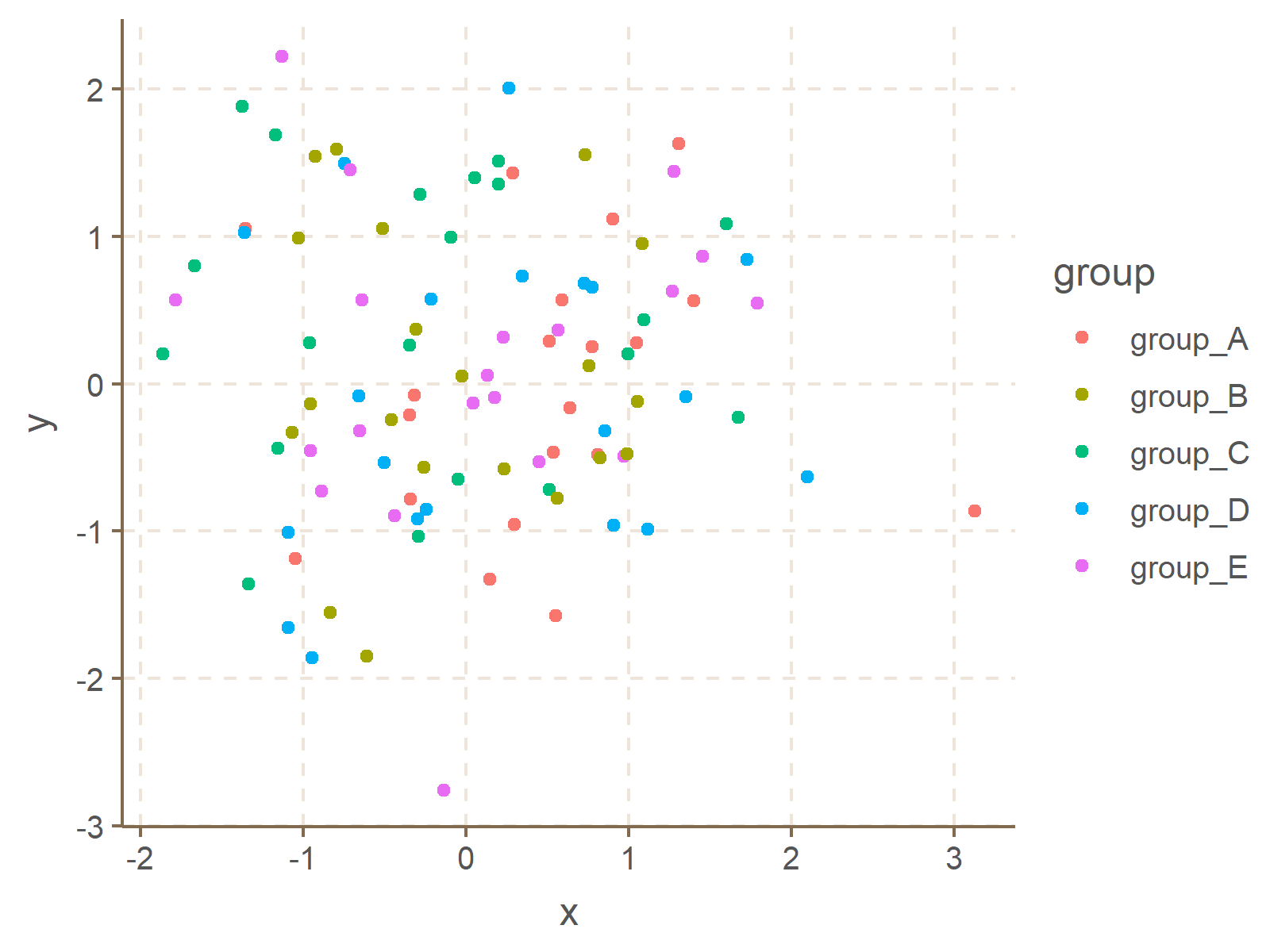
ggthemr("grape")
ggp
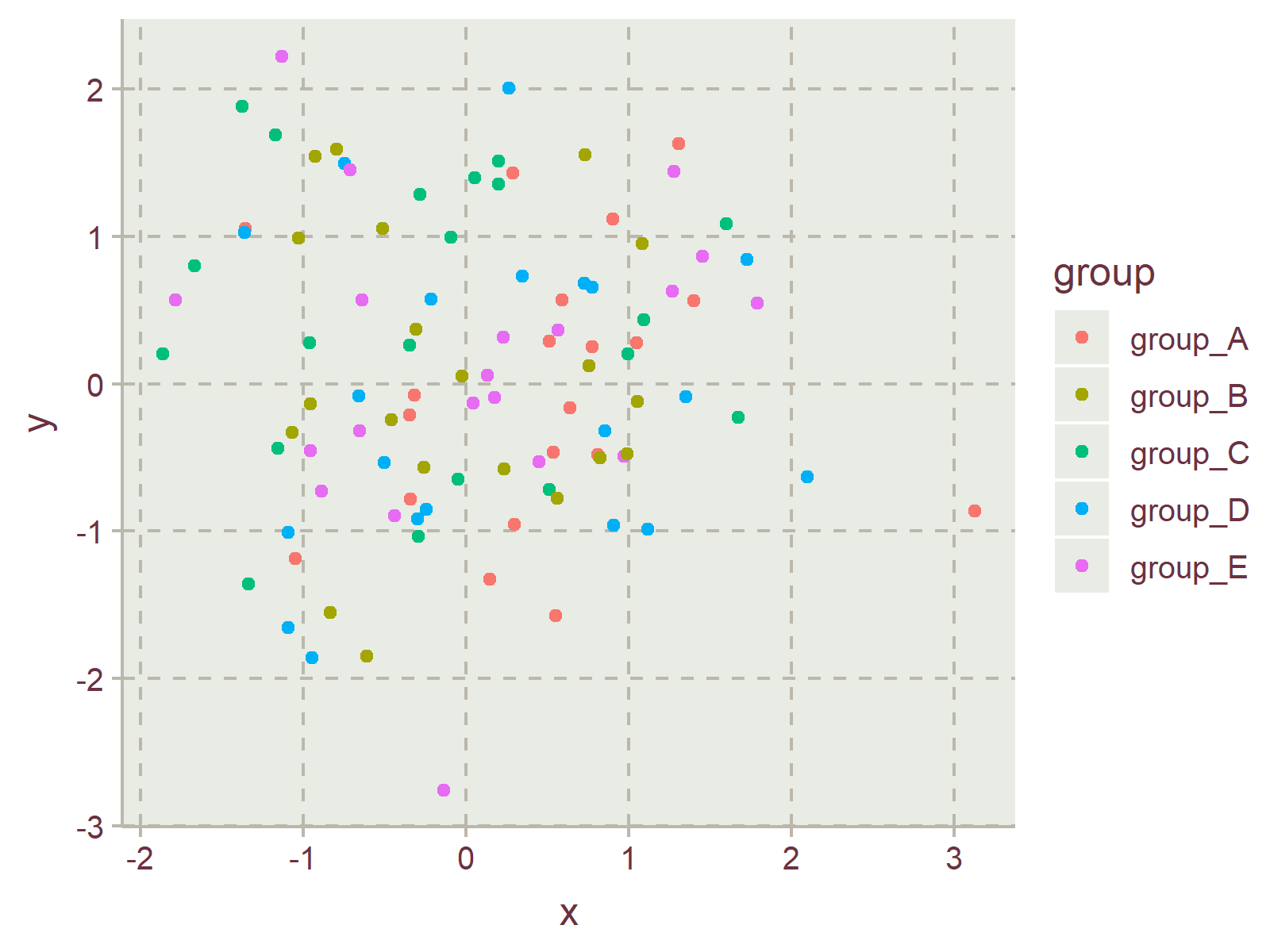
ggthemr("grass")
ggp
ggthemr("greyscale")
ggp
ggthemr("light")
ggp
ggthemr("lilac")
ggp
ggthemr("pale")
ggp
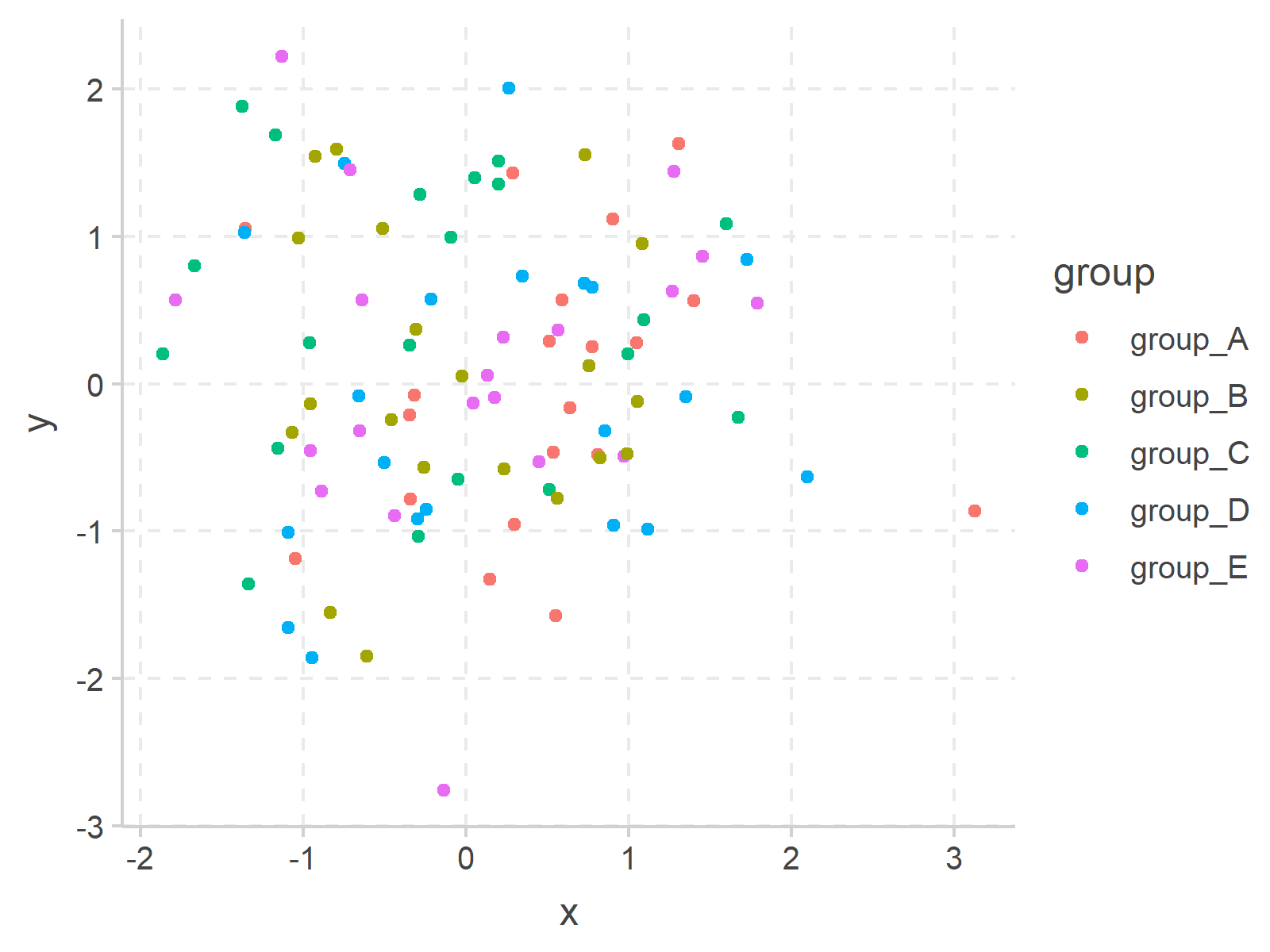
ggthemr("sea")
ggp
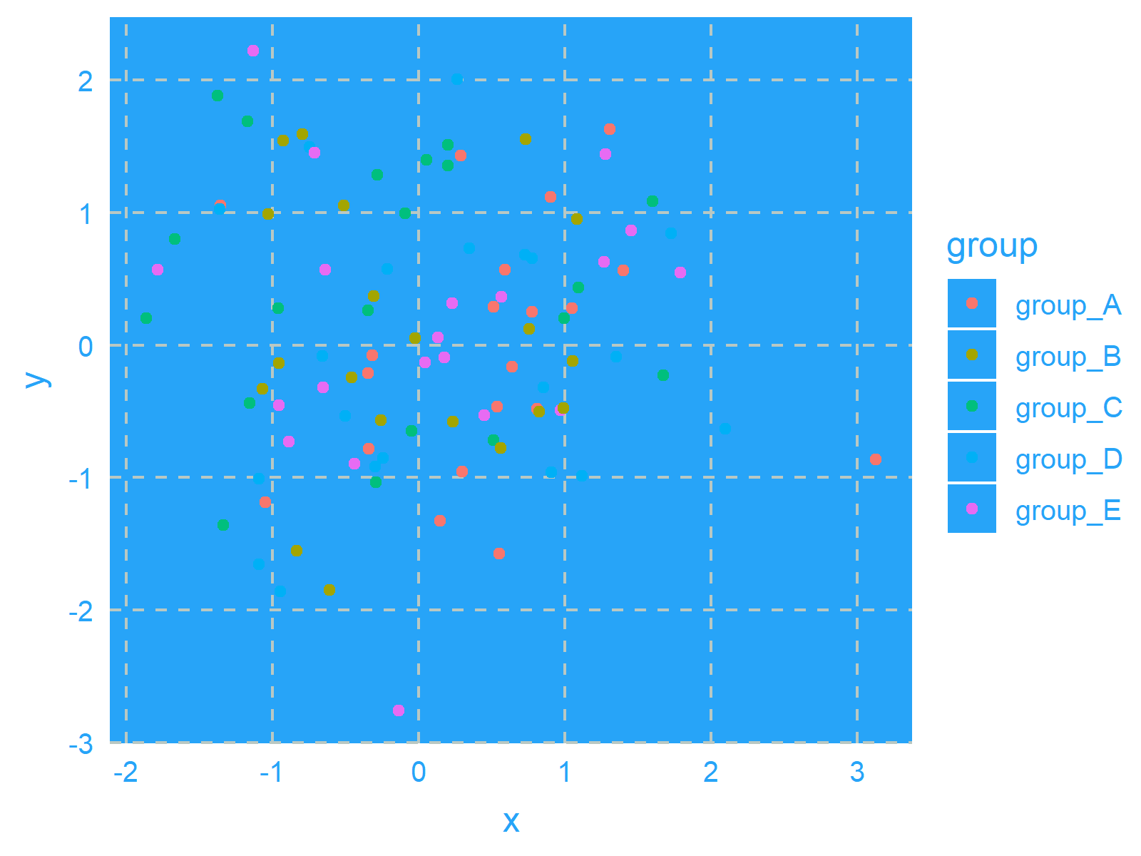
ggthemr("sky")
ggp
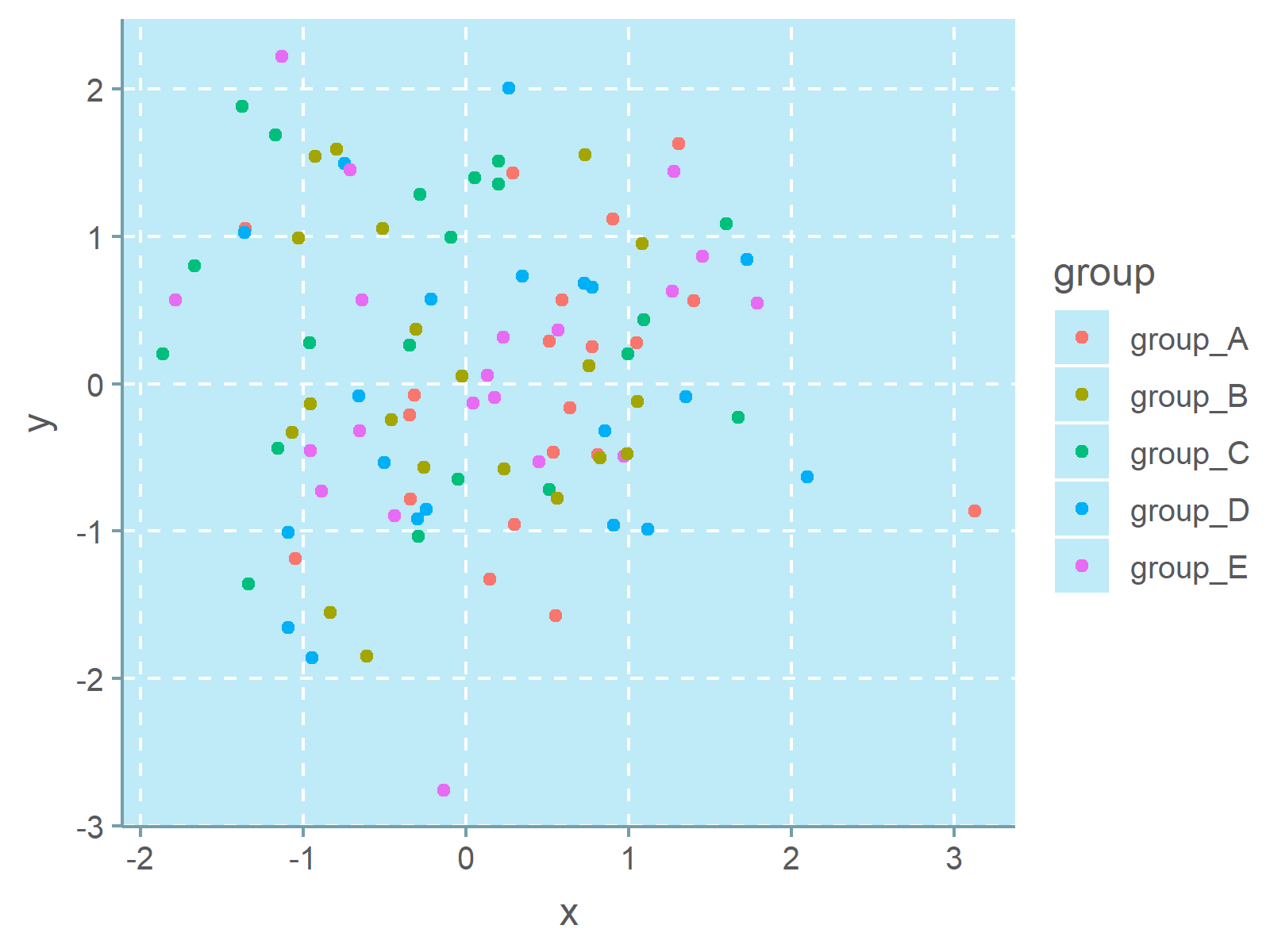
ggthemr("solarized")
ggp
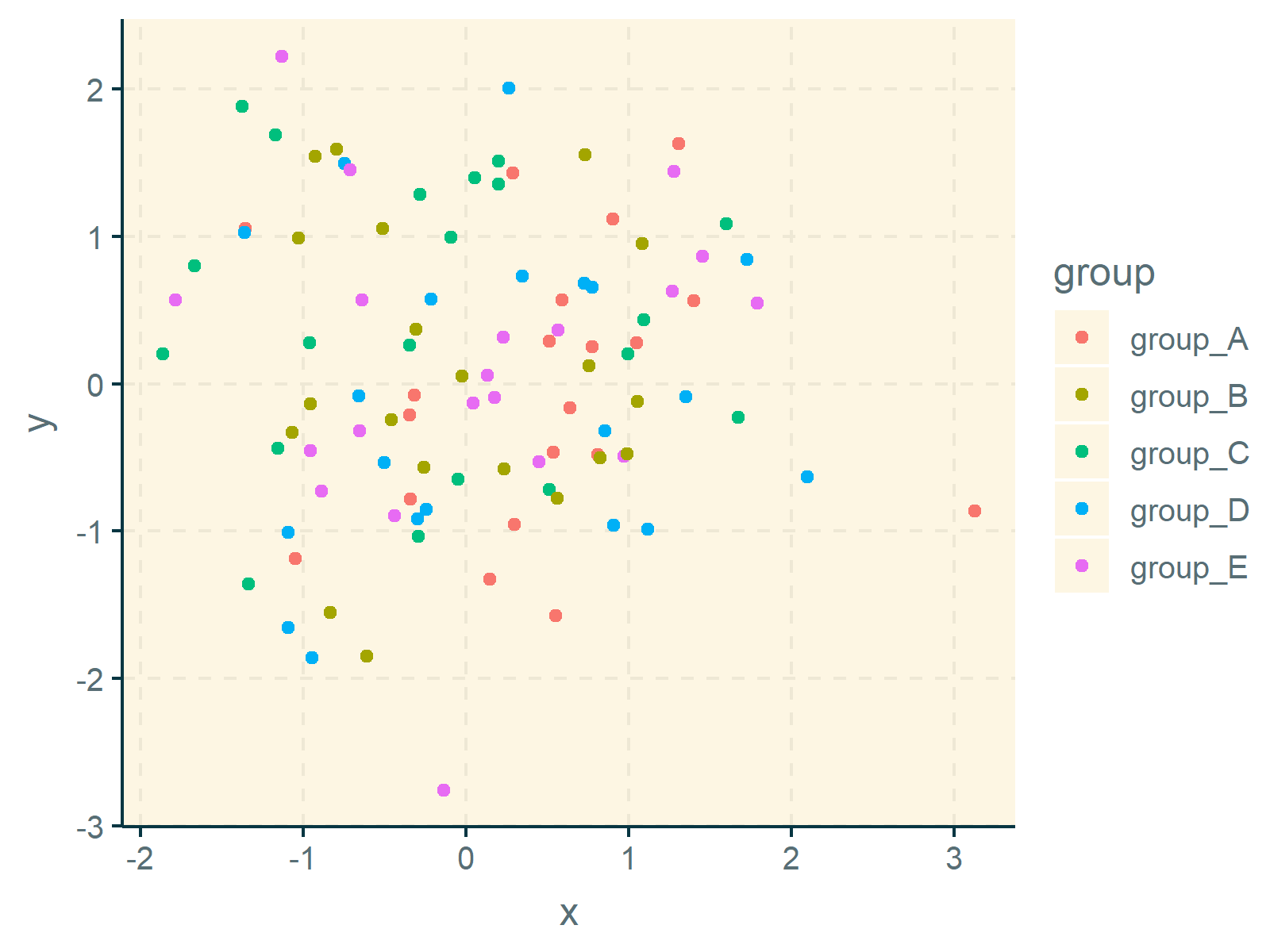
As you have seen, the ggthemr package provides many different pre-defined themes.
In case you want to take over the full control of your ggplot2 themes, you may also create your own theme manually. You can find more information on custom themes here.
Video & Further Resources
Have a look at the following video which I have published on my YouTube channel. In this tutorial, I give a detailed introduction to the ggplot2 Package and data visualization in R, structured in different sections with examples for beginners but also advanced users.
Below, you may also find tutorials on how to create different kinds of graphics such as scatterplots, density plots, barcharts, boxplots, histograms, and line plots using different ggplot2 themes:
- theme_bw
- theme_classic
- theme_dark
- theme_economist [ggthemes Package]
- theme_gray
- theme_light
- theme_linedraw
- theme_minimal
- theme_test
- theme_void
Furthermore, you may read the other tutorials on this website.
- ggthemes Package in R
- Change Continuous Color Range in ggplot2 Plot
- Change ggplot2 Color & Fill Using scale_brewer Functions & RColorBrewer Package in R
- Change Color of ggplot2 Facet Label Background & Text
- Extract Default Color Palette of ggplot2 R Package
- Graphics Overview in R
- All R Programming Examples
Summary: You have learned in this tutorial how to change the colors of ggplot2 plots using different themes in the R programming language. Please let me know in the comments section, if you have any further questions. Furthermore, don’t forget to subscribe to my email newsletter in order to receive updates on new posts.


