Add Labels at Ends of Lines in ggplot2 Line Plot in R (Example)
In this tutorial you’ll learn how to draw a ggplot2 line graph with labels at the end of each line in the R programming language.
The tutorial contains these content blocks:
So let’s get started!
Example Data, Add-On Packages & Basic Plot
Consider the exemplifying data below:
set.seed(2923874)                               # Create example data
data <- data.frame(x = 1:10,
                   y = c(rnorm(10),
                         rnorm(10, 3, 3),
                         rnorm(10, 10, 1.5),
                         rnorm(10, 6, 2)),
                   group = rep(LETTERS[1:4], each = 10))
head(data)                                      # First six rows of example data

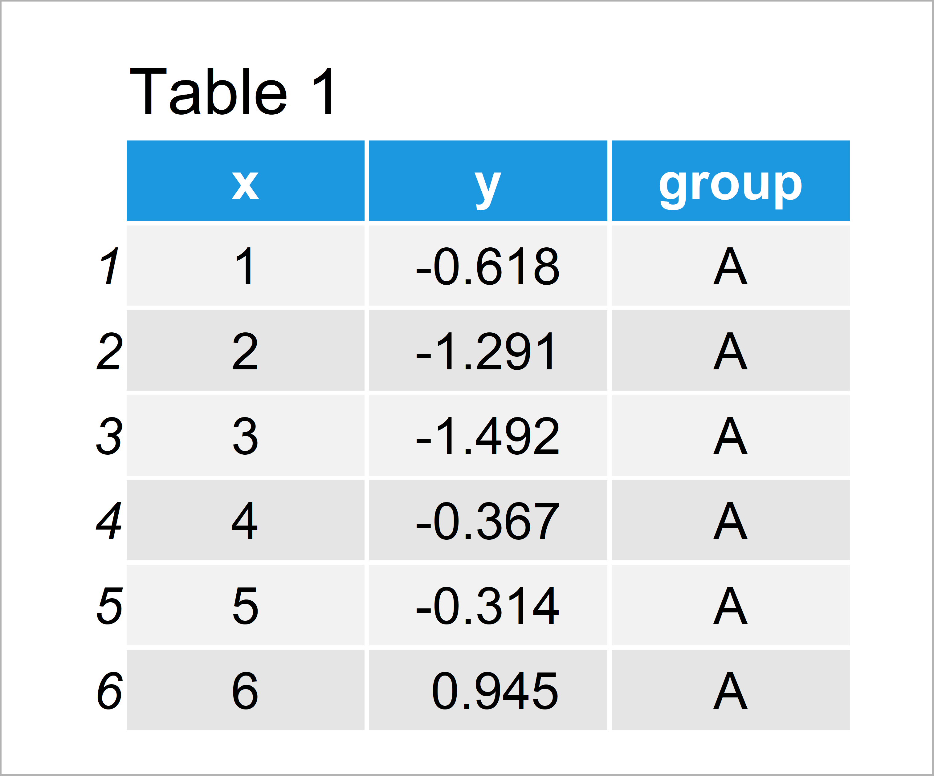
Table 1 shows the structure of our example data: It contains 40 rows and three columns.
We also need to install and load the ggplot2 package, if we want to use the corresponding functions:
install.packages("ggplot2")                     # Install & load ggplot2
library("ggplot2")
As next step, we can create a line graphic of our data using the ggplot2 package:
ggplot(data, aes(x, y, col = group)) +          # Draw default ggplot2 plot
  geom_line()

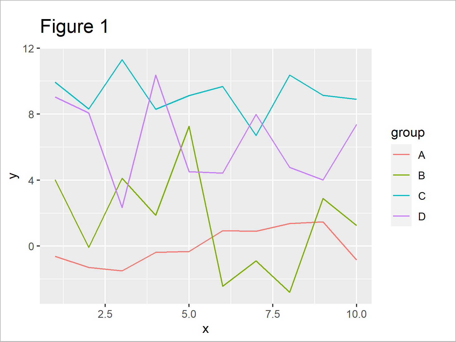
In Figure 1 you can see that we have created a ggplot2 line chart with four different lines. On the right side of the plot, you can see the default legend of the ggplot2 package.
Example: Draw Labels at Ends of Lines in ggplot2 Line Plot Using ggrepel Package
The following R programming code shows how to add labels at the ends of the lines in a ggplot2 line graph.
As a first step, we have to add a new column to our data that contains the text label for each line in the row with the maximum value on the x-axis:
data_label <- data                              # Modify data
data_label$label <- NA
data_label$label[which(data_label$x == max(data_label$x))] <- data_label$group[which(data_label$x == max(data_label$x))]
Furthermore, we have to install and load the ggrepel package to RStudio:
install.packages("ggrepel")                     # Install ggrepel package
library("ggrepel")                              # Load ggrepel
Next, we can use the geom_label_repel function of the ggrepel package to add labels at the end of each line. Note that we are also removing the default ggplot2 legend by specifying theme(legend.position = “none”).
ggplot(data_label, aes(x, y, col = group)) +    # Draw ggplot2 plot with labels
  geom_line() +
  geom_label_repel(aes(label = label),
                   nudge_x = 1,
                   na.rm = TRUE) +
  theme(legend.position = "none")

Figure 2 shows the output of the previous code: A ggplot2 line plot with labels at the ends of lines.
Video, Further Resources & Summary
Would you like to know more about line plots in R? Then you may want to have a look at the following video of my YouTube channel. I illustrate the R code of this article in the video tutorial.
Furthermore, you might want to have a look at the related posts of this website. I have published several articles about graphics in R already.
- Change Line Width in ggplot2 Plot
- Change Colors in ggplot2 Line Plot in R
- Add Greek Symbols to ggplot2 Plot in R
- Control Line Color & Type in ggplot2 Plot Legend
- Add Regression Line to ggplot2 Plot
- Plots in R
- R Programming Overview
On this page you have learned how to add text labels to each line of a ggplot2 line chart in the R programming language. If you have additional questions, tell me about it in the comments section.
Subscribe to the Statistics Globe Newsletter
Get regular updates on the latest tutorials, offers & news at Statistics Globe.
I hate spam & you may opt out anytime: Privacy Policy.
Thank you!
Welcome to the Statistics Globe newsletter. From now on, I’ll send you regular emails about statistics, data science, AI, and programming with R and Python.
I’m Joachim Schork. On this website, I provide statistics tutorials as well as code in Python and R programming.
Statistics Globe Newsletter
Get regular updates on the latest tutorials, offers & news at Statistics Globe. I hate spam & you may opt out anytime: Privacy Policy.
Thank you!
Please check your email inbox and click the confirmation link to complete your subscription. If you don’t see the email within a few minutes, please also check your spam/junk folder.


2 Comments. Leave new
thank you for the explanation it’ really helpful.
I follow your code, but I end up with having an error when I run the geom_label_repel()
Error in grid.Call(C_convert, x, as.integer(whatfrom), as.integer(whatto), :
Viewport has zero dimension(s)
In addition: Warning message:
Removed 42 rows containing missing values (geom_label_repel).
Any idea how to solve that
Hey Manal,
Thank you for the kind words, glad the tutorial is useful!
Could you illustrate what your data set looks like? It’s difficult to spot the problem without seeing the actual data.
Regards,
Joachim