Change ggplot2 Color & Fill Using scale_brewer Functions & RColorBrewer Package in R
In this article, I’ll explain how to apply the functions of the RColorBrewer package to modify ggplot2 plot colors in the R programming language.
The page will contain these contents:
Let’s dive into the exemplifying R syntax!
Example Data, Packages & Basic Graphic
First of all, we’ll have to construct some example data:
data <- data.frame(x = 1:9,                        # Create example data
                   y = 1:9)
data                                               # Print example data
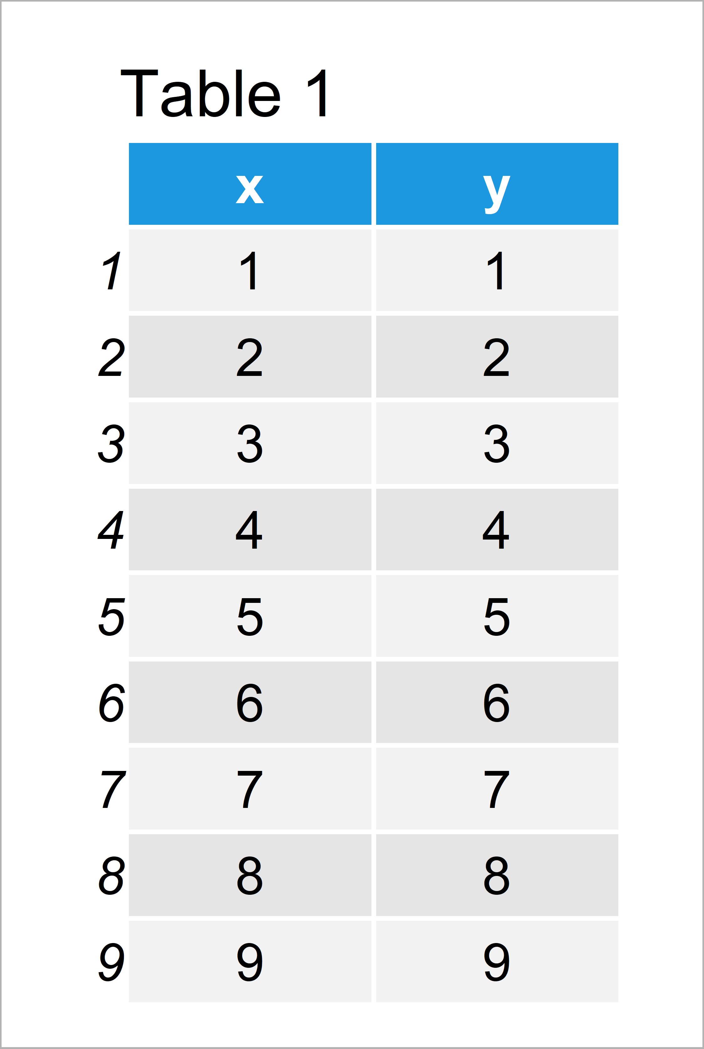
Table 1 shows that our example data contains nine rows and two columns. Both rows are numeric and range from the values 1 to 9.
We also need to install and load the ggplot2 package, in order to use the corresponding functions:
install.packages("ggplot2")                        # Install & load ggplot2 package
library("ggplot2")
Next, we can draw our data with default colors of the ggplot2 package:
ggp <- ggplot(data, aes(x, y, col = factor(x))) +  # Create default ggplot2 plot
  geom_point(size = 10)
ggp                                                # Draw default ggplot2 plot
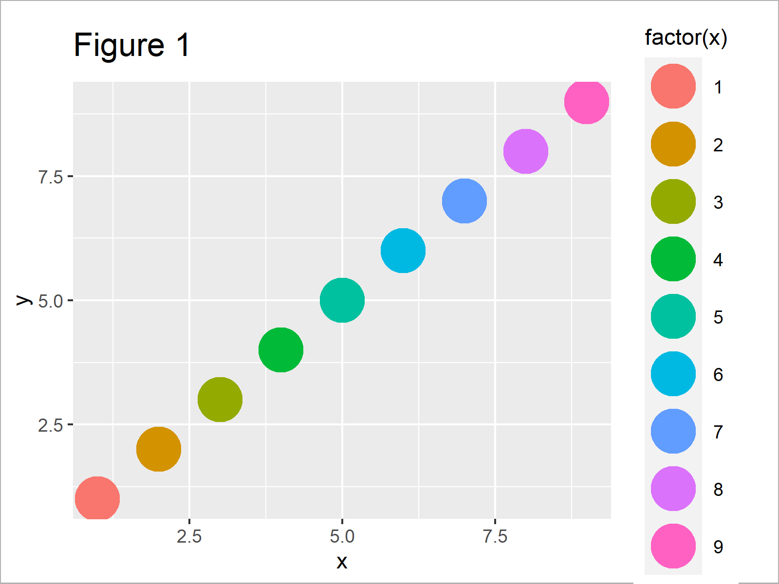
After running the previously shown R programming syntax the scatterplot shown in Figure 1 has been created.
As you can see, each data point is colored differently. However, we didn’t specify a particular color palette yet.
To do that using the RColorBrewer package, we have to install and load the package:
install.packages("RColorBrewer")                   # Install RColorBrewer package
library("RColorBrewer")                            # Load RColorBrewer
Now, we can jump right into the examples!
Example 1: Change ggplot2 Colors Using scale_colour_brewer() Function
In this example, I’ll show how to change the colors of a ggplot2 scatterplot using the scale_colour_brewer function.
For this, we have to add the scale_colour_brewer function to our ggplot2 plot that we have created before. Furthermore, we have to specify a color palette that we want to use. In this example, we’ll use the first color palette provided by the scale_colour_brewer function:
ggp +                                              # Apply scale_colour_brewer function
  scale_colour_brewer(palette = 1)
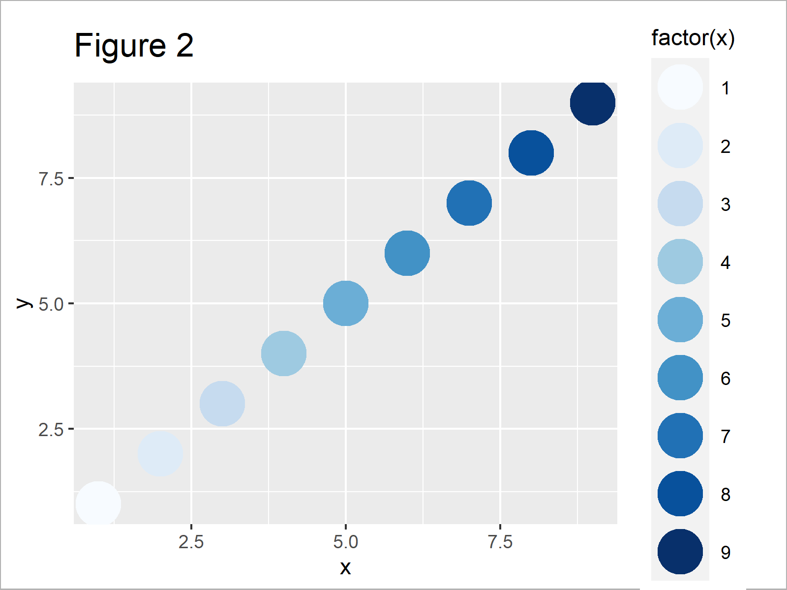
As shown in Figure 2, the previous R programming syntax has plotted a ggplot2 scatterplot with a different color scheme.
Example 2: Select Color Brewer Palette
This example shows how to select a different color palette of the RColorBrewer package.
We can use the display.brewer.all function to show all color palettes that are available in the RColorBrewer package.
Note that we are also specifying the colorblindFriendly argument to be equal to TRUE to exclude all color palettes that may be hard to differentiate by people suffering from color blindness.
display.brewer.all(colorblindFriendly = TRUE) # Show all color palettes
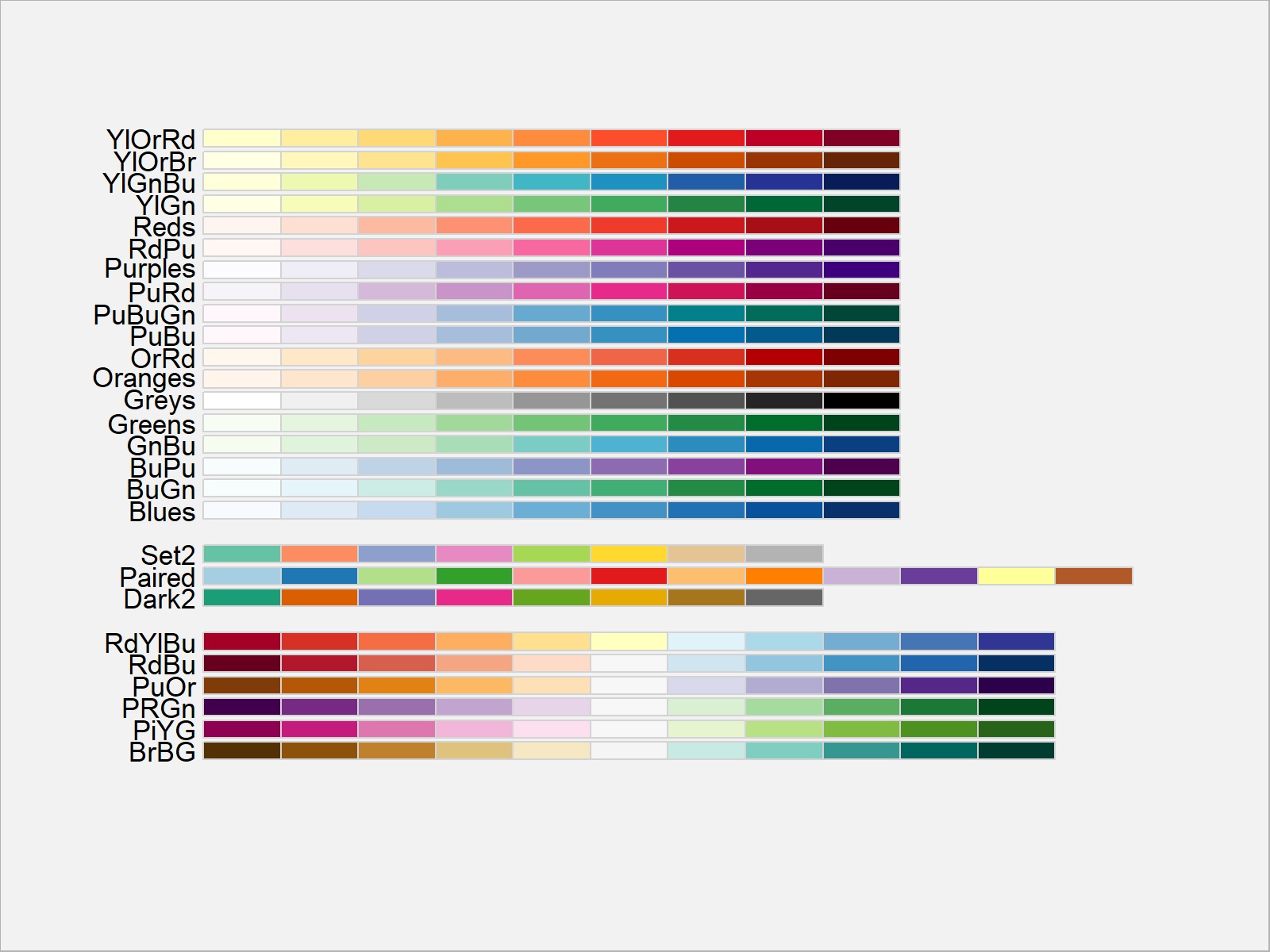
In Figure 3 you can see that we have plotted all available color palettes using the previous R programming code.
We can select these color palettes by the corresponding number (as we did in the previous example) or by their name. Let’s use the PiYG palette:
ggp +                                              # Change color brewer palette
  scale_colour_brewer(palette = "PiYG")
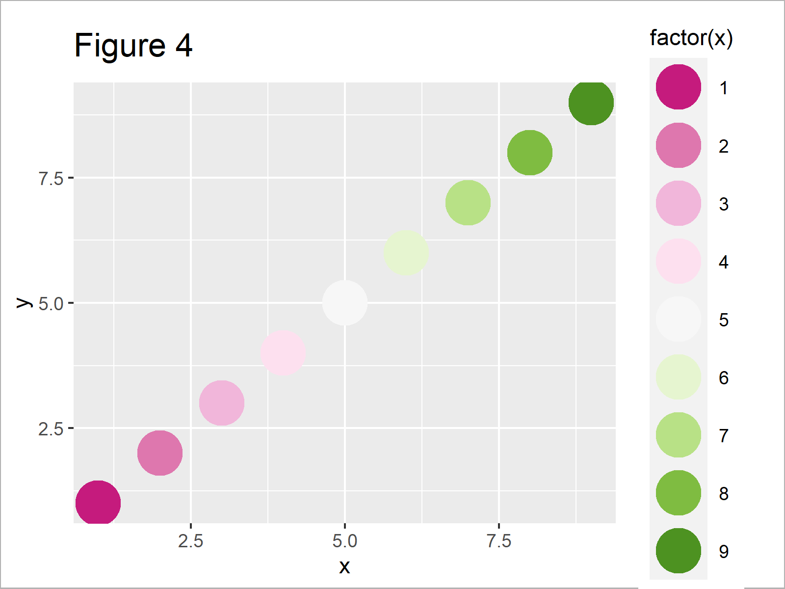
The output of the previous code is shown in Figure 4: We have created another ggplot2 graphic with a different color palette.
Example 3: Reverse Order of Color Brewer Palette
Example 3 shows how to reverse the order of an RColorBrewer palette using the scale_colour_brewer function.
For this, we simply have to specify the value – 1 to the direction argument:
ggp +                                              # Reverse color direction
  scale_colour_brewer(palette = 1, direction = - 1)
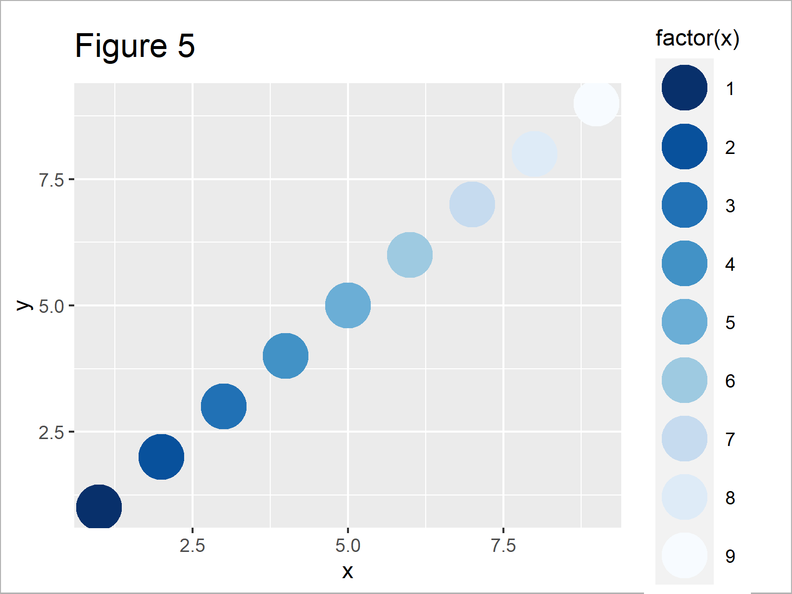
Figure 5 shows the output of the previous syntax: We have used the same color palette as in Example 1, but in the opposite direction.
Example 4: Use scale_colour_brewer() & scale_fill_brewer() Functions Simultaneously
So far, we have only used the scale_colour_brewer function to adjust the colors of our ggplot2 plots. However, we can also use the scale_fill_brewer function to modify the filling colors of ggplot2 graphs as well.
In this example, I’ll explain how to combine the scale_colour_brewer and scale_fill_brewer functions to change the colors in a ggplot2 barplot.
For this task, we have to specify a color palette to each of the functions. Note that we are using the reversed color sequence within the scale_colour_brewer function:
ggplot(data, aes(x, y,                             # colour_brewer & fill_brewer
                 col = factor(x),
                 fill = factor(x))) +
  geom_bar(stat = "identity", size = 2) +
  scale_colour_brewer(palette = "YlOrRd", direction = - 1) +
  scale_fill_brewer(palette = "BuPu")
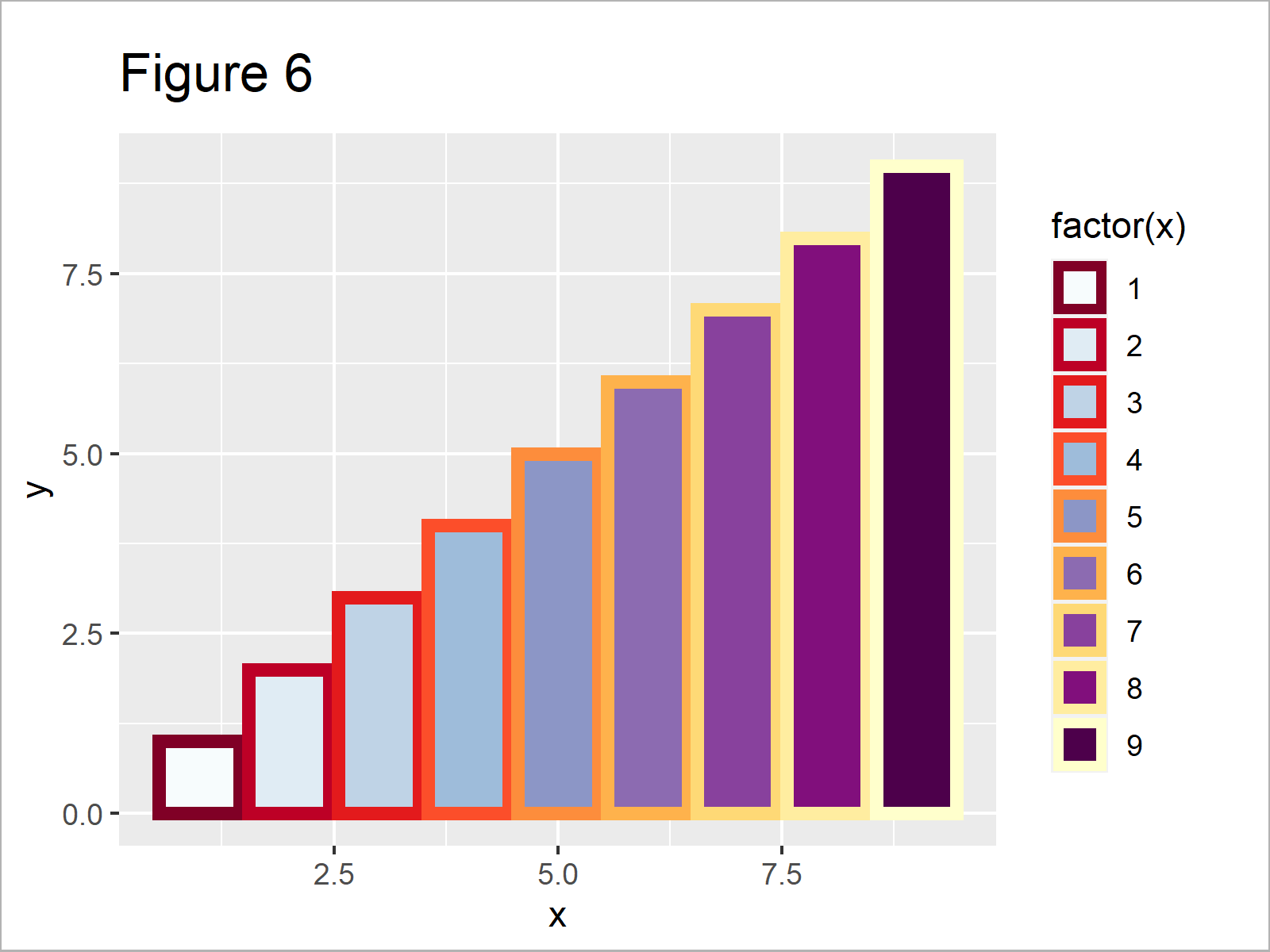
In Figure 6 you can see that we have created a ggplot2 barchart with different color palettes for the fill and border colors by executing the previous R programming syntax.
Video & Further Resources
In case you need further explanations on the R codes of this tutorial, I can recommend having a look at the following video which I have published on my YouTube channel. In the video, I’m illustrating the topics of this article.
The YouTube video will be added soon.
In addition, you might read some of the other articles on this website.
- Change Fill and Border Color of ggplot2 Plot
- Change Color of ggplot2 Boxplot in R
- Change Colors of Bars in ggplot2 Barchart
- Change Color, Shape & Size of One Data Point in Plot
- Control Line Color & Type in ggplot2 Plot Legend
- All R Programming Examples
To summarize: In this R tutorial you have learned how to change ggplot2 colors using the RColorBrewer package.
Note that we have discussed only some applications of the RColorBrewer package in this tutorial. For instance, the functions provided by the package also provide sequential, diverging and qualitative color schemes Furthermore, the package is also suited well for other types of graphics such as boxplots, heatmaps, density plots, or to display discrete values on a map.
In case you have further questions, let me know in the comments section.


